The WordPress Theme Index and the Garbage Invasion

One theme to rule them all, one theme to find them, one theme to bring them all and in the darkness bind them. This is a rather exact description of the current situation in the official WordPress theme index. It seems as if there was only one theme left which is uploaded and presented in new versions all the time. In between, the index is loosened up by themes that are so ugly that they could give you eye cancer.
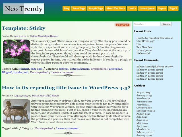
 Neo Trendy
 Cronista
 Corporate Plus
 Zap-Lite
 There are many more examples of uniform design that has been revived over and over again. It tries to distinguish itself with changing elements and colors. The less common magazine themes can be used as further examples.
 Accesspress Mag
 Smart Magazine
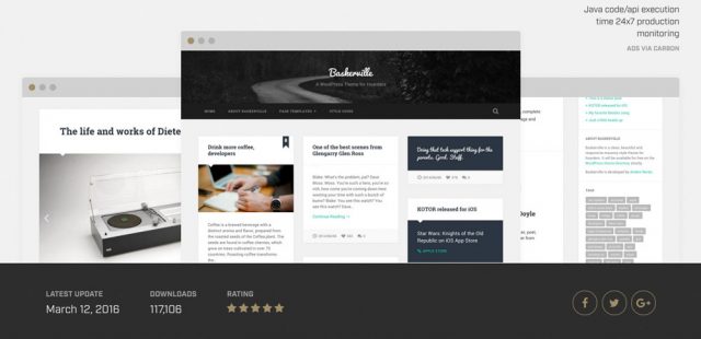
 Baskerville - Demo

WordPress Theme Index: One Theme, Many Variations
Every month, I have to write an article about the ten best WordPress themes of the month. Generally, I love this article, as I enjoy discovering new and exciting things. However, the article is upsetting, since the content that is uploaded and offered is always the same trash, which is very annoying. It seems like every third person feels like founding a premium WordPress theme provider and selling themes. In general, this is not a problem, as competition is good for business. However, the "theme providers" try to make money off of reduced versions in the public theme index. This happens using the basic theme, which is constantly only slightly altered and then reoffered. Sometimes, only the colors are changed, at times other photos are used, or the landing page's structure is changed a little. A close look shows that it is the same theme in different variations.One Theme Rehashed Repeatedly
Of course, it's a great thing for a business to be able to repeatedly rehash a template. Simply offer these variations as a reduced version in the official theme index, create a homepage that explains the functional differences between the lite and the full version, and make money. The clueless users want more and more features, even when the loading time is beyond good and evil.Kriesi or the Beginning of the End
All of this started with developers like Kriesi, who only offers his themes for sale via Themeforest, however. The fact that Kriesi only rehashes his themes is out of the question, but at least his themes always look different. On top of that, his premium themes are designed lovingly, and, for the most part, they look really nice. Nonetheless, he's a part of the problem. Themes like his "Enfold" are what started the flood of the development of the so-called "multi-purpose themes". This is not good for the community for two reasons. For one, the only themes that are developed come with a perceived 500 functions that integrate so many CSS and JavaScript files that you could get sick. But apparently, the users want it to be just like that. The fact that the loading time suffers from that should be evident. Secondly, everyone that feels like being a theme developer wants to create a multi-purpose theme.One Theme Can't do Everything
Most of the time, a multi-purpose theme's basic layout is a business layout. This is not necessarily bad, as many companies want to create a website using WordPress. However, a financially strong company would not use a free theme for that purpose, but would prefer a custom developed template. In addition to that, the developers of the free themes mostly focus on the landing page, leaving out a lot of important elements, like the blog, causing them to look terrible. The goal is fast and easy money, which is why there's not as much time put into the theme as it would be necessary for a product of quality. A proper multi-purpose theme should cover the following aspects with high quality:- A special, highly customizable landing page
- An "about us" section
- A portfolio in at least three versions
- A tenderly designed blog
- A perfect contact page including Google Maps
- A perfectly designed shop (based on WooCommerce, for example)
- All settings should be accessible via the WordPress theme customizer
Vanilla Multi-Purpose With the Same Landing Page
However, as the developers know how well themes like Kriesi's "Enfold" sell, they also want a piece of the cake. So, the business theme idea is constantly rehashed. More and more of these themes hit the market and the official WordPress theme index. Most of these themes are poorly designed as well, simply ugly and unsightly. You'll instantly notice that this was not a professional's work. When the design is ugly already, how bad is the quality of the code under the hood going to be? Okay, I'll admit, I don't care. I don't even want to know.I'd Like to Have a Theme in the Index...
There's another group of "theme developers". Those that can barely say PHP without any mistake and don't have an eye for design at all. They want to have a theme in the index as well, so they "develop" one. These theme's meet the prerequisites for the code, which is made sure by the theme review team. However, prerequisite doesn't mean that the quality of the code is acceptable. It only means that it's not horrible. These themes can be identified easily because their design is so incredibly ugly that it will burn itself into the viewer's retina forever. Do you want some examples?Three Examples of Poor Design
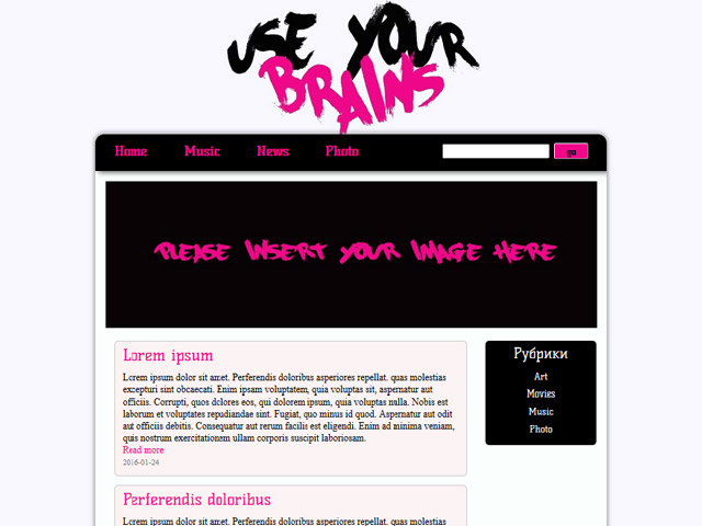
Use Your Brains Neo Trendy
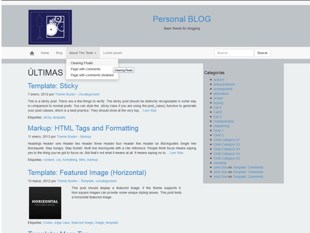
 Cronista

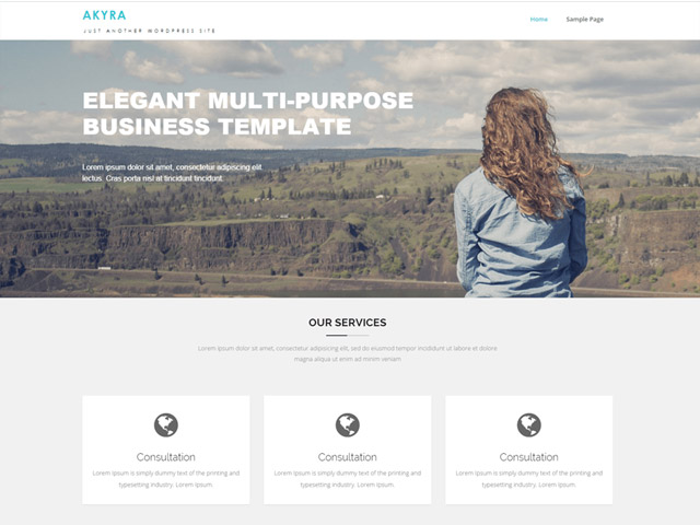
Three Examples for Uniform Design - Multi-Purpose Themes
Akyra Corporate Plus
 Zap-Lite
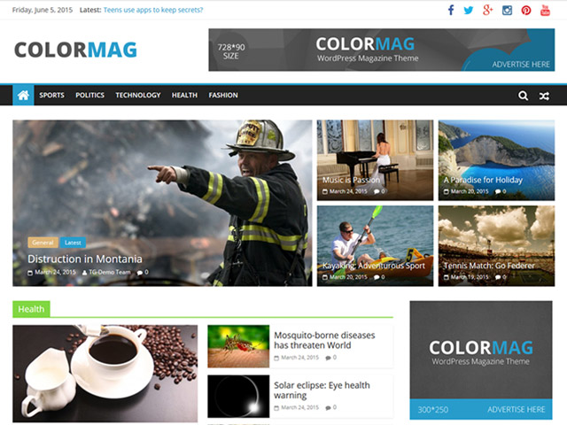
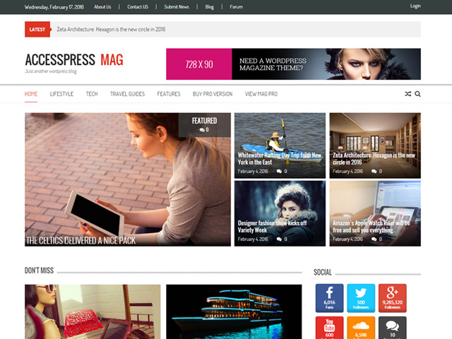
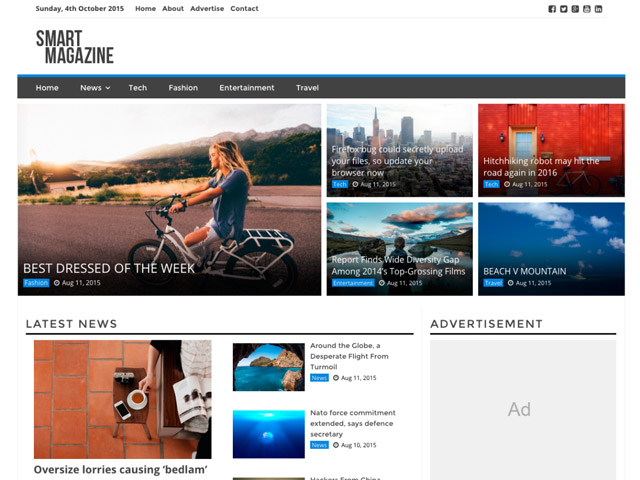
 There are many more examples of uniform design that has been revived over and over again. It tries to distinguish itself with changing elements and colors. The less common magazine themes can be used as further examples.
Three Examples of Uniform Design - Magazine Themes
Color-Mag Accesspress Mag
 Smart Magazine

WordPress Theme Index: The Exceptions of the Rule
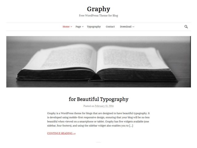
They exist. The infamous and soothing exceptions to the rule. Now and then, you'll find them after a lot of searching in the WordPress theme index. These are the themes that were created by specialists of their craft. They can mostly be recognized by the fact that they only have one purpose. They are pure blog or portfolio themes. From time to time, pure business themes are added to the index as well. This doesn't guarantee a good design, but it can promote it. Here is an example of a blog: Graphy
My Favorite Designer - Anders Norén
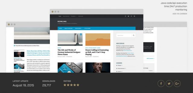
The Swede Anders Norén has lots of courage. His themes are designed independently, and thus, they instantly set themselves apart from the masses of themes. On top of that, they provide a high-quality code and are very durable. They are no multi-purpose themes either. In fact, they are the opposite. They do the one job they were made for. The majority of them looks great, too. Here are two examples: Rowling - Demo Baskerville - Demo
