WordPress 3.5 First Look: Yay or Nay?
WordPress 3.5 "Elvin" has just been released, and it comes with a good number of changes, upgrades and updates. In this article, we take a look at the new offerings that WP 3.5 has brought to the table. For someone who has been working with WordPress ever since the 2.x days, each new release brings many expectations and hopes. Naturally, hopes were high ever since the new version of WP was in the testing phase. I had been taking a look at the changes by test driving the release candidates on a dummy site. Oh yes, I was *that* impatient to wait for the final stable version to be released.
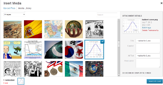 Considering the fact that, of late, WordPress has been powering multiple portfolio websites for photographers and artists, having a better-looking and simpler Media Manager makes sense. The new Manager also features drag and drop support, and this functionality will surely come in handy if you are creating a gallery using multiple images.
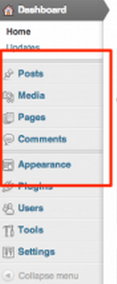 If you need the Links' functionality, you can opt for the Links Manager plugin.
 Basically, when you go to the Add New Plugins screen (Plugins-->Add New), you will see a new link, named ‘Favorites’, right next to Search, Upload, Featured, Popular and Newest. Using the Favorites page, you can enter your WP.org login credentials and then browse through all the plugins that you’ve marked as favorites in the repository.
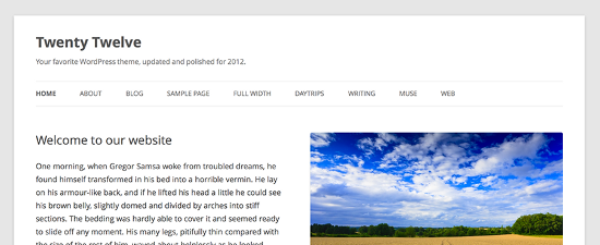
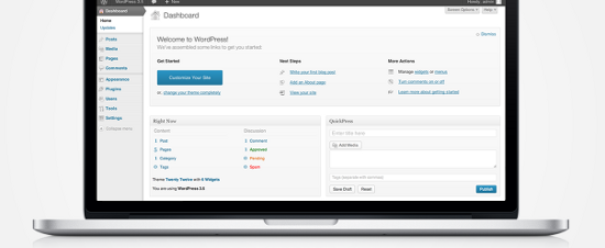 In fact, right from WP 3.4 itself, retina display was something that was in the making for WP. Even the default theme Twenty Twelve, which was released few months ago, was all ready for HiDPI retina display. Naturally, WordPress 3.5 has followed the trend and offered a crystal clear picture for those on high end screens.
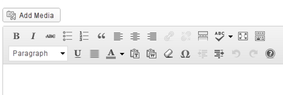
 Next, the TinyMCE toolbar buttons have also been given a minor facelift. They have become, well, more subtle in terms of appearance. I’m not sure about the rest of the world, but this new-look editor toolbar looks good to me.
WordPress 3.5 -- What’s New?
Considering the fact that this is not just a minor update, version 3.5 naturally brings certain new and noteworthy features to the front. For the sake of simplicity, I shall be sub-dividing them under broad heads: Admin Interface, Visual Tweaks, and Under the Hood. This is just to aid classification, and such division is, by no means, a rigid classification of features.Changes in Admin Interface
1. A New Media Manager
Codenamed "Elvin", WordPress 3.5 features a newly revamped Media Manager for uploading your photos and other files, as well as including them in your posts. Basically, instead of ‘listing’ the images, the new Manager shows thumbnails of each image, and loads older images as you scroll down. Plus, it has a side-pane for entering information such as Alternate text and Caption for your images. Considering the fact that, of late, WordPress has been powering multiple portfolio websites for photographers and artists, having a better-looking and simpler Media Manager makes sense. The new Manager also features drag and drop support, and this functionality will surely come in handy if you are creating a gallery using multiple images.
2. No Links Manager
WordPress 3.5 has done away with the Links section in the admin panel. However, if you are upgrading an existing installation of WordPress to the new version, and already have links or blogrolls added, your Links section will remain untouched. On the other hand, any new installations of WordPress, for example if you install WP 3.5 on a new site from scratch, will not have the Links section. If you need the Links' functionality, you can opt for the Links Manager plugin.
3. Favorite Plugins
Recently, WP.org had given users the power to ‘review’ themes in the repository. And now, if while browsing the plugin repository, you are logged in with your username, you have the ability to hit a ‘Favorite’ button on the plugin name. WordPress 3.5 has now offered better integration for this feature, right in your admin panel. Basically, when you go to the Add New Plugins screen (Plugins-->Add New), you will see a new link, named ‘Favorites’, right next to Search, Upload, Featured, Popular and Newest. Using the Favorites page, you can enter your WP.org login credentials and then browse through all the plugins that you’ve marked as favorites in the repository.
Visual Tweaks
1. A New Default Theme
WordPress 3.5 comes with Twenty Twelve as its default theme. It is clean, responsive and has already gained a good deal of popularity among the users. You can read more about Twenty Twelve here.
2. Retina Ready Display
The WordPress Dashboard is now all prepared for high resolution screens. No matter what device you are using: iPhone 5, iPad, Kindle Fire HD, Nexus 10, or Macbook Pro -- your WP Dashboard will look gorgeous! In fact, right from WP 3.4 itself, retina display was something that was in the making for WP. Even the default theme Twenty Twelve, which was released few months ago, was all ready for HiDPI retina display. Naturally, WordPress 3.5 has followed the trend and offered a crystal clear picture for those on high end screens.
3. Color Pickers and Accessibility
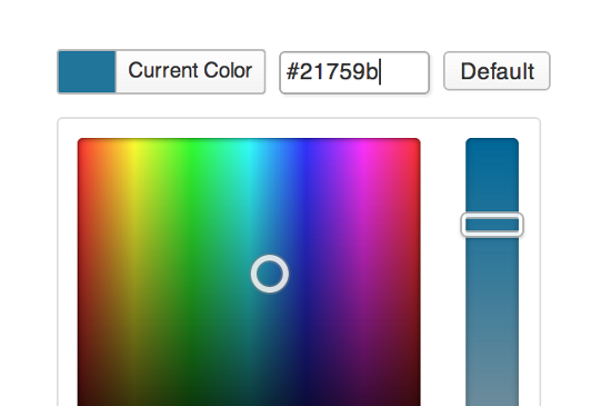
WordPress 3.5 comes with a refined and revamped color picker that makes it easier to pick the right shade of your favorite color. Plus, WP 3.5 also offers better accessibility features for screenreaders, touch devices and mouseless workflows.
Under The Hood
1. Multisite Improvements and External Libraries
WordPress 3.5 now includes certain JavaScript libraries, most notably Backbone and Underscore. Furthermore, switch_to_blog() has been improved as well (multisite, that is) and components such as TinyMCE and SimplePie have been updated.2. XML-RPC API
WordPress API is now enabled by default. This means faster load times for profile edits, post revisions and searches. Similarly, the image editing API will use ImageMagick whenever possible.3. Meta Queries and Objects
Classes such as WP_Comment_Query and WP_User_Query will now support meta queries. Also, post objects are now instances of a WP_Post class.Etcetera
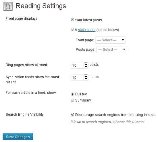
Among other things, WordPress 3.5 has also shifted the location of website privacy settings. Until now, you could navigate to Settings-->Privacy to turn off/on search engine indexing and visibility. This feature has now been shifted to Settings-->Reading. Seems logical, because having a separate page for just one privacy option was overkill anyway. Next, the TinyMCE toolbar buttons have also been given a minor facelift. They have become, well, more subtle in terms of appearance. I’m not sure about the rest of the world, but this new-look editor toolbar looks good to me.


I was looking for the “privacy” settings and got here after Google search.
OK, it is now in the reading settings. Fine with me.
But I had a big problem on one of my sites after updating to this 3.5 version of WordPress. Had a Warning message appearing on the top of the site. I manage to fix it but make sure you backup your WordPress site BEFORE updating to this version 3.5
Just to add to the opinions specifically on media manager: I like the interface and features when uploading the media/image into specific post, however, am annoyed at the fact that I cannot change the media (specifically images) titles AFTER they have been uploaded into the library. Maybe it’s just the old habits prevailing, but I am used to being able to title the image as I go when I need to manage my library, especially when uploading/working with multiple media files at once.
Thanks for this comprehensive summary of the new changes – I’ve added it to 2 test sites, and found one thing that they have taken away, which I’m not happy about! The “Size of the post box” setting (screenshot: http://screencast.com/t/rkuEZPTaJ79p) – I always change mine from the default 20 lines (which is usually too small) to at least 28 or 30 – but upon upgrading to WP 3.5, this option is gone AND they have reduced the size back to 20 lines – for someone who does a lot of editing for clients when setting up websites, this is a real pain in the *** ! So just be aware….
Great article…
Actually, the post box size option has changed, but it’s not gone – in the visual mode of the post editor, you can drag the bottom right-hand corner of the post box down to increase the post box size.
Same issue as Scott. Tried all fixes on Google I could find. Nothing is working. My last backup before 3.5 seems to not be complete for some reason (fabulous) so I got around it by adding the image to my image library, it seems to let me do that, but I can’t edit the image at all in there. Anyway, after doing that, I manually inserted the html code into the post and that seems to allow it to get there. Won’t allow the thumbnail to insert on my homepage via my studiopress theme (pain) but rather than to any more plugin messing, wp-config adds, cache clearing etc, I am hoping to be able to ride it out until WP releases an update to fix the problem.
The new media manager looks better than the old one, but it needs improvement. Agree with the author that it is annoying the way it handles featured image and edition of images. Previous version let you do it in one simple step and within same window. Cute and Simple should go hand-to-hand, not in separate roads.
I agree with the previous complains but the thing that annoyed me most is finding the URL’s of the uploaded files. I hope it will be fixed soon.
Great post! I agree with you about media manager. With products like highslide, why bloat up the main wp product where it is great for simple uploads of a screen shot or two. For some reason the “small medium large” options have also disappeared and I can’t set a sie percentage smaller than 60%. Quite annoying.
Agree also about Drupal – nice tool – but the simplicity of WordPress was why I went with it.
Overall, it’s more usable, but for some plugins and themes that rely on their own versions of jQuery, some may stop working. The solution is to get their latest version. Or you can try fixing it yourself. The good side is that your sites should load faster if all your plugins and themes are using a single jQuery js instead of many.
Hi! Nice article. Much like yourself, I am facing trouble with the new Media Manager. Although I am not that concerned about whether I want to create a gallery every time or not, my gallery is forcing its first image as the featured image of my post, even though I do not want any featured image. This is really annoying, and I have been trying to find a way to prevent it, but no success so far. I am starting to think perhaps I need a different gallery plugin.
I hate so much about the new media. HATE it.
Total pia to get rid of images on posts , the entire “attachment” issue, PDF problems , I really hate it