WordPress 3.5 First Look: Yay or Nay?
WordPress 3.5 "Elvin" has just been released, and it comes with a good number of changes, upgrades and updates. In this article, we take a look at the new offerings that WP 3.5 has brought to the table. For someone who has been working with WordPress ever since the 2.x days, each new release brings many expectations and hopes. Naturally, hopes were high ever since the new version of WP was in the testing phase. I had been taking a look at the changes by test driving the release candidates on a dummy site. Oh yes, I was *that* impatient to wait for the final stable version to be released.
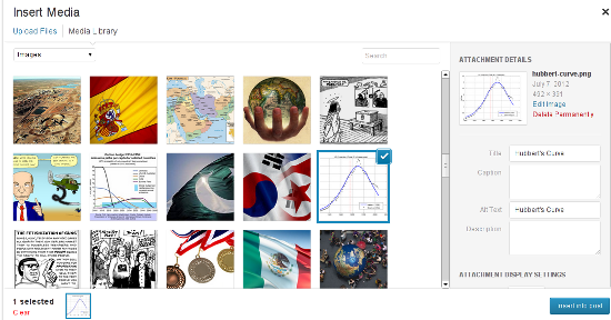 Considering the fact that, of late, WordPress has been powering multiple portfolio websites for photographers and artists, having a better-looking and simpler Media Manager makes sense. The new Manager also features drag and drop support, and this functionality will surely come in handy if you are creating a gallery using multiple images.
 If you need the Links' functionality, you can opt for the Links Manager plugin.
 Basically, when you go to the Add New Plugins screen (Plugins-->Add New), you will see a new link, named ‘Favorites’, right next to Search, Upload, Featured, Popular and Newest. Using the Favorites page, you can enter your WP.org login credentials and then browse through all the plugins that you’ve marked as favorites in the repository.
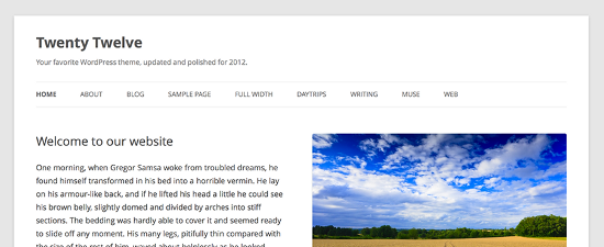
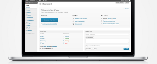 In fact, right from WP 3.4 itself, retina display was something that was in the making for WP. Even the default theme Twenty Twelve, which was released few months ago, was all ready for HiDPI retina display. Naturally, WordPress 3.5 has followed the trend and offered a crystal clear picture for those on high end screens.
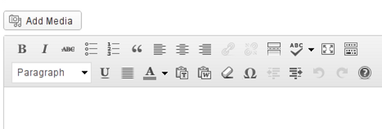
 Next, the TinyMCE toolbar buttons have also been given a minor facelift. They have become, well, more subtle in terms of appearance. I’m not sure about the rest of the world, but this new-look editor toolbar looks good to me.
WordPress 3.5 -- What’s New?
Considering the fact that this is not just a minor update, version 3.5 naturally brings certain new and noteworthy features to the front. For the sake of simplicity, I shall be sub-dividing them under broad heads: Admin Interface, Visual Tweaks, and Under the Hood. This is just to aid classification, and such division is, by no means, a rigid classification of features.Changes in Admin Interface
1. A New Media Manager
Codenamed "Elvin", WordPress 3.5 features a newly revamped Media Manager for uploading your photos and other files, as well as including them in your posts. Basically, instead of ‘listing’ the images, the new Manager shows thumbnails of each image, and loads older images as you scroll down. Plus, it has a side-pane for entering information such as Alternate text and Caption for your images. Considering the fact that, of late, WordPress has been powering multiple portfolio websites for photographers and artists, having a better-looking and simpler Media Manager makes sense. The new Manager also features drag and drop support, and this functionality will surely come in handy if you are creating a gallery using multiple images.
2. No Links Manager
WordPress 3.5 has done away with the Links section in the admin panel. However, if you are upgrading an existing installation of WordPress to the new version, and already have links or blogrolls added, your Links section will remain untouched. On the other hand, any new installations of WordPress, for example if you install WP 3.5 on a new site from scratch, will not have the Links section. If you need the Links' functionality, you can opt for the Links Manager plugin.
3. Favorite Plugins
Recently, WP.org had given users the power to ‘review’ themes in the repository. And now, if while browsing the plugin repository, you are logged in with your username, you have the ability to hit a ‘Favorite’ button on the plugin name. WordPress 3.5 has now offered better integration for this feature, right in your admin panel. Basically, when you go to the Add New Plugins screen (Plugins-->Add New), you will see a new link, named ‘Favorites’, right next to Search, Upload, Featured, Popular and Newest. Using the Favorites page, you can enter your WP.org login credentials and then browse through all the plugins that you’ve marked as favorites in the repository.
Visual Tweaks
1. A New Default Theme
WordPress 3.5 comes with Twenty Twelve as its default theme. It is clean, responsive and has already gained a good deal of popularity among the users. You can read more about Twenty Twelve here.
2. Retina Ready Display
The WordPress Dashboard is now all prepared for high resolution screens. No matter what device you are using: iPhone 5, iPad, Kindle Fire HD, Nexus 10, or Macbook Pro -- your WP Dashboard will look gorgeous! In fact, right from WP 3.4 itself, retina display was something that was in the making for WP. Even the default theme Twenty Twelve, which was released few months ago, was all ready for HiDPI retina display. Naturally, WordPress 3.5 has followed the trend and offered a crystal clear picture for those on high end screens.
3. Color Pickers and Accessibility
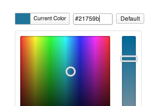
WordPress 3.5 comes with a refined and revamped color picker that makes it easier to pick the right shade of your favorite color. Plus, WP 3.5 also offers better accessibility features for screenreaders, touch devices and mouseless workflows.
Under The Hood
1. Multisite Improvements and External Libraries
WordPress 3.5 now includes certain JavaScript libraries, most notably Backbone and Underscore. Furthermore, switch_to_blog() has been improved as well (multisite, that is) and components such as TinyMCE and SimplePie have been updated.2. XML-RPC API
WordPress API is now enabled by default. This means faster load times for profile edits, post revisions and searches. Similarly, the image editing API will use ImageMagick whenever possible.3. Meta Queries and Objects
Classes such as WP_Comment_Query and WP_User_Query will now support meta queries. Also, post objects are now instances of a WP_Post class.Etcetera
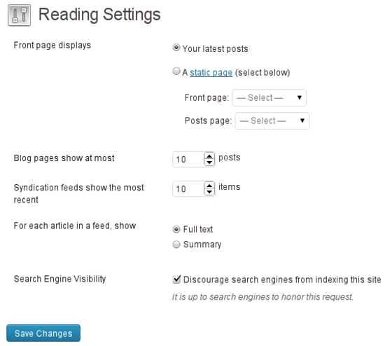
Among other things, WordPress 3.5 has also shifted the location of website privacy settings. Until now, you could navigate to Settings-->Privacy to turn off/on search engine indexing and visibility. This feature has now been shifted to Settings-->Reading. Seems logical, because having a separate page for just one privacy option was overkill anyway. Next, the TinyMCE toolbar buttons have also been given a minor facelift. They have become, well, more subtle in terms of appearance. I’m not sure about the rest of the world, but this new-look editor toolbar looks good to me.


I’m having the same problem as Scott – “Scott, 12 December 2012
“Have not been able to upload a single image since the update. They all start fine, then just stall and never complete. Anybody have this problem? also having a problem with the new media.”
I’m use to uploading my images via my Picasa folders.
IMHO the new MediaManager ist much better than the older one. Nevertheless, I agree that it’s still a weak point of WP. And for galleries you better use NextGen Gallery.
I’m a bit confused by the new Media Manager. Yeah it looks new, but it offers the same (or less? not sure yet) functionality using more clicks and more screen estate. So for me it seems a bit pointless.
I’m glad the Links Manager is at least maintained for existing users as I use it for keep track of sites and use it as a source for a WP plugin that generates a news page with the latest posts from those links.
So I’m sure there are plenty of people out there excited about 3.5 but for me it doesn’t really improve anything. It seems more aimed at people new to WP with the overhauled media manager, new theme and removed links manager.
I am having a bigger problem with media. When I press the Add Media button to add an image to a page or post, nothing happens. Zip, Nada, Zero.
Update to my earlier comment: Support from WP suggested flushing my browser’s cache and deactivating ALL plug-ins. This WORKED for me. I was able to upload an image. But when I tried a second time, the problem came back and I’m still stuck. The work-around no longer works. I’m ready to give up. Is there a way to go BACK a version of WP?
the gallery feature is great in wordpress 3.5.
The new Media Manager…………… :(
I liked the way I could operate the older version, able to bulk change titles ou alts of images, able to see only what i have upload during the post itself instead of all media i have,…
Scott,
The only way to go back a version of WP is if you backed up your database before updating to 3.5. Then you can just use that database and you’re back with the last version.
If you backed up before updating, your hosting service can usually reinstall your last saved database. Hopefully that makes sense!
I wish WP would do a fix for the image Title disappearing issue as you have to back in after posting your image to put it there. If not, Big G won’t index properly.
I couldn’t agree more about the new Media Manager. I don’t like that I can’t insert an image and set it as a featured image at the same time. Now it’s two completely separate tasks. I also think that the default should not be “all media items” but rather “uploaded to this post”. I don’t use the gallery feature at all and I also feel like this upgrade was geared toward those that do and the rest of us weren’t considered at all. :-/ I now have additional steps to an already long process of creating a post.
I wish WP would have include the new media manager as an included plugin just like Akismet. I used for websites for my clients and to date, never used a single image gallery.
The media features is good for avid image player, photographer or may be photoshop students. Loading a nice looking photo seems a daunting task for most of the people I know, let along playing with it. :)