WordPress 3.5 First Look: Yay or Nay?
WordPress 3.5 "Elvin" has just been released, and it comes with a good number of changes, upgrades and updates. In this article, we take a look at the new offerings that WP 3.5 has brought to the table. For someone who has been working with WordPress ever since the 2.x days, each new release brings many expectations and hopes. Naturally, hopes were high ever since the new version of WP was in the testing phase. I had been taking a look at the changes by test driving the release candidates on a dummy site. Oh yes, I was *that* impatient to wait for the final stable version to be released.
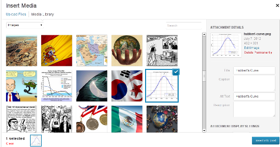 Considering the fact that, of late, WordPress has been powering multiple portfolio websites for photographers and artists, having a better-looking and simpler Media Manager makes sense. The new Manager also features drag and drop support, and this functionality will surely come in handy if you are creating a gallery using multiple images.
 If you need the Links' functionality, you can opt for the Links Manager plugin.
 Basically, when you go to the Add New Plugins screen (Plugins-->Add New), you will see a new link, named ‘Favorites’, right next to Search, Upload, Featured, Popular and Newest. Using the Favorites page, you can enter your WP.org login credentials and then browse through all the plugins that you’ve marked as favorites in the repository.
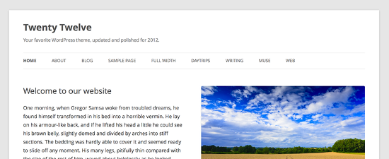
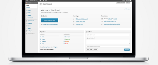 In fact, right from WP 3.4 itself, retina display was something that was in the making for WP. Even the default theme Twenty Twelve, which was released few months ago, was all ready for HiDPI retina display. Naturally, WordPress 3.5 has followed the trend and offered a crystal clear picture for those on high end screens.
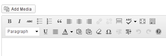
 Next, the TinyMCE toolbar buttons have also been given a minor facelift. They have become, well, more subtle in terms of appearance. I’m not sure about the rest of the world, but this new-look editor toolbar looks good to me.
WordPress 3.5 -- What’s New?
Considering the fact that this is not just a minor update, version 3.5 naturally brings certain new and noteworthy features to the front. For the sake of simplicity, I shall be sub-dividing them under broad heads: Admin Interface, Visual Tweaks, and Under the Hood. This is just to aid classification, and such division is, by no means, a rigid classification of features.Changes in Admin Interface
1. A New Media Manager
Codenamed "Elvin", WordPress 3.5 features a newly revamped Media Manager for uploading your photos and other files, as well as including them in your posts. Basically, instead of ‘listing’ the images, the new Manager shows thumbnails of each image, and loads older images as you scroll down. Plus, it has a side-pane for entering information such as Alternate text and Caption for your images. Considering the fact that, of late, WordPress has been powering multiple portfolio websites for photographers and artists, having a better-looking and simpler Media Manager makes sense. The new Manager also features drag and drop support, and this functionality will surely come in handy if you are creating a gallery using multiple images.
2. No Links Manager
WordPress 3.5 has done away with the Links section in the admin panel. However, if you are upgrading an existing installation of WordPress to the new version, and already have links or blogrolls added, your Links section will remain untouched. On the other hand, any new installations of WordPress, for example if you install WP 3.5 on a new site from scratch, will not have the Links section. If you need the Links' functionality, you can opt for the Links Manager plugin.
3. Favorite Plugins
Recently, WP.org had given users the power to ‘review’ themes in the repository. And now, if while browsing the plugin repository, you are logged in with your username, you have the ability to hit a ‘Favorite’ button on the plugin name. WordPress 3.5 has now offered better integration for this feature, right in your admin panel. Basically, when you go to the Add New Plugins screen (Plugins-->Add New), you will see a new link, named ‘Favorites’, right next to Search, Upload, Featured, Popular and Newest. Using the Favorites page, you can enter your WP.org login credentials and then browse through all the plugins that you’ve marked as favorites in the repository.
Visual Tweaks
1. A New Default Theme
WordPress 3.5 comes with Twenty Twelve as its default theme. It is clean, responsive and has already gained a good deal of popularity among the users. You can read more about Twenty Twelve here.
2. Retina Ready Display
The WordPress Dashboard is now all prepared for high resolution screens. No matter what device you are using: iPhone 5, iPad, Kindle Fire HD, Nexus 10, or Macbook Pro -- your WP Dashboard will look gorgeous! In fact, right from WP 3.4 itself, retina display was something that was in the making for WP. Even the default theme Twenty Twelve, which was released few months ago, was all ready for HiDPI retina display. Naturally, WordPress 3.5 has followed the trend and offered a crystal clear picture for those on high end screens.
3. Color Pickers and Accessibility
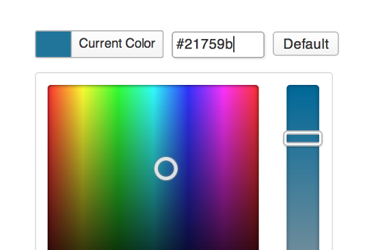
WordPress 3.5 comes with a refined and revamped color picker that makes it easier to pick the right shade of your favorite color. Plus, WP 3.5 also offers better accessibility features for screenreaders, touch devices and mouseless workflows.
Under The Hood
1. Multisite Improvements and External Libraries
WordPress 3.5 now includes certain JavaScript libraries, most notably Backbone and Underscore. Furthermore, switch_to_blog() has been improved as well (multisite, that is) and components such as TinyMCE and SimplePie have been updated.2. XML-RPC API
WordPress API is now enabled by default. This means faster load times for profile edits, post revisions and searches. Similarly, the image editing API will use ImageMagick whenever possible.3. Meta Queries and Objects
Classes such as WP_Comment_Query and WP_User_Query will now support meta queries. Also, post objects are now instances of a WP_Post class.Etcetera
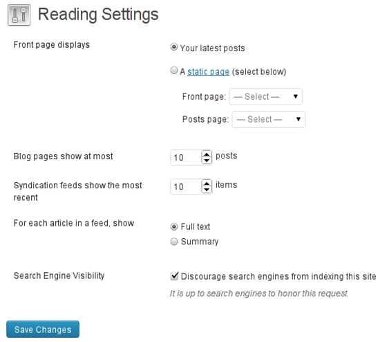
Among other things, WordPress 3.5 has also shifted the location of website privacy settings. Until now, you could navigate to Settings-->Privacy to turn off/on search engine indexing and visibility. This feature has now been shifted to Settings-->Reading. Seems logical, because having a separate page for just one privacy option was overkill anyway. Next, the TinyMCE toolbar buttons have also been given a minor facelift. They have become, well, more subtle in terms of appearance. I’m not sure about the rest of the world, but this new-look editor toolbar looks good to me.


Good article, but you are correct about getting disagreements on the media manager topic :)
I’ll agree with you that the media manager is definitely geared a bit more towards the photo-hungry bloggers now. However, as a UX designer, I think they nailed the ease-of-use functionality they were aiming for. The old media manager was familiar to us so it’s not surprising that it is receiving a bit of flack, but change tends to be good (especially in the web world, and even more in the WordPress world).
Good points though! Topics like this is why the WordPress community thrives!
Hi ! I agree with you regarding the new Media uploader : my website is both a portfolio and my blog, so for the first part is kind of intuitive and stuff, but for my blog articles is less practical.
Besides, I’m having some trouble with the media upload, it won’t show any of my images when I’m in an article, but when I go to my media library directly they all appear ! I desactivated all my plugins, I guess it’s an incompatibility with one of them…
wew.. nice share.. thank’s
I installed 3.5 in my sandbox, and I have to say: I’m glad someone else doesn’t like the new Media Manager! I host my images outside of my WordPress installation due to the need to sort my images in a more hierarchical manner (since WordPress doesn’t natively support image folders), and this new Media Manager has made inserting images from a URL amazingly cumbersome, removing a lot of the functionality that I was used to, like adding the title attribute on images, and then clicking the image link button and then editing it to add a parameter. And to add insult to injury, if you go back in and edit the image information, you get the old media manager window like it’s always been. Seems like an incomplete implementation, and a major pain in the butt for me.
I’ve also found that TinyMCE is a little clunky now when it comes to inserting linebreaks and things, in that it gives too much room at first and leaves me feeling uncertain whether there are extra lines that I don’t know about in the final version of things.
The other changes don’t bother me that much. If another update comes out that fixes the above (and a plugin to reinstate the old media manager tool), I’ll probably move my production sites to 3.5, but right now, I lose too much functionality to do it.
WP’s media manager new or old has always been its weak point stopping WP from higher levels of awesome.
Particularly, I liked the new version. It just seems new. Beautiful.
I was glad also about the retina feature. Great share!
Have not been able to upload a single image since the update. They all start fine, then just stall and never complete. Anybody have this problem?
I’m getting a bit annoyed with wordpress in general and I too think it’s getting too bloated for it’s own good. These days I generally use it as little as possible.
I agree too that wordpress is getting too bloated and annoying. I’ve learned the hard way not to upgrade right away unless it’s a security update and even then I test on a production site first. I think I’ll wait this update out a bit. I don’t have time to fix stuff that stops working because of various issues that almost always happen with a new update.
The one weird thing I discovered with the new media uploader is that the image title doesn’t stay put. when you upload your image, you’ll see the title and you can change it as usual, but once you insert it into the post it disappears and you only have the alt image tag and description if you filled it in.
Oddly the moderator on the WP forum had this to say and that the title disappearing is intentional.
“This was an intentional change made in the name of accessibility.”
If you’ve in Google News, you’ll suddenly notice that your articles won’t have your images next to them without a title. Big G likes Titles, alts and descriptions…and I’m rather baffled why WP would think that deleting them upon insertion is a help.
Now to find a workaround on that one! Great article, and I can really see where you’re coming from. The Media uploader definitely makes you take an extra step, and not that you have to re-insert your image title adds yet one more step.
There is a way to add the title tag back in after WP annoyingly removes it. When the photo is inserted in the post, click on it and click the little image icon to edit. Then insert the title tag AGAIN. Grr.