Fall Cleaning 2017: 10 Free WordPress Themes and How to Use Them Right

It's time for a thorough autumn cleaning. We show you ten free WordPress themes that have just been released, and we guide you through the steps to create a proper child theme from whatever theme you choose.
 Canuck[/caption]
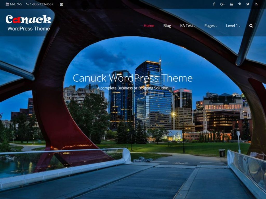
Canuck is a modern theme in grid layout that can be customized to any look you like. Flexibility is its biggest benefit.
[Green-Button url="https://wordpress.org/themes/canuck/" text="Download on WordPress"] | [Green-Button url="https://wp-themes.com/canuck/" text="Theme Demo"]
 Mercia[/caption]
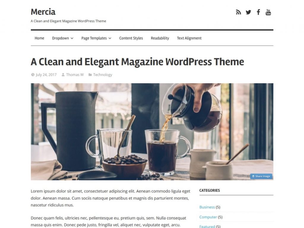
Mercia is a magazine theme with a heart for typography and responsiveness. It's near perfect for any website that focuses on fast changing dynamic content.
[Green-Button url="https://wordpress.org/themes/mercia/" text="Download on WordPress"] | [Green-Button url="https://preview.themezee.com/mercia" text="Theme Demo"]
 Rinzai[/caption]
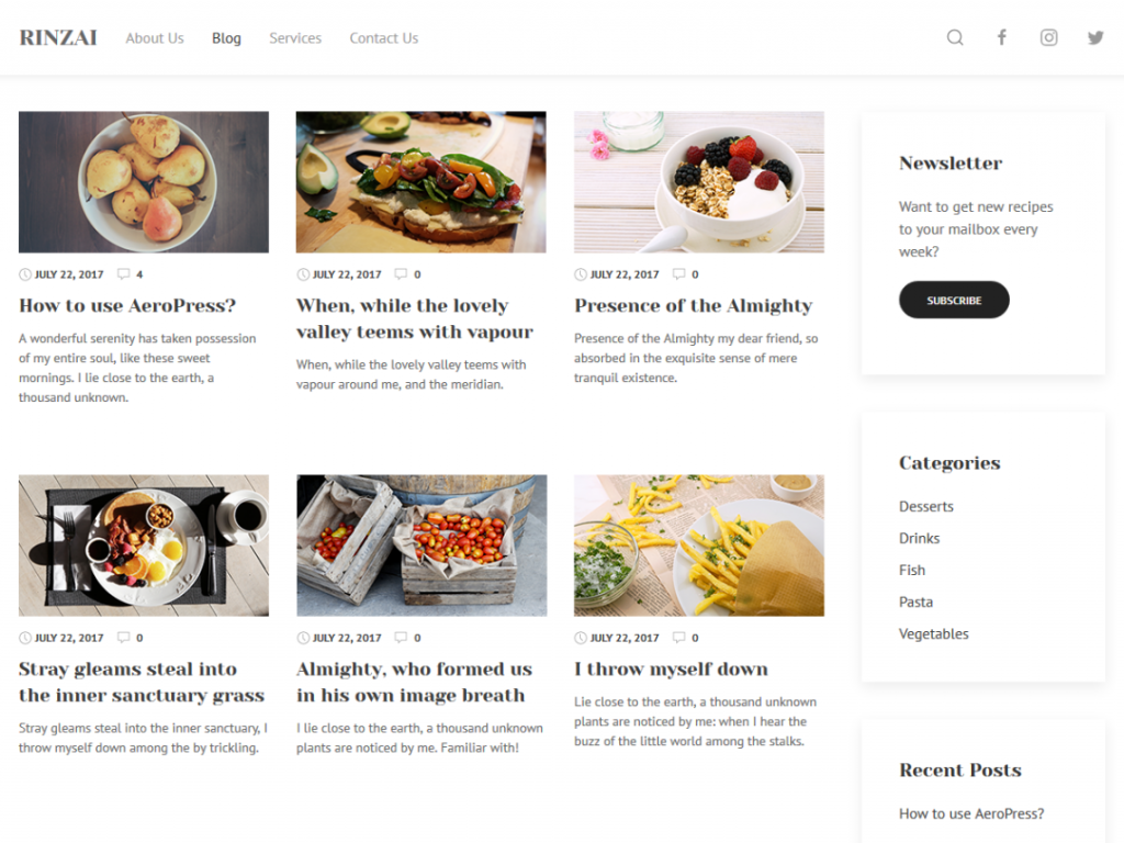
Rinzai was originally created as a motor for food-related websites, foremost those that present recipes. Its strict grid layout and visual hierarchy support that usecase ideally. Rinzai can still be used for other projects, such as portfolios or even a corporate website.
[Green-Button url="https://wordpress.org/themes/rinzai/" text="Download on WordPress"] | [Green-Button url="https://demo.webminimalism.com/rinzai/" text="Theme Demo"]
 Hestia[/caption]
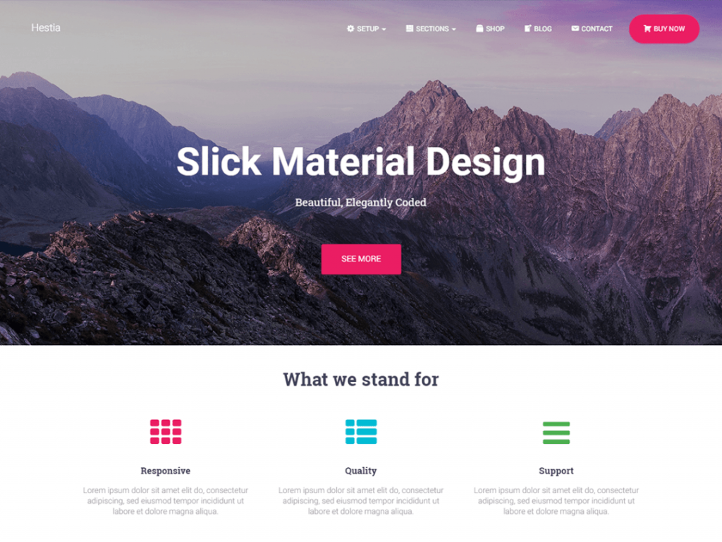
Hestia offers quite a few child offspins already. Hestia adheres to the Material Design guidelines, thus sporting a very contemporary look. The theme is positioned towards creative workers in need of a totally flexible foundation to build any client project on. It is even WooCommerce-ready.
[Green-Button url="https://wordpress.org/themes/hestia/" text="Download on WordPress"] | [Green-Button url="https://themeisle.com/demo/?theme=Hestia" text="Theme Demo"]
 Neville[/caption]
Neville is a very visual theme. It fits best with publications that want to draw their readers into the pictures they post. Generally any magazine could use Neville but as soon as you are lacking visuals the theme would be much less impressive.
[Green-Button url="https://wordpress.org/themes/neville/" text="Download on WordPress"] | [Green-Button url="http://demo.acosmin.com/themes/neville/" text="Theme Demo"]
 Oblique[/caption]
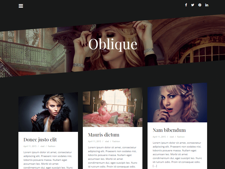
Oblique attracts the viewer's eye with its unusual aesthetics. Diagonal lines and asymmetrically cut images make for that special look you don't see too often in our squares grid new world. As an example of how you can use Oblique as a corporate site take a look at one of the child themes named CoffeeIsle. Oblique is fully responsive.
[Green-Button url="https://wordpress.org/themes/oblique/" text="Download on WordPress"] | [Green-Button url="https://themeisle.com/demo/?theme=Oblique" text="Theme Demo"]
 HitMag[/caption]
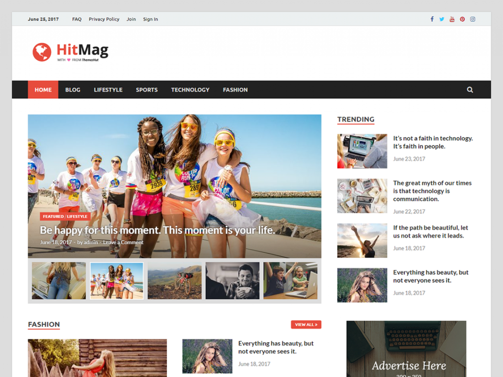
Finding a usable magazine theme was painful in the past but is not anymore. HitMag is one of the most contemporary magazine designs that I have seen in quite a while. It's not necessarily the best for highly visual sites but does a great job for just about any other publication thinkable.
[Green-Button url="https://wordpress.org/themes/hitmag/" text="Download on WordPress"] | [Green-Button url="https://themezhut.com/demo/hitmag/" text="Theme Demo"]
 Headstart[/caption]
Headstart is a very flexible theme for blogging and less dynamic websites alike. Its responsive design can be fully customized using widgets that carry almost any type of content you like. Build a dynamic blog oder build a static modern landing page. It will equally work great. Headstart is built upon the popular Foundation framework.
[Green-Button url="https://wordpress.org/themes/headstart/" text="Download on WordPress"] | [Green-Button url="https://wp-themes.com/headstart" text="Theme Demo"]
 ClubFitness[/caption]
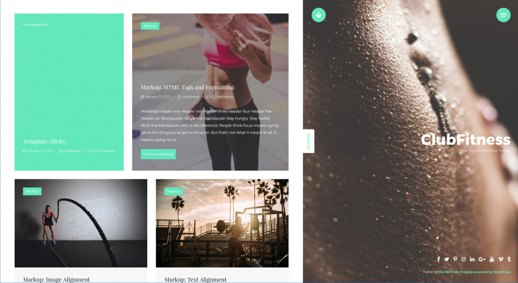
ClubFitness breaks with design conventions and is the most unusual new entry this autumn. If you like Pinterest ClubFitness might just be what you need. Its heavily card-oriented layout fits best with visually heavy websites. Despite its orientation towards images it runs perfect on mobile devices as well.
[Green-Button url="https://wordpress.org/themes/clubfitness/" text="Download on WordPress"] | [Green-Button url="https://demo.thewpclub.com/clubfitness/" text="Theme Demo"]
 Redxun[/caption]
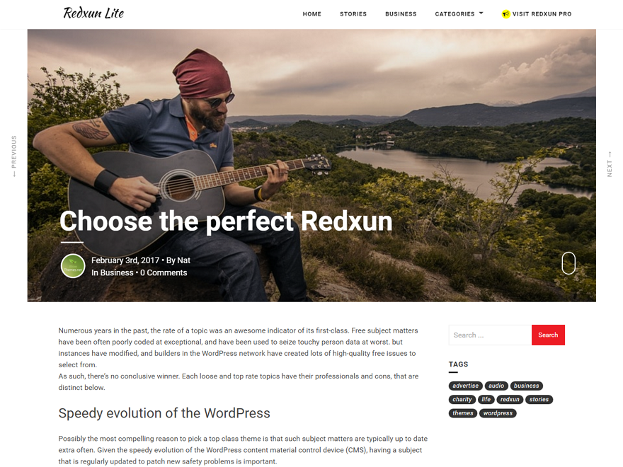
Redxun is a theme for the writers. Based on Bootstrap and giving access to all Google Fonts it offers a near perfect playground for anyone who wants to see their content strive on any platform.
[Green-Button url="https://wordpress.org/themes/redxunlite/" text="Download on WordPress"] | [Green-Button url="http://www.wowthemes.net/preview/index.php?theme=redxun" text="Theme Demo"]
 Now, the child theme is active. Thanks to the new screenshot, it is effortless to find within your theme index. Of course, there have not been any changes made to the design yet, so your adjustments will have to follow.
[caption id="attachment_77846" align="alignnone" width="660"]
 The Child Theme Right After the Activation, No Changes to be Seen.[/caption]
 The Slightly Modified Child Theme Already Has a Completely Altered Appearance.[/caption]
 The Final Result With the Reversed Order of Image and Header.[/caption]
 The Static Share Buttons at the End of an Article.[/caption]
Look For a Solid Starting Point
Of course could you start from scratch and create yourself a perfectly new WordPress theme beginning on an empty screen. I cannot imagine a case where this mode of operation would seem sensible to me, however. It's much easier and more efficient to just choose a proper theme that fits your needs as closely as possible and then alter it to meet your needs perfectly. This is done by deriving a child theme from the original theme files. We will come to how this is done later on in the article.WordPress Themes Galore: The 10 Best Free New Entries This Autumn
Let us first take a look at the hottest new entries in the free WordPress theme repository. As we know that our audience is international we will only feature themes that are translation ready.1. Canuck
[caption id="attachment_103157" align="aligncenter" width="1024"] Canuck[/caption]
Canuck is a modern theme in grid layout that can be customized to any look you like. Flexibility is its biggest benefit.
[Green-Button url="https://wordpress.org/themes/canuck/" text="Download on WordPress"] | [Green-Button url="https://wp-themes.com/canuck/" text="Theme Demo"]
2. Mercia
[caption id="attachment_103158" align="aligncenter" width="1024"] Mercia[/caption]
Mercia is a magazine theme with a heart for typography and responsiveness. It's near perfect for any website that focuses on fast changing dynamic content.
[Green-Button url="https://wordpress.org/themes/mercia/" text="Download on WordPress"] | [Green-Button url="https://preview.themezee.com/mercia" text="Theme Demo"]
3. Rinzai
[caption id="attachment_103159" align="aligncenter" width="1024"] Rinzai[/caption]
Rinzai was originally created as a motor for food-related websites, foremost those that present recipes. Its strict grid layout and visual hierarchy support that usecase ideally. Rinzai can still be used for other projects, such as portfolios or even a corporate website.
[Green-Button url="https://wordpress.org/themes/rinzai/" text="Download on WordPress"] | [Green-Button url="https://demo.webminimalism.com/rinzai/" text="Theme Demo"]
4. Hestia
[caption id="attachment_103160" align="aligncenter" width="1024"] Hestia[/caption]
Hestia offers quite a few child offspins already. Hestia adheres to the Material Design guidelines, thus sporting a very contemporary look. The theme is positioned towards creative workers in need of a totally flexible foundation to build any client project on. It is even WooCommerce-ready.
[Green-Button url="https://wordpress.org/themes/hestia/" text="Download on WordPress"] | [Green-Button url="https://themeisle.com/demo/?theme=Hestia" text="Theme Demo"]
5. Neville
[caption id="attachment_103161" align="aligncenter" width="1024"] Neville[/caption]
Neville is a very visual theme. It fits best with publications that want to draw their readers into the pictures they post. Generally any magazine could use Neville but as soon as you are lacking visuals the theme would be much less impressive.
[Green-Button url="https://wordpress.org/themes/neville/" text="Download on WordPress"] | [Green-Button url="http://demo.acosmin.com/themes/neville/" text="Theme Demo"]
6. Oblique
[caption id="attachment_103162" align="aligncenter" width="880"] Oblique[/caption]
Oblique attracts the viewer's eye with its unusual aesthetics. Diagonal lines and asymmetrically cut images make for that special look you don't see too often in our squares grid new world. As an example of how you can use Oblique as a corporate site take a look at one of the child themes named CoffeeIsle. Oblique is fully responsive.
[Green-Button url="https://wordpress.org/themes/oblique/" text="Download on WordPress"] | [Green-Button url="https://themeisle.com/demo/?theme=Oblique" text="Theme Demo"]
7. HitMag
[caption id="attachment_103163" align="aligncenter" width="1024"] HitMag[/caption]
Finding a usable magazine theme was painful in the past but is not anymore. HitMag is one of the most contemporary magazine designs that I have seen in quite a while. It's not necessarily the best for highly visual sites but does a great job for just about any other publication thinkable.
[Green-Button url="https://wordpress.org/themes/hitmag/" text="Download on WordPress"] | [Green-Button url="https://themezhut.com/demo/hitmag/" text="Theme Demo"]
8. Headstart
[caption id="attachment_103168" align="aligncenter" width="1024"] Headstart[/caption]
Headstart is a very flexible theme for blogging and less dynamic websites alike. Its responsive design can be fully customized using widgets that carry almost any type of content you like. Build a dynamic blog oder build a static modern landing page. It will equally work great. Headstart is built upon the popular Foundation framework.
[Green-Button url="https://wordpress.org/themes/headstart/" text="Download on WordPress"] | [Green-Button url="https://wp-themes.com/headstart" text="Theme Demo"]
9. ClubFitness
[caption id="attachment_103169" align="aligncenter" width="1024"] ClubFitness[/caption]
ClubFitness breaks with design conventions and is the most unusual new entry this autumn. If you like Pinterest ClubFitness might just be what you need. Its heavily card-oriented layout fits best with visually heavy websites. Despite its orientation towards images it runs perfect on mobile devices as well.
[Green-Button url="https://wordpress.org/themes/clubfitness/" text="Download on WordPress"] | [Green-Button url="https://demo.thewpclub.com/clubfitness/" text="Theme Demo"]
10. Redxun
[caption id="attachment_103167" align="aligncenter" width="880"] Redxun[/caption]
Redxun is a theme for the writers. Based on Bootstrap and giving access to all Google Fonts it offers a near perfect playground for anyone who wants to see their content strive on any platform.
[Green-Button url="https://wordpress.org/themes/redxunlite/" text="Download on WordPress"] | [Green-Button url="http://www.wowthemes.net/preview/index.php?theme=redxun" text="Theme Demo"]
More Great Themes
Not the right theme for you in here? Take a look at this evergrowing collection of Top 100 Free WordPress Themes. There is something for everyone.What's a Child Theme and How Do I Create One?
A child theme is the child of a full-fledged, regular theme as we've shown you ten of right above. It uses the files of the parent theme for display. This includes all template files, the style sheet for the design, the JavaScript - everything. That's why both themes have to be in the theme folderwp-content/themes at all times.
Should you need more basic support with WordPress, I advise you to thoroughly read this great tutorial. It will have you covered.
All Changes Remain, Even After an Update
A newly set-up child theme looks exactly like its "parent" theme. This is the starting point for every customization of your design. From there, you can make any change you want, without any dangers, and these changes will remain even after an update of the original theme. That's the big advantage. Every WordPress theme that is capable of receiving updates should only be used with a child theme. It's very simple, and in today's article, we'll show you the pitfalls that can break open.The Preparation for Creating a Child Theme
To create a child design, you need an FTP program, as well as an HTML editor. You can get both for free. To work with the FTP program, you'll also need the FTP access information for your web host. Your host will provide this information.- I can recommend the FTP program "FileZilla" as it's feature-rich and free for both Windows and Mac.
- The HTML editor I'd recommend is the program "Brackets." It's free as well, and due to its many expansions, it can be tailored to your needs.
- The 9 Best Free HTML Editors for Web Developers (Windows-Edition)
- The 5 Best Free HTML Editors for Web Developers (Mac-Edition)
Creating and Using Child Themes
I'll use WordPress' popular Twenty Fifteen Standard Theme as an example for the creation of a child theme. You'll learn to create a child design, use your own stylesheet for the CSS, and to adjust theme files. I will also introduce you to all tripping stones that may come up when working with child layouts.1 - The Creation and Activation of a Basic Child Theme
A child theme only requires three things: the index to the parent theme, astyle.css file, and a functions.php.
First, create a folder on your desktop, and name it "twentyfifteen-child." Next, please create an empty file named style.css using the HTML editor. Enter the following into the CSS file:
/*
  Theme Name:   Twenty Fifteen Child
  Description:  Twenty Fifteen Child Theme
  Author:       Your Name
  Author URI:   http://yourdomain.com
  Template:     twentyfifteen
  Version:      1.0.0
  Text Domain:  twenty-fifteen-child
  */
/* Enter All of Your Changes at the Bottom */
This Header Defines the Following Things:
- The name of your theme
- The description that states that it's a child theme of the Twenty Fifteen Theme
- Under Template, you'll find the "address" that your theme needs to be able to display the template files. It's the name of the parent theme's theme folder. When creating a child theme for another theme, of course, the folder name of your theme has to be included. So, if you need a child theme for the popular "Hueman" theme, this will say "hueman".
- Under Text Domain, your child theme finds the translation files, so that the theme will continue to be displayed in the language you chose.
functions.php. The following has to go into this file:
<?php
/*
=============================================================================
The functions.php for Your Child Theme
=============================================================================
*/
/**
* This Function is Necessary. It Installs the Parent Theme's CSS
* The CSS of Your Child Theme Will be Installed Automatically.
*/
add_action( 'wp_enqueue_scripts', 'tb_theme_enqueue_styles' );
function tb_theme_enqueue_styles() {
 wp_enqueue_style( 'parent-style', get_template_directory_uri() . '/style.css' );
}
/*
=============================================================================
From This Point Downwards is Where You Can Enter Your Changes
===============================================================================
*/
Optional: Create a Preview Image For Your Theme
Each theme has a screenshot, so it is easy to tell apart from the other themes in the dashboard. All you have to do for that is to set up a preview image with the namescreenshot.png. This graphic goes into the folder of the child theme. There, it has to be placed in the main index, not in a separate folder.
The recommended size is 880 x 660 pixels. However, it will be displayed in 387 x 290 pixels. The large file size allows the screenshot to be shown well on retina screens. You may also use other image formats like JPG, or GIF, but PNG is recommended.
2 - Activating the Child Theme
Now, upload the foldertwentyfifteen-child into the theme index (wp-content/themes) of your WordPress, and activate your new child theme under "Design => Themes."
 Now, the child theme is active. Thanks to the new screenshot, it is effortless to find within your theme index. Of course, there have not been any changes made to the design yet, so your adjustments will have to follow.
[caption id="attachment_77846" align="alignnone" width="660"]
 The Child Theme Right After the Activation, No Changes to be Seen.[/caption]
3 - Customizing Child Themes - CSS
Now, write all adjustments into your child theme'sstyle.css. A few very simple adjustments would be changing the background color, the color, size, and font of the header, and so on. With just a few lines of CSS, we've already changed the theme's design entirely:
/*
Theme Name:   Twenty Fifteen Child
Description:  Twenty Fifteen Child Theme
Author:       Your Name
Author URI:   http://yourdomain.com
Template:     twentyfifteen
Version:      1.0.0
Text Domain:  twenty-fifteen-child
*/

/* Enter All of Your Changes Below */

body {      color: #666;      background: #444;  }
h1.site-title {      font-size: 38px;  }
h1.site-title a {      color: #900;  }
#main {      padding-top: 10px;  }
h2.entry-title {      font-family: Arial, sans-serif;      font-size: 38px;  }
h2.entry-title a {      color: #900;  }
[caption id="attachment_77847" align="alignnone" width="1000"] The Slightly Modified Child Theme Already Has a Completely Altered Appearance.[/caption]
4 - Working With Template Files
Your new theme is fully customizable, you can also use your own templates, or revise the files of the parent theme. WordPress checks the child theme folder for template files first. If there are none, the files from the parent theme will be used. This means, that a fileheader.php in the child theme folder is being used, instead of the file in the parent theme. If you want to change the display of a specific file, just copy it from the parent theme into your child. Now you can either change the entire presentation or add specific elements only.
Two Examples: Changing Post Images and Static Share Buttons
Example 1: Reversing the Display of the Post Images
Copy the filecontent.php from your parent into the child folder. The original code of the file in the lines 14 to 27 looks as follows:
<?php
// Post thumbnail.
twentyfifteen_post_thumbnail();  ?>
<header class="entry-header">
<?php     if ( is_single() ) :
the_title( '<h1 class="entry-title">', '</h1>' );
else :
the_title( sprintf( '<h2 class="entry-title"><a href="%s" rel="bookmark">', esc_url( get_permalink() ) ), '</a></h2>' );
endif;
?>
</header><
!-- .entry-header -->
For the fun of it, let's reverse the code, and insert the post image under the header.
<header class="entry-header">
<?php
if ( is_single() ) :
the_title( '<h1 class="entry-title">', '</h1>' );
else :
the_title( sprintf( '<h2 class="entry-title"><a href="%s" rel="bookmark">', esc_url( get_permalink() ) ), '</a></h2>' );
endif;
?>
</header>
<!-- .entry-header -->
<?php
// Post thumbnail.
twentyfifteen_post_thumbnail();  ?>
Of course, our CSS needs some adjustments, so that the final result looks superb.
/*
Theme Name:   Twenty Fifteen Child
Description:  Twenty Fifteen Child Theme
Author: Your Name
Author URI: http://yourdomain.com
Template:     twentyfifteen   Version:      1.0.0
Text Domain:  twenty-fifteen-child
*/
/*
Enter your changes below
*/
body {
color: #666;
background: #444;
}
h1.site-title {
font-size: 38px;
}
h1.site-title a {
color: #900;
}
#main {
padding-top: 10px;
}
h2.entry-title, h1.entry-title {
font-family: Arial, sans-serif;
font-size: 38px;
padding-top: 20px;
margin-bottom: 20px;
}
h2.entry-title a{
color: #900;
}
h1.entry-title {
color: #444
}
Screenshot of the Final Result:
[caption id="attachment_77848" align="alignnone" width="660"] The Final Result With the Reversed Order of Image and Header.[/caption]
Example 2: Adding Static Share Buttons
This task is also done using thecontent.php file. You don't have to place another file in the child folder.
Part 1: The Snippet for the functions.php
<?php
// Copy from here
/**
* Static Share Buttons With Print-Button
* Adjust the URL of Your Facebook-Page. The Second Link From Below.
*
*/
function tb_share_buttons() {
?>
<div class="share-container">
<div class="share-buttons">
<a class="facebook social" title="Recommend on Facebook" href="https://www.facebook.com/sharer/sharer.php?u=<?php echo urlencode(get_permalink($post->ID)); ?>&t=<?php echo rawurlencode(strip_tags(get_the_title())) ?>" target="blank" rel="nofollow"><span>Teilen</span></a>
<a class="twitter social" title="Recommend on Twitter" href="https://twitter.com/intent/tweet?source=webclient&text=<?php echo rawurlencode(strip_tags(get_the_title())) ?> <?php echo urlencode(get_permalink($post->ID)); ?>" target="blank" rel="nofollow"><span>Twittern</span></a>
<a class="googleplus social" title="Recommend on Google+" href="https://plusone.google.com/_/+1/confirm?hl=de&url=<?php echo urlencode(get_permalink($post->ID)); ?>&title=<?php echo rawurlencode(strip_tags(get_the_title())) ?>" target="blank" rel="nofollow"><span>Google+</span></a>
<a class="fb-like social" href="https://www.facebook.com/TechBrain-552504691587032" target="_blank" rel="nofollow" title="Like my Facebook Page"><span>Like</span></a>
<a class="print social-tooltip" href="javascript:window.print()" title="Print">Print</a>
</div>
</div>
<?php }
function tb_fontawesome() {
?>
<link rel="stylesheet" href="https://opensource.keycdn.com/fontawesome/4.5.0/font-awesome.min.css" type='text/css' media='all' />
<?php }
add_action( 'wp_enqueue_scripts', 'tb_fontawesome' );
The buttons need two functions. Number one creates the buttons, and number two adds the required icon font "Font Awesome" to your header.
Part 2: The CSS
For the buttons to be displayed correctly, we need a bit of CSS. Depending on the theme, the width of the single buttons in line nine may need to be adjusted. I have already done that for our Twenty Fifteen child.
/*
=============================================================================
STATIC SHARE-BUTTONS
============================================================================= */

div.share-buttons.top {margin-top: 0 !important; max-width: 100%; margin-bottom: 15px }
div.share-container {padding-bottom: 20px; border-bottom: 3px solid #eee}
.share-buttons { padding: 10px; margin: 20px 0 0 0; background: #f5f5f5;  max-width: 100%; display: inline-block; overflow: hidden}
.share-buttons a, .share-buttons a:hover { color: #fff !important; text-decoration: none !important; border-bottom: none !important}
.share-buttons a.twitter, .share-buttons a.facebook, .share-buttons a.googleplus, .share-buttons a.print, .share-buttons a.fb-like { display: block; width: 112px;  font-size: 16px; font-size: 1rem; padding: 6px 0; text-align: center; opacity: 0.7; filter: alpha(opacity=70); color: #fff; float: left; font-family: Arial, sans-serif;}
.share-buttons a:hover, .share-buttons a:active, .share-buttons a:focus { opacity: 1; filter: alpha(opacity=100); text-decoration: none !important; color: #fff !important; border-bottom: none !important}
.share-buttons a.facebook { background: #3e64ad; }
.share-buttons a.twitter { background: rgb(0, 172, 237); }
.share-buttons a.googleplus { background: #cd3627; }
.share-buttons a.fb-like {background: #4267b2}
.share-buttons a.twitter, .share-buttons a.facebook, .share-buttons a.googleplus, .share-buttons a.fb-like { margin-right: 5px; }
.share-buttons a.print{ margin-right: 0;}
a.print{background:#13475e;}
a.print:before{content:'\f02f';font-family:FontAwesome;font-size:16px;padding-right:8px}
a.facebook:before{content:'\f09a';font-family:FontAwesome;font-size:16px;padding-right:8px}
a.twitter:before{content:'\f099';font-family:FontAwesome;font-size:16px;padding-right:8px}
a.googleplus:before{content:'\f0d5';font-family:FontAwesome;font-size:16px;padding-right:8px}
a.fb-like:before{content:'\f164';font-family:FontAwesome;font-size:16px;padding-right:8px}
Part 3: The Correct Placement in content.php
<?php // copy below this line, exchange the section .entry-content ?>
<div class="entry-content">
<?php
/* translators: %s: Name of current post */
the_content( sprintf(
__( 'Continue reading %s', 'twentyfifteen' ),
the_title( '<span class="screen-reader-text">', '</span>', false )
) );
wp_link_pages( array(
'before'      => '<div class="page-links"><span class="page-links-title">' . __( 'Pages:', 'twentyfifteen' ) . '</span>',
'after'       => '</div>',
'link_before' => '<span>',
'link_after'  => '</span>',
'pagelink'    => '<span class="screen-reader-text">' . __( 'Page', 'twentyfifteen' ) . ' </span>%',
'separator'   => '<span class="screen-reader-text">, </span>',
) );
?>
<!-- Staic Share Buttons. Only shown with single.php -->
<?php if ( is_single() ) : ?>
<?php echo tb_share_buttons(); ?>
<?php endif; ?>
<!-- End of Static Share Buttons  -->
</div>
<!-- .entry-content -->
The correct position is still within the DIV .entry-content, right above the closing </div> tag.
The Final Result of Our Efforts:
We get these beautifully formatted share buttons with icons for Facebook, Twitter, Google+, the Facebook page, and a button that activates the browser's print function. [caption id="attachment_77849" align="alignnone" width="660"] The Static Share Buttons at the End of an Article.[/caption]
5 - Now, Let's Get Serious. Including Files
One of the pitfalls when working with child themes. Many clueless beginners fail this seemingly simple task, because the snippets from the web are always meant for independent themes. That's why they can't work. If you want, or have to include a file, the internet will give you the following code:require_once( get_template_directory() . '/my_included_file.php' );
This small tag tries to load a file from the parent theme. That's where the child theme's templates are located. As we overwrite the parent theme's stylesheet with ours, the following tag has to be used instead:
require_once( get_stylesheet_directory() . '/my_included_file.php' );
The tag above searches for the needed file from the child folder. Thus, always use the get_stylesheet_directory() variant, and you'll get the desired result.
Check every snippet from the internet, to see if it has been modified for this small difference.
6 - Adding Widget Areas
Additional widget areas are possible without any problems. For example, we could create an area that wasn't meant to contain widgets - the footer. Add the following code to thefunctions.php of your child theme:
<?php
//Copy from here
function twentyfifteen_child_widgets_init() {
register_sidebar( array(
'name'          => 'Footer Widget',
'id'            => 'footer-widget',
'description' => __( 'An additional widget area in the footer' ),
'before_widget' => '<div class="footer-widget">',
'after_widget'  => '</div>'
) );
}
add_action( 'widgets_init', 'twentyfifteen_child_widgets_init' );
Afterward, copy the footer.php from the "Twenty Fifteen" theme folder into your theme folder, and add this small code in beforehand:
<?php
if ( is_active_sidebar( 'footer-widget' ) ) :
dynamic_sidebar( 'footer-widget' );
endif;
?>
At this point in the footer.php the code seems to be in good hands:
<?php
/**
* The template for displaying the footer  *
* Contains the closing of the "site-content" div and all content after.  *
* @package WordPress
* @subpackage Twenty_Fifteen
* @since Twenty Fifteen 1.0
*/
?>
</div><!-- .site-content -->
<footer id="colophon" class="site-footer" role="contentinfo">
<div class="site-info">
<?php if ( is_active_sidebar( 'footer-widget' ) ) :  dynamic_sidebar( 'footer-widget' );  endif;  ?>
<?php  /**   * Fires before the Twenty Fifteen footer text for footer customization.
*
* @since Twenty Fifteen 1.0
*/
do_action( 'twentyfifteen_credits' );
?>
<a href="<?php echo esc_url( __( 'https://wordpress.org/', 'twentyfifteen' ) ); ?>">
<?php printf( __( 'Proudly powered by %s', 'twentyfifteen' ), 'WordPress' ); ?>
</a>  </div><!-- .site-info -->
</footer>
<!-- .site-footer -->
</div>
<!-- .site -->
<?php wp_footer();
?>
</body>
</html>
The Creation of a Child Theme From an Existing, Modified Theme
It is so much easier to create a child theme from scratch. However, if you have already modified your theme a lot, without having a child theme set up in advance, it's still possible. You have to transfer all changes into the child theme to make sure that any updates to the parent theme don't delete any changes. Read the following steps, and follow them precisely. This is complicated, and hard work with a lot of fiddling.- First, make a backup of your theme. To do so, use your FTP access, and copy the theme folder to your desktop. Then, create a backup of that folder, and save it somewhere else. You'll use one of the folders to work, while the other one serves as a backup if everything goes wrong.
- Now, create a child theme, following the guide above. A folder, an empty stylesheet, an empty
functions.php, and a screenshot. - Get yourself a fresh version of your theme that has not been modified.
- Divide your HTML in the center, so that you can display the original file on the left, and the one from the modified theme on the right. Check every template file to see if you made changes.
- Transfer all modifications from the
functions.phpinto the version of your child theme. - The altered files belong into the child theme folder. Also, check if you have to swap
get_template_directory()for.get_stylesheet_directory()Further information above. - Now for the part that is a bit tricky. You have to compare the fresh Style.css function with the file you altered. Maybe your HTML editor has a function that lets you compare the two files, pointing out the differences. That would be helpful. I have never needed this type of function. If it is not available to you, you will have to use your own eyes to compare the files. All changes go into its own
style.cssfile. After that, place it into the child theme folder equipped with all modifications. - After you have put all altered theme files, and the extended CSS into the child theme folder, load the folder into your theme index
wp-content/themes. Make sure that the fresh version of your theme is in there as well. - Log into your WordPress, and make your way to the themes. Use the live preview to check your newly created child theme. If everything is displayed correctly, you're good. If not, check, in which areas you may have overlooked something.
- Revise the missing elements.
- Then, check the entire website, and all necessary functions again, using the live preview. If everything is fine, activate your child theme, and enjoy it.
- Never do this again:-)

Great list Noupe Team.
Hestia comes under my collection of favourite Themes.
Thanks