
Mastering the Art of Web Typography: Enhancing Readability and Brand Identity

Typography is a core element of web design that impacts how easily people can read and engage with your content.
Your message and brand identity stand out when you have a font that draws the eye in.
When you know how to use web typography principles to grab attention, you can transform a good-looking website into one that is captivating.
Let’s take a closer look at why your website typography matters — and how you can use it to enhance readability and brand identity.
Understanding typography
Web typography best practices focus on how text looks and feels on a screen. Unlike print typography, where the final product is static, web typography must adapt to various screen sizes and resolutions.
This means you’ll need to choose fonts that are both aesthetic and function properly on different devices.
But before you dive into choosing fonts, you need to understand a few basic terms.
Fundamental typography terms
Here are some basics to know:
- Typeface vs. font: A typeface is an overall design, like Helvetica. A font is a specific style within that typeface, such as Helvetica Bold or Helvetica Light.
- So, when you choose Helvetica, you’re picking a typeface. When you choose Helvetica Bold, you’re selecting a font.

- Serif vs. sans-serif fonts: Serif fonts have small lines at the end of characters (like Times New Roman), enhancing print readability. *Sans-serif fonts (like Helvetica) are cleaner and generally easier to read on screens, making them a popular choice for web design.
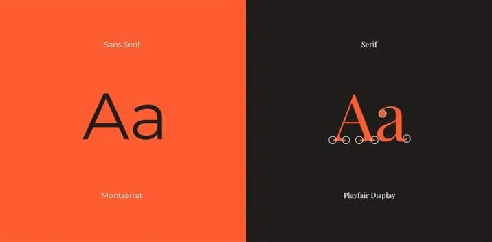
- Kerning, tracking, leading, and hierarchy: Kerning adjusts the space between individual letters, tracking adjusts the space across a block of text, and leading is the space between lines of text. Hierarchy is how you use different sizes and styles to guide readers through content.

Font selection for web design
Here’s how to select the best fonts for your website:
Consider readability and brand identity
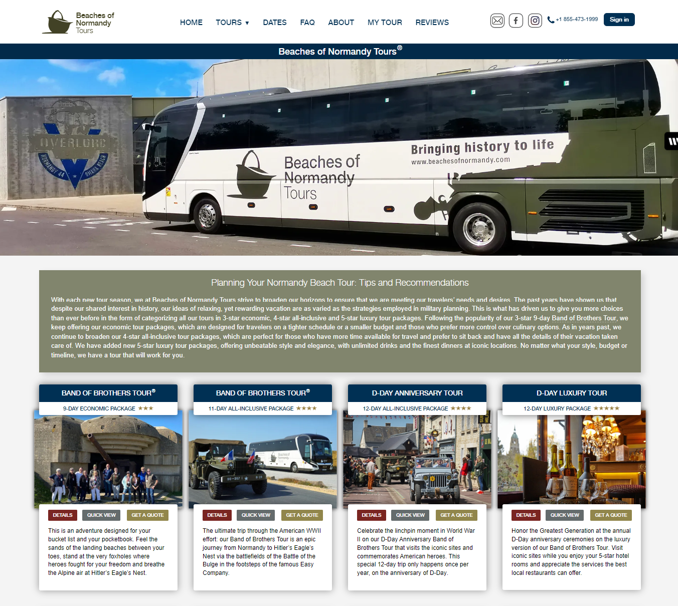
Choose a font that aligns with your brand's personality. For instance, Helvetica's clean lines suit professional sites like Beaches of Normandy Tours, where its articles, such as the Liberation of Paris, must clearly convey historical information. On the other hand, a playful font might suit a creative agency.
Use web-safe and standard fonts
Stick to fonts that are widely supported across modern browsers. Fonts like Arial, Verdana, and Georgia are safe choices.
Implement font stacks
If you prefer unique fonts, use font stacks. This means listing several fallback fonts in your CSS, so if one isn’t available, it’ll use another one of your choices.
This helps make sure that your text looks good across different devices. For example, you might use “Helvetica, Arial, sans-serif” in your CSS. If Helvetica isn’t available, Arial or a generic sans-serif will take its place.
Designing for readability
Readability is key to a successful website.
Here’s how to make sure your text is easy to read:
- Text size and line length: Aim for a base font size of 16px. For line length, keep lines between 40 and 80 characters to avoid reader fatigue. Larger fonts are easier to read on smaller screens, so adjust sizes for mobile devices.
- Spacing and alignment: Make sure there’s enough space between lines and paragraphs. This vertical spacing, or leading, should generally be 1.5 times the font size for body text.
- Use white space strategically to make your content more digestible and visually appealing.
- Color contrast: High contrast between text and background color is essential. Use tools like a contrast checker to make sure your color choices meet accessibility standards. For example, black text on a white background is typically a safe bet.
Advanced typography considerations
Adapt your typography to various screen sizes and settings.
Consider:
Screen size and resolution
Text may look different on various devices. Responsive design helps adjust typography based on screen size. (Test your designs on different devices to promote consistent readability.)
Adjustments
Experiment with typography settings.
Compare how changes to line height, letter spacing, and other aspects affect readability.
X-height and counter-openness
The x-height is the height of lowercase letters, which affects readability. Fonts with larger x-heights are generally easier to read. Counter-openness refers to the space inside letters like “e” and “a” and should be ample for legibility.
Enhancing brand identity through typography
Choose fonts that reflect your brand’s character and values.
For instance, Henry Meds uses clean, sans-serif fonts to establish a modern, professional image. This aligns with its commitment to clear and accessible health information. It also uses consistent formatting, clear headings for navigation — and white space around text blocks to make the content more engaging and digestible.
This look is congruent across its blog, which helps readers more easily digest its medical topics, such as the following one about semaglutide costs without insurance.

Other successful brands, like Nike and Coca-Cola, also demonstrate how typography can strengthen brand identity.
Nike uses bold fonts that communicate strength and innovation. This perfectly aligns with its dynamic and forward-thinking brand image. On the other hand, Coca-Cola uses a script font that evokes a sense of nostalgia and tradition. This reinforces its classic and beloved brand persona. (Who could ever forget its beloved polar bears and Christmas-themed branding?)
Long story short: Choose fonts that resonate with your core message to leave a lasting impression and connect deeper with your audience.
Wrap up
Mastering web typography means ensuring that your text is readable, your brand identity is clear, and your content effectively engages your audience.
Understand typography basics, choose the right fonts, and continuously test and optimize your website to create a web experience that looks great and performs well. Remember, great typography enhances readability and strengthens brand identity. So, take the time to perfect it and watch your website thrive.
Featured image by Florian Klauer on Unsplash