Create a Neat Ribbon in Adobe Illustrator
Holidays are arriving. One of the most necessary things for gift wrapping is the ribbon. Today we will be learning how to create a vector illustration of a beautiful red ribbon in Adobe Illustrator. All you need is the Pen Tool, 3D effect Extrude & Bevel and a good taste in color selection. This could be a nice practice for less skilled Pen Tool users.
This is what we will be creating.

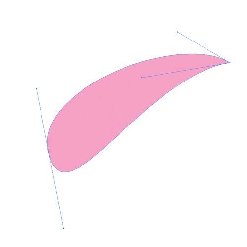 With the Pen Tool (
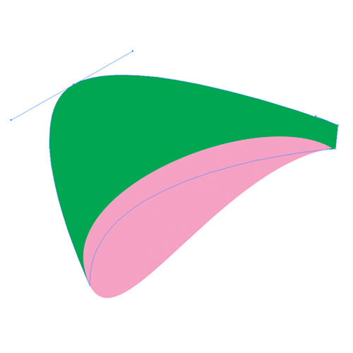 Make sure to match the sides of both the shapes.
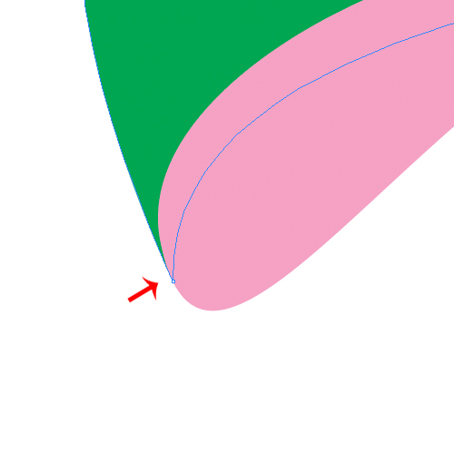 Under Object select Path > Offset Path. Set the value for Offset to
 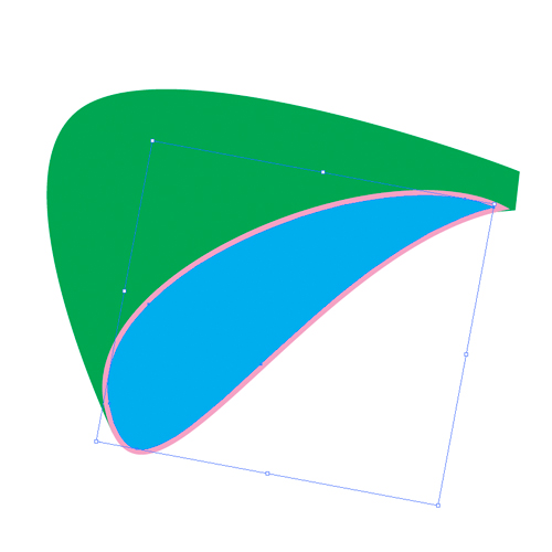 This is the basic shape of the bow. To complete it we need to apply some nice gradients.
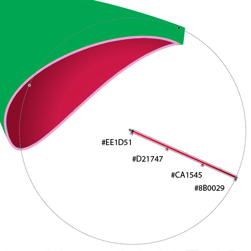 For the outer part of the bow we will be using a linear gradient. Make sure to use the right angle when you are applying linear gradient.
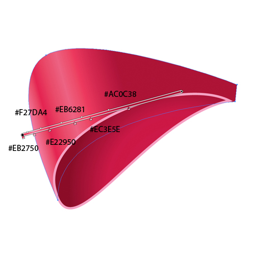 You can notice how we've used the lighter colors to emphasize the influence of the light and to simulate the silk look of the ribbon.
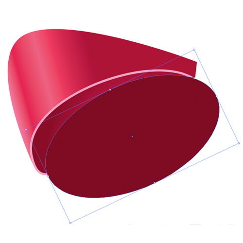 Select both shapes and under the Pathfinder Panel hit the Minus Front button. Set the color of the new shape to
 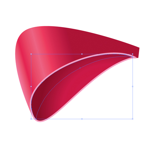 Select all the elements we have created so far and Group them (
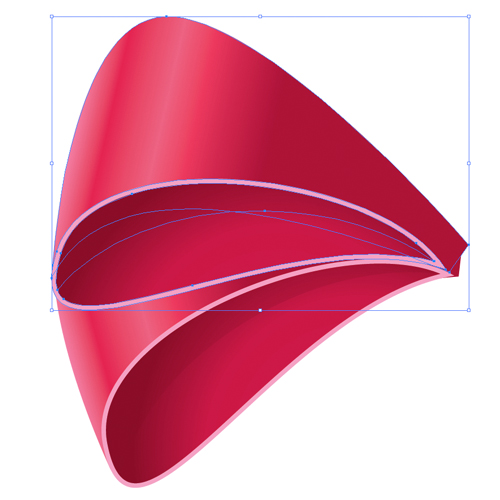 Although our illustration looks nice like this we will make a few changes. We are all aware how difficult it is to tie a bow with symmetrical sides. This is the reason why we are going to distort the copy we have just made. First of all remove the sharp shadow on the inner side of the bow. Remove the smaller part of the inner side of the bow as well. You should end up with something like this.
 Select the Direct Selection Tool (
 We need to create two things in order to complete this part of the bow. One of them is the inner part of the bow. Select the pink shape and under the Object select Path > Offset Path. Set the value for the Offset to
 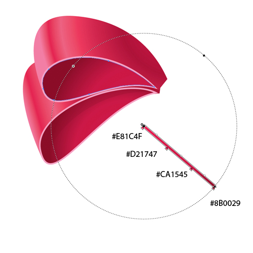 Repeat one of the previous steps where we've explained how to create a sharp edge. You should end up with something like this.
 We need one more shadow. Grab the Pen Tool (
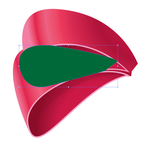 Set the Fill color of the new shape to
  We have to make sure to adjust the shape of the shadow to cast properly on the lower part of the ribbon. Our shadow crosses the border of the lower part of the bow. To fix, this duplicate (
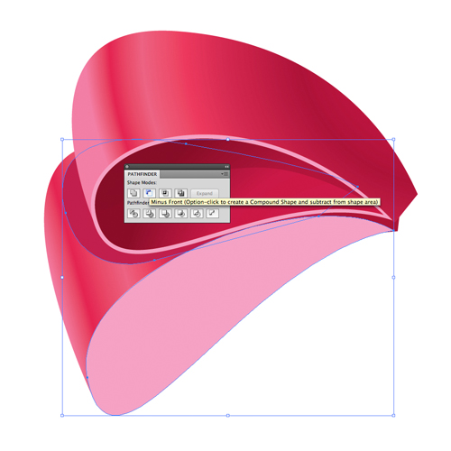 Place the shadow underneath the upper part of the bow.
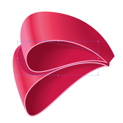 This way we have created one side of the bow. Let's create the mirror image for the right side.
Select all the elements and Group them (
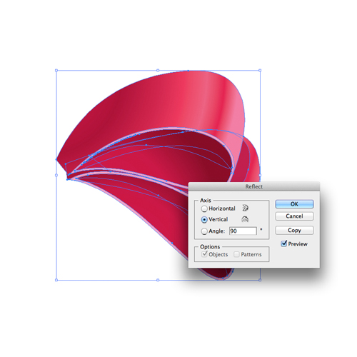 You should end up with something like this.

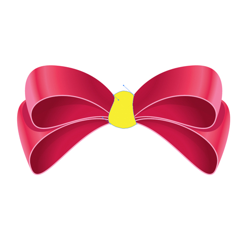 After you are done adjusting the shape of the knot apply a nice radial gradient as it is shown below.
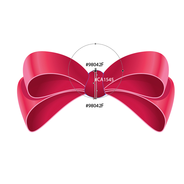 For the knot we have to create the same thickness as we did for the bow. Select the shape of the knot and duplicate it (
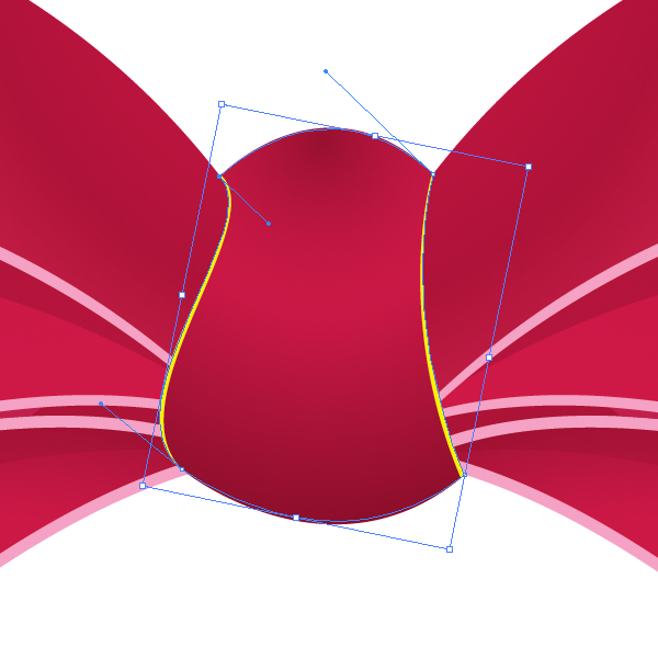 Set the Fill color of the new shape to

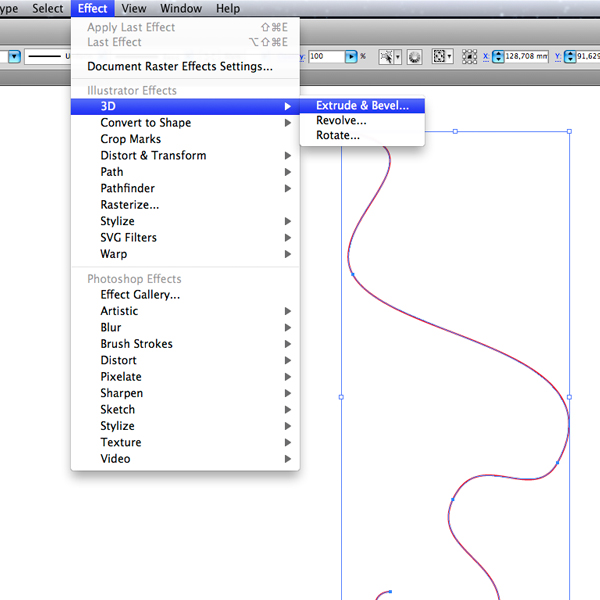
 Under Effect select Extrude & Bevel.
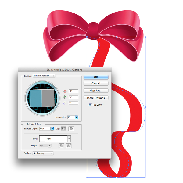
 These are the settings we have used in this tutorial. Feel free to play with settings until you reach a desired look.
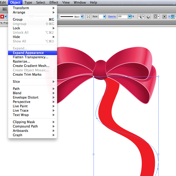
 Under Object select Expand Appearance in order to turn the path into an editable shape.
 Ungroup (
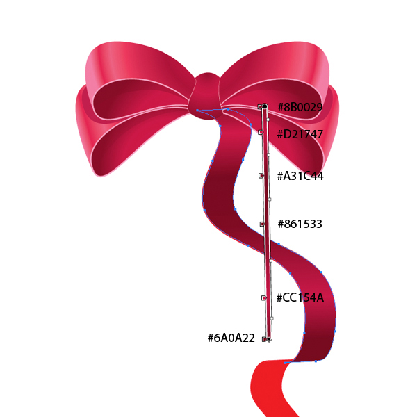
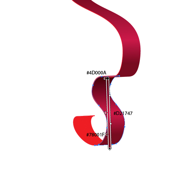
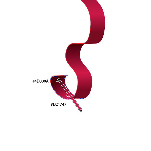
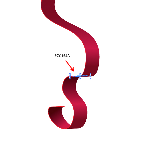 Set the Fill color of the thickness to
 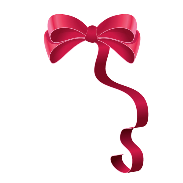 Using the same technique complete the left side of the ribbon. Make a small color adjustment if needed, and we are done!


Creating the Bow
We will start with the Pen Tool (P). Select it from the Tool Panel and create a shape as it is shown in the picture below. We will use this shape to complete the inner part of the bow.
 With the Pen Tool (
P) still selected draw another shape.
 Make sure to match the sides of both the shapes.
 Under Object select Path > Offset Path. Set the value for Offset to
 -2 pt.
 This is the basic shape of the bow. To complete it we need to apply some nice gradients.
Gradients
For the inner part of the bow we will be using a radial gradient. For the outer part of the bow we will be using a linear gradient. Make sure to use the right angle when you are applying linear gradient.
 You can notice how we've used the lighter colors to emphasize the influence of the light and to simulate the silk look of the ribbon.
Shadow
If you take a look at the inner part of the bow you will notice that we've simulated a soft shadow that is caused by upper part of the bow. Besides this soft shadow we will create a sharp one as well. Duplicate (Ctrl + C, Ctrl + F) the small shape that represents the inner part of the bow. Grab the Ellipse Tool (L) from the Tool Panel and create an ellipse as it shown in the picture below.
 Select both shapes and under the Pathfinder Panel hit the Minus Front button. Set the color of the new shape to
 #7E0022.
 Select all the elements we have created so far and Group them (
Ctrl / Cmd + G). Duplicate (Ctrl / Cmd + C, Ctrl / Cmd + F) this group and move it upwards. Rotate it a little bit as well in order to place it in the right spot.
 Although our illustration looks nice like this we will make a few changes. We are all aware how difficult it is to tie a bow with symmetrical sides. This is the reason why we are going to distort the copy we have just made. First of all remove the sharp shadow on the inner side of the bow. Remove the smaller part of the inner side of the bow as well. You should end up with something like this.
 Select the Direct Selection Tool (
A) from the Tool Panel and start to move around anchor points until you get something you like. This is one of the possible results.
 We need to create two things in order to complete this part of the bow. One of them is the inner part of the bow. Select the pink shape and under the Object select Path > Offset Path. Set the value for the Offset to
 -2 pt. Don't forget to apply the same radial gradient we've used in the previous step to complete the lower part of the bow.
 Repeat one of the previous steps where we've explained how to create a sharp edge. You should end up with something like this.
 We need one more shadow. Grab the Pen Tool (
P) from the Tool Panel and create the shape as it shown on the picture below.
 Set the Fill color of the new shape to
 #BF144A and place the shadow under the upper part of the ribbon.
 We have to make sure to adjust the shape of the shadow to cast properly on the lower part of the ribbon. Our shadow crosses the border of the lower part of the bow. To fix, this duplicate (
Ctrl / Cmd + C, Ctrl / Cmd + F) the pink shape of the lower part of the bow. Select the shadow and the copy we have just made and under the Pathfinder Panel hit the Minus Front button. Just make sure to bring the copy of the pink shape to the Front. This way you'll be able to create a nice form of the shadow.
 Place the shadow underneath the upper part of the bow.
 This way we have created one side of the bow. Let's create the mirror image for the right side.
Select all the elements and Group them (
This way we have created one side of the bow. Let's create the mirror image for the right side.
Select all the elements and Group them (Ctrl / Cmd + G). Under the Object select Transform > Reflect. Set the Axis to Vertical and hit the Copy button. Drag the copy we have just created to the right. Don't forget to hold the Shift key on the keyboard for straight dragging.
 You should end up with something like this.

Creating the Knot
We need a midpoint for the ribbon. This mean we need to create the knot. For this part of the illustration we will need the Pen Tool (P) again.
There are various shapes of the knot you can create. Feel free to be creative. Select the Pen Tool (P) from the Tool Panel and create the shape as it shown on the picture below.
 After you are done adjusting the shape of the knot apply a nice radial gradient as it is shown below.
 For the knot we have to create the same thickness as we did for the bow. Select the shape of the knot and duplicate it (
Ctrl / Cmd + C, Ctrl / Cmd + F), set the Fill color of the copy to some other color (just to make sure that we are editing the right shape) and send it behind the actual shape of the knot (Ctrl / Cmd+[). Grab the Direct Selection Tool (A) and move the anchor points around a bit, as it is shown in the picture below.
 Set the Fill color of the new shape to
 #F5A2C5.
You should end up with something like this.

Completing the Ribbon
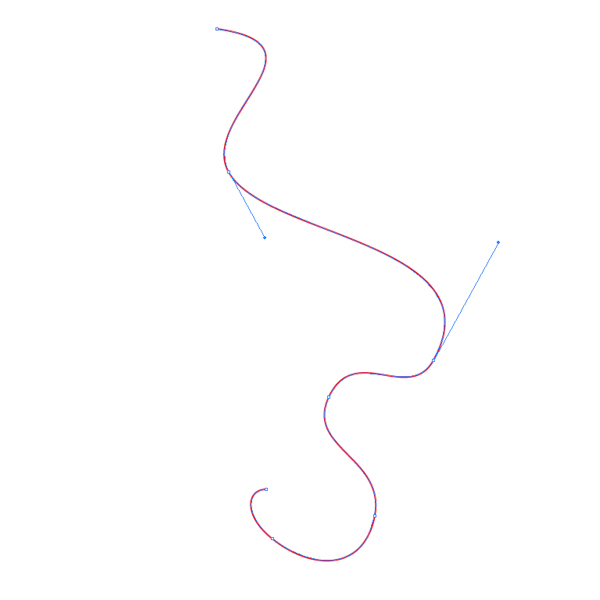
Grab the Pen Tool (P) from the Tool Panel and create the path as it shown on the picture below.
 Under Effect select Extrude & Bevel.
 These are the settings we have used in this tutorial. Feel free to play with settings until you reach a desired look.
 Under Object select Expand Appearance in order to turn the path into an editable shape.
 Ungroup (
Shift + Ctrl / Cmd + G) the red shape (since the shape contains many parts we will have to ungroup it several times) and prepare a nice linear gradient for the ribbon.
You can get more information about gradient use on the following pictures. Don't forget to use lighter colors to emphasize the influence of the light and dark colors for the shadows.


 Set the Fill color of the thickness to
 #F5A2C5.
 Using the same technique complete the left side of the ribbon. Make a small color adjustment if needed, and we are done!


I’ll try the same test. looks nice. Thanks for the article very useful
In-fact i enjoyed ur tutorial is fantastic
That’s just so amazing ! I love it !
Rally Good and amazing tutorial . solid and fantastic strategy .
how to use those colour gradients #EE1D51 in illustrator
Grate Illustration. Vary Helpful for Me.
Thanks !
Great Great Great
This is a great tutorial, with a beautiful result. You use a lot of different colors, and they all blend well. That’s a wonderful ability. How do you choose your colors? Do you create them all at once as swatches, or do you choose them as you go along? And how do you pick them- is it a base hue varied by using the saturation and brightness sliders, or do you just pick colors by eye from the color picker box?
I had to use the brush tool to draw a path that the extrude effect would work on. The pen tool made a strange shape with gaps in the fills. Perhaps I have a setting different or incorrect?