The Ultimate Ugly Showcase of Current Government Websites
Something a little different today: a showcase of government websites. The biggest difference between this showcase and others you see here at Noupe is obvious; the majority of the web 'designs' (if you can call them that) in this showcase are tremendously awful and poorly coded. And, well, let's be honest here: butt ugly!
So, what is it all of these governments don't quite understand? Someone is going to have to help me out here! Some of them say they are 'Optimized for Internet Explorer 6 and Firefox 1.0'. Firefox 1.0?! How many years ago was that?
Having very out-dated websites representing an entire country can't be a good thing - at all. They are difficult to use, the text is usually difficult to read, they have ridiculously slow loading speeds (depending on the country, of course), some of them are so bad they hurt your eyes.
To top the above points off, if you happen to be looking for one small piece of information (which you most probably are), it could take you hours on end of waiting, clicking, more waiting, napping, more clicking... until you're finally presented with a 'Server not found' error message! If I was looking at moving to a country and I got a server not found message, I think I would be put right off on the spot!
Bangladesh, Costa Rica and Papua New Guinea are just a few of the culprits of the dreaded non-loading pages, Russia is one of the many (far too many!) design offenders that use horrific drop-shadows. Also, the body copy font size is usually way too small for comfortable reading (Belarus).
However there are a couple that stand out from the rest - how many of you can tell me which ones they are?
Asia
Afghanistan
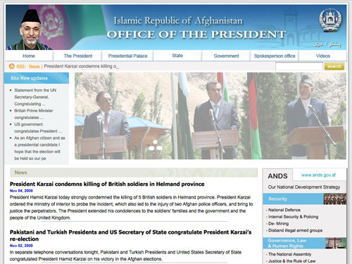
Afghanistans website manages to incorporate a workin RSS Feed but not much else. What's with the lowered opacity image?!
Bangladesh
Well, this site was loading for 10 minutes and, as you can see, didn't get very far!
Cambodia
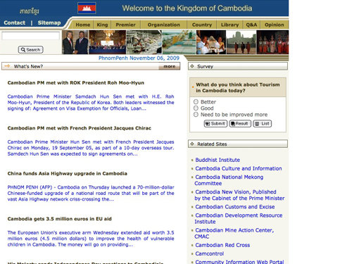
Cambodias government website has a great selection of Related Sites, but its 90s style color scheme and poorly coded structure makes it yet another terrible looking website.
China
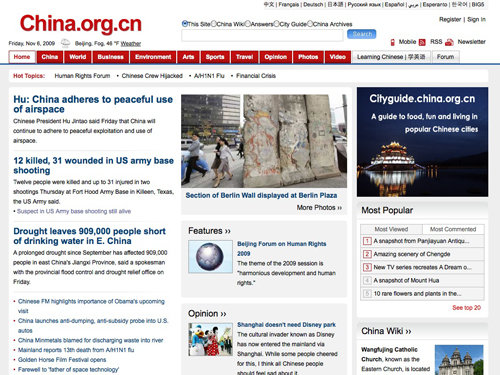
China has half managed a decent website for their government, a suitable and easy to read color scheme, a nice bold heading and an RSS Feed!
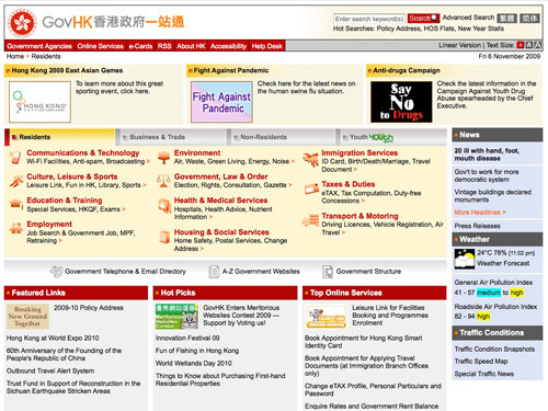
Hong Kong has a better idea then a lot of other sites here.
India
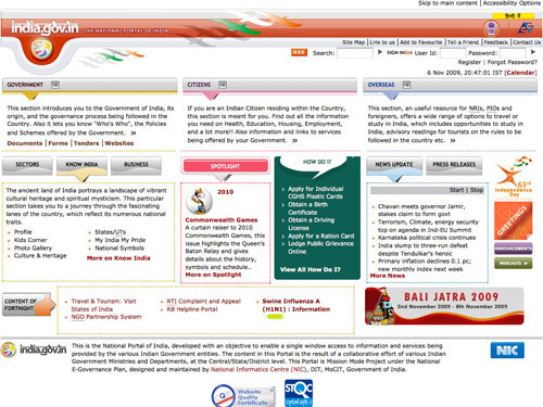
India has incorporated some nifty Web 2.0 highlight effects in with their 90's style layout. The spotlight section doesn't quite hit the spot though!
Indonesia
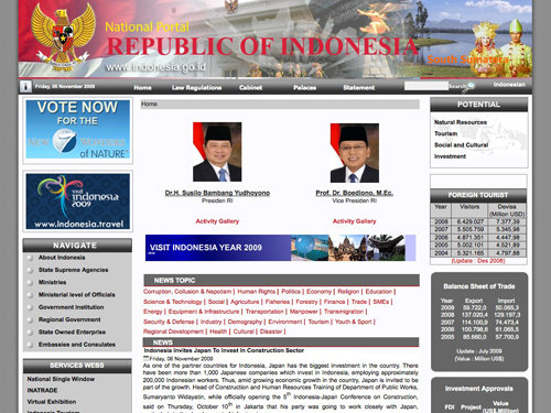
Indonesias government website looks a little like several different images merged together to create a banner style header with almost impossible to read text.
Iran
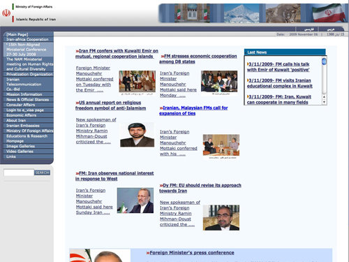
Iran makes great use of an iFrame style text box to display the 'Last News' in a scrollbox even though they have plenty of space left directly beneath it.
Iraq
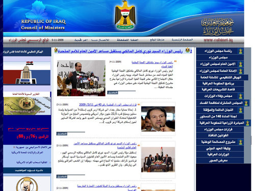
Iraq uses some terrible gradients and drop shadows on their aligned header type. For some unknown reason, the links on the right aren't doing what they're told either - but on second thought I highly doubt they were told in the first place.
Israel
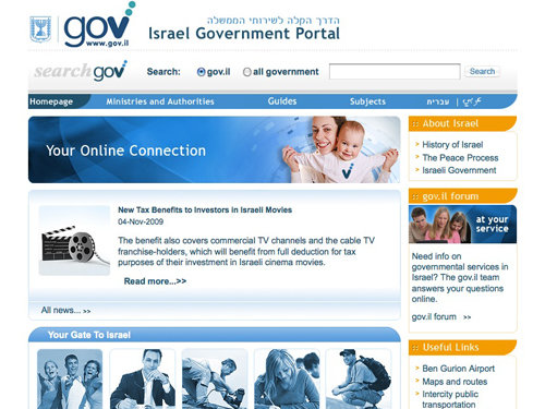
Israels government has done their website pretty well compared to others, don't quite understand what the two dots off the 'v' in their logo are for though!
Japan
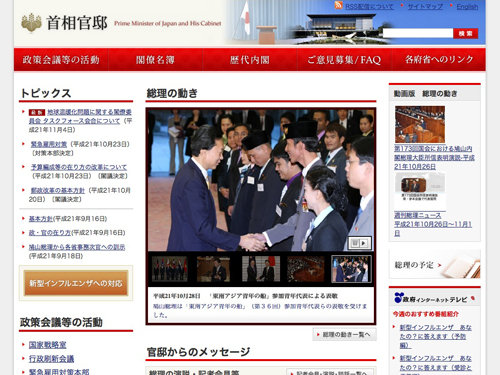
Japan has a very calm, simple and informative design.
Kazakhstan
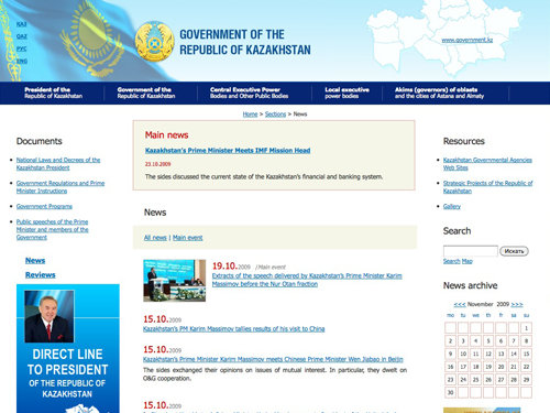
Kazakhstan has a better knowledge of color schemes and has come up with a half decent advertisment in the bottom left. Something still isn't quite right though... and the calendar obviously serves a great purpose for those who were about to ask!
Korea
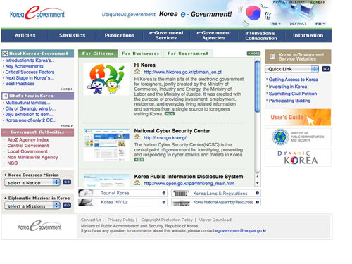
Korea has managed to pick up some great internet talk when creating their government website and decided to call it an e-Goverment... that explains it all.
Malaysia
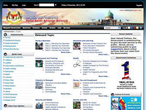
Malaysia has incorporated the option to change text size and color with their website. The designers should sort out the spacing between the thumnbail images and bullet points.
Maldives
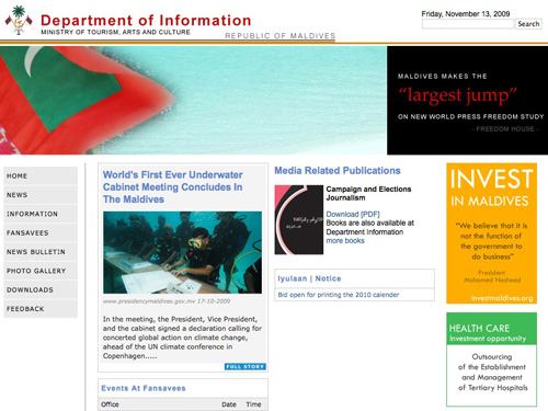
The Maldive's government website seems to have the content randomly placed on the page. And off the record: guys, letter-spacing isn't just used for fun!
Pakistan
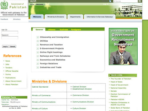
Pakistans 'official web gateway to the Government' uses lots of Photoshop feathering, gradients and drop shadows with some groovy dotted tables!
Saudi Arabia
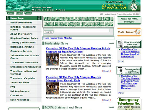
You can't get much worse than Saudi Arabia's government website, it's overcrowded and uses bevel and emboss; a user's nightmare!
Singapore
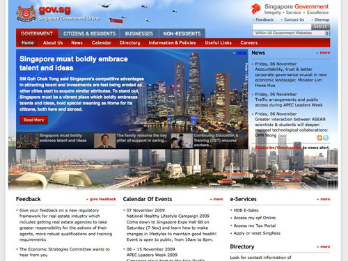
Singapore hasn't done too badly with their government website, they've incorporated a pretty stylish photo of the city center in both daylight and nightlight; we are not too sure about the blending it into the rest of the page via feathering, though.
Thailand
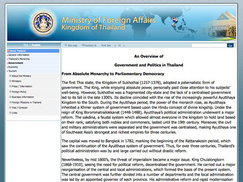
Thailand's government website can't get much simpler, it has various gradients and feather objects with outer glows to produce an attractive design – someone, please remove these terrible HTML borders!
Uzbekistan
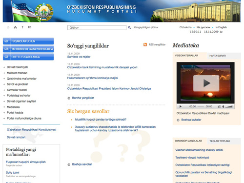
A very clean and well-commented (see the source code) design from Uzbekistan. The site uses many icons and a very light color scheme that makes it easy to read the text. However, on some pages there are certainly too much whitespace. Nice surprise: that's certainly not what we expected from Uzbekistan.
Vietnam
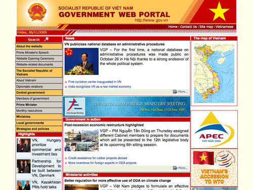
Vietnam has combined various warm colors to make a slightly over-the-top color scheme to use on their government website. The alignments are all wrong and you can see the table borders... should they even be using tables?!
Europe
Austria
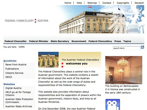
Austria, compared to other websites, is on the right track. There are no visible HTML tables and the navigation menu down the left side of the page is half decent.
Belgium
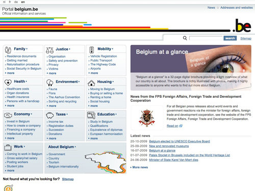
Well done, Belgium! I actually quite like this government website - they've combined a sleek color scheme with plenty of important information and stylish icons.
Belarus
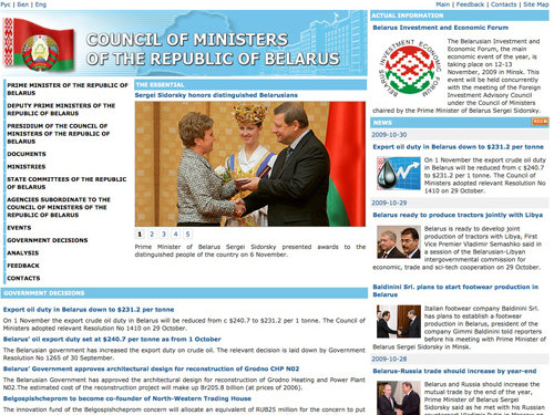
Hey, Belgium had a good government website, you can't really expect much more, can you? We're back to normal with Belarus' website; table layout, small body copy size, not enough white space and a bit messed up site. However, the page does contain an RSS feed.
Bulgaria
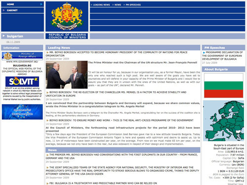
Bulgaria's government website's source code is full of the legendary HTML table tags, and what for? Empty tables! Excellent!
Croatia
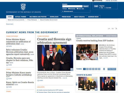
I admit, Croatia's website doesn't look great, but it looks a damn lot better than other government websites in this showcase. They've managed to include some headers, search options and a half decent menu!
Cyprus
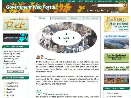
Cyprus' government website makes it feel like Autumn all year round; of course it's not true, so I'm not quite sure what the leaves are there for!
Czech Republic
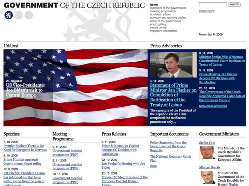
Czech Republic are in a similar position as Croatia, their site is much better but not quite nice. If they improved some horrible type and updated a few things to make it a little more modern, it wouldn't be half bad. Nothing compared to what we're used to, though!
Denmark
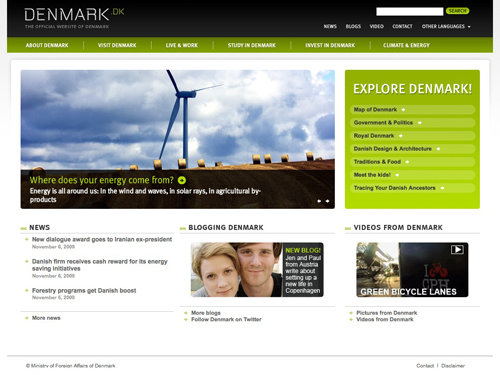
Denmark, I'm impressed! They've managed a pretty good looking color scheme, a nice navigation menu and have even chucked in some nice photography in there to show off their country!
Finland
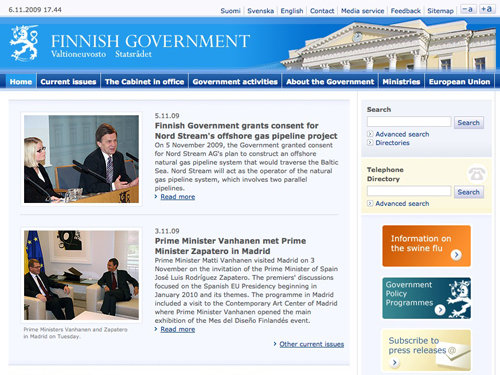
I hate to say it Finland, but to me, the website doesn't look finished. There are gaps between menu items, and unfinished edges on areas that display the main content.
France
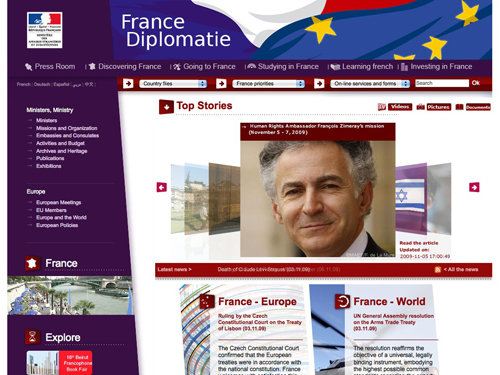
France's site honestly did damage my eyes. Purple and red might work well in some very rare cases, but it really doesn't here. A uneven menu on a government website? Hmm... Looks like someone hacked at this design with a very sharp machete.
Germany
Germany has a solid, clean and sharp design with probably way too many navigation options. I have to admit I don't really know where to start. There seem to be some random blocks that don't align well with each other.
Greece
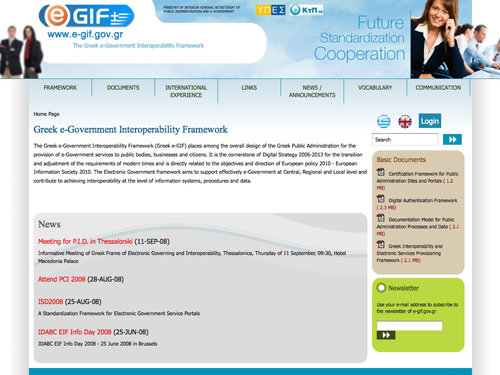
Greek 'e-Government' website uses some really strange shapes and some very, very out of focus stock photos. The seperators used in the navigation menu seem to be random lengths, or is that just me? The site looks a bit more like an online-shop than a government website.
Hungary
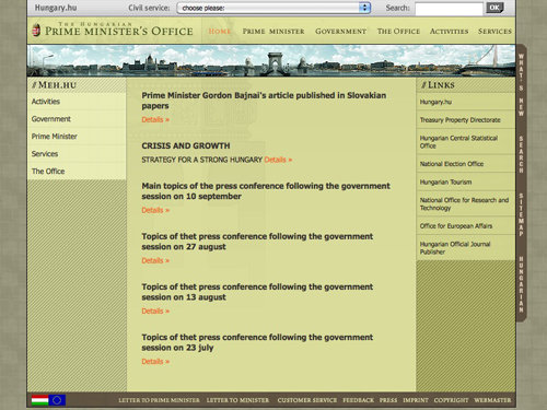
Hungary's government website isn't something I'd usually like, but compared to some others on this list it's actually been put together reasonably well. They've even managed to incorporate seamless patterns – now that's the spirit!
Iceland
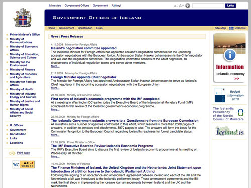
Iceland, Iceland, Iceland. Oh why have you given us the option to make your website worse via a user styles link? Hey, nice drop shadow on the Information advertisement!
Ireland
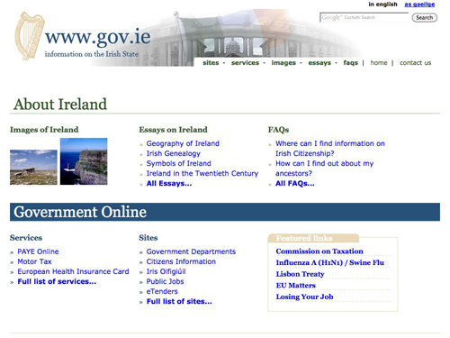
Ireland can't get much simpler with their government website, they seem to have thrown a couple of images, some tables and some text together to form a very outdated website.
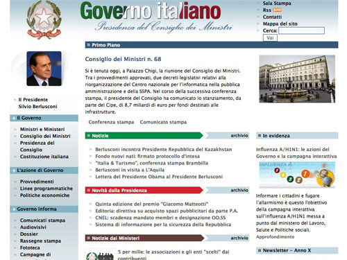
Italy
Italy, with so many others in this showcase, also has a very outdated website. They do however have an RSS feed, although being reminded old HTML pages like that still exist day in day out would make me feel quite depressed!
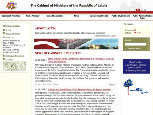
Latvia
Sure, Latvia doesn't have a great looking site, but it does a much, much better job than some other sites in this showcase. They even have a map in their sidebar!
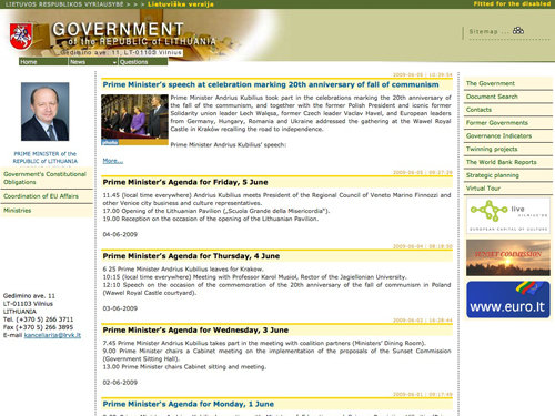
Lithuania
Lithuania's government website uses horrible colors; a combination of red, green, brown, yellow and blue - and none of them are particulary nice shades!
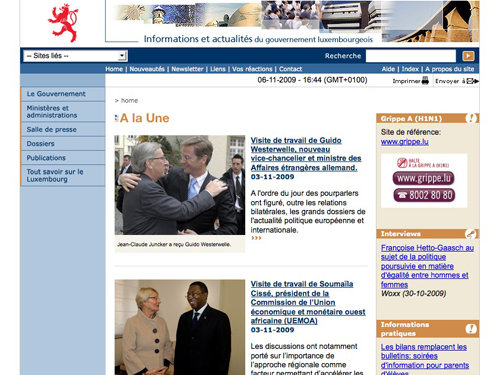
Luxembourg
Luxembourg's website feels a little incomplete and like the web developer ran out of time to work on the project. The buttons in the right sidebar (that aren't actually buttons - all they do is display a URL and telephone number!) are on a white background - why did they not just use a transparent PNG?
Netherlands
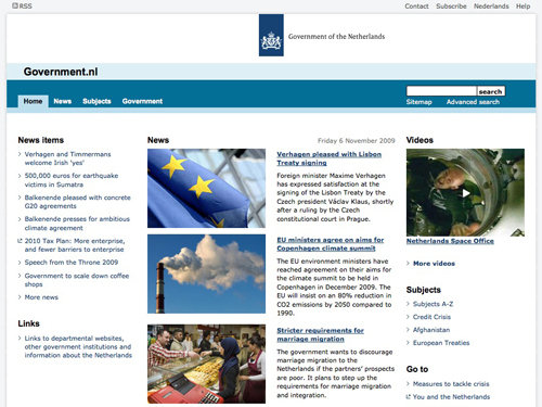
Netherlands have done a better job than most on this list. They've gone with a simple layout with quite a nice sleek style – I think this style works really well as a government website. Nice, clean and simple!
Norway
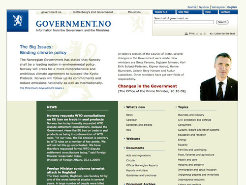
Again, Norway's website isn't great, but it looks clean and modern.
Poland
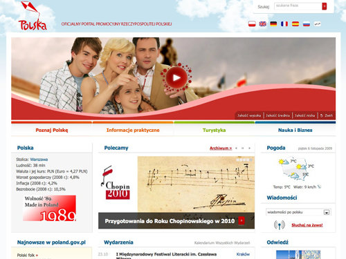
Well I have to say, out of all the countries in this showcase, Poland was one of the ones I was expecting to have a poor website, but instead they have one of the best on this list! They use some lovely cloud images, a great creative logo that fits in well with the web design (or the other way around!), lots of nice colors, some great photography and overall a clean and modern design. This one could quite easily make it into a beautiful showcase!
Portugal
Portugal hasn't done too badly either! Their website is aligned well, has a nice color scheme and they even use Twitter which they managed to incorporate into their design! However, things do seem a bit cramped – maybe they need a little more white space!
Romania
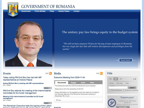
All the better sites on this list are coming at once! Romania have managed to incorporate RSS icons into their web design; however the upper half of the design does feel a little overloaded with blue!
Russia
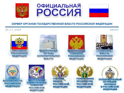
I hope the design of Russia's government website doesn't have a degree in anything to do with design or art, or any kind of qualification for that matter. This is just a nightmare; bevel & emboss, ugly drop shadows and awful glows. Something tells me that the site was designed back in 90s. Eurggh!
Slovakia
Slovakia's website is nice and very simple – they've managed to lay it out pretty well and have used a matching color scheme. Not bad, not bad at all!
Spain
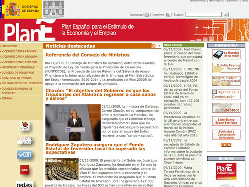
Oh dear! Spain uses some huge drop shadow effects on their graphics, but the overall look and feel is not that bad. The line height could be increased and the design could use some padding.
Sweden
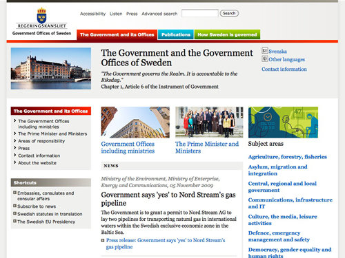
Swerden has done a nice job on their government's website. They used an attention grabbing color scheme which actually draws your eyes to different areas (such as the red, blue and green). The only thing I'm not too sure about is the dark red/brown to red gradient used as a header background at the top of the left sidebar.
Switzerland
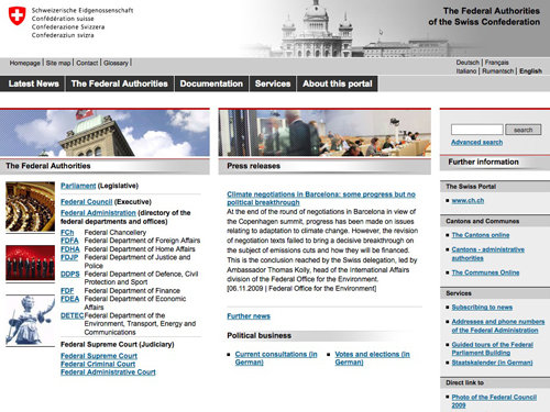
Switzerlands website is a bit overcrowded and the alignment seems to be incorrect. Overall the design appears to be simple and the navigation is more or less OK. The images on the left hand side seem to be underlined!
United Kingdom
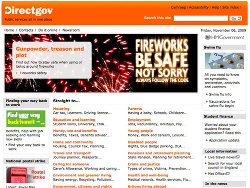
United Kingdom's government website isn't too bad – it's aligned pretty well, has enough whitespace and is relatively easy to read. I'm not quite sure why they use an orange color scheme, though? Notice that this website doesn't have a UK flag anywhere – that's a bit odd for a government website.
Ukraine
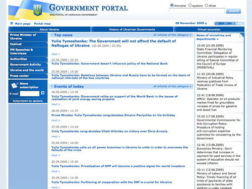
It sure would be boring searching Ukraine's government website for a vital piece of information! Everything seems to look the same and nothing really stands out from anything else on the page! Also, the small font size makes the page difficult to read.
Africa
Cameroon
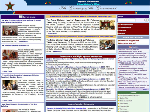
Cameroon's government website is over-crowded. It uses various different colors in a desperate attempt to grab your attention but simply doesn't work.
Egypt
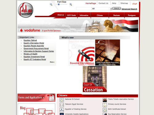
Egypt's government website could have been one of the nicer ones in this showcase, but it's poorly coded and seems to have randomly placed images.
Ethiopia
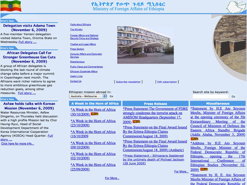
Ethiopia's government website uses several shades of blue which don't quite go with their green, yellow and red flag despite the blue circle.
Kenya
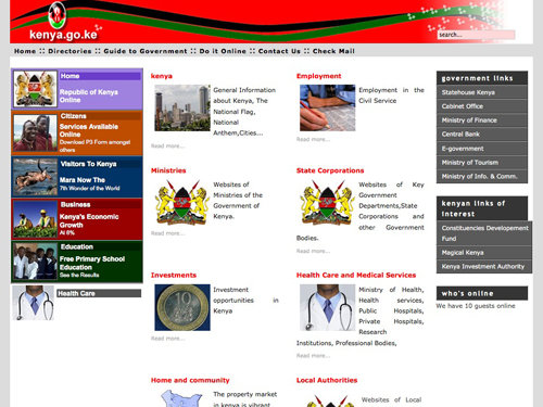
The biggest fault with Kenya's government website is there poor use of justified text alignment. They also use a crazy color palette to catch your attention which again doesn't work!
Madagascar
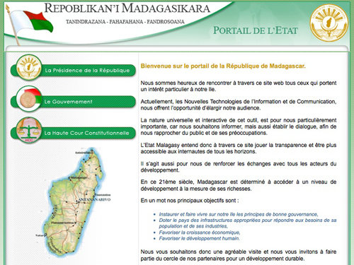
Madagascar's government website could have possibly been influential in 1999 with its hover image buttons and patterned background.
South Africa
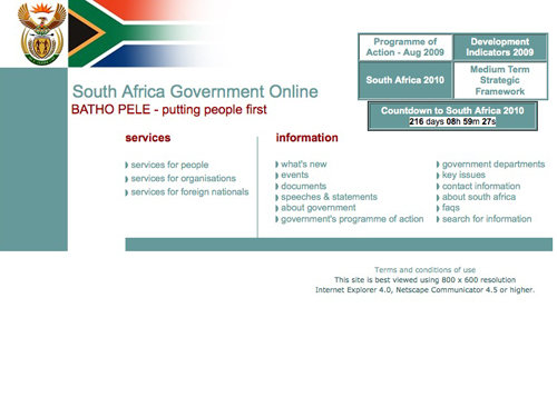
Possibly one of the worst on this list; there seems to be random blocks of color aswell as really ugly tables. Please do remember that this website is best viewed using a 800x600 resolution in IE4!
Tunisia
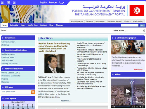
Tunisia uses a terrible color scheme of light cyan and mid-blue mixed with a little brown and red. Hey, at least they have an RSS Feed!
Uganda
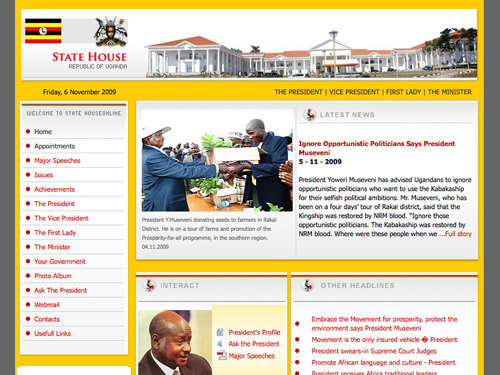
Uganda's government website is one of the best so far; although I'm not quite sure why they've used that horrible pastel yellow and white gradient under the interact heading.
Zimbabwe
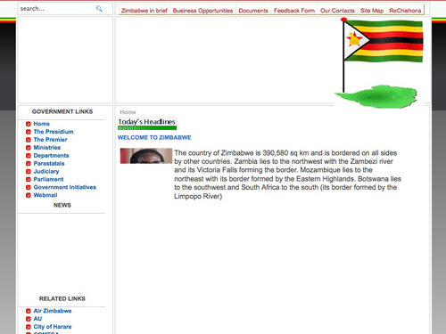
You'll see from the screenshot that Zimbabwe's government website doesn't look like it's finished loading, that's because after 5 long, long minutes, I had enough and decided to screenshot anyway!
North America
Canada
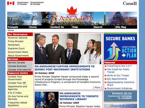
Canada is yet another culprit of the outdated glow and feathered banners. That's a pretty random color scheme they're using on their left sidebar, too!
Mexico
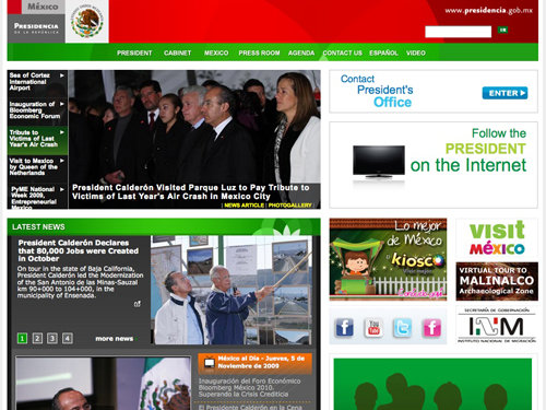
Woah, now this is a pretty bad design. Everything seems to be everywhere and it's all right in your face, I don't know what to look at! They have managed to keep up to date a little though and have a Facebook and Twitter page!
United States
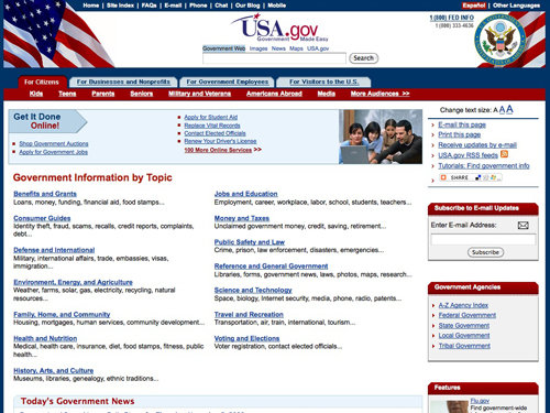
After looking at USA's Drupal powered Whitehouse website, their actual government website is a huge letdown, it uses dated HTML and awful header graphics.
Central America
Costa Rica
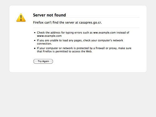
Well, having a Server not found message come up when visiting a governments website would certainly make me change my plans (if I had any) to move there!
Guatemala
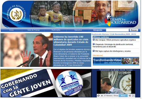
Guatemala's government website is highly focused on the leader of the Guatemala's government, having many photos of him throughout the page. The site seems to have way too many design elements that are all fighting for attention making the site difficult to scan.
Nicaragua
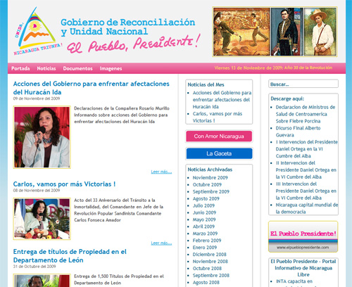
Nicaragua's government website decided to stick to a blog layout to display its news and updates. That's an unusual choice. Can you find the search box on the page?
Bahamas
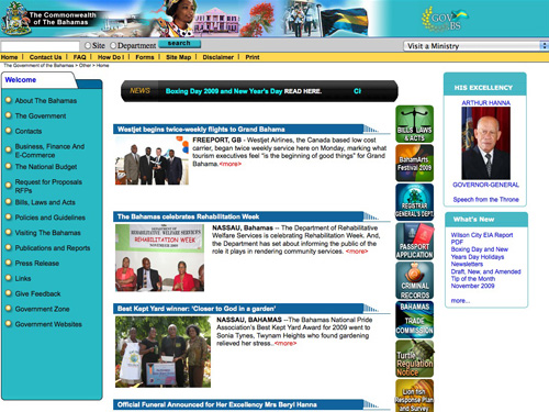
Bahamas' goverment website with a striking color scheme, a news ticker and a bit weird <more>-links. The page has a copyright statement with the year 2005 in the footer.
Barbados
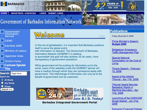
Barbados' government website is a typical 90's HTML website - random colors, drop shadowed/gradient headers and some real ugly graphics!
Cuba
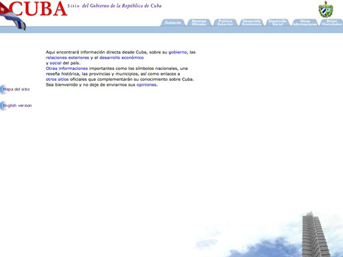
Cuba tried to do 'something special' with their government website by including a background image - it's a shame they did it completely wrong and left far too much white space!
Dominican Republic
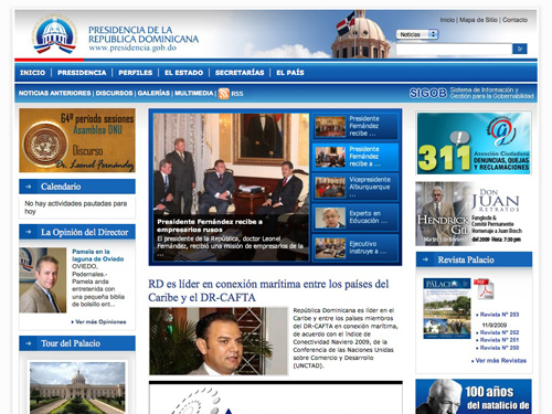
(Updated)Well, that's a real surprise: the government website of the Dominican Republic is clean and nice and uses a layout which is common for newspapers and online magazines. However, the page seems to have way too many design elements at once – a bit of padding would be very helpful here.
Jamaica
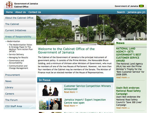
Jamaica's government website isn't too bad - some things are a little big in my opinion, such as the header gradients and the type used under the 'news' section, but other than that it's not bad at all!
Puerto Rico
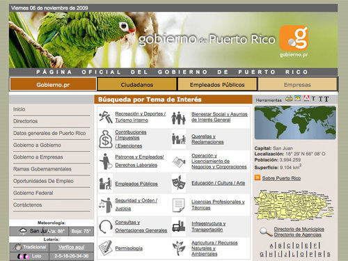
The header used in Puerto Rico's website design is quite nice; a cute photograph of a parrot and a case where a drop shadow on the header actually works reasonably well. Any lower on the page though and things become a little dated with terrifying borders and horrible color schemes.
Saint Lucia
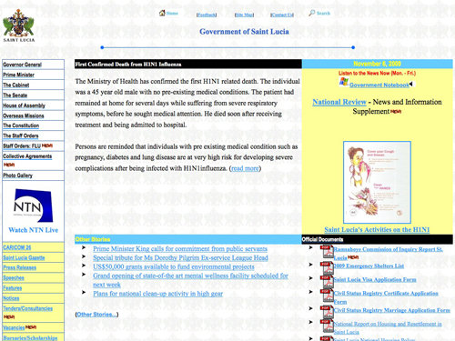
Saint Lucia's website reminds me of the first website I made when I was about 7 years old using Yahoo! Geocities. Now that's what I call old-fashioned!
Trinidad and Tobago
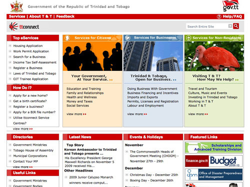
Trinidad and Tobago's site isn't too bad - it's a little old fashioned but they have managed to draw my attention to different sections of the design by using a reasonable color scheme - unlike most others!
South America
Argentina
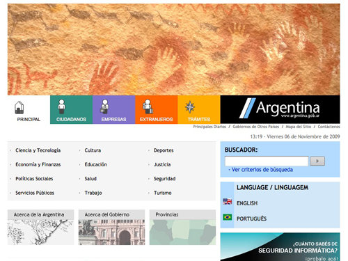
Argentina played it safe when designing their website. They've used a simple color scheme and an easy to read layout.
Bolivia
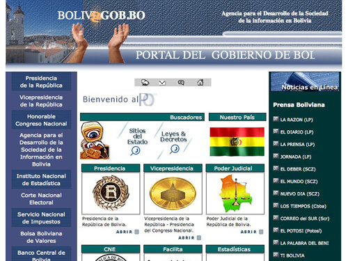
Bolivia's government website is a complete mess to put it nicely! The header is awful, and everything graphic makes me cringe!
Brazil
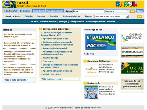
Brazilian website kind of reminds me of a dated online shop with it's multiple navigation menus and drop down lists - or is that just me?
Chile
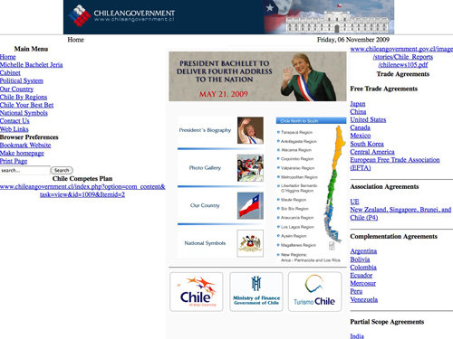
Now this one made me laugh the most. Chile is kind enough to put a message at the bottom of their website 'design' stating that it has been Optimized for IE6 & Firefox 1.0 - yay!
Peru
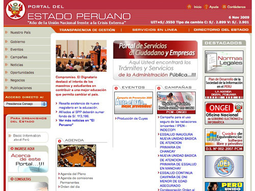
Peru's website is a tiddy bit dated but it's better than a few in this pretty terrible showcase! I think they need to rework the structure of the main content area.
Uruguay
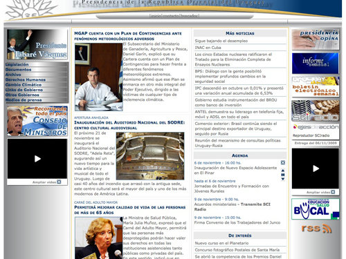
I can't bare to look at Uruguay's government website, just look at them terrible black and white gradients used down the left side of the design - ahhh!
Venezuela
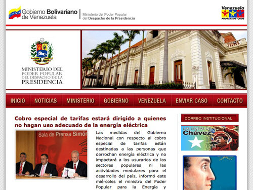
Venezuela, for a country a lot of people haven't heard much about, did a pretty good job with their design. Everything has ben laid out quite nicely but they need to improve that terrible text layout in their main content area!
Oceania
Australia
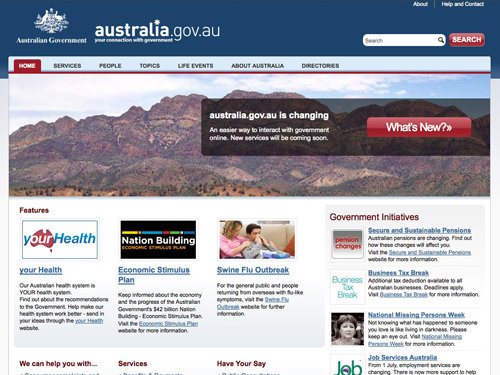
Australia has done a great job with their government website; it's simple, stylish and isn't over the top. In other words, it does what it's suppose to do well, and that's a good thing!
Fiji
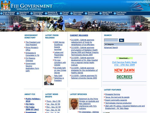
I'm not quite sure what happened to Fiji's 'online portal' but the alignment of the main content seems to be a little (or a lot) out of place!
New Zealand
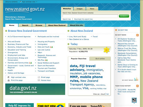
New Zealand, like Australia, has done a great job. They use a simple and sleek design that serves easy to find and read content - just what the user needs!
Papua New Guinea
When visiting Papua New Guinea's website I didn't even get a 'Server not found' error message - instead I got a broken URL/image error message, that's nice of them!
Solomon Islands
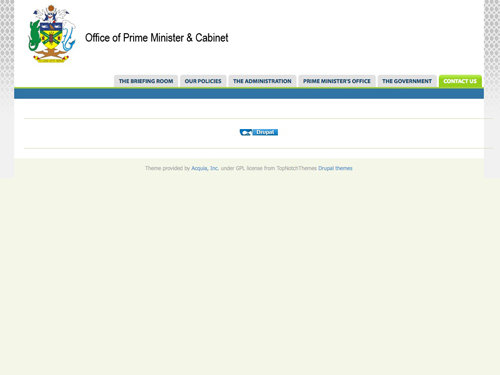
Solomon Islands, as can be seen from the screenshot, is a Drupal powered website. It looks like it could have been a promising website, if only the rest of it was actually there! Maybe they forgot to finish it?
Take a look at some of these beautiful showcases!
12 Tips for Creating a Great Portfolio Site
Twelve tips for creating a great portfolio site, no matter what you particular artist field is!
20 Vital Techniques & Best Practices for Effective Web Design
Creating beautiful and unique websites is getting harder everyday - this post offers 20 excellent techniques you can incorporate in to your own designs.
Showcase of Beautiful Textured Web Designs
Grunge design has become more popular and has been put to greater use in recent years. This post showcases a huge collection of some of the best web designs that use texture.
50 Beautiful and Creative Blog Designs
This post showcases 50 fresh, beautiful, inventive and, hopefully, inspiring blog designs.
Designing “Coming Soon” Pages
A perfect post showcasing some great “coming soon” pages, as well as a great explanation to why you’ll benefit from it!
About the author
Callum Chapman is a freelance graphic designer. He is the creative blogger behind Circlebox Blog, a design related blog offering articles, inspiration, tutorials and free, high-resolution textures. Drop him a line at Twitter!






im surprized Philippines is not included! haha
haha.. Interesting, Philippines is not included! haha
oe pagina culia, esa no es la pagina del gobierno de chile
terrible aweonao gringos qls chupen la q cuelga
great idea for making a blogpost, but I think all the descriptions lack of a real analysis, this is just a compilation of poor opinions and no real arguments in any subject: comunication, information design, graphic design, really I expected much more from the title/subject of the post
that isn’t the actual Chilean government website.
http://www.gobiernodechile.cl/
We are aware about the actual poor quality of the design of the website (and the logo) but is much better than the snapshot you post here.
Great post btw
I think this is number one
174.142.8.50/pages1list.aspx?page_site=1&x_Page_site=1&z_Page_site=%3d%2c%2c&x_page_cat=2&z_page_cat=%3d%2c%2c&pages1_psearchtype=&pages1_psearch=
“they even are not have DNS name ”
All your “analysis” don’t need to end in exclamation points, its veryhard to take you seriously. This was not a well executed post. Many of you web sites listed are not official websites of the respective countries either.
i was really surprised by the polish website, they even have a different b&w Layout because of the … current events, i would say that would be worth an extra mention!
Great showcase, with some obvious link/source errors, and I don’t agree with many of the design comments, but it’s still great to have a general overview on different ideas of information presentation around the globe. Most are fungly for sure, but that’s governmenty goodness for ya.
Hello Callum
I had to applaud u for you’re perspective of GOV websites and their poor designs, very funny !
You have a nack for being critical of others poor choices.
I wish there were more writers on the web like you !!
The website for India seems so cluttered to me. I wish they’d space everything and add a better navigation, because that’s just too much text all at once.
Let’s not even get started on the Canadian one.