Six Creative Solutions in Online Advertising
By Mike Takahashi
Recently, there have been a lot of creative ideas and uses of online ads that have been pushing the traditional medium. Takeover ads, where ads takeover the entire site design have become more common. Apple has taken banner ads into a new dimension by creating ads that appear to interact within the design of a site. While others have been able to leverage platforms such as YouTube and Twitter to create an interactive experience. Here are some creative and unique trends that have been showing up in advertising online.
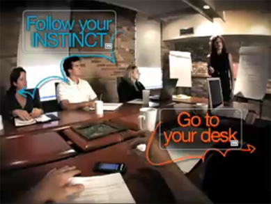 To promote their new phone Instinct, Samsung created an interactive online video campaign on YouTube called "Follow Your Instinct." Using YouTube's annotations feature, which allows clickable links embedded in the video to other videos, users can follow multiple story lines by choosing where to go next. At the end of each short clip you are presented with two choices. For example: 1) Follow you Instinct or 2) Go to your desk
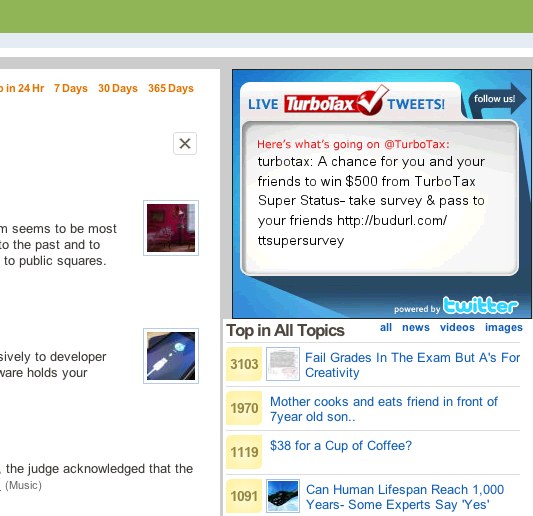 TurboTax created a live Twitter banner ad that showed the five most recent tweets featuring responses to consumer questions and comments on taxes, product use and feedback.
 Image source
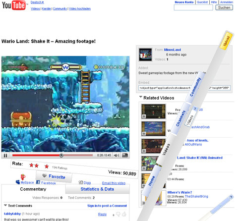
To promote their new game Wario, Nintendo created what at first appeared to be a standard YouTube page showing a video of the game being played. However, as the video progresses, elements within the design of the page start to interact with the game. The entire screen shakes, items begin to fall down, YouTube's navigation starts to crumble, and the page eventually becomes unrecognizable.
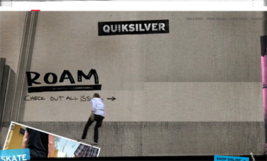 As the video begins to play, the skaters start to jump outside the video and become part of the website, interacting with elements of the design by skating and doing tricks on the photos, video player, etc.
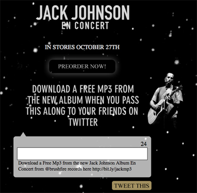 A simple, yet effective concept that was done using Twitter to promote Jack Johnson's live album En Concert. It allows you to Tweet up to 24 characters while the other 116 characters are reserved to retweet the message. Once it is sent, a link is given to download a free mp3 from the album.
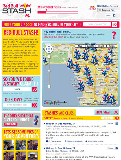 Brands are incorporating interactive experiences with consumers on the web in more ways than ever. Red Bull has taken the scavenger hunt concept one step further by teaming up with Facebook to incorporate a virtual scavenger hunt across the United States. Using the website, you type in your zip code to find the locations of places where cans of Red Bull are hidden. The general locations are shown via Google Maps with clues on where to find the exact spot. Once found, you "claim the stash." Users can make comments on each individual location and upload photos of their stashes through Facebook.
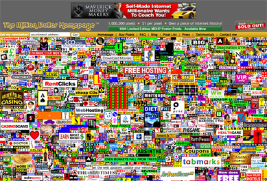 Not really a trend, but worth mentioning since it was something truly creative and completely different at the time. Conceived in 2005 by Alex Tew, a college student who needed to raise money for his tuition, he came up with an idea to try and make $1 million by selling 1,000,000 pixels for $1 each on a single web page. He ended up selling every single pixel making $1 million with several imitators copying his idea.

1. Interactive Ads
Samsung
Follow Your INSTINCT http://www.youtube.com/watch?v=HoOCiaxIZF4 To promote their new phone Instinct, Samsung created an interactive online video campaign on YouTube called "Follow Your Instinct." Using YouTube's annotations feature, which allows clickable links embedded in the video to other videos, users can follow multiple story lines by choosing where to go next. At the end of each short clip you are presented with two choices. For example: 1) Follow you Instinct or 2) Go to your desk
TurboTax
http://look.daileyads.com/omma_submissions/twitteralpha/ TurboTax created a live Twitter banner ad that showed the five most recent tweets featuring responses to consumer questions and comments on taxes, product use and feedback.
2. Synched Banner Ads
By now you've probably seen one of the many creative and witty Apple ads featured on sites such as CNN, The Wall Street Journal, and Pitchfork. By breaking the traditional mold of static banner ads and utilizing synched ads, an interactive experience is created using elements within a site's layout to grab the users attention.Apple
Appeared in the Wall Street Journal Appeared in the New York Times3. Takeover Ads
Takeover ads takeover a sites existing layout, changing the normal flow and convention of what the user is normally accustomed to seeing.Nintendo
http://www.youtube.com/watch?v=zSU-z-t9Ku4 Image source
To promote their new game Wario, Nintendo created what at first appeared to be a standard YouTube page showing a video of the game being played. However, as the video progresses, elements within the design of the page start to interact with the game. The entire screen shakes, items begin to fall down, YouTube's navigation starts to crumble, and the page eventually becomes unrecognizable.
Apple
To show the features of the iPod Touch, Apple was able to create an interactive experience that interacted with Pitchfork's design. This has also appeared on sites such as ESPN.Madden NFL 10
To promote the game Madden NFL 10, YouTube's home page was taken over by an ad that interacts with elements the home page as football players break outside the ad space and into the design of the site.Quiksilver
http://skate.quiksilver.com/thespot As the video begins to play, the skaters start to jump outside the video and become part of the website, interacting with elements of the design by skating and doing tricks on the photos, video player, etc.
4. After Click Ad
After click ads expand and interact with the design of the page only when a user had clicked on it.Braquo
Braquo is a crime TV series in France.BMW Korea
5. Social Media
Traditional advertising has been able to successfully incorporate and leverage social media to create interactive experiences that can only be done online. Designers have been able to leverage the concepts and ideas of sites like Twitter to create an interactive experience with users that allow them to engage with the audience.Jack Johnson
Twitter Promotion for Live Album http://twitter.jackjohnsonmusic.com A simple, yet effective concept that was done using Twitter to promote Jack Johnson's live album En Concert. It allows you to Tweet up to 24 characters while the other 116 characters are reserved to retweet the message. Once it is sent, a link is given to download a free mp3 from the album.
Red Bull
http://www.facebook.com/redbull?v=app_123793864961 Brands are incorporating interactive experiences with consumers on the web in more ways than ever. Red Bull has taken the scavenger hunt concept one step further by teaming up with Facebook to incorporate a virtual scavenger hunt across the United States. Using the website, you type in your zip code to find the locations of places where cans of Red Bull are hidden. The general locations are shown via Google Maps with clues on where to find the exact spot. Once found, you "claim the stash." Users can make comments on each individual location and upload photos of their stashes through Facebook.
6. Something Unique
The Million Dollar Homepage
http://www.milliondollarhomepage.com Not really a trend, but worth mentioning since it was something truly creative and completely different at the time. Conceived in 2005 by Alex Tew, a college student who needed to raise money for his tuition, he came up with an idea to try and make $1 million by selling 1,000,000 pixels for $1 each on a single web page. He ended up selling every single pixel making $1 million with several imitators copying his idea.

thanks for thes Great post.
Great post, but this is the wrong direction.
The other day I was trying to read a New York Times pieces online. A big Delta ad ‘creatively’ exploded out of the page the covered up the first 6 lines of the story. It didn’t have a ‘close’ button, and took a good 20 seconds to move out of my way on its own.
I have no idea what Delta’s message was, all I remember was it kept me from reading the content I came to the site for.
It’s true that online ads tend to be flat, and we need to innovate. However, I think it’s important for us to realize the difference between engaging readers and aggravating them.
We do have a few guides as far as how we can make this happen. Magazine readers think those ads are fairly credible. In fact, they actively pay attention to them without having animation or harming the user experience. The question is, why? And how can we recreate that effect on the web?
100% with you Jason. Not only that the reading/navigating experience get’s messy. It should be the message that get to the client right? But now, nowdays marketers are ‘selling’ the experience (even if it’s negative?)
Hopefully, in short period of time, we’ll publish a report with ‘creative online ads’ from various countries.
This was really interesting!
Nice out of the box examples – thanks for sharing these.
What a great post, never even seen some of these before! How out of touch am I?
Good article good work buddy
I’m just wandering whether you guys can provide me some of the simple and more complex ways of measuing website advertisements. I’m carrying out some study into this for my course.
It’s quite interesting the extent to which people can ‘filter out’ ads …. almost literally not see parts of a web page which they sense are ads, and therefore the extent advertisers go to to try to combat this. I guess I’m a little like a fellow commenter above – I don’t like my reading experience interrupted too much – I prefer to control what I see and when .. that’s the power of the internet … but hey!
some of them are really inspirational.. ;]
Fun ads, that do not have the annoyance factor (at least not yet) of a lot of web advertising.
Which came first:
http://girl.inyourshirt.tv/
or
http://iwearyourshirt.com