Showcase of Gorgeous Black and White Websites
These days, black and white website designs are becoming a trend because of their simplicity and attractiveness. Black and white website layouts are especially elegant, efficient and effective for creating expansive typographic layouts that create a huge impact when partnered with the freshness and mystery these two simple colors bring to the design.
Today, we have compiled a list of some exceptional and attractive black and white websites for your viewing pleasure. Check them out!
Black and White Websites
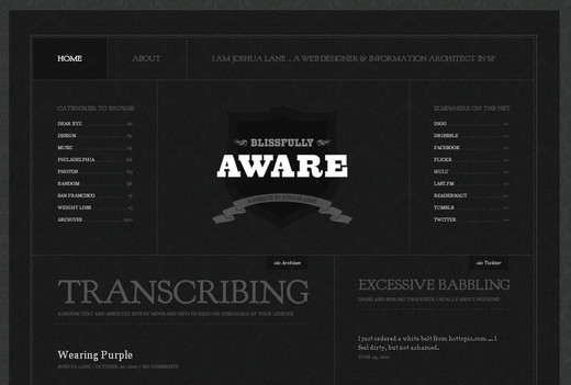
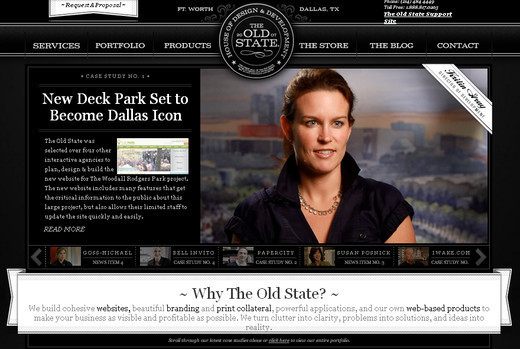
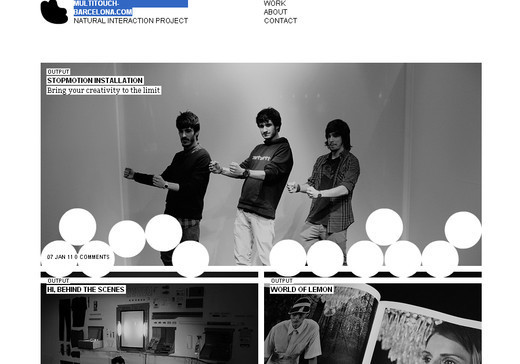
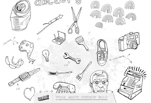
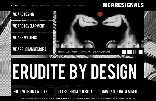
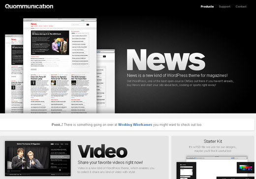
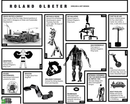
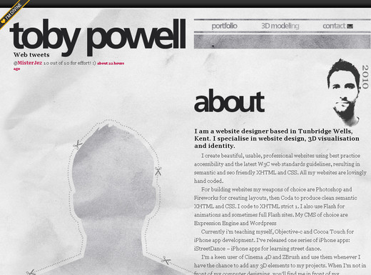
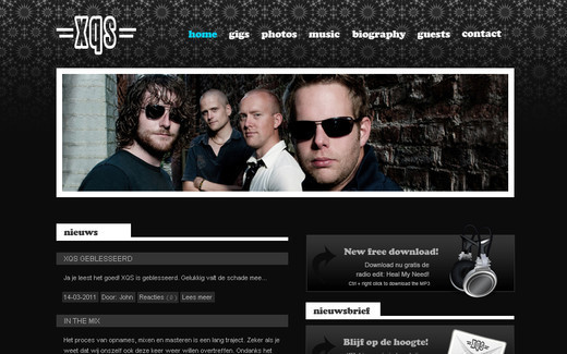
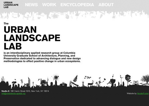
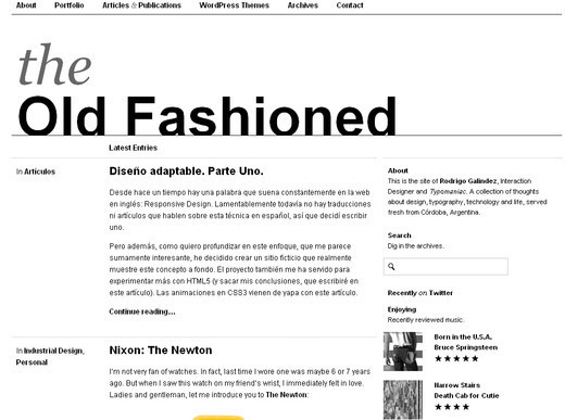
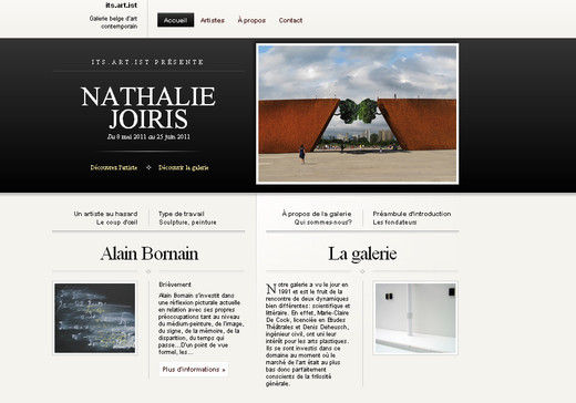
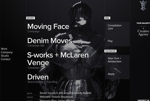
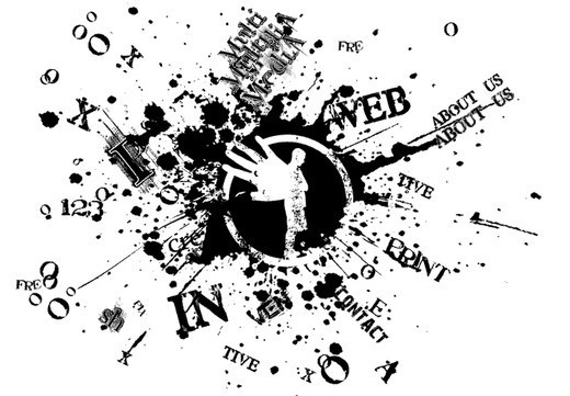
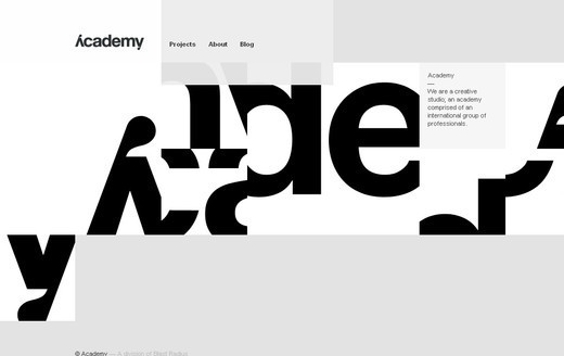
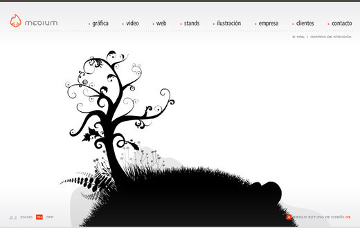
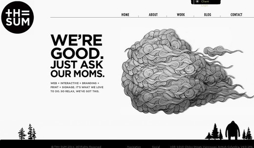
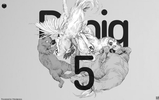
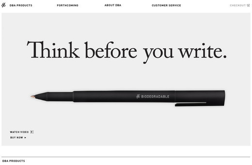
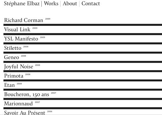
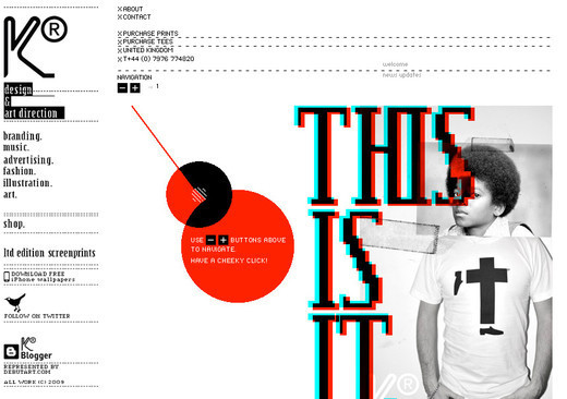
Blissfully Aware Black is used for the background, meanwhile white bold typography is used to grab the reader's attention. The layout of the website is simple yet appealing. The Old State This is one of the most interactive black and white websites in the list with a very sylish and elegant look. Multitouch Barcelona A very simple and beautiful website design. As you scroll down through the website, there are elements that playfully follow you down the site. Leg Work Studio The website is full of sketched elements that are actually clickable, and help to navigate the users to all of the relevant content. Jag Jeans This is not a conventional black and white website. The designer has put loads of creativity and imagination into this site. We are Signals A very interactive web design that uses lots of bold typography throughout the site. Mouse over effect is great. Master Grinding The website only contains black and white colors which puts the emphasis on the key ingredients of the design and grabs the attention on the first look. Quommunication White color font is used against black background that looks awesomely appealing. The images used also add a visual interest to the overall look. Olbeter A very unusual design concept that sets this website apart from others. Special attention is given to the graphics used that is truly inspirational. Circus The hover effect on this website is simply marvelous that even makes you forget the absence of colors. Toby Powell This is not a pure black and white website design rather the mixture of white and grey color to give the design a much more subtle look. XQS Band Here the designer brilliantly uses the black and white to set off the touch of light blue color which adds a nice spark. Urban Edge Design A pure classic black and white website design using an emotive and beautiful black and white photograph to set off the introduction to the site. Hell Cat You will find a bit of color variation in this web design, with splashes of red thrown in here and there, but overall the site sticks to the use of black and white. Urban Landscape Lab In this web design the main color that was used is white. Clear and bold black typography is used against the white background which stands out brilliantly. Leahhaggar This is one of the simplest yet most appealing and effective black and white website designs featured. The precision and neatness is the main attraction for this web design. Marc Ecko This particular design of black and white website is a milestone that inspires loads of designers to create something out of the ordinary. Marcin Kaniewski So many images are incorporated within the design yet look so appealing even without the colors. This website design proves that colors are not necessarily required to showcase your creativity. The Old Fashioned A very neat and clean black and white website design that not only captures the attention of the onlookers but also displays the information in the cleanest of ways. M1k3 A simple and minimalist website design that although does not showcase loads of graphical elements, the presentation of text and the typography make this website compelling. Dragon Interactive This website design comes with an interactive header. Although the website main colors are black and white, the hover effect brings a very beautiful blue shade to the design. Its Artist A very neat and clean website with a white background and minimal graphical element to put emphasis on the content of the site. Design Give A very unusual website design that mainly focuses on the products the website offers, and uses the design to help place this emphasis.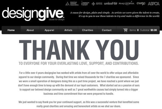














Wonderful collections!!!
hum…. one more bw blog http://supercomentario.com.br/
awesome collection! and I do agree that black and white has a nice appeal
But from a designers point it becomes pretty clear that those sites, who use one color catch far more attention and look more alive.
or those with pictures. even tho I imagine it hard to find imagery in color that looks good at all times. so there it might be better to go with black and white pics as well or head for a colored tone… even if that is very 90s xD
I love black and white webdesign.. very nice selection.. maybe you can post a second part? :)
Great collection of these black and white websites.
Thank you for this collection, it definitely help me on my own website.
Thank you for this wonderful collection! The emotions that a black-and-white design evokes are sometimes stronger than a color one is able to arouse. It’s reached due to stark contrasts and a direct focus on the website’s idea.
White single site is beautiful :). But not to overdo it. Some pages are too chaotic. Even if you are graphic designer… web site application is not and should adhere to standards The navigation and the like. Chaotic site from closing, not interested in me.
Thanks for post!
I like this BW sites, but i think there is hard to find right balance where design is cool and where it gets too black (negative) or too white (clean).
I absolutely loved the Multitouch Barcelona .Thanks for sharing the list.