Parallax-driven Hero Sections: 10 Great Examples
Keep the theme alive and enhance the visual experience – are two main things that parallax effect introduce to the website.
While we have accustomed to seeing parallax effect in tandem with long scroll-powered pages, for several years in a row this simple method is applied individually and locally across the entire website. You can stumble upon it on work sections, sliders and most often in hero areas. Traditionally, it is used to recreate a sense of depth and smooth motion. Today we are going to look through 10 websites with parallax-driven front pages.



Fotonaut
Fotonaut’ homepage is based on a sophisticated, multilayered layout. A ton of 3D objects is scattered throughout the screen, making the page look chaotic and complicated. Here the smooth parallax effect helps to add a pleasing sense of depth.
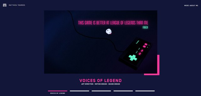
Matthieu Tourdes
Matthieu Tourdes leverages parallax effect to reinforce the appearance of the front-page slider. It is applied to the central part naturally driving the overall attention to his works. Also, it plays nicely with the opening transitions.
Vyctoire
Vyctoire’s homepage gives off a little charm: gorgeous pastel coloring and lots of fresh air produce a compelling visual clarity. The parallax here is increasingly subtle: it glues only the elements that are located in the heart of the screen, gently reinforcing the atmosphere of elegance.
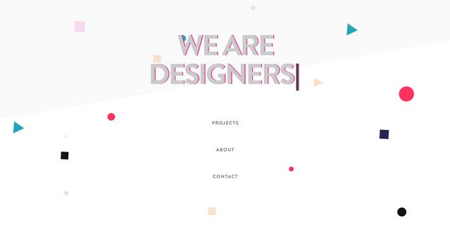
PixelPink
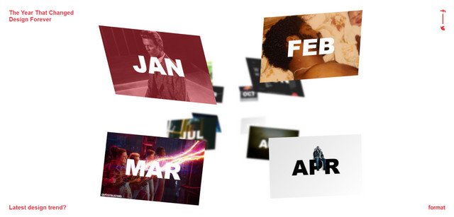
PixelPink has an oversimplified first page of their portfolio. It is clean and populated with plain geometric shapes like circles or squares. Here parallax is used to give a composition a nice zest transforming a dull design into an engaging scene.2016 Changed Design Forever
The team behind this project uses the boxy vibe in a creative way. Not only have they skewed the image panels to make them look three-dimensional, but they also connect everything together with the parallax effect, completing the tone of the website.
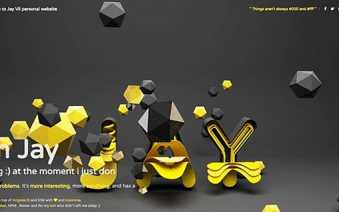
Jay Vi Official
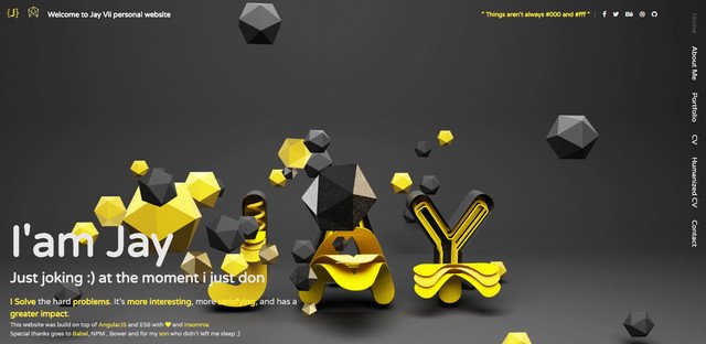
With such a stunning 3D rendering used as a hero section, it is only natural for the team to bring in some parallax effect here, boosting the general impression significantly. It ideally blends into the environment, making its important contribution.
Keley on Mars
Much like the previous example, the official website of “Keley on Mars” greets the online audience with the refined multilayered hero section. There are many renderings that due to parallax effect smoothly move and float over the screen.
Big Horror Athens
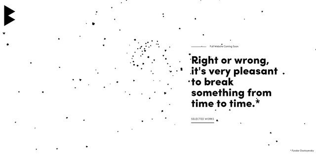
It is here where the parallax effect meets the chaotic yet eye-pleasing and enticing particles animation. Together they recreate a harmonious symbiosis that converts a plain page into a small amusing playground.
Raoul Gaillard
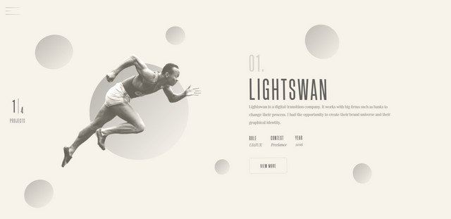
Not only is the welcome screen of Raoul Gaillard’s portfolio charged with a parallax effect, but also the work section. Both of them benefit from the technique. The design stays clean and tidy; and, thanks to tricks with shapes and parallax it looks alluring and intriguing.
BorgoVeneto
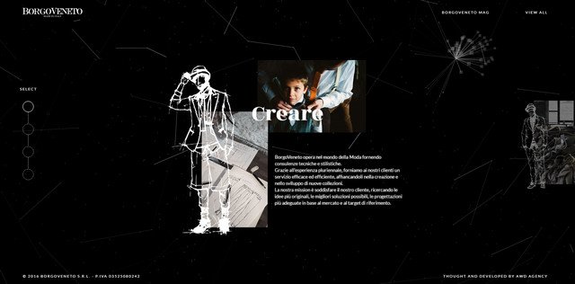
BorgoVeneto uses parallax effect to embellish the already intricate and elaborate slider. Here the multilayered compositions are spiced up with advanced particle animations that react to the mouse cursor. And parallax just works together with all this, bringing about an incredible experience.

Amazing list. Kudos!
I think the webdesign from the webpage “Keley on Mars” looks so cool. It’s my favourite. Someone know if this is available as a revo slider theme for WP?