Good Web Design: Best Practices for Modern Designers
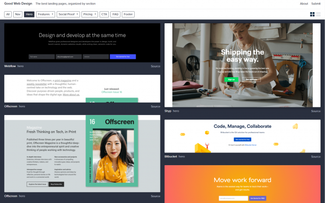
Good Web Design is a service dedicated to collecting the best landing pages. Not limited to that, the developers also focus on details, such as the best navigation bars, or the best CTA.
We all know curated screenshot collections of modern designs. They are a dime a dozen. Unfortunately, a lot of them have suffered from their creator's disinclination, and don't add any new designs, or add anything the users hand in. Eldorado for link builders.
[caption id="attachment_103108" align="alignnone" width="1024"]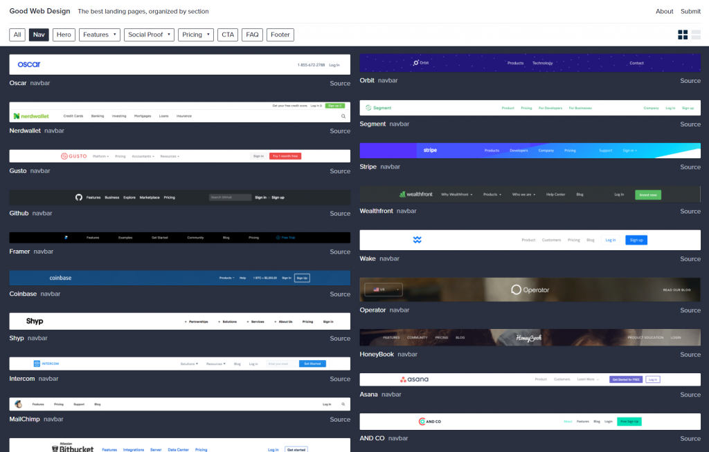 Good Web Design: Navigation Bars[/caption]
Good Web Design pursues a different approach. Firstly, the creators, Charlie Feng and Yitong Zhang, didn't get bored of it yet, allowing you to continuously find freshly curated pages. Furthermore, the two operators don't restrict themselves to the display of landing pages as a whole but also present more specific best practices, like the best CTA, the best FAQ, or the best navigation bars.
[caption id="attachment_103109" align="alignnone" width="1024"]
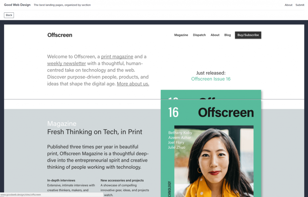 Good Web Design: Fullscreen Preview[/caption]
The service itself has a modern design, and the controls are intuitive. You can either display all entries chronologically or filter by keywords. The overview can be shown as a grid or as a list. Clicking an element opens it in a fullscreen view, but it's not a link to the original. This way, they make sure that the example presented as a best practice cannot be made nonsense of by potential changes to the original. The link to the source can be found on the bottom right of the preview in the grid and list view, behind the word "Source."
Aside from the option to filter individual topics using the upper navigation bar, you can use the tags of the respective preview at any time during surfing, allowing you to move through the supply associatively.
The submission of your own suggestions is appreciated as well.
 Good Web Design: Navigation Bars[/caption]
Good Web Design pursues a different approach. Firstly, the creators, Charlie Feng and Yitong Zhang, didn't get bored of it yet, allowing you to continuously find freshly curated pages. Furthermore, the two operators don't restrict themselves to the display of landing pages as a whole but also present more specific best practices, like the best CTA, the best FAQ, or the best navigation bars.
[caption id="attachment_103109" align="alignnone" width="1024"]
 Good Web Design: Fullscreen Preview[/caption]
The service itself has a modern design, and the controls are intuitive. You can either display all entries chronologically or filter by keywords. The overview can be shown as a grid or as a list. Clicking an element opens it in a fullscreen view, but it's not a link to the original. This way, they make sure that the example presented as a best practice cannot be made nonsense of by potential changes to the original. The link to the source can be found on the bottom right of the preview in the grid and list view, behind the word "Source."
Aside from the option to filter individual topics using the upper navigation bar, you can use the tags of the respective preview at any time during surfing, allowing you to move through the supply associatively.
The submission of your own suggestions is appreciated as well.