Global Web Design Trends: South America
We live in a global world that has an overflow of information. The Internet has given us access to very different cultures and allowed us to share much more information than ever before. But do different regions have their own specific Web design trends?
Design usually has to do with creating a product or service that targets a specific, local audience. However, thanks to the Internet, some design characteristics that are specific to local regions have become global, while other characteristics remain regional. Moreover, the laws of usability, at least for the Web, are universal, or at least based on common principles. This makes the process of learning about and designing for the Web quite similar throughout the world.
In this article, we'll showcase a bit of what we've been doing here in South America, identifying trends within the region, if any exist.


Web Design In South America
Brazil is the biggest country in South America. It's known for Carnival, soccer and beautiful beaches. So it's unfortunate that a country that produces such creative and happy people also has so many barriers to becoming a great Web designer (the main ones being a lack of design culture, slow Internet connections and almost no good courses or schools). The ones who succeed in the profession have a remarkable skill at solving problems in innovative ways, as Vitor Lourenco points out in our interview below. The profession of Web Designer is very new here in Brazil and still a bit unknown to some people and business professionals. Some very interesting progress has been made with regard to regulation of the industry, most notably the establishment of regional associations and the recent creation of the ABRADI, the Brazilian Association of Digital Agencies, which focuses on education and public awareness about what makes for good and bad Web design and development. Even though professionals are getting more organized and agencies are taking shape, there's still a lack of good schools, books and events about Web design and about design in general. All of these problems force us to look for references, books and information from other parts of the world. But because Brazil is very big and the only Portuguese-speaking country in South America, we face a big language barrier. This scarcity of information forces designers to rely more on their creativity and intelligence, which in turn opens them up to points of views that are different than what is shown in books, magazines and on the Internet. Again, as Vitor Lourenco points out, the ones who succeed have a remarkable skill at solving problems in innovative ways. Another big problem that designers face here is the lack of understanding among entrepreneurs of the importance of having a well-designed and well-developed website. A lot of kids working from home offer Web design services for prices much lower than what should be the industry standard, thus creating serious problems when it comes to businesses allocating budgets for Web design projects. You could say we operate in a somewhat hostile environment, then. But incredibly, the market is very promising, and some really talented designers and studios are doing incredible work, from totally Flash-based websites to big portals of information. And the industry will only evolve from here, and we look forward to that.Stats
- 128,652,435 Internet users as of December 2008. 33.0% penetration rate;
- 3.3% penetration, according to Internet World Stats;
- A resolution of 1024x768 and fixed layout are most common;
- CSS vs. Flash: it used to be very Flash-focused, but we notice that SEO concerns have changed the game in favor of CSS/XHTML-compatible websites.
Web Design Trends
In order to see whether specific Web design trends exist in South America, nothing could be better than showcasing a ton of websites! One noticeable trend that does seem to be emerging is a shift towards simplicity and SEO. So, take a look at some popular websites from our region in the showcase below.News Websites


Social Websites

Associations and Conferences


Design Studios


Type Foundries

Popular Designers and Their Porfolios


Blogs and Learning Websites


Web Apps and Online Services


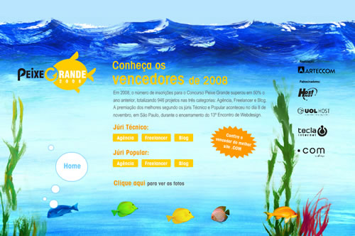
Flash Websites


Online Stores


Podcasts
- Webinsider
- BraincastTV
- Hora do Mac
- FalaFreela
- Nerdcast
- Podcast da Info
- Eupodo.com.br
- PodBrasil
- Argentina Podcasts
- Chile Podcasts
- Podcasts from Peru
- Jumpcast
- Interactivia - Colombia
Video
As you can see, identifying very specific Web design trends in South America is difficult. You could say the same about the rest of the world. Design will always be focused on delivering the best solution to a targeted audience, regardless of trends or technologies. One thing is pretty clear, though: Web design is moving towards simplicity, and if we could put our finger on a Web design trend, that would be it. Because of this, we conducted a short interview with the designer behind Twitter, the Brazilian Vitor Lourenco, one of the proponents of the law of simplicity within the Brazilian Web design community and now within Twitter.Interview With Vitor Lourenco
Vitor Lourenco is a 21-year-old user interface designer. Despite his young age, Vitor has already reached millions of people worldwide with his designs. He has worked on Twitter (the free social-messaging utility that is changing the way people communicate), Yahoo! (one of the most visited websites in the world) and Globo (the largest media company in Latin America). Question: Do you think that Brazil has its own specific Web design style and trends? Vitor: I don't think there's such thing as "Brazilian" design. The Brazilian culture isn't attached to a single influence. It's all about mixture and diversity. Moreover, design isn't about style or visual references. It's about solving problems and finding what works best, in terms of aesthetics and functionality, for what you're trying to build. Even if we did consider areas related more to visuals or art direction, it would still be hard to define what's Brazilian. However, I can assert that there's a lot of creativity around here. Because of all the constraints against someone becoming a great Web designer in Brazil (lack of design culture, slow Internet connections, almost no good courses or schools), the ones who succeed have a remarkable skill at solving problems in innovative ways. Question: Twitter is the latest Web sensation, and you were the designer behind its interface. Could you tell us a bit about your experience in working for Twitter. What were your goals? Vitor: I consulted for Twitter for about six months last year. I was the only designer involved in its latest major interface overhaul, which got rave reviews from users and the press. We simplified the UI by removing a lot of noise and unnecessary elements. Most of my ideas for that redesign were based on John Maeda's law of simplicity: shrink; hide non-essential functions; and embody quality to compensate for what's been lost. I also did a lot of work with the interface/visual design and front-end implementation, creating a range of different prototypes until we achieved the most compelling version, which then went through a lot of iteration and user testing. After consulting for Twitter, I spent six months at Yahoo!, where I was the User Experience Lead behind a cool new product they're launching soon. And now I'm back at Twitter, joining as a full-time employee on Monday, April 13th, to work with our amazing Creative Director, Douglas Bowman, on a mission to take Twitter's UI to a whole new level. Question: Could you share with us some Brazilian designers who you admire? Vitor:Contributors
This article wouldn't have been possible without the help of the following designers from South America who contributed links and valuable information. I'd like to thank you:- Paulo Antunes
- Vitor Lourenco
- Cristhian Serur
- Nicolas Gonik
- Cleuza Eleutério
- Ariel Fuggini
- Kitty Florido
- Gabriel
- Adrian Quevedo
- Ohmar Tacla

Thank, nice overview.
It may be the south american way of life but they all look so owerhelming, so much information on every site, however great and interesting collection!
Nice post! :-)
But I have a comment about Domestika and CristalLab, because they are not from South America; they are from Spain (Domestika is the big Spanish network of designers).
Nice post anyway! ;-)
Hi Fabio
You missed a great conference coming in October called SUDALA in Santiago, Chile. It showcase som great designers from Latin America, Spain and other parts of the world.
Check it out at sudala.cl
It seems to be a problem: By cultural affinity (not only liguistical), we’re obliged to put Mexico and the whole countries of Central America (sorry if I skip the list) in your post. Geography decided otherwise.
However, aesthetically, websites in Mexico are more likely to look like South American sites than North American sites.
So, I’m sad to see South Americans (as you Fabio) are not considering Mexican and Central American design as part of their Universe. You’re hurting my feelings :(
In the other hand, thanks for the post :)
You’re right egiova
It would be more correct to make a Iberoamerican design definition or Latin american.
Two good examples of Mexican designers with a clear Latin American identity would be:
Mr Kone > http://mrkone.com.mx/
Alberto Cerriteño > http://www.albertocerriteno.com/
These are some great websites!