Creativity With Skill: Showcase of Hand-Drawn Elements in Web Design
With the advent of technology, more traditional hand-drawn art has taken something of a back seat. Of course, you do find masterpieces, both classic and modern, in art galleries. But in general, many of the hobbyist artists among us have given up pencil and brush in favor of Photoshop and, at times, cameras.
In this article, we take a look at innovative usage of hand-drawn elements in web design. The pieces in this round-up are varied; some are minimal and clean, whereas others are mere sketches, but all show both creativity and skill. So without further ado, let's take a look at some awesome hand-drawn pieces that have been incorporated into web design.

Creativity With Skill
1. XHTML Cafe
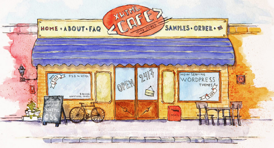
XHTML Cafe showcases a unique and intuitive design that appears to be just out of a comic book. The logo is displayed in the center, and since the name has "cafe" in it, the image portrayed is that of a cafe. If you look closely, you'll see that the logo has the navigation menu to its sides, and the window shows "Now serving: WordPress Themes". Plus, the specials' menu-board on the outside mentions 'dishes' such as XHTML and CSS.
2. The Neighbourhood
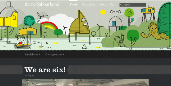
The Neighbourhood has kept the drawn elements in its header, where you see drawings of kids playing, tree houses and a rainbow. Perhaps something reminding us of an idealized neighborhood! If you scroll down, you'll find a gorgeous and nifty website with a blog.
3. Odosketch
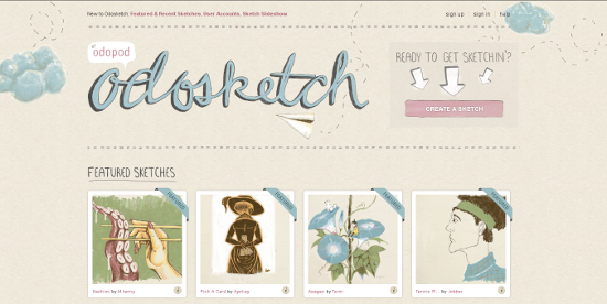
Odosketch is a product from Odopod that lets you create, well, sketches! The website shows featured and latest sketches, but the hand-drawn elements are best visible in the clouds on the header and the logo, which is followed by a paper plane.
4. Natrashka
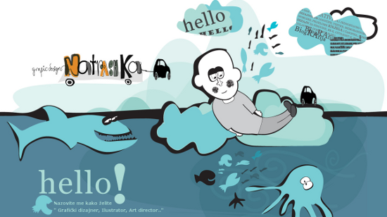
Natrashka is a well designed portfolio. You can see the imaginative inclusion of the drawings in the boy-caricature and certain other graphics as you scroll down the page.
5. Mel Kadel
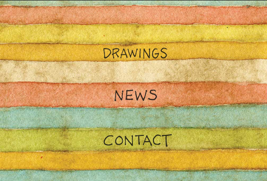
Mel Kadel uses a colorful background for the homepage, and if you visit the Drawings section, you will be presented with some awesome artwork.
6. Me & Oli
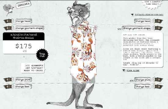
Me & Oli is a garment shop, and many of the drawings used in the website design are both inspiring and creatively included.
7. Li Chin's Showcase
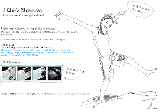
While Li Chin has moved the actual website to a different URL, you can see the gorgeous drawing on this page, right next to the text.8. Legwork Studio
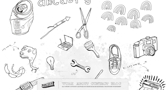
Legwork Studio uses drawings in a clever manner. As you keep scrolling down, you'll be greeted with hand-drawn items from daily life (i.e. cameras, scissors, brushes, light bulbs, coffee mugs, remote controls, and so on).
9. Kyle Steed
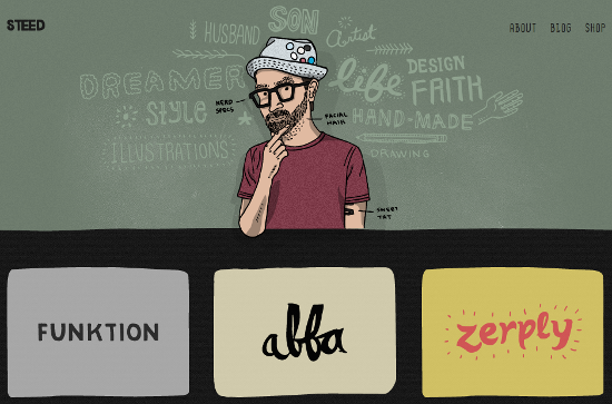
You can see drawn caricatures both in the header and footer of Kyle Steed's website. Also, don't forget the background text in the header describing Steed and his work.
10. Kutztown University (Communication Design Department)
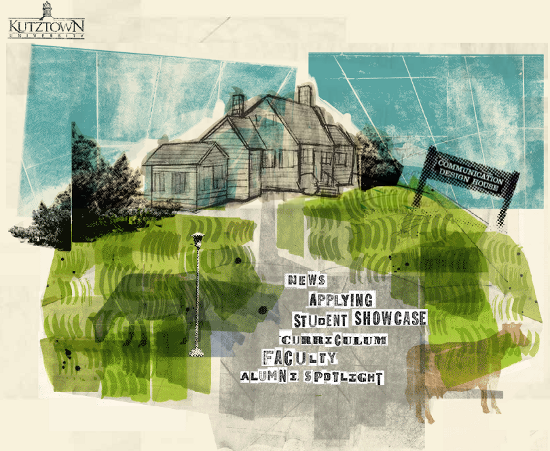
What better way to create a website for a design department than using mind-blowing design in the website itself? Kutztown University's Communication Design Department presents a no-nonsense homepage. Complete with links in the center and a stunningly beautiful drawing taking up rest of the page.
11. Kinetic V5
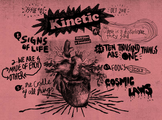
This is one website you HAVE to visit, regardless of whether you need science lessons or not. Simply keep scrolling down, and you'll be treated with one of the most unique combinations of website design and hand drawings.
12. Kevin Monger
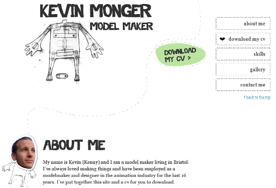
Kevin Monger uses drawings all throughout his portfolio, and intersperses them throughout the site to complement or highlight other elements.
13. Just Dot Media Services
Just Dot Media Services makes judicious usage of drawings in their website. You can see caricatures and cartoons associated with each text or portfolio segment.
14. STUDIOIMG.COM
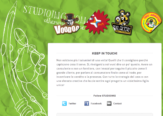
This is another site that made it into the showcase with its stunning and large background image that is hand-drawn.
15. Miki Mottes
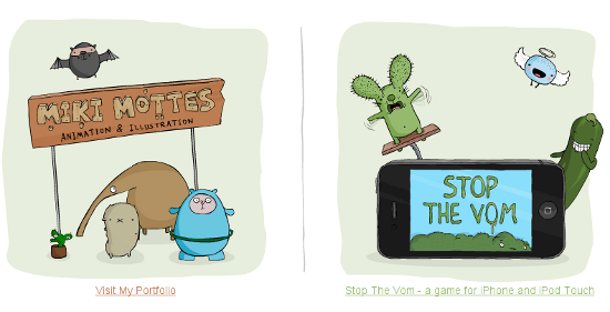
Miki Mottes uses cute drawings throughout the website. Simply head to the Portfolio section and treat yourself to amazing creativity.
16. Lucama
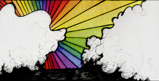
Lucama presents abstract and, dare I say it, pseudo-surreal artwork. As you click on the links in the header, the main picture on the page slides to make room for another, and so on.
17. Esteban Muñoz
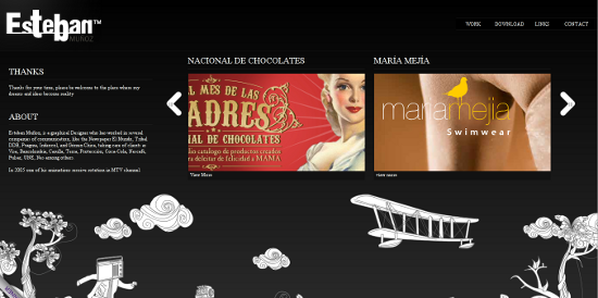
This website shows good drawings in the footer, which move as you move the cursor towards or away from them.
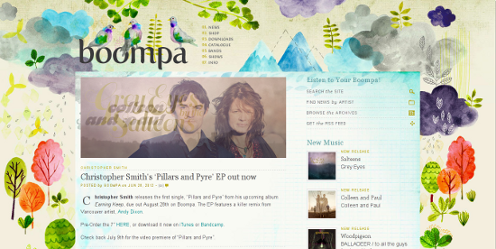
18. Boompa
If you like colors and have an appetite for websites with a beautiful background, you should check this one out. The website overall is just too beautiful to resist, all thanks to the wonderful background.
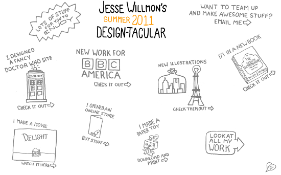
19. Jesse Willmon
Looking at the screenshot itself, you can conclude that Jesse Willmon's website makes prolific use of drawings. None of the drawings are anything that out of the ordinary, but they do portray simplicity done right.
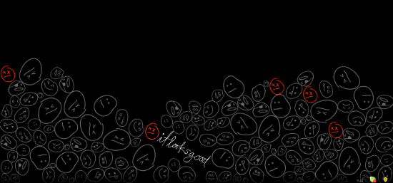
20. It Looks Good
The older version of It Looks Good uses several cartoon-type drawings against a dark setting, and the navigation related 'heads' are in red. The newer version, however, does away with this extravagance, but retains the cartoon 'head'.
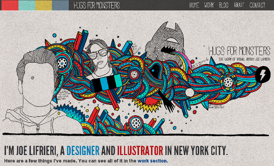
21. Hugs for Monsters
Hugs for Monsters is the portfolio of Joe Lifrieri. The header, as shown in the screenshot below, features good drawings and is definitely worth a look, be it for inspiration or simply fun.
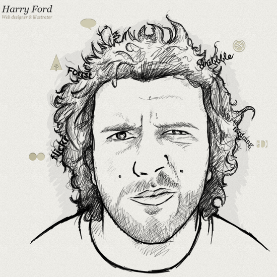
22. Harry Ford
Harry Ford's website has a drawing of a man, presumably Ford himself. If you look closely, you'll notice that social media links are in his hair!
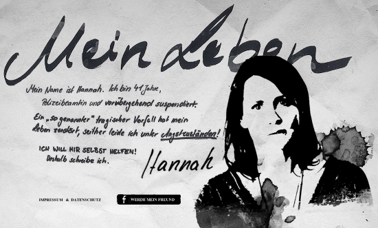
23. Hannah's Leben
This website showcases some amazing artwork and hand-drawn elements to complete the look, along with some wonderful typography.
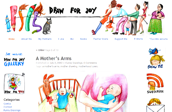
24. Draw for Joy
Draw for Joy -- doesn't the name speak to you? The website is a gallery of artworks, some of which are really nice to look at. Needless to say, this is a good pick for showing hand-drawn elements in web design.
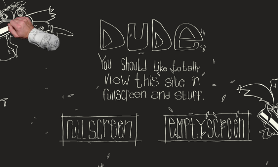
25. Bio-Bak.nl
Here, oddly enough, your mouse cursor is followed by an arm. However, the typography is interesting, and the two flying demons clearly show the creator's drawing talent.

Amazing web designs art list thanks sharing this :)
Crazy websites :) nice collection
really crazy website :) and Great Hand-Drawn Elements Web Design coool
Nice list! Thanks for the inspiration. Here is another good one to add to the bunch http://www.thefarmerandthechef.com
Maybe dropbox web page deserves a place on this list. They mixed handmade icons with traditional images and backgrounds.
I am looking for a graphic artist to create our company logo, Is this something
you would be interested in?
One more: http://highonpixels.com
Wow we are loving the creativity here. the XHTML cafe and Kutztown does it for us, inspirations for a web design comes at a price in today’s living.
Great inspiration. I think Kyle Steed has pulled it off the best in these examples. It’s subtle but effective.
It’s a shame I’m not a great drawer – I better get practicing!