5 Trends in Personal Portfolios
Although traditional CVs are still in demand, it seems that web-based personal portfolios are becoming a new tool for presenting and promoting yourself.
Artists of different professions emerge from the shadows of their companies and agencies. They make a statement. Not only do they express their personalities and show off the skills but also establish themselves online almost like a brand. If you are one of those who wants to give a taste of your quality by means of your personal portfolio, then there are five trends to remember include.


One-page website
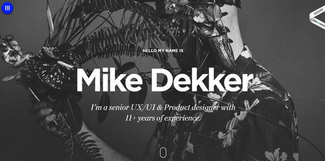
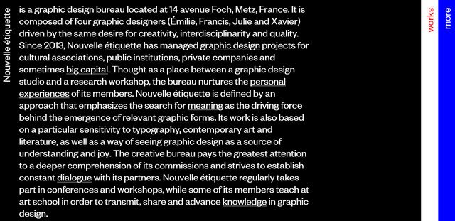
When it comes to ingenious personalities with a wealth of experience, which can’t wait to burst out, it is hard at times to use just several words to describe yourself. We all intend to show off to stand out the competition. However, visitors never read - they scan, so the approach of “brief and to the point” is the best solution. The one-page website is its incarnation and is widely adopted by artists today. It can be a classic long page website with a linear structure (like in the case of Mike Dekker’s personal portfolio) that coherently reveals all the essential stuff such as works, biography, services, contacts. Or, it can be a zingy and nifty one screen website (like in the case of Nouvelle Etiquette) where all the information is vigilantly located within the free space granted by the monitor.
Image source - Mike Dekker’s personal portfolio

Image source - Nouvelle Etiquette
Creative Works Sections
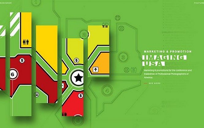
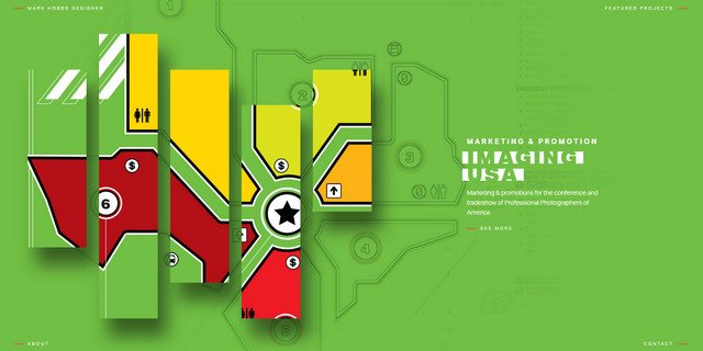
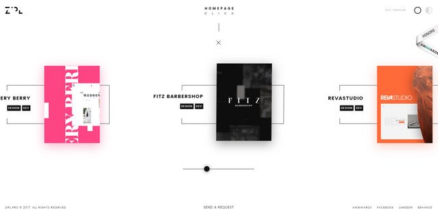
The works and case studies are aimed to promote you as an artist. They usually speak louder than words and make a rather great impression - that may seem to be sufficient to win over the potential clients; nevertheless, no one forbids you from making the portfolio section even more exciting. The tendency is that many artists these days turn to unique methods of displaying their works ditching boring and hackneyed grid-like presentations. They apply different effects, experiment with layout and adopt extraordinary solutions. For example, Mark Hobbs shows his exceptional designer’s and developer’s skills by coming up with such an outstanding interface; and Zipl Web Studio has injected some new life into the basic horizontal slider giving each piece an outstanding high-tech look.
Image source - Mark Hobbs

Image source - Zipl Web Studio
WebGL in Welcome Area
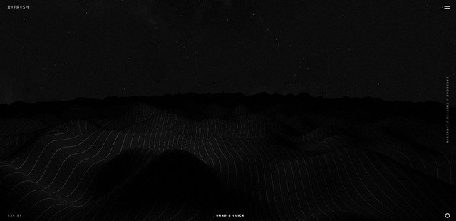
WebGL stands by numerous mind-blowing projects. Even despite the fact that it can “upset” your browser, it is increasingly popular. Being quite impactful, predictably, it, as a rule, occupies the “welcome” area where it can produce the most profound effect and make the first impression even more persuasive. However there is one thing to bear in mind: with great powers come great responsibilities - make baby steps with WebGL to not fail your mission. Great examples to follow are Wanaka and Refresh Studio. The latter one goes for a popular wave-like behavior, which does not cease to amaze, whereas Wanaka mixes and matches 3d elements making experience interesting and engaging from the get-go.
Image source - Wanaka

Image source - Refresh Studio
Dark coloring
To paraphrase Coco Chanel: “You can never go wrong with a little black interface.” Black is a universal color that makes an excellent pair with almost any other tone. It exudes elegance and refinement and at the same time mystery and modesty. It is one of the favorite options among the creatives these days. Both NYon Design and Julien Lozingue competently play with the contrast striking the harmony in the primary color scheme. Their interfaces look stylish, intriguing and extremely polished.
Image source - NYon Design

Image source - Julien Lozingue
3D
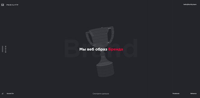
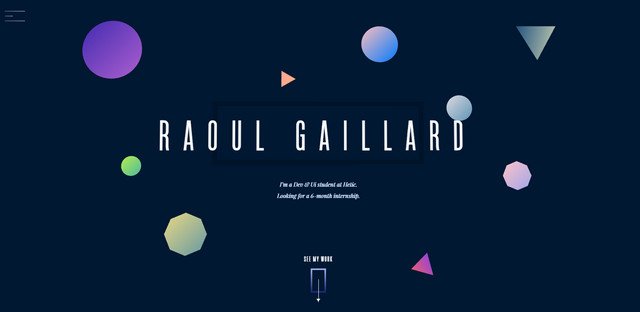
Use of 3D in web design, especially in the personal portfolios, is highly multi-faceted. With Three.js, everyone wants to try their hands in mastering it. However, not only has an animated 3D computer graphics been featured on the cover, but also straightforward and light solutions like parallax that gives any scene a subtle hint of dimension. The Facility Team pushes their limits making the hero section entertaining with some 3D animations; while Raoul Gaillard proves once again that time-proven parallax can be a nifty solution.
Image source - Facility Team

Image source - Raoul Gaillard

Thanks For Great Post .