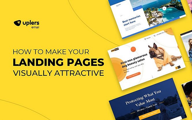
How to Make your Landing Pages Visually Attractive – [Infographic]

Landing pages are like gateways to conversions, if done right. Rather than having a wall of text on your landing pages, it is always better to have impactful visuals that would engage the prospects and encourage them to take the next action. Too much text does not only clutter a landing page but also contributes to the high bounce rate.
According to a study, content with visuals is viewed 94% more than its counterparts and gets 180% stronger engagement. While it is important to use the right tone and persuasive language, visuals play an equally important role when it comes to landing pages.
This brings us to the very important question of HOW to add relevant visuals that can bring out the best from your landing pages.
1. Impressive images
80% of readers pay more attention to the content if there are images supporting it. You can use visual cues on your landing page to direct the subscriber to take the required action.
2. GIF animations
GIFs are the perfect amalgamation of a video and slideshow of static images. They have gotten immensely popular in recent times which is evident from the fact that 500 million active users spend 11 million hours viewing GIFs on GIPHY. These animations can help you present your product in different angles or let the reader know about the huge range of products available on your eCommerce website. Just make sure that the size of your GIF is not more than 1MB as it can cause the page to load slowly and lead to an increased bounce rate.
3. Explainer videos
Videos in landing pages can increase the conversion by 86%. However, this is possible only if you use relevant videos that reflect the brand personality and convey the message. Adhere to the inverted pyramid technique when you strategize the design of your landing page (as shown in the image below). It will help you drive better conversions.

90% of users prefer video content and that’s the reason why savvy marketers prefer to use it in their landing pages. You can even go a step ahead and add personalized videos to your landing pages with the help of tools like Vidyard or other alternatives.
4. Demonstrative illustrations
The latest survey has revealed that 95% B2B buyers want shorter and highly visual content. In light of this trend, abstract art has gained momentum and ideas are getting represented in a graphic manner through modern designs. Just bear in mind that you do not use any images or illustrations directly from the stock as it will hamper your brand credibility.
5. Informative graphs
If you want to give the readers an overview of some facts and figures or complicated statistics, you must know when to use infographics for your page. Graphs can also be a great option for you. To showcase trends over the years, you can use line charts or bar graphs while pyramids and pie charts work well to show the proportion of elements.
How will you choose the right colors?
Selecting the right color is of utmost importance as it can affect customer psychology and get him or her to take the decision.
For example, white stands for purity and minimalism. It is a great choice for non-profit organizations and medical facilities.
Red, being the color with the longest wavelength in the spectrum gets noticed even from a distance. It represents power, passion, intensity, love, and heat. Have you noticed how McDonald’s and Burger King both have these colors? Many FMCG brands choose to use it in a combination with white and yellow.
Blue conveys the emotions of calmness and peace. It is used for legal services.
To learn more about using the right visual elements and CTA designs in your landing page to drive maximum conversions, head to this insightful infographic put together by our friends at Email Uplers: A Deep Dive Into The Use Of Visuals In Landing Pages.
 Source: How to Use Visual Elements in Landing Page to Boost Conversions

Hi Kevin,
Thanks for sharing this amazing content. In my opinion, Good looking themes and infographic content will give a great user experience. Thanks again, Kevin.