What Can You Learn From Web Design Of Fortune 500 Companies? (Infographic)
Don't you carry a positive prejudice when you hear the word Fortune 500? Hey, these companies are the most successful, the best of the best, the créme de la créme. And as they are so successful, probably everything they put their fingers on turns to gold. Now wouldn't they guarantee for an awesome example in web design? Probably not...

Infographic-Sunday: Not So New Facts About Not So Many Companies
Anyway, a learning process can be induced from both sides of the tunnel. Learning from best practices is as valuable as learning from worst practices. To distinguish one from the other is where it starts getting tricky.
The following infographic by Go-Globe is based on a study, advertising agency Moosylvania carried out quite some time ago, while the graphic is new. The advertisers from Moosylvania wanted to know if websites of Fortune 500 companies stand out from the crowd and if yes, then why. So they picked the Top 30 out of the 500, claiming that this sample would make for a valid spot check base as the Top 30 are from diverse industries thus addressing a broad range of different target groups.
That study was later picked up by web design agency Go-Globe and molded into the infographic you'll come to see below this post. So, before we have a take on the results, we need to keep in mind, that despite of the title suggesting otherwise, we are not looking at the design of the entire Fortune 500. And, despite the infographic being rather fresh, it consists of results of a study carried out two years earlier.
This doesn't render the infographic worthless and this is why I present it to you. I went through the results and in my opinion, they still stand on solid ground. Also, this gives me the chance to weigh in lots of my own experiences and insights.
Big Companies Don't Like Too Much Innovation
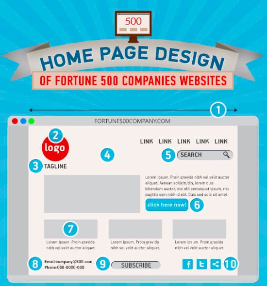
Again, the heading reflects my thoughts on the matter. As you can distill from the infographic, there are a lot of resemblances and established looks. The design concepts are altogether more on the conservative side and stick to concepts known from desktop software:
- Logo on the top left
- Menu at the top
- Search box right under the menu bar, top right
You can call that conservative and have that negative taste to it. Or you can call that conservatively clever. I like these standards as they help to not make people think. Just today I had to make my way through a website of a web design agency sporting such an exceptional navigational architecture that I lost my interest half way. They may be very proud of standing out from the crowd and being able to achieve the most unusual. But, their clients to-be will not award them prizes. Maybe some obscure design pope will...
This way it is less astonishing than you might think at first sight, that big companies do not rely on extravaganza. Make your way through the infographic to get confirmation that a clean standards based web design with a modern approach still is the way to do it. Push aside all the whistle-blowers who tell you that you must dive into the extraordinary to become successful.
If you are like me, you'll certainly agree that success is measured rather in terms of bank balances than in terms of the number of design prizes awarded. It is rather seldom the case that these two factors relate...
Have fun with the infographic by Go-Globe, based on Moosyvania's findings. Clicking on the image leads you to the source, where they provide you with a slightly higher resolution:
(Source: Go-Globe | Moosylvania)


The above design clearly explained how to design the home page for new designers. Follow the standard format to design the home page and attract the customers. The average size of the home page may vary because if we use more images in the home page it will increase the size.
As we all know the home page of any website matters a lot and the above given format is a standard format. Thanks for sharing this useful information.
Great insights, can be very helpful!
No mention about responsiveness though.