50 Beautiful Blog Designs From All Over The World
Blogs have become one of the primary sources for daily updated information around the web. This has developed to such an extent that major newspapers and magazines, which are the primary sources of public information, have all upgraded they websites to blogging systems. Blogs are a very convenient way of offering fresh information due to the fact that they are extremely flexible and updating the content is fairly easy. Besides content, which is and always has been king, blogs need to attract their readers through looks. A good-looking website with great information is way more comfortable to read than a uglily user-unfriendly one with the same quality of information. To reflect that fact and to give you a good idea of what your creativity should come up with, we decided to inspire you with the following collection. Below there are 50 beautiful examples of inspiring blog designs.
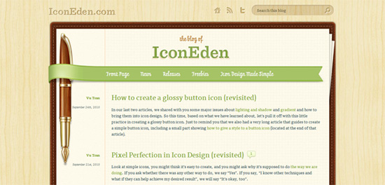 An elegant design lead to perfection. The blog is in the form of a notebook with a beautifully detailed pen to the left.
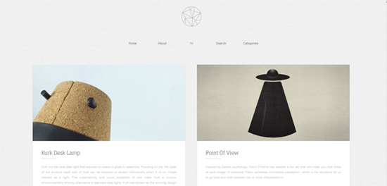 One of the most amazing minimal designs for a blog. The homepage features only a row of links, a logo and a series of posts. Scrolling activates 3 small buttons to the left, a back to top button, the search and the categories section. The website also features parallax scrolling.
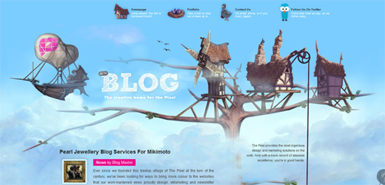 The Pixel sports a beautiful illustration design, with the footer being the ground and the header being a series of tree houses. The blog posts and sidebar sections are branches of the tree.
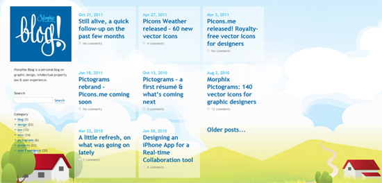 Morphix carries another lovely design based on illustrations. The cheerful color usage inspires happiness and well-being. The posts are also interestingly placed in a grid structure.
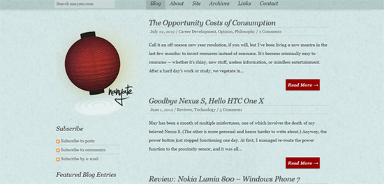 Nanyate blog is based on a minimal design with a lovely stained blue background. The sidebar is located on the left and includes a great tag cloud. The website navigation and search is placed at the top and is floating on scroll.
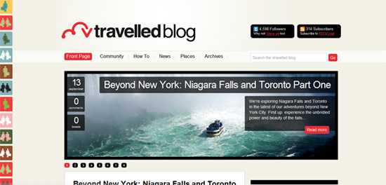 vtravelled: The Virgin Atlantic travel blog features one of the most innovative forms of displaying the tweets from their account. The left side of the blog features a moving conveyor of minimal traveling people icons. Each of the icons is a tweet revealed on mouse over. The overall design of the blog is precise, rounded and elegant.
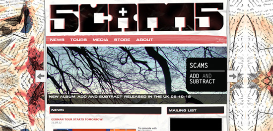 The overall feeling of Scams' blog is one of colored brush strokes on a crumpled piece of paper.
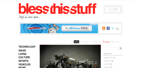 This magazine for guys, as they entitle themselves, features a minimal gray, white and red design with a beautiful, prominent logo to the top.
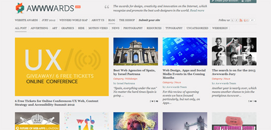 Awwwards blog is one of the most content packed blogs out there. As most of the websites they feature in their gallery, the blog looks great and features the latest submissions.
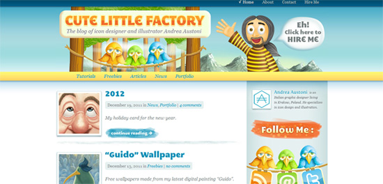 Cute Little Factory shows up in a beautiful and inspirational cartoon-like design by Andrea Austoni, known in the design industry by the quality of his icon designs and freebies. A thing to look for is the beautiful 3 birds holding the RSS, email subscription and Twitter icons.
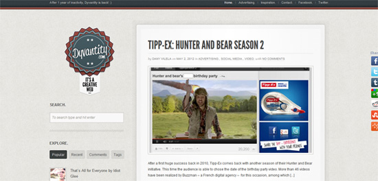 Dyvanity is a good-looking blog with a right sidebar. The design is defined by the large, beautiful logo to the left of the posts section and tabbed navigation. The use of web fonts gives the website a modern feel.
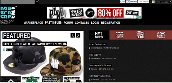 Probably one of the few blogs that has a loading animation, New Era Captalk impresses with even more features that you don't see every day in the blogging world. But I will leave that for you to explore.
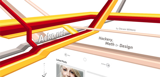 Acko features a 3D stripe design activated by scrolling. The 3D animation is so good that it actually makes you feel like you pass through the colorful stripes.
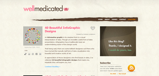 Well Medicated presents to its readers as a simple, yet well-made design. The top navigation looks as if it were situated behind the blog's mainpage and is only visible because someone ripped the mainpage open. Unfortunately the post frequency on this blog can only be called low, at best.
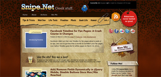 Snipe features a beautiful grunge design. The background of the main section of the blog is designed as a vintage piece of paper. The navigation is designed as a ripped cardboard held together with the paper background through a clip. Another noticeable aspect is the comment number section designed like a scotch tape over the post preview image.
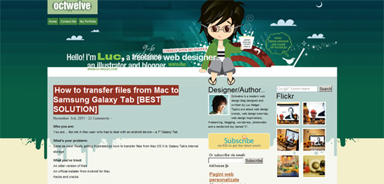 Octwelve impresses with the beautifully illustrated header of a child sitting on top of the blog.
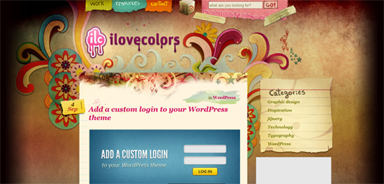 This blog has one of the best illustrated headers I have seen in a while. The main theme of the website makes use of paper-like backgrounds and sections. Speaking of sections you should check out the "Fresh Web" section which makes good use of sidebar space.
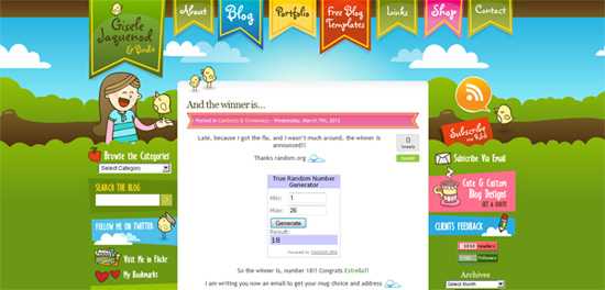 Gisele Jaquenod's blog has a lot of similarities with a website for little children. The cartoon-like illustrations and bright colors inspire a pleasant navigation experience. The footer area of this website is also a design masterpiece.
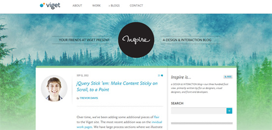 Viget Blog impresses with the beautiful use of the painted-like background. Also every post features a picture of the author to the left of the title.
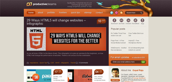 Productive Dreams is one of my favorite blog designs. The WordPress theme used by this website is incredibly precise and elegant. Not even 1 pixel is off to the left or to the right. Everything seems in place. Even the Facebook fan box is custom designed. Also noticeable is the footer tree with the other websites from the same network.
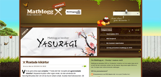 Matblogg is a Swedish blog with a unique bookshelf-like design. The background used is also very impressive.
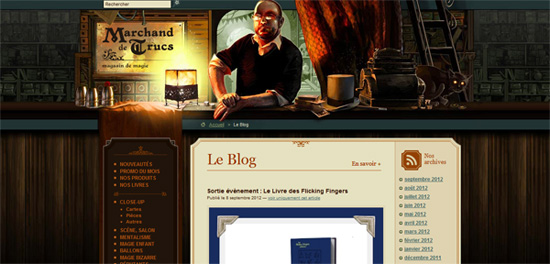 Marchand de Trucs has a mystic, almost Harry Potter-like atmosphere to it. The clever use of sound in the loading process makes you feel like you enter an antique shop.
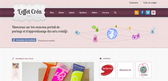 A lovely use of purple is exemplified by this blog. The elegance of this design is very hard to replicate. Even the shadows of the images are elegant. The color palette is carefully selected and the colors go together flawlessly.
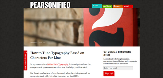 Pearsonified comes with a simple design, supported by a prominent featured image. The colorful navigation resembles the one of a plastic folder with multiple sections.
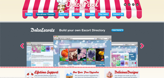 The blog of Dolce Pixel isn't - as the image would suggest - the blog of a pastry shop. Here you will find sweet WordPress themes and cookies. The overall feel of the website is what's impressive.
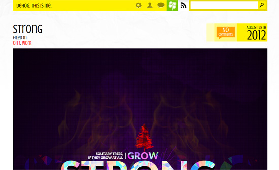 This is one of the most interesting blog designs in this list. The homepage features only one post dominated by a very large post image. The header is very basic, but the footer is something else entirely; very inspiring.
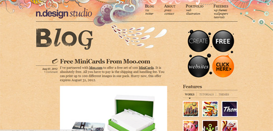 Probably this website, as Web Designer Wall, needs no introduction. They both belong to the talented designer Nick La. His use of illustration is impressive. The footer is used as an RSS aggregator for Nick's other websites.
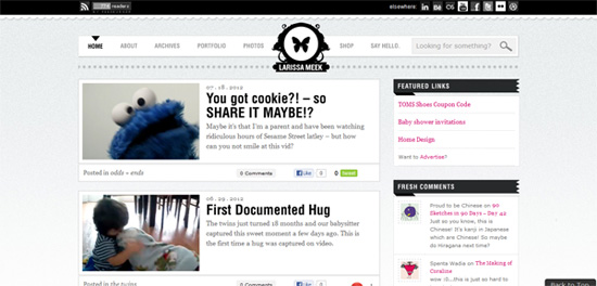 The blog of ex-bikini model and talented designer Larissa Meek is a testimonial to her abilities. I don't know if many of you were familiar with the previous design of the blog, which was equally impressive, and the successor doesn't fall short. The beautiful archive table in the footer is something that could inspire you in your next designs.
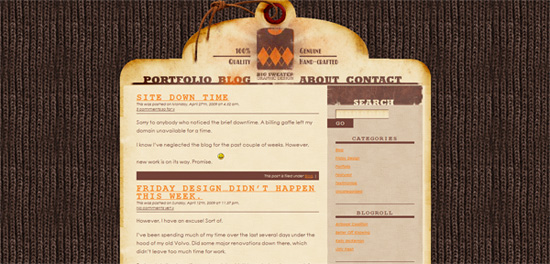 As the title of the blog suggests the overall design resembles a sweater. Well, actually the background. the main section is designed as a clothing label with burnt edges.
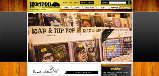 Horizon Records blog is a veteran of a blog, being online since 2005. The overall "music industry" feel is omnipresent and helps the blog reach its goal.
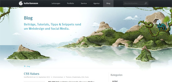 Kulturbanause is a German blog. The design is clean and simple. It impresses, just as the previous version did, through the beautifully designed header.
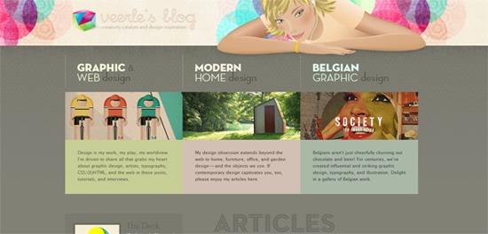 Veerle's Blog probably needs no introduction. In the community she's one of the most known designers in the world and her skills are plentifully shown in the design of the blog. A simple word is sufficient to describe the design and work of this artist: Amazing.
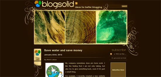 Blog Solid stands out through its amazing header design and unusual color palette.
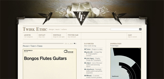 Twirk Ethic sports an elegant, clean design with an amazing header design and an overall vintage feel to it.
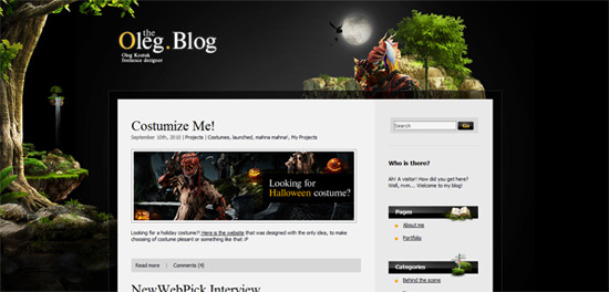 theOleg Blog makes use of a great background design to create a fairy tale-like mood. The ornamental footer also contributes to this atmosphere.
 Line25 is the second blog maintained by Chris Spooner. It features a very precise and mathematical design with an elegant feel to it.
 Robert Beerworth's blog is a very good example of a personal blog. The color palette is very well-chosen as well as the used background.
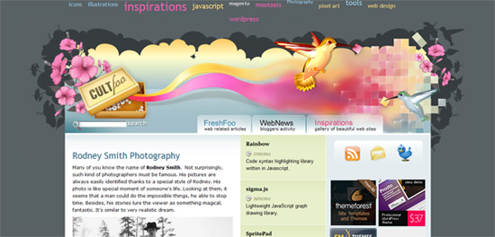 Cult-Foo has probably one of the best header designs. The tag navigation to the top is floating on scroll and the contact colibri bird in the footer is impressive.
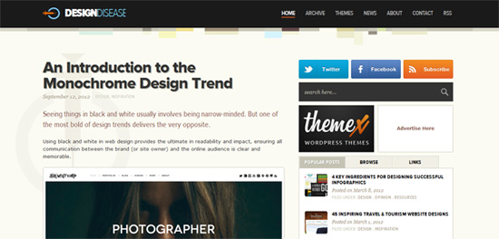 Design Disease are famous through their beautiful WordPress designs. Their own blog is a beautiful, simple and clean design with a great footer. The back to top arrow is something you should definitely look at.
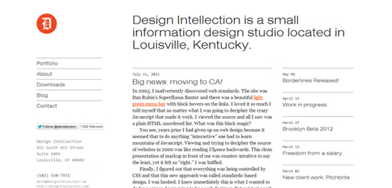 Design Intellection represents a beautiful implementation of the minimal design style.
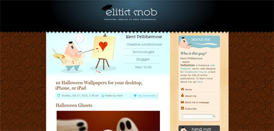 Elitist Snob is the love child of Kent Pribbernow. The style used is something between illustration and cartoon-like design. These elements are visible everywhere throughout the page, from the header to the sidebar.
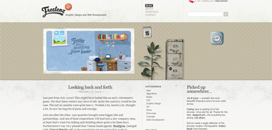 A warm and pleasant feeling is what crawls upon me whenever I visit this blog. The overall style is vintage and implemented beautifully here.
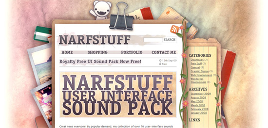 Narfstuff has a great design based on the illusion of paper. The result is pretty good, judge for yourself.
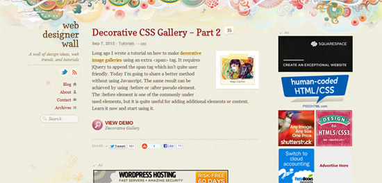 The fact that this is the second blog design in this list that belongs to Nick La says a lot. The man knows how to make a blog stand out. The same beautiful use of illustration is present here as well.
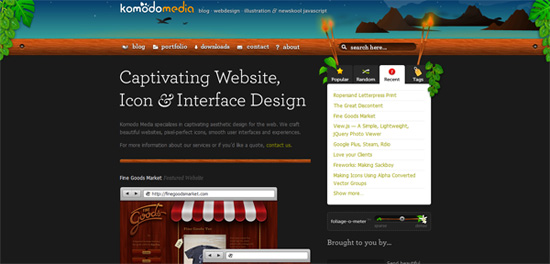 Komodo Media makes clever use of some JavaScript to modify its appearance. Although not functional, the visual impact is a nice addition to an already amazing website.
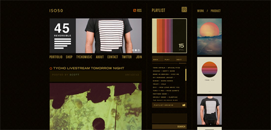 iso50 comes with a simple design using a dark color palette. The sidebar also includes a flawless integration of a music playlist.
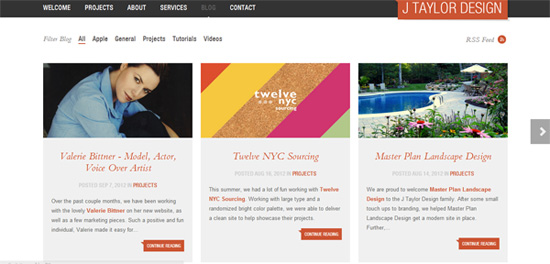 J Taylor features a full width clean, almost minimal design.
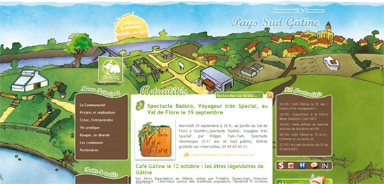 The background of this blog has a childish simplicity to it. The sidebar widgets to the left and right are seamlessly integrated into the design.
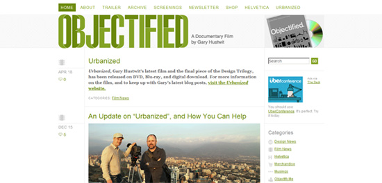 The first thing you notice about Objectified is the prominent green logo with a beautiful 3D effect. The rest of the blog's design is simple yet elegant.
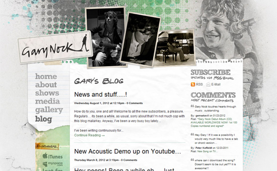 The blog of Gary Nock has a beautiful grungy vintage feel to it. You should check out the "Elsewhere" section.
Icon Eden
Defringe
 One of the most amazing minimal designs for a blog. The homepage features only a row of links, a logo and a series of posts. Scrolling activates 3 small buttons to the left, a back to top button, the search and the categories section. The website also features parallax scrolling.
The Pixel
Morphix
 Morphix carries another lovely design based on illustrations. The cheerful color usage inspires happiness and well-being. The posts are also interestingly placed in a grid structure.
Nanyate
 Nanyate blog is based on a minimal design with a lovely stained blue background. The sidebar is located on the left and includes a great tag cloud. The website navigation and search is placed at the top and is floating on scroll.
vtravelled
 vtravelled: The Virgin Atlantic travel blog features one of the most innovative forms of displaying the tweets from their account. The left side of the blog features a moving conveyor of minimal traveling people icons. Each of the icons is a tweet revealed on mouse over. The overall design of the blog is precise, rounded and elegant.
Scams
 The overall feeling of Scams' blog is one of colored brush strokes on a crumpled piece of paper.
Bless this stuff
 This magazine for guys, as they entitle themselves, features a minimal gray, white and red design with a beautiful, prominent logo to the top.
Awwwards Blog
 Awwwards blog is one of the most content packed blogs out there. As most of the websites they feature in their gallery, the blog looks great and features the latest submissions.
Tricky Enough
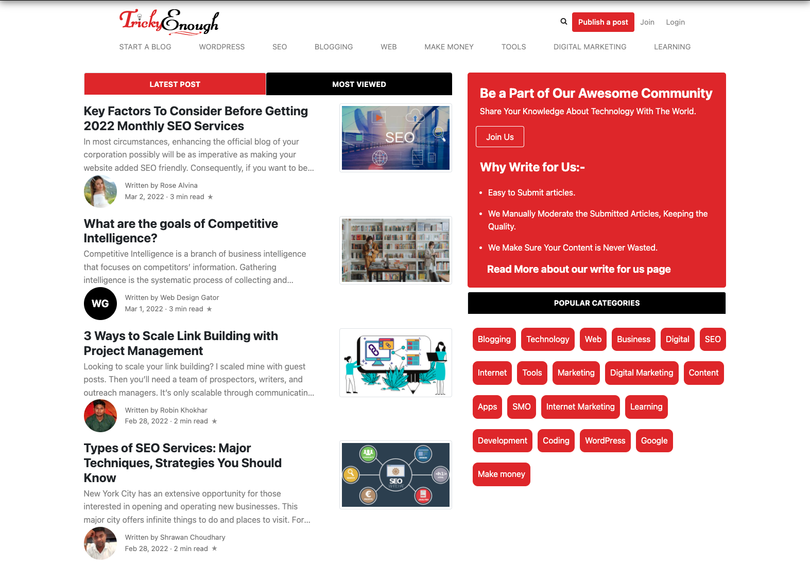
Tricky Enough is Platform where you can explore and write. It has a unique design and is accessible easily. The combination of red, black, and white make it different from others. The color combination attracts the users and gives them a smooth experience.
Cute Little Factory
 Cute Little Factory shows up in a beautiful and inspirational cartoon-like design by Andrea Austoni, known in the design industry by the quality of his icon designs and freebies. A thing to look for is the beautiful 3 birds holding the RSS, email subscription and Twitter icons.
Dyvantity
 Dyvanity is a good-looking blog with a right sidebar. The design is defined by the large, beautiful logo to the left of the posts section and tabbed navigation. The use of web fonts gives the website a modern feel.
New Era Captalk
 Probably one of the few blogs that has a loading animation, New Era Captalk impresses with even more features that you don't see every day in the blogging world. But I will leave that for you to explore.
Acko
 Acko features a 3D stripe design activated by scrolling. The 3D animation is so good that it actually makes you feel like you pass through the colorful stripes.
Well Medicated
 Well Medicated presents to its readers as a simple, yet well-made design. The top navigation looks as if it were situated behind the blog's mainpage and is only visible because someone ripped the mainpage open. Unfortunately the post frequency on this blog can only be called low, at best.
Snipe
 Snipe features a beautiful grunge design. The background of the main section of the blog is designed as a vintage piece of paper. The navigation is designed as a ripped cardboard held together with the paper background through a clip. Another noticeable aspect is the comment number section designed like a scotch tape over the post preview image.
Octwelve
 Octwelve impresses with the beautifully illustrated header of a child sitting on top of the blog.
ilovecolors
 This blog has one of the best illustrated headers I have seen in a while. The main theme of the website makes use of paper-like backgrounds and sections. Speaking of sections you should check out the "Fresh Web" section which makes good use of sidebar space.
Gisele Jaquenod
 Gisele Jaquenod's blog has a lot of similarities with a website for little children. The cartoon-like illustrations and bright colors inspire a pleasant navigation experience. The footer area of this website is also a design masterpiece.
Viget
 Viget Blog impresses with the beautiful use of the painted-like background. Also every post features a picture of the author to the left of the title.
Productive Dreams
 Productive Dreams is one of my favorite blog designs. The WordPress theme used by this website is incredibly precise and elegant. Not even 1 pixel is off to the left or to the right. Everything seems in place. Even the Facebook fan box is custom designed. Also noticeable is the footer tree with the other websites from the same network.
Matblogg
 Matblogg is a Swedish blog with a unique bookshelf-like design. The background used is also very impressive.
Marchand de Trucs
 Marchand de Trucs has a mystic, almost Harry Potter-like atmosphere to it. The clever use of sound in the loading process makes you feel like you enter an antique shop.
L'Effet Crea
 A lovely use of purple is exemplified by this blog. The elegance of this design is very hard to replicate. Even the shadows of the images are elegant. The color palette is carefully selected and the colors go together flawlessly.
Pearsonified
 Pearsonified comes with a simple design, supported by a prominent featured image. The colorful navigation resembles the one of a plastic folder with multiple sections.
Dolce Pixel
Dehog
 This is one of the most interesting blog designs in this list. The homepage features only one post dominated by a very large post image. The header is very basic, but the footer is something else entirely; very inspiring.
N.Design Studio Blog
 Probably this website, as Web Designer Wall, needs no introduction. They both belong to the talented designer Nick La. His use of illustration is impressive. The footer is used as an RSS aggregator for Nick's other websites.
Larissa Meek
 The blog of ex-bikini model and talented designer Larissa Meek is a testimonial to her abilities. I don't know if many of you were familiar with the previous design of the blog, which was equally impressive, and the successor doesn't fall short. The beautiful archive table in the footer is something that could inspire you in your next designs.
Big Sweater Design
 As the title of the blog suggests the overall design resembles a sweater. Well, actually the background. the main section is designed as a clothing label with burnt edges.
Horizon Records
 Horizon Records blog is a veteran of a blog, being online since 2005. The overall "music industry" feel is omnipresent and helps the blog reach its goal.
Kulturbanause
 Kulturbanause is a German blog. The design is clean and simple. It impresses, just as the previous version did, through the beautifully designed header.
Veerle
 Veerle's Blog probably needs no introduction. In the community she's one of the most known designers in the world and her skills are plentifully shown in the design of the blog. A simple word is sufficient to describe the design and work of this artist: Amazing.
Blog Solid
 Blog Solid stands out through its amazing header design and unusual color palette.
Twirk Ethic
 Twirk Ethic sports an elegant, clean design with an amazing header design and an overall vintage feel to it.
theOleg Blog
 theOleg Blog makes use of a great background design to create a fairy tale-like mood. The ornamental footer also contributes to this atmosphere.
Line 25
 Line25 is the second blog maintained by Chris Spooner. It features a very precise and mathematical design with an elegant feel to it.
Robert Beerworth
 Robert Beerworth's blog is a very good example of a personal blog. The color palette is very well-chosen as well as the used background.
Cult-Foo
 Cult-Foo has probably one of the best header designs. The tag navigation to the top is floating on scroll and the contact colibri bird in the footer is impressive.
Design Disease
 Design Disease are famous through their beautiful WordPress designs. Their own blog is a beautiful, simple and clean design with a great footer. The back to top arrow is something you should definitely look at.
Design Intellection
 Design Intellection represents a beautiful implementation of the minimal design style.
Elitist Snob
 Elitist Snob is the love child of Kent Pribbernow. The style used is something between illustration and cartoon-like design. These elements are visible everywhere throughout the page, from the header to the sidebar.
Freelenz
 A warm and pleasant feeling is what crawls upon me whenever I visit this blog. The overall style is vintage and implemented beautifully here.
Narfstuff
 Narfstuff has a great design based on the illusion of paper. The result is pretty good, judge for yourself.
Web Designer Wall
 The fact that this is the second blog design in this list that belongs to Nick La says a lot. The man knows how to make a blog stand out. The same beautiful use of illustration is present here as well.
Komodo Media
 Komodo Media makes clever use of some JavaScript to modify its appearance. Although not functional, the visual impact is a nice addition to an already amazing website.
iso50
 iso50 comes with a simple design using a dark color palette. The sidebar also includes a flawless integration of a music playlist.
J Taylor Design
 J Taylor features a full width clean, almost minimal design.
Communauté de Communes du Pays Sud Gâtine
 The background of this blog has a childish simplicity to it. The sidebar widgets to the left and right are seamlessly integrated into the design.
Objectified
 The first thing you notice about Objectified is the prominent green logo with a beautiful 3D effect. The rest of the blog's design is simple yet elegant.
Gary Nock
 The blog of Gary Nock has a beautiful grungy vintage feel to it. You should check out the "Elsewhere" section.

A great collections, great inspiration!
Lovely design collection. And your site?
You know, the half of those websites are a disastrous shit and not being updated from 2010. I love how the outdated design being proposed as *beautiful and other cool stuff*.
At least 1 of these is made of a typical themeforest wordpress theme by gorgeous designer Orman Clark.
Disastrous shit, that’s maybe a bit overreact, but most of this sites are indeed quite old and/or déjà-vu…
Most are very appealing. I like the use of colour and textures!
Very appealing collection ;) My favorite design is http://www.productivedreams.com/, really impressive
Very cool!
For the next showcase, could you link the thumbnails to the site in addition to the title?
Great collection of beautiful blogs, My personal favorite is Kulturbanause, I like the concept and blue color composition for this website.
Absolutely beautiful designs. Especially the 3rd one, just shows the importance of a powerful hero image.
Fantastic post however , I was wondering if you could write a
litte more on this subject? I’d be very thankful if you could elaborate a little bit more. Kudos!