The Importance of Creative Design For Mobile App User Experience
Just this spring, Apple revealed that more than 25 billion apps have been downloaded from its App Store. Add to that the 10 billion Android Market downloads announced at the end of 2011, and you’re looking at more than 35 billion apps downloaded cumulatively across both platforms. Clearly, consumers love their smartphones and the mobile apps they can get on them – but they can’t love all the apps.
With over a million different apps on the market, the competition is fierce. So unless you’re Facebook and pretty much guaranteed a ubiquitous presence on smartphones everywhere, you have to figure out how to make your app stand out. Having the next big idea might do it, but with the marketplace so saturated, that’s becoming increasingly difficult to do. New competitors are instead focusing on improving or redesigning existing ideas to make a better app.
One of the most effective ways of getting an app to stand out should be obvious, and yet many app developers don’t spend nearly enough time on it: creative design. What an app looks like is the first aspect people notice about it – even before they download it, and certainly before they test it out and see how it functions. That initial visual impression affects the entire user experience and will likely determine the ultimate success of an app.
If you’re doubtful, just look at Apple. Many people don’t realize that, despite now being a leader in the industry, Apple was actually not the first company to provide a mobile operating system or mobile apps. Before iOS, there were the likes of Palm OS, Symbian, Windows CE, and BlackBerry OS. And yet, like with almost everything else, Apple quickly surpassed the competition in the mobile market. In large part, this was because iOS simply looked better.
It set completely new standards for the role of creative design in the mobile app user experience arena; something that has always been one of the most basic foundations for all Apple products and services. And successful app developers have been smart to take a cue from the giant whose platform they’re building on. If you take a closer look at some of the top apps, you’ll see they tend to follow three general guidelines:
 As long as you keep your audience in mind, you can even forgo a bit of simplicity to make an app more exciting. Like when it comes to a drinking app. Take Brewski Me for example: every single design element – from background texture, to fonts, to buttons – took into account the preferences and interests of the target audience. It’s fun and flashy, but without compromising the simplicity or intuitiveness of the interface. There’s a reason it won the 2011 Best Beer App award.
For people outside of the app design process, User Experience (UX), a.k.a., how the app controls in the user’s hands, can seem a little nebulous. What exactly does it entail? Where does UX end and UI (user interface) begin? Do they ever cross over?
While they are two different disciplines, they are absolutely intertwined. UX defines the userflow and functionality of the product, while the UI is all about what visuals you see while using the app.
Some additional apps that do a great job of giving users an intuitive UX coupled with a stunning UI are:
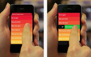
Clear
UX Highlights: Simple list of to-dos, gesture-based clearing of items, pull-down to add a new feature, pull-up to clear a finished list, and pinch to move through menu hierarchy.
UI Highlights: Bold, gorgeous colors. Beautiful chiming animations make you feel accomplished and keep you smiling. Vibrations upon choices give that little extra punch that you’ve completed something monumental. The usage of color coding to indicate priority is coupled with the work-as-you-expect it movement of items. Add in the different theme options, which grow as you install different applications on your device, and Clear is the end-all, be-all of to-do lists.
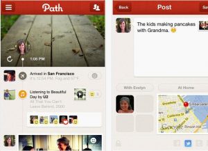
Path
UX Highlights: The springy menu at the bottom left, housing all of your action items, takes the place of the typical TabBar seen in most applications. Also the left-side slide-out navigation, which houses details about your user account is reminiscent of Facebook, but that’s okay because we think perhaps Facebook’s Timeline feature may have borrowed a thing or two from Path’s.
UI Highlights: Aside from the gorgeous graphics, all of the animations, interactions, textures, structure of information, loading bars and even the typing experience makes it easy to use. The parallax scrolling on the Timeline is particular mesmerizing.
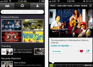
Miso
UX Highlights: With a TabBar at the top, Miso sets itself apart, but keeps important information always in a users view. The simple grid view for popular shows lets you find data quickly, and interior pages are laid out in an easy to understand fashion. The Check-In & Rate screens are some of the most straight-forward, intuitive around.
UI Highlights: Using a dark interface, perfect for not bugging other viewers around you, coupled with tiny little animation touches, Miso makes for a great viewing experience. Pull to Refresh unleashes a rainbow of fun!
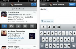
Tweetbot
UX Highlights: The account view pop-over allows for super-quick switching between accounts, great for experienced Twitter users. A slide-down sub-menu for each tweet makes replying or retweeting a pleasure. The custom icon bar at the bottom of a new tweet makes adding tags, photos even easier. By far the best Twitter application available.
UI Highlights: Everything? From the subtle textures used on the buttons and navigation bars, to the plethora of indicator sounds that let you know what the app is doing, Tweetbot is the sort of application you love to use - just because it’s so much fun.
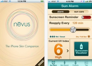
Nevus
UX Highlights: The most important features of a skin care app - what the UV Index is and when you need to reapply sunscreen, are given center stage. The Skin Record feature is intuitive, fun, with a straight-foward “compare to a penny” feature to track size. Password protecting skin records is a nice added feature.
UI Highlights: Simple, clean colors work well in the sunlight and communicate effectively. The design of the Skin Record chart is particularly straightforward, while attractive.
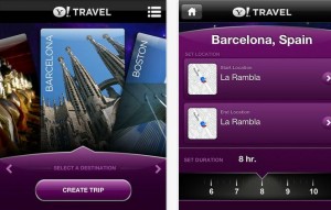
Yahoo! TimeTraveler
UX Highlights: The card-style destination city chooser is simple and effective. The spinning “duration” picker is a lot of fun to play with. Top navigation floats above content but is always available for users to utilize.
UI Highlights: Animations on the aforementioned card-style destination city choose is flawless. Beautiful colors and buttons lets the app feel like Yahoo!, but very distinct as well. Informational rows are clean, while giving you plenty of room between each stop to facilitate reading.
Just Landed
UX Highlights: Quick interface lets you enter the flight number, then tells you how when you should leave to pick up your passengers on time. All of this without any muss, or fuss. Just to the point.
UI Highlights: Clean and stunning interface. From clever little animations of turbines spinning to the distinctive time meter indicating how long until you should leave to the beautiful illustrations beneath each airport, this app makes you want to always volunteer to pick up friends when they arrive!
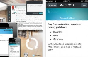
Day One
UX Highlights: Simple interface shows you what you’ve done and gives you access to everything. Concise list views and a simple writing interface.
UI Highlights: The epitome of clean. Nothing superfluous, only solid colors and subtle suggestions. The sounds make this app a stunner.
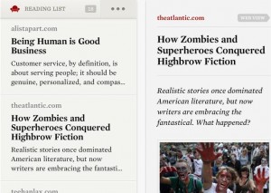
Readability
UX Highlights: Big, bold rows, with menu items hidden at the top so they don’t get in the way of reading. Controls for changing text-size are unique and intuitive. Layout of reading page is uncluttered and pristine.
UI Highlights: A classic style, with subtle textures and slight values of brown keep this app warm and inviting. From the subtle fade on the font-slider to the choice Hoefler & Frere-Jones fonts throughout, this app is the best way to read content on a consistent basis.
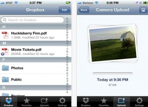
Dropbox
UX Highlights: Human Interface Guideline is friendly all the way. They keep it simple and it works.
UI Highlights: Custom illustrators for each of the sections before you’ve added anything into the mix. Clean use of icons and the strength to remain reserved when other uploading applications go overboard with visuals.
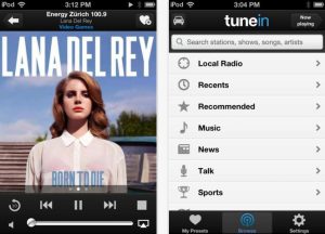
TuneIn
UX Highlights: Easy to understand icons and straight forward usage of the list view. Layout of the radio station page is great, with many features right at your fingertips.
UI Highlights: Use of warm colors coupled with dark backgrounds and navigation draws the eye directly where it needs to go.
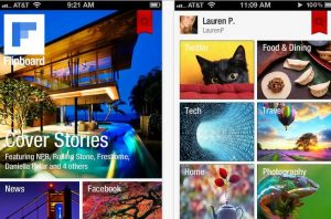
Flipboard
UX Highlights: From the now-classic grid-interface for news consumption, to the pull-down menubar, Flipboard gives you a high-level view of news & information. The “flip-up” paradigm with the interface is useful and entertaining. Keeping text in navigation elements to a minimum means you pay attention to the content instead.
UI Highlights: The moving images when you launch the application coupled with the clean, narrow fonts lets you know this app means business. Inside, the off-white background is easy on the eyes, while the usage of bold, vibrant photographs engage readers. Beautiful tutorial overlays add wonderful polish.
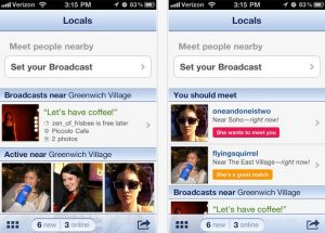
OkCupid
UX Highlights: The slide-up drawer TabBar is a fantastic way to handle multiple options. Large, easy to follow rows and layout make browsing simple. Photo gallery is intuitive and quick.
UI Highlights: Great loading animations, calming, comforting colors (nice to have in a dating app), with a clean, distinctive interface.
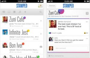
Stamped
UX Highlights: The color gradient picker for choosing your stamp color stands out as particularly amazing. The large new stamp button in the TabBar is to-the-point, and the simple icon-based filter works flawlessly with its pop-over tool tip.
UI Highlights: Subtle shades of white and gray, with splashes of color where they are needed. The large, narrow font helps Stamped stand out from most other check-in apps. Great animations and tons of style.
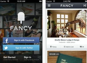
The Fancy
UX Highlights: A simple, elegant design that puts an emphasis on ease of navigation. Tapping the menu button in the upper left-hand corner of the screen will bring up a list of options. The browse button splits all 'Fancied' items into categories.
UI Highlights: Pleasant light blue and white theme. A selection of products can be purchased directly through the app’s effortless process.
Forget Web Design
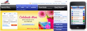
Mobile design comes with its own set of rules and expectations, so when you’re designing for mobile, don’t let the standards of web design dictate what you do. Sure, you should maintain consistency of look-and-feel across devices and stick to brand standards, but you also need to keep in mind conventions that have been established for mobile operating systems. A great example is how Southwest adapted its website to the iPhone. The mobile app incorporates design elements from the site, but has clearly been created to provide the optimal user experience on a smartphone:Keep it Simple
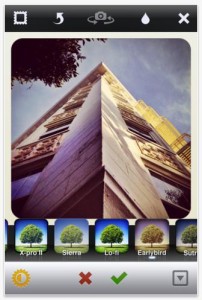
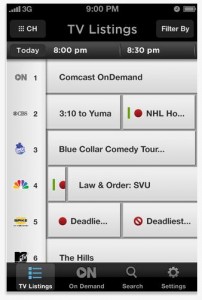
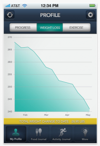
One of the biggest trends in mobile app design today is simplicity. Clean, intuitive interfaces that are easy to navigate and don’t try to be flashy. “Less is more” is not a cliché in mobile app design, but a standard. One of the best examples of this is the incredibly successful Instagram, which combined a great idea with a simple, easy-to-use design and intuitive functionality. Many new apps are doing the same thing, regardless of industry. Two examples are the XFINITY TV and Medi-Weightloss Clinics apps below.


Make it Fun
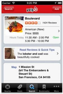
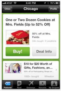
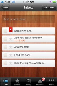
Have you ever heard someone say they don’t like fun? For mobile apps, this means incorporating things like bright colors, cool textures, 3D effects, fun buttons, and any of a thousand other options. And no, simple and fun are not mutually exclusive as long as you don’t go overboard. Just take a look at Yelp, Groupon, and Wunderlist – all popular apps that take advantage of interesting creative design elements while keeping the overall interface clean and simple:

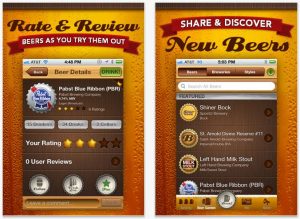
 As long as you keep your audience in mind, you can even forgo a bit of simplicity to make an app more exciting. Like when it comes to a drinking app. Take Brewski Me for example: every single design element – from background texture, to fonts, to buttons – took into account the preferences and interests of the target audience. It’s fun and flashy, but without compromising the simplicity or intuitiveness of the interface. There’s a reason it won the 2011 Best Beer App award.
For people outside of the app design process, User Experience (UX), a.k.a., how the app controls in the user’s hands, can seem a little nebulous. What exactly does it entail? Where does UX end and UI (user interface) begin? Do they ever cross over?
While they are two different disciplines, they are absolutely intertwined. UX defines the userflow and functionality of the product, while the UI is all about what visuals you see while using the app.
Some additional apps that do a great job of giving users an intuitive UX coupled with a stunning UI are:
Clear
UX Highlights: Simple list of to-dos, gesture-based clearing of items, pull-down to add a new feature, pull-up to clear a finished list, and pinch to move through menu hierarchy.
UI Highlights: Bold, gorgeous colors. Beautiful chiming animations make you feel accomplished and keep you smiling. Vibrations upon choices give that little extra punch that you’ve completed something monumental. The usage of color coding to indicate priority is coupled with the work-as-you-expect it movement of items. Add in the different theme options, which grow as you install different applications on your device, and Clear is the end-all, be-all of to-do lists.
Path
UX Highlights: The springy menu at the bottom left, housing all of your action items, takes the place of the typical TabBar seen in most applications. Also the left-side slide-out navigation, which houses details about your user account is reminiscent of Facebook, but that’s okay because we think perhaps Facebook’s Timeline feature may have borrowed a thing or two from Path’s.
UI Highlights: Aside from the gorgeous graphics, all of the animations, interactions, textures, structure of information, loading bars and even the typing experience makes it easy to use. The parallax scrolling on the Timeline is particular mesmerizing.
Miso
UX Highlights: With a TabBar at the top, Miso sets itself apart, but keeps important information always in a users view. The simple grid view for popular shows lets you find data quickly, and interior pages are laid out in an easy to understand fashion. The Check-In & Rate screens are some of the most straight-forward, intuitive around.
UI Highlights: Using a dark interface, perfect for not bugging other viewers around you, coupled with tiny little animation touches, Miso makes for a great viewing experience. Pull to Refresh unleashes a rainbow of fun!
Tweetbot
UX Highlights: The account view pop-over allows for super-quick switching between accounts, great for experienced Twitter users. A slide-down sub-menu for each tweet makes replying or retweeting a pleasure. The custom icon bar at the bottom of a new tweet makes adding tags, photos even easier. By far the best Twitter application available.
UI Highlights: Everything? From the subtle textures used on the buttons and navigation bars, to the plethora of indicator sounds that let you know what the app is doing, Tweetbot is the sort of application you love to use - just because it’s so much fun.
Nevus
UX Highlights: The most important features of a skin care app - what the UV Index is and when you need to reapply sunscreen, are given center stage. The Skin Record feature is intuitive, fun, with a straight-foward “compare to a penny” feature to track size. Password protecting skin records is a nice added feature.
UI Highlights: Simple, clean colors work well in the sunlight and communicate effectively. The design of the Skin Record chart is particularly straightforward, while attractive.
Yahoo! TimeTraveler
UX Highlights: The card-style destination city chooser is simple and effective. The spinning “duration” picker is a lot of fun to play with. Top navigation floats above content but is always available for users to utilize.
UI Highlights: Animations on the aforementioned card-style destination city choose is flawless. Beautiful colors and buttons lets the app feel like Yahoo!, but very distinct as well. Informational rows are clean, while giving you plenty of room between each stop to facilitate reading.
Just Landed
UX Highlights: Quick interface lets you enter the flight number, then tells you how when you should leave to pick up your passengers on time. All of this without any muss, or fuss. Just to the point.
UI Highlights: Clean and stunning interface. From clever little animations of turbines spinning to the distinctive time meter indicating how long until you should leave to the beautiful illustrations beneath each airport, this app makes you want to always volunteer to pick up friends when they arrive!
Day One
UX Highlights: Simple interface shows you what you’ve done and gives you access to everything. Concise list views and a simple writing interface.
UI Highlights: The epitome of clean. Nothing superfluous, only solid colors and subtle suggestions. The sounds make this app a stunner.
Readability
UX Highlights: Big, bold rows, with menu items hidden at the top so they don’t get in the way of reading. Controls for changing text-size are unique and intuitive. Layout of reading page is uncluttered and pristine.
UI Highlights: A classic style, with subtle textures and slight values of brown keep this app warm and inviting. From the subtle fade on the font-slider to the choice Hoefler & Frere-Jones fonts throughout, this app is the best way to read content on a consistent basis.
Dropbox
UX Highlights: Human Interface Guideline is friendly all the way. They keep it simple and it works.
UI Highlights: Custom illustrators for each of the sections before you’ve added anything into the mix. Clean use of icons and the strength to remain reserved when other uploading applications go overboard with visuals.
TuneIn
UX Highlights: Easy to understand icons and straight forward usage of the list view. Layout of the radio station page is great, with many features right at your fingertips.
UI Highlights: Use of warm colors coupled with dark backgrounds and navigation draws the eye directly where it needs to go.
Flipboard
UX Highlights: From the now-classic grid-interface for news consumption, to the pull-down menubar, Flipboard gives you a high-level view of news & information. The “flip-up” paradigm with the interface is useful and entertaining. Keeping text in navigation elements to a minimum means you pay attention to the content instead.
UI Highlights: The moving images when you launch the application coupled with the clean, narrow fonts lets you know this app means business. Inside, the off-white background is easy on the eyes, while the usage of bold, vibrant photographs engage readers. Beautiful tutorial overlays add wonderful polish.
OkCupid
UX Highlights: The slide-up drawer TabBar is a fantastic way to handle multiple options. Large, easy to follow rows and layout make browsing simple. Photo gallery is intuitive and quick.
UI Highlights: Great loading animations, calming, comforting colors (nice to have in a dating app), with a clean, distinctive interface.
Stamped
UX Highlights: The color gradient picker for choosing your stamp color stands out as particularly amazing. The large new stamp button in the TabBar is to-the-point, and the simple icon-based filter works flawlessly with its pop-over tool tip.
UI Highlights: Subtle shades of white and gray, with splashes of color where they are needed. The large, narrow font helps Stamped stand out from most other check-in apps. Great animations and tons of style.
The Fancy
UX Highlights: A simple, elegant design that puts an emphasis on ease of navigation. Tapping the menu button in the upper left-hand corner of the screen will bring up a list of options. The browse button splits all 'Fancied' items into categories.
UI Highlights: Pleasant light blue and white theme. A selection of products can be purchased directly through the app’s effortless process.


I’ve bookmarked this article.
Great post! I’m a big fan of Smashing Mag as well. Design is a differentiator!