Flash Isn’t Dead Yet!
It's been really popular lately for many professionals to dismiss the use of Flash. Many designers and developers push the idea to discontinue use of the almost 20 year old technology. There are a range of what seems to be problems from the heaviness of Flash projects, the inability to frequently update without tearing everything apart and the difficulty in creating a Flash website with great search engine optimization.
In the meantime, designers and developers are looking towards different technology such as JavaScript, Ajax, Silverlight, HTML5 and CSS3. Many of these technologies are actually wonderful alternatives as they are lighter than Flash and make it a bit easier to work around, as well as many are free and open source technologies. You also have the mobile device argument--where many devices don't make Flash available on most browsers. However, dismissing the use of Flash is extremely premature.
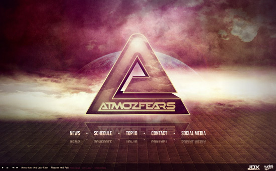 This website exemplifies how you can take a pretty good graphic and make it the centerpiece of an outstanding website. The interaction is much further than that of any other relevant technology without losing an audience.
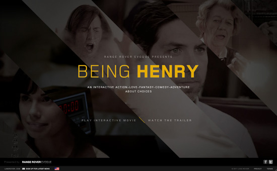 This is an extremely interesting and progressive concept. It's a movie, that allows you to choose your story line. This is an amazing idea, because there are books similar to this made popular for children! The use of Flash takes this type of interaction to a new level.
 Flash is used here to captivate and draw in the audience. It was also used as a great way to showcase some amazing graphics and ideas. The interface is super easy to understand and makes for an overall great website.
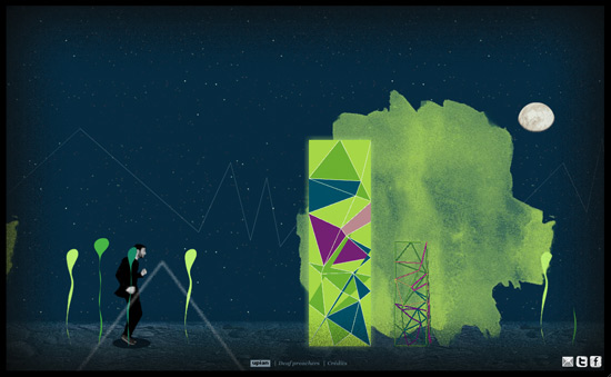 Musicians have always got to find a way to stand out from the pack and really make themselves noticeable. This website serves as an interactive music video for the artist. This is a GREAT way to get folks interested in their music as well as their brand.
 Eric Stanley's website is a typical showcase of his musicianship and artistry, however, it is taken up to that WOW factor with the use of Flash. This site focuses on good design with the special touch used via Flash.
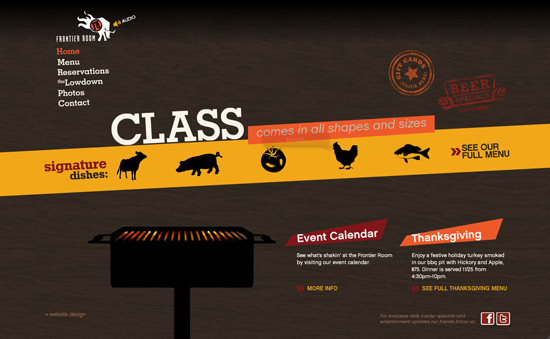 Another example of how Flash can take a regular idea (like a restaurant website) and turn it into something with a ton of character. From the loading screens to other elements, it definitely stays true to it's character and adds a bit of humor to their site. (Go to the reservations page to get a laugh out of the moo cow).
 The great thing about Flash is that there are little to no limits when we are talking about graphics. GT3 Creative did a superb job creating their own little interactive island for potential clients. They claim to be a creative company, why not be as creative as possible?
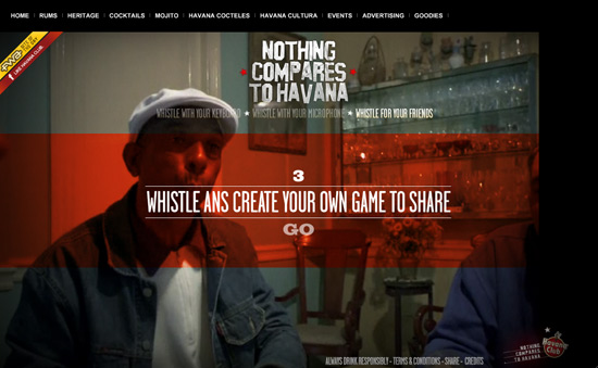 Aside from that blatant typo, this is another extremely interesting, progressive and interactive website. We had to see it to believe, but basically the site can connect to your microphone, and if you whistle you can navigate throughout the website. Pretty neat for those who can whistle.
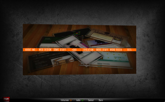 It's getting harder and harder to create a stand out portfolio that gets the attention of potential clients. So, instead of creating a simple website, Ivan decided to make his have a 3D navigational system. This is a simple, yet very effective use of Flash.
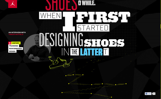 There are times when we visit websites just to get a bit of background history on a product and most times when you do that, you get a blurb on how amazing the company is and why the product rocks. Well, in this circumstance, Flash gets us a visually appealing interview on one of the most purchased shoes ever.
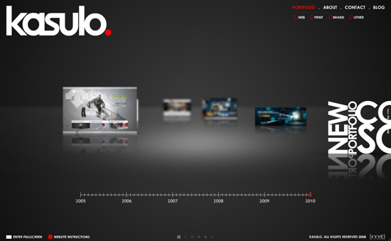 This is another great example of taking things to higher levels. The design is very good and the interface let's you travel throughout the timeline of this portfolio. This is another forward-thinking idea.
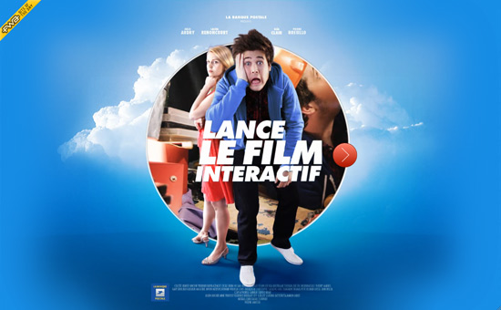 While we aren't French buffs, we can assume this is another one of those super neat interactive films. However, this site is a bit more graphical and Flash heavy than the former--and simply amazing. Sites like this really draw viewers in.
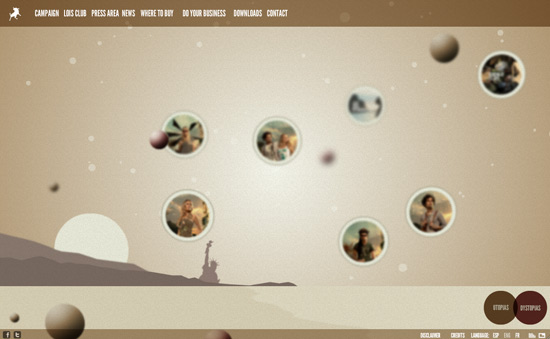 Another great example of crazy good graphics and stellar interactivity. This site is a bit simpler in it's graphic department, but the Flash is what gives it it's character. The interaction the mouse has with the entire site also contributes to this design.
 When you decide to purchase or create a cover for your telephone, wouldn't you like to see what your phone would look like? Have no fear, Flash is here! This website allows you to create a custom cover for your phone and see it in 3D.
 This is the website for a movie that really gets you involved and drawn in to the concept. Many times, folks say you shouldn't use a Flash type of intro, but it really gets you more and more interested in this film, much like an extended, super awesome trailer. Did we mention that it's interactive?
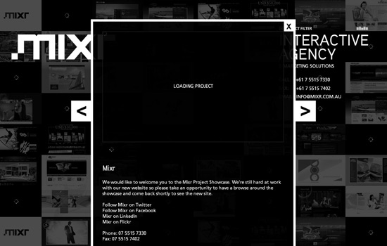 This is another great portfolio type of site that allows you two different ways to navigate through their featured projects. The use of Flash shines up the presentation a bit and makes this site fairly intuitive.
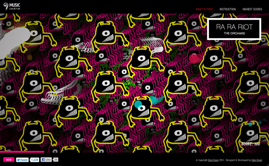 One of the most popular and probably most employed uses of Flash is to make games folks can play in their past time. Most games however don't pay a ton of attention to precise graphics, like this extremely addictive game.
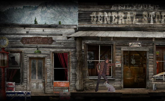 Neil Young is a pretty famous musician who is characterized by his ability to use personal lyrics and make you feel like he's holding a conversation with you through music. His store and website here almost attempt to do the same by inviting into a place in which he may have really resided or frequented.
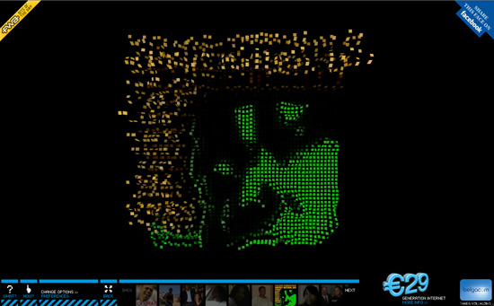 This seems to be an application that will convert you and your Facebook friend's profile pictures into a three-dimensional presentation. It's a pretty neat app that shows how Flash has the ability to interact with other entities on the web and come up with some pretty neat stuff.
 There's something about video that can get people interested in something more so than a bunch of different pictures. This site uses Flash to backdrop a handful of great athletes who use their product.
 This entire site is composed of pictures taken of the actual chocolate and hand drawn icons and typography. This website is completely thorough and goes to a higher level of branding and being consistent. See how it was made.
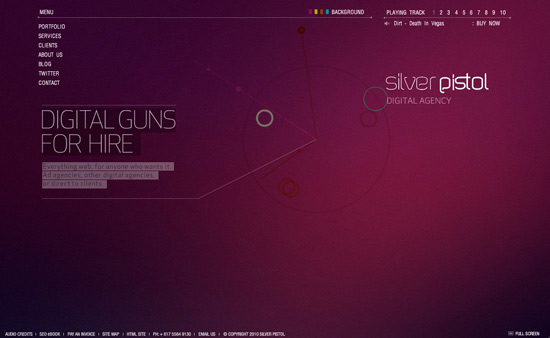 Graphics can really make or break a site, but great graphics with great user interface always wins. This website shows off the best of both worlds and uses Flash as a means to spice it up and give a little atmosphere/character with their audio choice.
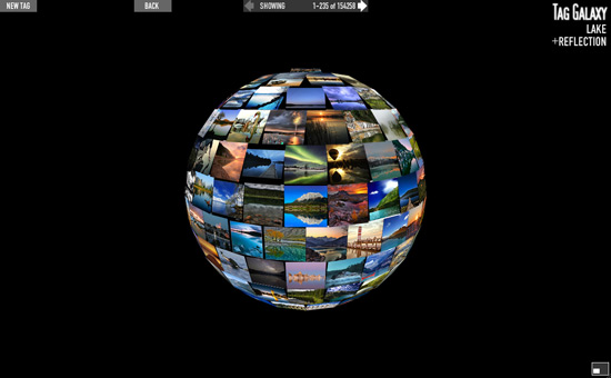 Much like 'The Profiler' site, this one connects to Flickr via tags and brings up whatever pictures you are looking for. This is a very useful site for designers that puts things together in a very visual and understandable way.
 One word: HILARIOUS. If you don't know about this guy, he's an American baseball player with an out of control beard and personality. What better way to make a baseball website than to feature him and an interactive beard?
 Once again, this is an example of using Flash to take what could be a pretty regular site into an amazing web experience. This travel photography type of blog is taken to new heights with it's graphic design and it's interactivity.
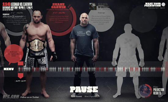 The UFC put together this site to help promote a past wrestling event, one that claimed to be the largest in their history. Fortunately for us, we can judge accordingly by looking at all the wrestlers and vote on what we feel will happen. This is a very well put together site.
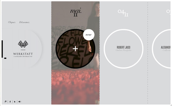 This example is another great and creative way to showcase a wonderful portfolio website. Instead of creating a nice grid type of view, this site intuitively scrolls side to side to allow you to see this artists work. On this site, Flash adds the extra creativity.
Flash Site Examples
Flash is still a necessary and great technology to use. Flash can really push the idea of your graphics forward and help come up with a great level of interactivity for audiences. Below is a list of some really great websites to look at, use and understand how useful Flash really is.Atmozfears
 This website exemplifies how you can take a pretty good graphic and make it the centerpiece of an outstanding website. The interaction is much further than that of any other relevant technology without losing an audience.
Being Henry
 This is an extremely interesting and progressive concept. It's a movie, that allows you to choose your story line. This is an amazing idea, because there are books similar to this made popular for children! The use of Flash takes this type of interaction to a new level.
The Bulitt Agency
 Flash is used here to captivate and draw in the audience. It was also used as a great way to showcase some amazing graphics and ideas. The interface is super easy to understand and makes for an overall great website.
Deaf Preachers
 Musicians have always got to find a way to stand out from the pack and really make themselves noticeable. This website serves as an interactive music video for the artist. This is a GREAT way to get folks interested in their music as well as their brand.
Eric Stanley Global
 Eric Stanley's website is a typical showcase of his musicianship and artistry, however, it is taken up to that WOW factor with the use of Flash. This site focuses on good design with the special touch used via Flash.
Frontier Room
 Another example of how Flash can take a regular idea (like a restaurant website) and turn it into something with a ton of character. From the loading screens to other elements, it definitely stays true to it's character and adds a bit of humor to their site. (Go to the reservations page to get a laugh out of the moo cow).
GT3 Creative
 The great thing about Flash is that there are little to no limits when we are talking about graphics. GT3 Creative did a superb job creating their own little interactive island for potential clients. They claim to be a creative company, why not be as creative as possible?
Nothing Compares to Havana
 Aside from that blatant typo, this is another extremely interesting, progressive and interactive website. We had to see it to believe, but basically the site can connect to your microphone, and if you whistle you can navigate throughout the website. Pretty neat for those who can whistle.
Ivan Moreno
 It's getting harder and harder to create a stand out portfolio that gets the attention of potential clients. So, instead of creating a simple website, Ivan decided to make his have a 3D navigational system. This is a simple, yet very effective use of Flash.
Jumpman
 There are times when we visit websites just to get a bit of background history on a product and most times when you do that, you get a blurb on how amazing the company is and why the product rocks. Well, in this circumstance, Flash gets us a visually appealing interview on one of the most purchased shoes ever.
Kasulo
 This is another great example of taking things to higher levels. The design is very good and the interface let's you travel throughout the timeline of this portfolio. This is another forward-thinking idea.
La folle journée de Julien
 While we aren't French buffs, we can assume this is another one of those super neat interactive films. However, this site is a bit more graphical and Flash heavy than the former--and simply amazing. Sites like this really draw viewers in.
Lois Jeans
 Another great example of crazy good graphics and stellar interactivity. This site is a bit simpler in it's graphic department, but the Flash is what gives it it's character. The interaction the mouse has with the entire site also contributes to this design.
I Make My Case
 When you decide to purchase or create a cover for your telephone, wouldn't you like to see what your phone would look like? Have no fear, Flash is here! This website allows you to create a custom cover for your phone and see it in 3D.
Martha Marcy May Marlene
 This is the website for a movie that really gets you involved and drawn in to the concept. Many times, folks say you shouldn't use a Flash type of intro, but it really gets you more and more interested in this film, much like an extended, super awesome trailer. Did we mention that it's interactive?
Mixr
 This is another great portfolio type of site that allows you two different ways to navigate through their featured projects. The use of Flash shines up the presentation a bit and makes this site fairly intuitive.
Music Can Be Fun
 One of the most popular and probably most employed uses of Flash is to make games folks can play in their past time. Most games however don't pay a ton of attention to precise graphics, like this extremely addictive game.
The Neil Young Store
 Neil Young is a pretty famous musician who is characterized by his ability to use personal lyrics and make you feel like he's holding a conversation with you through music. His store and website here almost attempt to do the same by inviting into a place in which he may have really resided or frequented.
The Profiler
 This seems to be an application that will convert you and your Facebook friend's profile pictures into a three-dimensional presentation. It's a pretty neat app that shows how Flash has the ability to interact with other entities on the web and come up with some pretty neat stuff.
Reusch
 There's something about video that can get people interested in something more so than a bunch of different pictures. This site uses Flash to backdrop a handful of great athletes who use their product.
Sagres - Preta Chocolate
 This entire site is composed of pictures taken of the actual chocolate and hand drawn icons and typography. This website is completely thorough and goes to a higher level of branding and being consistent. See how it was made.
Silver Pistol Digital Agency
 Graphics can really make or break a site, but great graphics with great user interface always wins. This website shows off the best of both worlds and uses Flash as a means to spice it up and give a little atmosphere/character with their audio choice.
Tag Galaxy
 Much like 'The Profiler' site, this one connects to Flickr via tags and brings up whatever pictures you are looking for. This is a very useful site for designers that puts things together in a very visual and understandable way.
Brian Wilson | MLB Always Epic
 One word: HILARIOUS. If you don't know about this guy, he's an American baseball player with an out of control beard and personality. What better way to make a baseball website than to feature him and an interactive beard?
The Place To Be
 Once again, this is an example of using Flash to take what could be a pretty regular site into an amazing web experience. This travel photography type of blog is taken to new heights with it's graphic design and it's interactivity.
UCF 116
 The UFC put together this site to help promote a past wrestling event, one that claimed to be the largest in their history. Fortunately for us, we can judge accordingly by looking at all the wrestlers and vote on what we feel will happen. This is a very well put together site.
Werkstatt
 This example is another great and creative way to showcase a wonderful portfolio website. Instead of creating a nice grid type of view, this site intuitively scrolls side to side to allow you to see this artists work. On this site, Flash adds the extra creativity.

The development of jquery has helped to rid of flash based websites. However, there are certain effects that you just can’t achieve without using flash. It’s disappointing that devices such as the ipad can’t read flash components; if so, the web would be so much more interesting.
Louis Slade
Some of the above comments still show that many people don’t understand the capabilities of these platforms. Flash supports multi-touch just fine, it also has access to device capabilities like the accelerometer and camera. Google has been able to crawl Flash content just fine since 2009 (http://bit.ly/4FXqyF). Flash Player 11 has direct access to GPU for 3D AND 2D applications, and it runs very nicely indeed (http://helloracer.com/flash11).
Saying you can replace Flash with a combination of ‘Javascript, PHP, HTML, CSS, jQuery, Ajax’ kind of underlines why Flash became and still is a popular platform, because you can develop applications with ONE language and toolset, across many platforms.
Anyone claiming it doesn’t perform well on mobile is very welcome to show me a like-for-like comparison of HTML 5 running faster on their device. HTML5 is a subset of what Flash is capable of, and the argument about Flash vs HTML5 is pointless; HTML5 is unevenly implemented across platforms and browsers, and in the same way I can’t view Flash content on an iOS device I similarly can’t view WebGL or CSS transitions, or WebM video on some browsers without (ironically) installing a plugin.
I’m happy to use and view rich content via Flash, HTML5 or anything that adds to my experience. Fighting over which platform is better is a waste of time – just build stuff, and stop trying to ‘kill’ technologies that enrich the web.
I praise your words, man! A glimpse of reason in an ocean of ignorance…
+1 to you sir. Finally someone who know what they’re talking about.
Flash is a niche product now, and may live on as that. As for the mainstream? It is already dead.
Long, long ago, long before SEO was a concern, long before icommerce became a major focus, the mindshare battle was ‘Netscape vs. iE. ‘ Sites optimized for IE could not be opened with Netscape.
When researching potential vendors on the early web, vendors whose site didn’t open in Netscape dropped off my evaluation list: if the company did not want to supply information in a consumable format, I reasoned that they probably were not willing to negotiate on anything else.
I wasn’t alone. Companies learned (often the hard way) that eliminating prospects because they used the ‘wrong’ browser was hazardous to their financial well-being.
Twenty years later, the lesson has still not been learned. If a site won’t provide information on my iPad, I can only assume that they don’t want me as a customer.
Sigh. The flash haters are out in force again.
Sure, Flash is being replaced by javascript and HTML5 in some instances (navigation, image galleries, video, etc.), but it still kicks total ass.
Can HTML5 provide on the fly variable bitrate options for video depending on bandwidth of the viewer? Nope. Flash can. HTML5 is still fighting the codec wars with various browsers.
What’s better at creating frame by frame animations? Yes, you CAN do it wthout flash, but it’ll take you 10 times as long, and often will use up more processing power. For complex interactions and animations, Flash is the only way to go. HTML5 is great, but it’s not the end of Flash by any means for the next 3-5 years.
Flash isn’t invisible to search engines either. I won’t go so far as to say it’s a good choice for content managment, but you can absolutely get content crawled and rank high with a site that uses flash. For many clients, I’ve found it to be a help, not a hindrance.
It’s been interesting to read through the comments and note the die-hard Flash supporters as opposed to those who prefer to work outside of Flash.
In my experience as a designer and dev, I have to say that there are instances in which Flash is the easiest, most efficient, least breakable way to add certain kinds of image presentation, animation, and user interaction. There are instances in which the best current solution is still Flash. Creating embedded, interactive videos, for example.
That being said – it has a growing number of drawbacks, including the fact that changing something within a Flash component and then re-embedding it requires much more time and skill than a simply HTML, Javascript, or CSS change, which makes it more difficult for clients to become responsible for updating their own sites and for designers to clear their plate and move on to the next project. I think a great many websites could be just as creative and effective, with the added benefit of browser flexibility (projector to 40-inch Mac to iPad to smartphone) without the use of Flash as a defining characteristic.
I think hbo is a good example of great usable website without the unnecessary “bells and whistles” that characterizes so many flash based sites
I agree that it should no longer flash, but still have not seen any website that using JavaScript, HTML5, CSS3, jQuery and Ajax, dates back the level of animation and visual impact that a good website in flash can provide. You should stop thinking about having complete web flash and only used for animated presentations.
Flash might be starting to look good now but it defiantly not great for your website. The whole content you put in the flash is lost in SEO terms, jQuery lets you do everything you can in Flash and its more SEO friendly.
@Dean Would you also consider it professional negligence to deploy a site based on WebGL or one that uses Webkit-specific transitions that aren’t supported in IE? Or to deploy a site that slows a user’s mobile to a crawl? That’s the reality of HTML5 right now – ‘best viewed in browser X’ messages, inconsistent support and implementations. Video codecs, sound, video acceleration and font aliasing are all examples of the current mess – having to cater for different browsers and devices is surely more work for a developer trying to implement a rich site? I agree that maintenance is a factor in favour of HTML-based content however, but surely the solution is to choose the best technology for the task and degrade or enhance gracefully, not to choose one over the other regardless? – no single technology is best at all things. The reality is I can’t view many HTML5 based sites on my iPhone – they either don’t run at all, or run badly. Saying Flash isn’t optimal on mobile, or that deploying it is negligent is a moot point when rival technologies only run equally or less well, or I can’t view them on my chosen browser. Negligence would be not providing alternative content.
@Sam – This is a myth continually thrown around by people who either ignore or don’t realise that Google uses a ‘headless player’ technology to parse Flash SWF textual content, and this technology has been in place since 2009. It’s correct to say jQuery etc is ‘more’ SEO friendly, but wrong to suggest the content you put in the SWF is ‘lost’ to Google’s spiders.
@Kirk – I don’t understand how this argument relates to Flash – ‘People were getting sick of waiting for uninspired animations and cheesy effects’ is going to apply equally to sites using HTML5/CSS/JS as it does to Flash as these technologies replace it. Your argument is against a particular type of implementation, not the technology that enabled it.
@Charbs @David Bushell Adobe makes its money from tools. HTML5/CSS etc represent an emerging market for them, hence Adobe Edge. It isn’t a statement of intent to ‘drop’ Flash, or that Flash is dying – the development ecosystem around the Flash Platform includes the open-source Flex framework and AIR, both of which allow developers to directly target desktops and mobile. Both are doing very well in the iOS and Android app stores, just as web-based technologies like PhoneGap are (Nitobi have also been acquired by Adobe). What Adobe is doing is implementing a multi-platform/channel strategy on tooling, and in the meantime, the Flash Platform is evolving – multi-threading, Unity support, Alchemy, Unreal engine, AIR on iOS etc. The browser plugin is now more focused on graphically-intensive applications like gaming, and no-one would argue for Flash for vanilla effects like transitions and simple vector animation when they are now possible in web technologies, but Flash Player is very much alive and kicking and moving forward, and the development platform and ecosystem around it have already moved way beyond the browser.
In the period since the HTML5 vs Flash debate began, Flash developers have been able to move onto platforms and markets like iOS, Android and Blackberry devices using the same language and tooling they have always used, using mature MVC frameworks, unit-tests and OO-based development. The browser plugin is one endpoint, but there are multiple others. It’s absolutely the correct thing to do to use jQuery etc. when appropriate, but you have to ensure you are using the correct tool for the job – in some case this is HTML5/CSS/JS etc, in others it’s still Flash. All these technologies enrich the web and devices, and have strengths and weaknesses. Flash has pushed what’s possible on the web forwards much more quickly than standards have been able to, and this is its strength – augmenting and enhancing what’s possible, leaving standards to take up the conventions it leaves behind. I think that’s a good thing.