Oozled: Fast Growing Resource Collection for Designers and Any Webworker
Who's to say that list posts are boring, noone would want to read them anymore? Only a few months ago, it was November 2013, design freelancer Dan Edwards wrote just that. He put up a list of resources over at Medium and titled his article simply "Resources". He curated 80 offerings, he found to be inescapable for any designer out there. The list raised loads of attention and grew continuously. In fact the list got so much applause, that Dan decided to transform the simple list into a full-blown web app. The result, strangely entitled Oozled, has gone online merely two weeks ago and it's growing even faster than its list predecessor...

Oozled: Simple Directory of Tools of All Kinds
Had the list, at least in its early versions, clearly been focused on resources for designers, Oozled opens up for all kinds of webworkers. With over 624 resources already available, it's more than doubled its size since the launch two weeks ago. The possibility to publicly submit new resources surely adds to that success. Note that new resources only get included after having successfully run through an editorial process. So, no worries, there's no garbage collected here.
More than 40 categories are intended to help you sift through the massive collection in a structured manner. The transformation from a Medium list to a web app is not the work of Dan Edwards alone. He was able to motivate designing developer Ryan Taylor from the UK to jump ship. Now they are two halfs of TeamOozled.
Oozled: Metro Says Hi
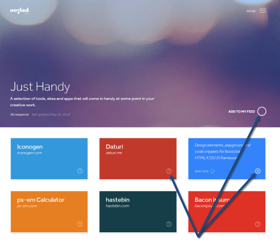
Oozled sports a responsive layout under a rather simple design which functions equally good on smartphones and large 34inchers. With its colorful tiled interface, it reminds me of the fairly new Windows Modern UI fka Metro. Oozled's concept is just as simple. From the homepage you choose one of - in my opinion too - many categories. Inside of each category the individual resources are presented and sorted by kind. You'll find icons, templates, web apps, books, videos, presentations, articles and more, with one tile representing one resource. Boy, do they have tiles.

These tiles consist of a front and a back side. The front side carries title information, prices if necessary and a question mark icon. Clicking this icon flips the tile, presenting a very short description of what this resource does. Click the X icon to flip the tile again. Clicking anywhere else besides the mentioned icons takes you to the homepage of the resource directly.
Oozled: Tailored RSS Feeds for Registered Users
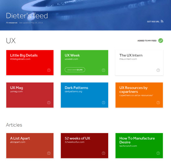
Besides simply using Oozled as a website with loads of webworker resources, its creators came up with an advanced approach. If you decide register a user account, you are enabled to subscribe to categories. You get a tailored landing page with your own sub-domain and your own RSS feed to feed to your favorite RSS reader such as Feedly, Fever, you name it. From now on, new additions to a category you are subscribed to are pushed to your reader, just as you're used to. It's a pity that you cannot subscribe to the meta category "The Latest 50" that way, though.

My Feed as an Example (consumable via URL, e.g. using Feedly)
It's plain to see that there's not much resemblance between the initial Medium post and Oozled. Comparing it to other collections, Oozled is an in between. More than a list, but not really a service. There's no further information, you don't get a lot more than a clickable link. I like the idea of tailored RSS feeds, though and a lean directory without a lot of weight sure has its benefits. Our webworker colleagues do vote with their feet anyway, given the many resources they already submitted. We'll see from when on we'll really be missing the missing free search function ;-)
No matter how you look at it, Oozled is a welcome addition to any webworker's toolbox in any case. Dan Edwards promised to shed some light on how the web app was created. That might be interesting. We'll keep an eye on that.
Before I forget, Dan and Ryan don't do that for da munny. They are just two decent chaps...
