Muzli and Panda: Free Daily Visual Design Inspiration on the Go
What if you could open your Google Chrome and immediately become immersed in design-related topics? No need to explicitly fire up any of your favorite web sites nor your RSS reader. It's just there. That's the idea behind Muz.li and Panda, new Chrome Tab Extensions, bringing loads of inspiring design news right in front of your eyes. Doesn't sound like much? Sometimes it's the little things that are the greatest. But only sometimes...

Muzli Curates the Usual Suspects and Then Some
The idea behind Muz.li is simple. Why not bring the latest content from well-known and popular design sites right to the desktops of those who earn a living by mastering the latest trends? The presentation would have to be attractive, so that the service becomes more likely to be installed as a starting point to the internet, a classical homepage.
That's what Muz.li does. It comes in the form of a Google Chrome Extension and takes the functionality of "New Tab" to show itself and its design collection. You don't have to willingly call the service, simply open a new tab in Chrome and there it is. The design is modern minimalism with lots of whitespace and flat looks.
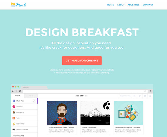
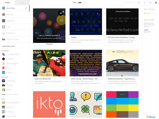
The content is presented as a grid. The individual topics are shown with a small preview image, their title and a descriptive one-liner. Clicking on the image immediately opens the source link, hovering the image allows you to tweet the link around your followership.
Curated design content is drawn from Dribbble, Awwwards, Tuts#, CSS Winner and Behance Served. More links are listed below the curated part in the left sidebar. These links lead to well-known web sites such as Smashing Magazine (of course) and resources such as Unsplash or Flaticon. Besides design content Muz.li also offers tech content from the most popular sources such as TechCrunch and Mashable.
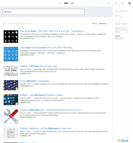
To the top center of Muz.li's browser appearance you'll notice a switch. It allows you to switch between "Feed" and "Zen". Switching to Zen astonishingly opens a search engine for design resources. This works fairly well, yet why this is called Zen doesn't immediately explain itself to me.
Muz.li is nothing ground-breaking or disruptive, as Silicon Valley likes to call it. There is nothing original to the service, nothing you couldn't find elsewhere, no unique selling proposition as the marketer in me says.
But: It is a nice way to fill the "New Tab" in Chrome with content you are likely interested in, instead of just having another instance of Google Search presented in it. The curated link grid contains quite a few gems, you would have found throughout the day anyway. So why not shorten the process and get the inspiration on opening the browser. Muz.li uses the term "Design Breakfast" to characterize the idea.
Muz.li also curates its own Flipboard Magazine, updates their Facebook and Ello as well as Twitter with (basically) the greatest link of each day. Thus, if Muz.li as a service is too much for you, you can still go for the slimmed down social network version and get the best link of each day at least.
Panda: Are Developers Hackers?
Very much the same approach is what you find when you look at Panda, a very similar service with an equally strange name. Panda also wants to take the place of your "New Tab" in Chrome. Other than Muz.li Panda also offers you to use it via opening the service as a website. The result is the same. The Chrome Extension simply opens the website automatically, without you having to type in the url.
The visual similarities between Muz.li and Panda are striking. Panda also curates a grid of content from Behance, Dribbble, Awwwards and (difference, difference) UI8 with small preview imagery, but without the description. Clicking on the images opens the source links, much the same way Muz.li handles it. While Muz.li offers "Editorial Picks", Panda relies fully on the individual services' own ranking systems.
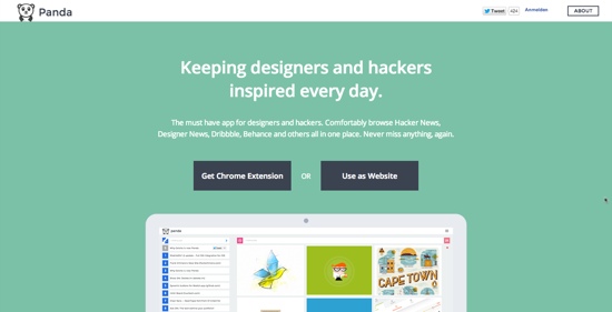
Besides showing a nice grid of hopefully inspring new additions to Behance and the usual suspects, Panda gives you access to other proven sources of inspiration for designers and develoeprs, who Panda insists on calling hackers.
While Muz.li links to the most popular design magazines and a few resources, Panda takes it one step further and links in all the meta services there are. Thus you'll find the Hacker News, Designer News, Sidebar.io and more. This sounds good but isn't much as soon as you look closer into it.
All the sources are presented as a list of their most recent entries, much like any RSS reader would do it. Click on one of the links and you are taken to the source. There's no further integration, just a nicely designed link hub an a "New Tab". What would have been great was a ranking mechanism spanning across all embedded sources, so one could easily decide what to read without having to check Hacker News, designer News and what not individually. But this isn't offered.
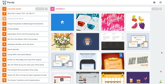
So you end up searching the sources by foot, just like you normally would without Panda. The Feedly I use to curate my sources is more powerful as it at least sorts content chronologically across all sources. A design search feature, similar to Muz.li's offering isn't in place at Panda.
Should I go for Muz.li, Panda or Away?
Both services don't convince me. But Muz.li's approach comes closer to something useful than Panda. Muz.li's editorial picks add value and the design search engine yields good results. I also like the short descriptions below each preview image on the initial grid. Blindly clicking on colorful images to see what's behind them has lost its magic as soon as I turned eight years old.
[caption id="attachment_86451" align="alignnone" width="550"]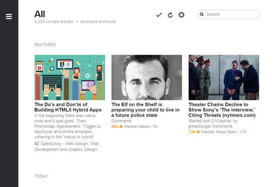 Feedly: Not Too Far Away, Visually[/caption]
Neither of the services comes close to Feedly, my personal information and inspiration news stand. But I'll stick with Muz.li as my default new tab and see how it goes. I don't have a better use case for that particular tab anyway. So how can I go wrong?
Featured Photo by JÉSHOOTS and Ronald Carlson, CC0, via Wikimedia Commons
