Homepage Builder on Steroids: Is Wix.com Going to Disrupt the Web Design Industry?
Wix.com has grown to more than 40 million users lately and has put loads of effort into changing from the ground up in the last few years. A few weeks ago, Wix.com went public. It was the biggest IPO ever in Israel's history. Will Wix change the web design industry in a way similar to what Apple did to the computer industry? A disruptive service bringing a whole new definition as to how websites will be designed in the future? At least this doesn't seem too far-fetched...

Homepage Builders, Website Generators: Isn't That All Crap?
I can almost feel the nails of quite a few of our readers crinkle. As soon as a design magazine only mentions the term "homepage builder" some purists go nuts. When did you decide not to target professionals anymore? Are you changing to a consumer magazine for newbies? And so on...
Homepage Builders for Small to Medium Businesses
Let's argue a little. We do not specifically target professional designers and developers, we target any maintainer of a website out there, among other groups... Maintaining a website does not necessarily mean to be able to code a whole page with one's own hands. We as Noupe don't want to be reduced to the highly professional experts, though we admit that quite some of our articles are only comprehensible by experts. This article here targets you as soon as you maintain a website. No other skills to have or preconditions to meet.
Imagine the Italian restaurant around the corner or that guy who earns his money by taking dogs for a walk. Imagine loads of other similar businesses, small to medium, with individual challenges to live up to. While most of them will be aware of the fact, that having a website is crucial these days, not all of them will see the need to have it created as a technical gem, thoroughly hand-coded by the best experts out there. Like it or not, this market exists and I'd bet it is much bigger than the market for technical gems..
I am a designer, too. But I never had a problem accepting these facts. Moreover I quite frequently advised potential clients to go for a website builder, rather than having me design a one-pager with fairly more information than their address on it. It would be considerably cheaper and the result would probably be not as great, but still good enough to reach their communication goals..
Homepage Builders for Professional Web Designers
It might surprise you, yet there are really quite a few web designers, and you can count me in here, who never promoted the need for having HTML and CSS written manually. I have always used various tools to make my life easier.
This does not mean I was an avid user of NetObjects Fusion or Frontpage. In fact, these two never felt like alternatives to me. What I am using since day one is Dreamweaver. Since more than ten years Dreamweaver is my companion. We have designed hundreds of websites together, no matter the complexity. What mattered to me and still matters as the one criterion is how open the tools I am using are. With Dreamweaver I am able to hand-code if I should feel the need to do so, yet I don't have to. If I do, Dreamweaver still supports me with syntax highlighting, autocompletion and more.
It should have become clear by now, I'm open for tools, anything that reduces the work load. That's why I have always had an eye on website builders. Five years ago I wrote a round-up of homepage builders and came to the conclusion, that they are clearly getting better, but are not quite ready for prime time. Since then a lot has happened. And while I'm still close friends with my Dreamweaver, I cannot deny that website builders are getting better by the minute. I have switched to the cloud for some of my important use cases already. I wouldn't promise that this will never happen in regard to my web design software, too. In fact I can imagine using a homepage builder such as Wix.com for some of the smaller projects already today.
This summer I took a deeper look at Webydo. These guys nearly got me. Following I will introduce you to Wix.com, which really had me almost from hello. Make sure to check some of the examples of websites created using the tool.
Homepage Builders for Professional Designers
Let's not just talk about me or my fellow web designers. Let's talk about designers in general. You know, that species that roamed the world already designing while there was no web to design for. Those people we as web designers learned from. And let's talk about those highly creative designers with addictive ideas, who cannot code manually, but are wizards in Photoshop and InDesign.
Let's talk about those who are primarily creating print, yet want to expand their customer base and get their slice of the pie. I'd call that perfectly legitimate.
Or simply look at the average design project, where budgets are low typically . A website builder could significantly heighten your profit if you dare use one instead of the manual way of the perfect coder. Web designers often argue that for these cases they can always turn to their own collections of snippets and design elements, they have curated over the years. So, they wouldn't need a homepage builder there. My answer usually is: what is the difference between your bag of snippets and a homepage builder? Take your own prebuilt elements or those of e.g. Wix.com. The latter will ensure you'll always be working with the latest technology, not outdated snippets from five years ago.
To sum it up let's turn to the argument, a website builder would have all websites look the same. This argument is about as valid as the assumption, the introduction of Microsoft Word would have led to all texts being more or less the same. Creative professionals have been using a handful of tools ever since. Still their creations haven't been identical...
I do not expect this war of opinions to end anytime soon. Yet we should be aware that there are different ways of looking at the same facts. Did I miss out on any aspect? Feel free to add it to the comment section below this article!
Wix: From Zero to Hero?
It is only two years ago that I had to write an article on homepage builders for a German magazine. I chose 17 different products and checked them thoroughly. Wix was among those, but not able to convince me, so it didn't make it into my Top 10 then. What annoyed me most was the fact that Wix generated websites based on Adobe's Flash technology. Both Wix's backend and the generated websites relied completely on proprietary technology which already at that time didn't have a future too bright.
Wix: Yay, no more Flash
Since then, Wix.com underwent a complete overhaul. Today it would have easily made it into the Top 10, if not grab the top spot there. The single biggest reason for that is the waiver of Flash. Instead of generating Flash sites, Wix.com today relies on HTML5. In a first step they waived Flash as the output format while still relying on Flash for the editor. Today you don't see any Flash anymore, neither in the generated sites, unless you integrated a Flash object for whatever devil may have driven you, nor in the editor. Wix.com has added support for multiple languages and improved on it. Machine-translation once ruled, but does no more.
The editor of Wix.com appeals to me. It really does. It is much cleaner and slicker than Dreamweaver, which I find slick enough. And the cloud, people, the cloud. I wished to have been able to make quick changes from where I just happened to be far more than once. Give me internet access and a browser and I'll edit that project right away.
Wix.com: NASDAQ-Listed since November
Today Wix.com counts more than 40 million clients with over 700,000 of them paying for the service. The numbers have more than doubled since my last research two years ago.
In 2013 Wix.com went public and is now listed at New York's NASDAQ. The IPO brought 127 million dollars of cash and is the largest IPO of any Israeli corporation in history. Wix, with its 400 employees in the US and in Israel is now considered to be worth 750 million dollars.
CEO Avishai Abraham is convinced to be just at the beginning. According to his estimates the 40 million client base represents a mere one percent of the market as a whole.
Wix: Free Editor with Paid Additions
Before we take a look at the feature set of the homepage builder from Tel Aviv, let's first take a quick glance at the pricing. This is always my first look, because what use is the best car, if you can't afford it? In which case I wouldn't even be interested in how great it probably is...
Wix gives the full feature set for free. The creation of your website goes without limitations and completely free of charge. Even the app market, a marketplace containing add-ons such as contact forms, social media integration and more, is generally free to use, as long as the given add-ons themselves are free. Most of them are, at least concerning their basic functionality.
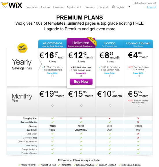
If you think, there must be a hitch somewhere, you are not totally misled. The only twist is the unavailability of having your own domain connected in the free plan, while additionally having to accept advertisements in the generated website. If your project is not completely private, you'll find this a catch enough to immediately think about one of the paid plans.
Before you do that, check Wix and its editor thoroughly, even build your website ready to publish. It's not unless you're fully satisfied, that you need to make that decision. And if so, you know that you'll not regret it.
Once generally decided, I advise you to choose the plan “Unlimited”. 15,95 EUR monthly buy you a domain, hosted at Wix, 10 GB storage space and unlimited bandwidth. If you decide to tie yourself to the service for a whole year, the monthly fee lowers to 12,42 EUR. Needless to mention, that you won't see any ads embedded, unless you do so yourself.
Private users might find interest in the plan “Combo”, which also offers a domain and rids your space of ads. If 3 GB storage space and 2 GB bandwidth are sufficient for your project, you can save a few bucks as "Combo" sets you back 10,95 EUR per month (8,25 EUR if you book a full year).
As upgrades are always only one click away, you might as well opt to start with the smallest plan, then upgrade as needed. Then again, price differences are that low...
If you want to run an online shop, you are limited to booking the plan “eCommerce” for 19,90 EUR monthly (16,17 EUR monthly with a year's contract). This plan gives you 20 GB storage space, yet astonishingly limits your bandwidth to 10 GB.
As you can see, Wix.com is no price breaker, yet not expensive either. Wix.com's capabilities are much higher than its price. The price-performance-ratio has to be called great.
Wix.com: First Steps
Now that I was able to assure you you wouldn't have to sleep under bridges, just because you chose Wix.com, lets take a look at the rest of the feature set. Always bear in mind, that Wix.com is largely customizable and extensible. Especially the ever-growing app market has features in store, you wouldn't have expected to be available in a website builder. It's the app market that removes the single biggest disadvantage of the usual homepage builder. With Wix.com almost any type of website is possible.
Once you registered for an account, which is simple and doesn't involve NSA-like nosiness, you can immediately start to create your website. The first step is to choose a template as a foundation on which to build up upon. Wix offers hundreds of templates. I didn't check all of them, but from what I've seen, your expectations can't be too high to not get fulfilled there.
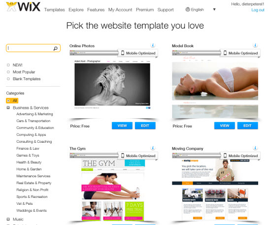
Although the templates are categorized well, the sheer amount of them has you spoilt for choice. If you are more into designing freely, choose one of the empty grid layouts. These only contain a basic structure on which to start building. Most templates are suitable for mobile clients, which does not mean they'd function automagically for mobile. Instead the Wix editor has a separate area in which you'll have to adjust the template for mobile viewing. In other words: you'll design mobile and Desktop version separately, based on the same template.
Once the template has been chosen by clicking "Edit" below the thumbnail, Wix directs you to the editor without further ado. This editor in itself is based on HTML, no signs of Flash left. Today's editor is clean, well structured and looks and feels like a locally installed software. Especially in terms of performance I couldn't find anything to complain about.
![]()
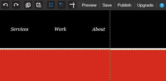
In the editor window you'll notice two toolbars. One is floating vertically above the content to the left side of the browser window and the other one sits at the top of the browser window, stretched in horizontally from the right. To begin with, you'll focus on the floating toolbar as it carries most of the design features.
Five Icons to Rule Them All
Five icons are sufficient to cover all necessary layout functionality. The first icon named "Pages" has features to add new pages, rearrange existing ones, change their hierarchy, define the homepage and set essential SEO information. If you are feeling fancy, you might want to add page transition effects to your site. If so, this would be the place to do it..
The icon “Design” unveils possibilities to choose or upload backgrounds, choose or customize color palettes and choose or customize a wide variety of web fonts. If you need character sets other than latin, you simply activate support for the desired language and are free to create your Website in Russian, Greek, whatever. Everything you do is immediately reflected in the editor. If what you see is not what you want to get, click "Discard Changes" and be happy again.
The icon "Add" gives you access to all the elements you might ever want to add to your site. Starting with text and images, over to galleries, blogs or social media integration, there is not a lot you could miss.
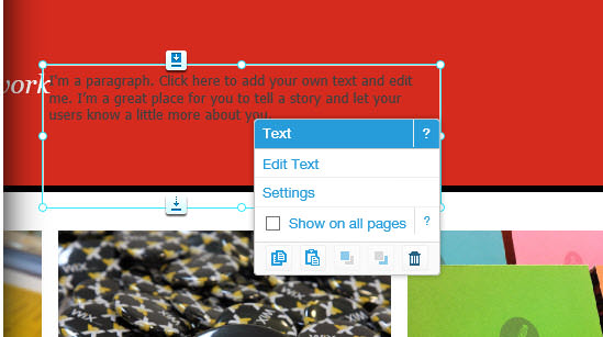
Whenever you add an element, it gets added in the form of a freely placable container, much as you might know it from Adobe's InDesign. Using your mouse you cannot only move the container, but also resize or rotate it.
Depending on what you add, Wix offers context-sensitive tips in the form of overlays. Clicking the right mouse button opens context-sensitive menus equipped with available options to choose from.
"Settings" is there for you to configure basic parameters, such as site address, social media integration, Google Analytics or - if you are located in Europe - implementing the new so-called Cookie law.
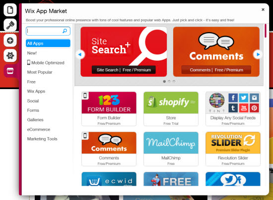
The already mentioned app market comes as the fifth icon and gives you direct access to the variety of available add-ons. Make sure to check the information below each app thumbnail. "Free trial" means that the app is only free for testing, while "Free/Premium" means you'll be able to use the add-on with basic features for free, while having to pay for more advanced functionality.
Wix and Its Second Toolbar
The second toolbar stretches in horizontally from the top right corner of the editor window. Here you'll find basic features such as "Redo" and "Undo" as well as "Copy" and "Paste". I appreciate that Wix has the last two implemented as they tend to not work reliably in some browser environments when used per keyboard shortcut.

The following three icons control visual helpers for the pixel-perfect design. Configure a grid or make sure that elements adhere to the grid. Place lines freely e.g. to prebuild multi-column layouts. Asa I already said, all this resembles InDesign very closely. Designers will feel at home immediately. People with no idea of design will be happy to find intuitive helpers. It's only the coder, who will not feel at home at all ;-)
Wix: Final Steps
You might find it superfluous, as the whole editor works in WYSIWYG mode. Still the top toolbar has a button titled "Preview". Clicking on it leads to having all toolboxes, grids, helpers and what not stripped from view. Now you see the site in the way your visitors will. Clicking a toggle lets you change between mobile and Desktop view.

A click on "Publish" does exactly what you'd expect from it, it puts your website into the wild. From here you are able to adjust some of the most essential settings again, such as search engine indexing or publication of a mobile website. If you want to connect the created site to your own domain now, the button "Upgrade" in the top right corner is never too tired to be waiting for you..
Wix Support: Help-Center Extraordinaire
Let me mention the support center. Although it should be a matter of course to offer the best available help, oftentimes it is not. Wix.com stands out from the crowd by really offering anything you need to get acquainted to the product. The support center is always available through a click on the question mark icon from the top toolbar. Depending on whether you are currently using the mobile or the Desktop editor, contents will adjust.
The support center is organised in the same way the editor is. This makes it incredibly easy to find your ways around. Support center follows the same use patterns the editor does:
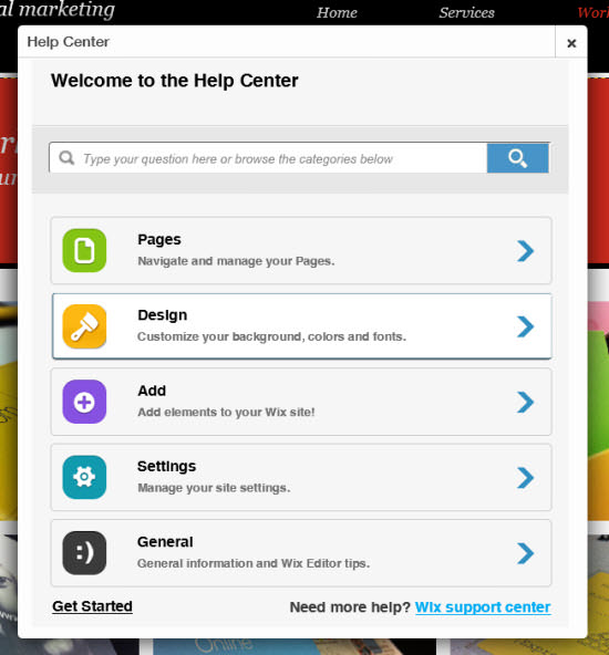
Special features get introduced by short videos to help you get a hold of the concepts quickly. .
Conclusion: Reasonable Pricing Meets High-Grade Capability (drop that WordPress theme)
Why does he mention WordPress themes, you might ask yourself. The answer is simple. According to my own experiences, people with lower skills in design tend to turn to WordPress-driven websites. This is usually not due to the fact that they'd necessarily want or even need a CMS. It is almost always due to the fact that there is a plethora of read-made themes available, most of which are free, even. Installing WordPress, selecting a theme - this all can be done in half an hour with the result of a not too ugly website ready for the world. Now, with Wix.com you can gain flexibility and even reduce the effort needed in the creation of your website.
As an old-school designer you'll soon get used to Wix.com and will gain expertise in no time. As I've mentioned several times throughout this article, Wix.com resembles editor software such as Photoshop, InDesign or Illustrator quite closely. I suppose you know some of these...
One downside shouldn't go unmentioned. Sites created using Wix.com don't show their source code without additional effort. In Wix.com's support center they tell you the trick, which basically exists in adding a URL parameter to each call. This is far from comfortable, but sufficient, if you want to have an expert take a look at your code. It's unclear why you should even want this, as there are no options for manually editing the generated source anyway. Thus, I suppose you simply forget that, and live with the concept of WYSIWYG.
In the end, Wix.com is a valid alternative for the end consumer as well as for designers who cannot or don't want to code manually. If you don't need a high level of business logic in your web site, homepage builders such as Wix.com are what you should definitely take into consideration. I estimate this covers about 90% of all possible use cases...

Hello Dieter,
I just created an account at Wix after reading your article.
I have to say, most of the ready-to-use templates are actually way below your average wordpress standards (at least the ones presented on Noupe ;).
No doubt I’ve missed a number of great counter-examples, but I guess my point is more to say that picking a WP theme for what it is rather than for the CMS itself isn’t going to die because of Wix.
Greg
It’s not the picking of prebuilt templates, that makes Wix great. It is the freedom to create whatever you can imagine using their fabulous editor.
No. Wix is great, I know it inside and out. However, it is marketed as super easy to use and it is, but if you do not have proper web development knowledge there is potential for awful design or big holes in fundamental things, you still need to have a grasp and mentality of a web dev or graphic designer to get the most out of it. Many of the sites designed by amateurs have a lot of horrible mistakes. They say 40 million users, but I bet half of them are not premium websites, but free wix branded one to three page experiments. The good thing is they have Wix Pros which can actually design you a real proper website that works and looks just as any other developed and coded site would. But Wix is a gazillion times better than using WordPress, which hackers love to get into, many zero days expoits for WordPress even for unupdated plugins, its a mess, every time I have to fix a wordpress site, its like an archaeological dig, you get what you pay for.
Hi Ara. Thanks for stopping by. Just to clarify one of your thoughts. Wix claims to have 700,000 paying customers. No need to throw estimates there ;-)
I think you missed it, its written in this article.
Wix.com: NASDAQ-Listed since November
Today Wix.com counts more than 40 million clients with over 700,000 of them paying for the service. The numbers have more than doubled since my last research two years ago.
and if this is true- 700,000 x $12 for the minimum paid service = 8,400,000.
WOOOW!
Hi Dieter
I have already read a few of your posts, really great writing.
I’m a freelance designer and I was surprised to see that you recommend Wix for professional web designers when there are other (better) free tools which are much more suitable for designers.
Webzai.com and Webydo for example are aimed at designers and give users much more freedom and features and they really do resemble graphic design software (wix does not….). Just to prove my point, Webzai will give you a free premium if you are a web designer.
Iv’e been in contact with a few site builders trying to have them feature a white label feature for designers like myself. Most website builders are not going in this direction but webzai.com told me that they are launching a fully white labeled product with a CMS platform soon (Webydo have a studio for designers but its not fully white labeled).
Hi Joan.
Great to have you here. Just to add to the confusion ;-) I’ve written about Webydo in the past and pointed out all those design business related things.
Here, if you’re interested: https://www.noupe.com/design/webydo-the-center-of-your-web-design-business-78872.html
I’ll check out webzai soonest possible. Thanks for the mention.
Sure, It’s always great to discover new products for designers :D.
Oh, and I have already read that one, great resource.
Hi Joan – Thanks for the comment, and actually Webydo does offer a full, free white label option for designers. If you have any other questions, please feel free to reach out to us at [email protected].
I also used to cringe at website builders. Now, I think they’re great. For someone whom is frustrated with WordPress, site builders are now a very viable alternative for them. They’ve really come a long way.
I never was a technical designer, so I can’t position that into my statement. However, I do have an eye for design, usability and creating things. It’s just the coding, HTML and all the other technical stuff that I don’t like to deal with.
What’s interesting to note is that when people use WordPress the first thing they do is pick a theme. This is interesting because a theme is essentially a prebuilt website… just like a site builder. People then use WordPress to make customizations. I found WP customizing to be limited. For example, I once wanted to add columns on a page. Turns out you need a plugin for that. Then, you have to make sure it’s the right pluggin… is it up to date? … does it work? … is it confusing to use? … do I have to write these funny little shortcodes every time I want a column?
Ugh. No thanks.
I would rather focus more on creating content, growing my business and not get bogged down with an extensive process for simple desires. I ended up with a sitebuilder that I like. I won’t say which one because this comment is not meant to be an advertisement. I just want to say that if you think site builders are lame… give them a try. Try more than one. The one I use can do everything WP can, and it does it better in my opinion. I can seamlessly sell, post, have events, podcast… anything I want to.
And that makes me happy. :)
Hi Dieter ,
There can be no doubt WIX is an impressive user-friendly platform , however , as a long-time user it does have one ‘ glaring ‘ deficiency ( which simply defies understanding ). Despite its many virtues , a plethora of very unhappy customers continue to be frustrated & bewildered , quite simply because WIX still does not support or allow ‘ RSS Feed ‘ generation on its users’ websites. I find this astounding , that the most basic of features for generating traffic to a website is not a given. As one disgruntled complainant said on WIX’s feedback forum – it’s like McDonald’s or Burger King but no burgers. What’s the point ?!?
What’s worse is – while the WIX support may be ” Help-Centre Extraodinaire ” (which I don’t disagree with) , all this is undone by their support centre’s unresponsiveness to its customers pleas for a fix to gaping hole in the functionality of their product. Customers are subjected to a never-ending string of one-line excuses , or told ” Yes , it is our top priority ” or ” please vote here for this feature ” with no clue or ETA when the feature will ever be available. This has gone on for months … & months … & months. Just incomprehensible & a pity , because every other aspect of their product is superb.
Given your product expertise & evaluation of this product , are you able to offer any explanation for this bewildering issue. Surely RSS is not rocket science. Perhaps you have contacts. Be interested in your thoughts or suggestions for circumventing this problem , to enable RSS on a WIX website.
Chris.