Modern Websites and Elements: 8 Sources of Inspiration for Designers

Digging through articles on web design trends is one thing. But finding inspiration in the wild is an entirely different matter. We have compiled eight sources of real-life inspiration for you.
It is easy to find articles on web design trends. Almost all design magazines put out at least one each year, including us. These articles cover recent design trends and prove them with one or two screenshots.
Finding real examples of good web design is a lot harder. You can't just search for appropriate offers on Google, where they sit and wait for you to find them. Fortunately, there are friendly people out there who put in the effort to collect, evaluate and present contemporary designs.
In the following article, we will introduce you to eight of those inspiration sources.
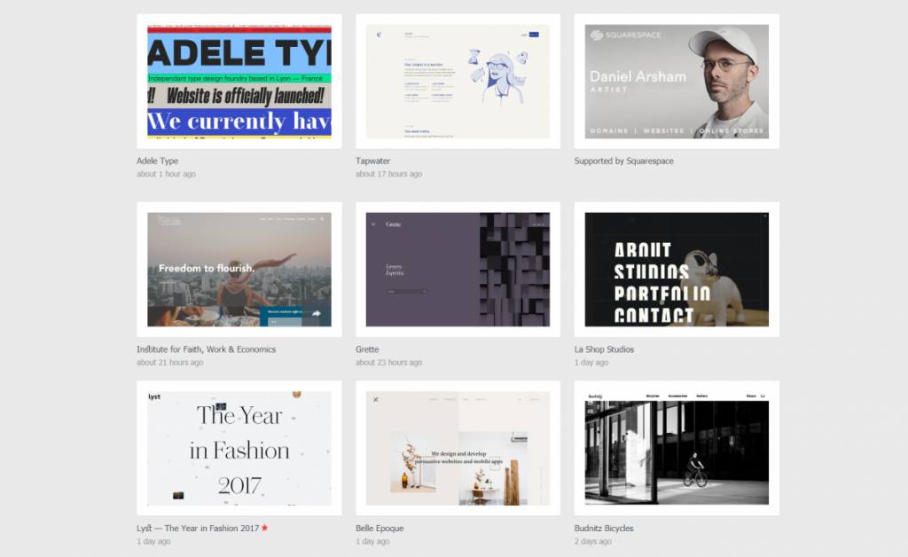 siteInspire has been around for eight years already. The large portfolio contains over 6,300 pages. All entries were evaluated and selected for publication manually. Although anyone can hand in suggestions, the collection is growing slowly. By their own account, out of over 200 submissions a day, the editorial team only selects the ones that stretch the limits of visual, and interaction design as much as possible. This doesn't mean that the featured pages have to be exceptionally pretty. At the moment, there are even a few brutalist designs.
You can subscribe to siteInspire as an RSS feed. In addition to that, there are the indispensable social media profiles on Twitter and Facebook.
[Blue-Button url="https://www.siteinspire.com/" text="Click To Visit siteInspire"]
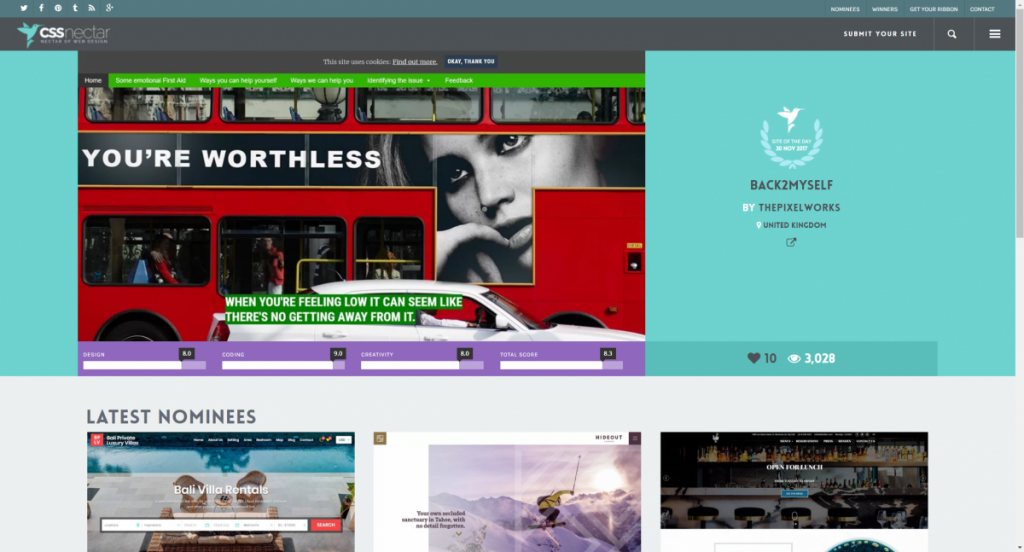 CSS Nectar also collects community suggestions, but only rates them regarding the factors design, coding, and creativity, allowing users to vote as well. Every day, one site is declared "Site of the day."
The fact that submissions are only accepted for a fee of five USD is a bit of a downer. CSS Nectar does promise a refund if the suggestion is not included. However, I can imagine that the motivation to prompt refunds is equally low on both sides. Put differently: it is questionable if what you get to see here really are the "best of."
Nonetheless, the gallery is useful for the quick inspiration on the go, as the bees of CSS Nectar definitely have a few beautiful designs to offer. By the way, the CSS in the name does not mean that the shown designs were great examples of CSS usage.
[Blue-Button url="https://cssnectar.com/" text="Click to Visit CSS Nectar"]
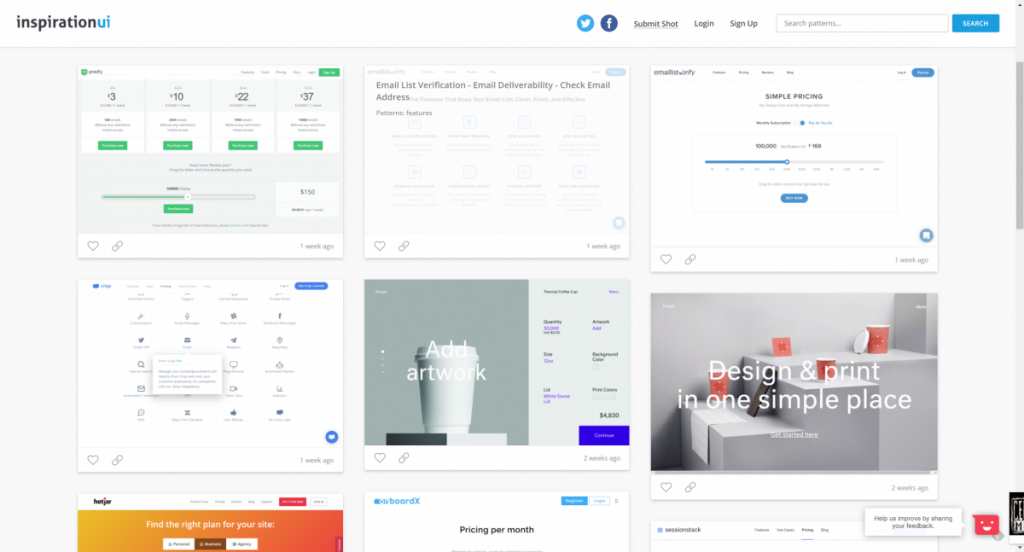 InspirationUI is designed to be a showcase as well. However, here, individual elements of the user interface are featured, rather than entire websites. The elements can be sorted by their purpose, allowing you to look at all notification suggestions, all 404s, all price charts, and dozens of other patterns. The operator makes sure that the submissions come from projects that actually exist. Thus, you shouldn't find any Dribbble lalaland.
[Blue-Button url="http://inspirationui.com/" text="Click to visit InspirationUI"]
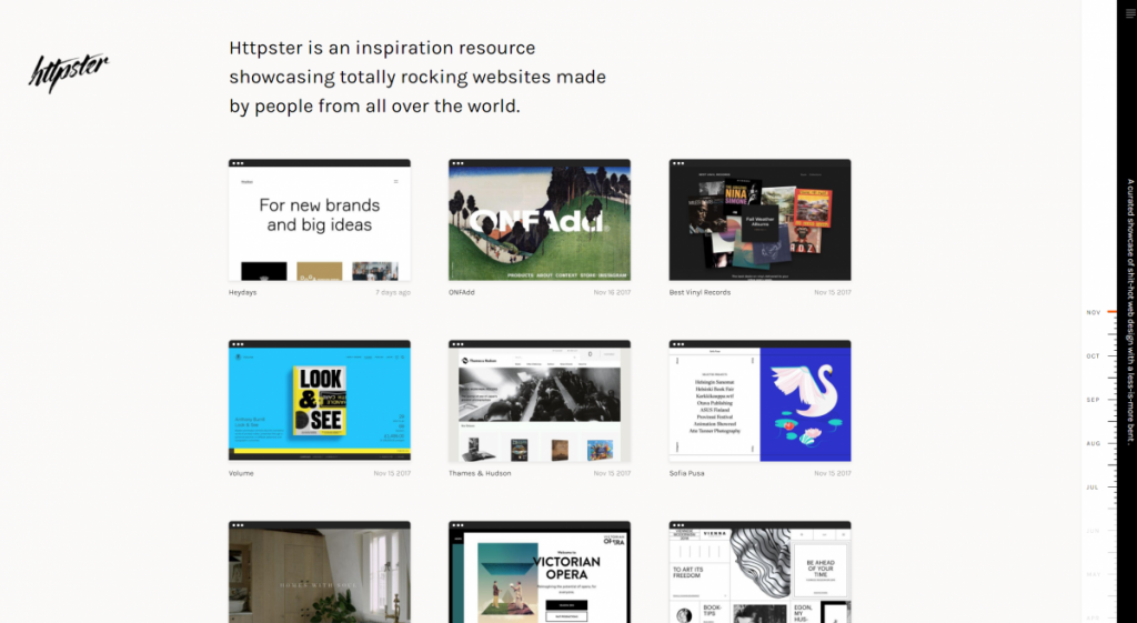 Over at Httpster, you'll find web designs that merely look good. Here, a clean technological realization is not the primary focus. If it looks great, chances are the site ends up on Httpster. The operators make no secret of that either. Anyone can submit. The submitter doesn't even have to be the originator of the website.
In many cases, Httpster shows more than one of the website's pages in the detail view of the feature. This gives you a good idea of the look. Tags are used for categorization which allows you to switch back and forth in the portfolio associatively. If you can't generate ideas here, you can't do it anywhere.
[Blue-Button url="https://httpster.net/" text="Click to visit Httpster"]
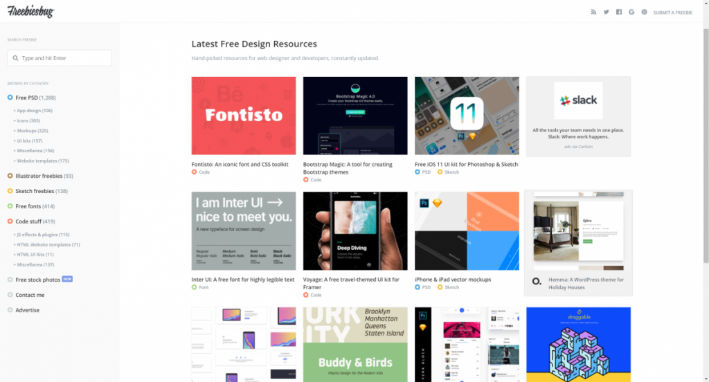 Freebiesbug collects free design elements for graphic and web designers. The difference to other, similar services is the fact that Freebiesbug is curated manually. Of course, the technical, but also the subjective taste is a factor. Nonetheless, the approach is still better than simply offering everything with the label "freebie." Freebies may only be submitted by their originators.
[Blue-Button url="https://freebiesbug.com/" text="Click to visit Freebiesbug"]
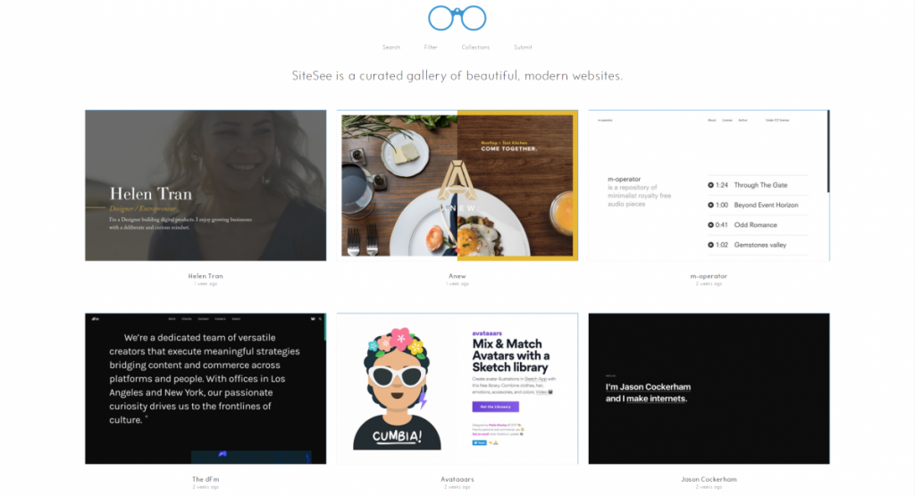 SiteSee also displays attractive, modern, manually curated websites, but anyone is allowed to submit. The included designs are represented by a screenshot. A click on this screenshot leads directly to the original URL. There are no descriptions, ratings, or anything similar.
Nonetheless, SiteSee is still second to none in some cases. On SiteSee, you can filter for some criteria that others don't offer. For example, you could filter by dominating colors. This is good if you already know which color will dominate your design, which is the case for most corporate orders. You also get to filter by the website's categories, for instance, if the design was made for an event, product, an agency, or something else. This allows you to see how other people approached the same task.
SiteSee's collection feature is unique as well. This way, you and the other visitors can create collections, that only deal with specific topics. These collections can be published, too. You'll find collections like "Pink Backgrounds," or "Dark Portfolios." This is what truly apposite inspiration looks like.
[Blue-Button url="https://sitesee.co/" text="Click to visit SiteSee"]
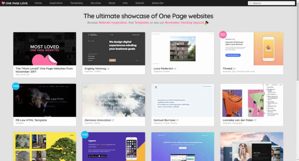 As you might have guessed, One Page Love deals with one-pagers, websites that consist of a single page. One Page Love has been a thing for almost ten years so that it might be partially responsible for the increasing popularity of this website type. Either way, the portfolio is filled to the brim. Every website is displayed in its entirety, as a long scroll screenshot. The designs can be sorted by categories and features.
Aside from the web design collection, the operators also curate templates for the creation of one-pagers. Some of them are free, and others are charged. Submissions to One Page Love cost different amounts of money, depending on the submitter's aim.
[Blue-Button url="https://onepagelove.com/" text="Click to visit One Page Love"]
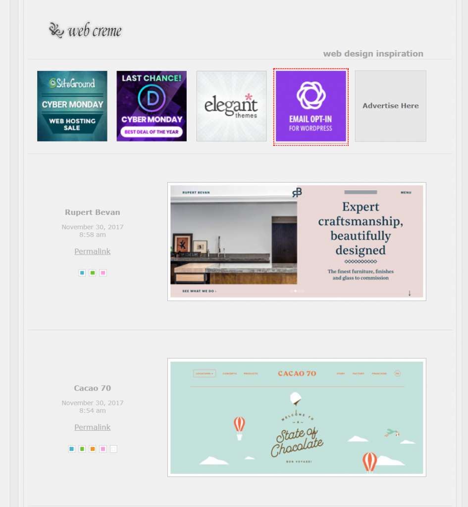 Web Creme is twelve years old, so it can almost be considered a part of the web's bedrock. Web Creme cares about the creative part of web design. The aspiration is to provide the best, and most creative designs on the web. The goal is to inspire the visitor, giving him quick ideas.
Compared to fresher services like Httpster, or SiteSee, Web Creme almost seems antiquated, or let's call it conventional. The service's design was more up to date in the mid-noughties, than it is now. This does not derogate from the displayed pages, however. Here, you'll definitely find some fresh inspirational material. On the left, next to the designs, the dominant colors are displayed. A click on the colors gives you an overview of all designs that have said color as a dominant one. The function does not have much use value, though. Anyone can submit suggestions using the contact form.
[Blue-Button url="http://www.webcreme.com/" text="Click to visit Web Creme"]
siteInspire
 siteInspire has been around for eight years already. The large portfolio contains over 6,300 pages. All entries were evaluated and selected for publication manually. Although anyone can hand in suggestions, the collection is growing slowly. By their own account, out of over 200 submissions a day, the editorial team only selects the ones that stretch the limits of visual, and interaction design as much as possible. This doesn't mean that the featured pages have to be exceptionally pretty. At the moment, there are even a few brutalist designs.
You can subscribe to siteInspire as an RSS feed. In addition to that, there are the indispensable social media profiles on Twitter and Facebook.
[Blue-Button url="https://www.siteinspire.com/" text="Click To Visit siteInspire"]
CSS Nectar
 CSS Nectar also collects community suggestions, but only rates them regarding the factors design, coding, and creativity, allowing users to vote as well. Every day, one site is declared "Site of the day."
The fact that submissions are only accepted for a fee of five USD is a bit of a downer. CSS Nectar does promise a refund if the suggestion is not included. However, I can imagine that the motivation to prompt refunds is equally low on both sides. Put differently: it is questionable if what you get to see here really are the "best of."
Nonetheless, the gallery is useful for the quick inspiration on the go, as the bees of CSS Nectar definitely have a few beautiful designs to offer. By the way, the CSS in the name does not mean that the shown designs were great examples of CSS usage.
[Blue-Button url="https://cssnectar.com/" text="Click to Visit CSS Nectar"]
InspirationUI
 InspirationUI is designed to be a showcase as well. However, here, individual elements of the user interface are featured, rather than entire websites. The elements can be sorted by their purpose, allowing you to look at all notification suggestions, all 404s, all price charts, and dozens of other patterns. The operator makes sure that the submissions come from projects that actually exist. Thus, you shouldn't find any Dribbble lalaland.
[Blue-Button url="http://inspirationui.com/" text="Click to visit InspirationUI"]
Httpster
 Over at Httpster, you'll find web designs that merely look good. Here, a clean technological realization is not the primary focus. If it looks great, chances are the site ends up on Httpster. The operators make no secret of that either. Anyone can submit. The submitter doesn't even have to be the originator of the website.
In many cases, Httpster shows more than one of the website's pages in the detail view of the feature. This gives you a good idea of the look. Tags are used for categorization which allows you to switch back and forth in the portfolio associatively. If you can't generate ideas here, you can't do it anywhere.
[Blue-Button url="https://httpster.net/" text="Click to visit Httpster"]
Freebiesbug
 Freebiesbug collects free design elements for graphic and web designers. The difference to other, similar services is the fact that Freebiesbug is curated manually. Of course, the technical, but also the subjective taste is a factor. Nonetheless, the approach is still better than simply offering everything with the label "freebie." Freebies may only be submitted by their originators.
[Blue-Button url="https://freebiesbug.com/" text="Click to visit Freebiesbug"]
SiteSee
 SiteSee also displays attractive, modern, manually curated websites, but anyone is allowed to submit. The included designs are represented by a screenshot. A click on this screenshot leads directly to the original URL. There are no descriptions, ratings, or anything similar.
Nonetheless, SiteSee is still second to none in some cases. On SiteSee, you can filter for some criteria that others don't offer. For example, you could filter by dominating colors. This is good if you already know which color will dominate your design, which is the case for most corporate orders. You also get to filter by the website's categories, for instance, if the design was made for an event, product, an agency, or something else. This allows you to see how other people approached the same task.
SiteSee's collection feature is unique as well. This way, you and the other visitors can create collections, that only deal with specific topics. These collections can be published, too. You'll find collections like "Pink Backgrounds," or "Dark Portfolios." This is what truly apposite inspiration looks like.
[Blue-Button url="https://sitesee.co/" text="Click to visit SiteSee"]
One Page Love
 As you might have guessed, One Page Love deals with one-pagers, websites that consist of a single page. One Page Love has been a thing for almost ten years so that it might be partially responsible for the increasing popularity of this website type. Either way, the portfolio is filled to the brim. Every website is displayed in its entirety, as a long scroll screenshot. The designs can be sorted by categories and features.
Aside from the web design collection, the operators also curate templates for the creation of one-pagers. Some of them are free, and others are charged. Submissions to One Page Love cost different amounts of money, depending on the submitter's aim.
[Blue-Button url="https://onepagelove.com/" text="Click to visit One Page Love"]
Web Creme
 Web Creme is twelve years old, so it can almost be considered a part of the web's bedrock. Web Creme cares about the creative part of web design. The aspiration is to provide the best, and most creative designs on the web. The goal is to inspire the visitor, giving him quick ideas.
Compared to fresher services like Httpster, or SiteSee, Web Creme almost seems antiquated, or let's call it conventional. The service's design was more up to date in the mid-noughties, than it is now. This does not derogate from the displayed pages, however. Here, you'll definitely find some fresh inspirational material. On the left, next to the designs, the dominant colors are displayed. A click on the colors gives you an overview of all designs that have said color as a dominant one. The function does not have much use value, though. Anyone can submit suggestions using the contact form.
[Blue-Button url="http://www.webcreme.com/" text="Click to visit Web Creme"]
