Microsoft To-Do: Humor is Laughing in the Face of Adversity

Almost two years ago, the Redmonders bought a business that has a sophisticated to-do app called Wunderlist on the market. And now, they presented their replacement, which is nothing short of a joke. Someone there has to be smoking some bad weed.
First, I was happy about the news. Microsoft presents a task manager called To-Do, created by the former Wunderlist team, and meant to completely replace Wunderlist in the long run. Nothing wrong about that. Although rebranding would have been an option as well. Smaller adjustments to the corporate design of the Seattle team, maybe change the "Alexanderplatz" background to the Space "Needle", and go. Well, they wanted to do it the hard way. But that's legitimate, Chuck Norris in the software world.
https://www.youtube.com/watch?v=6k3_T84z5Ds
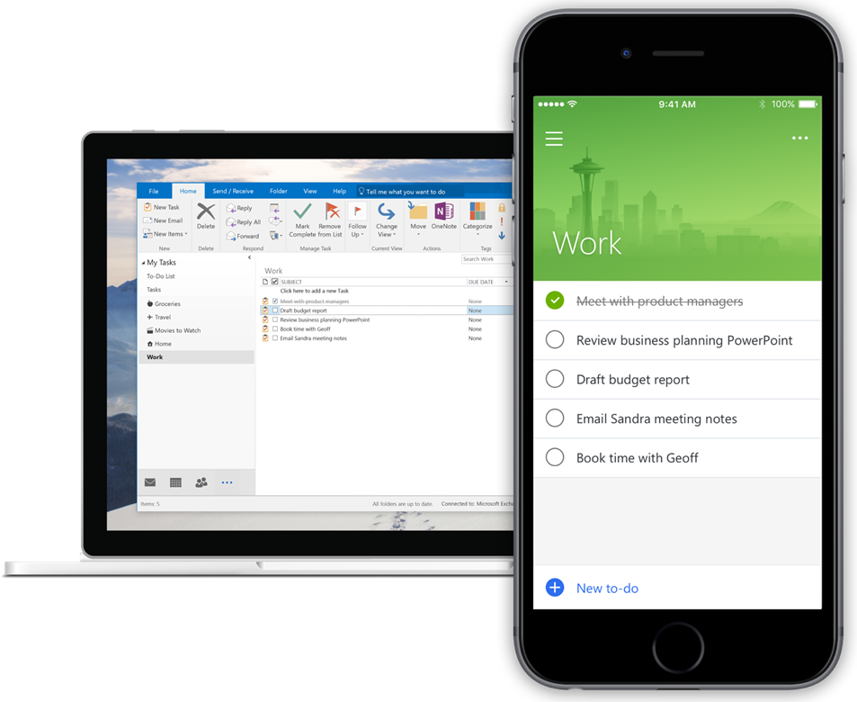
 Synchronization of Outlook to To-Do: Where is the Benefit? (Image: Microsoft)[/caption]
While Wunderlist and Todoist provide a wide array of apps, To-Do is limited to Android, iPhone, and Windows Phone. In order to not do To-Do injustice, I want to point out that it's able to automatically synchronize Outlook tasks. I heard that WTF you mumbled...
To-Do: The Disillusionment Came Soon
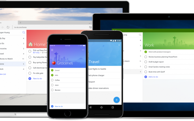
Over the weekend, I installed the iOS app and used the web app to log in using my Microsoft account. During the process, I was asked if I wanted to import my tasks from Wunderlist or Todoist. At this point, I was still in cheerful spirits. I frowned for the first time when To-Do told me that it found tasks with subtasks in my Wunderlist account and that it wasn't able to import them like this. It asked me to decide whether I wanted to import the subtasks as single tasks, or as a note for the main task. Huh? Can't To-Do even manage subtasks? Gnashing my teeth, I selected the note version. After a short while, the import was completed and I went to the web app to gain a first impression of a completely filled task list under To-Do. At a glance, To-Do looks modern, close to the material design from a completely different house, as well as slim and fast. The design similarities to Wunderlist can't be denied. However, disillusionment set in very quickly. Barely any features that I know from Wunderlist or Todoist are available. I have already mentioned the lack of subtasks. On top of that, there is no option to sort task lists into folders, in order to create a better division of job-related and private task lists or to simply sort them by projects.To-Do is Consistent: No Basic- and No Pro-Features
To-Do doesn't even allow for comments. This feature is not only crucial for collaborations with multiple members, but also great to include information on a task that is important, but not relevant to the status of completion. Speaking of collaboration, To-Do doesn't provide the slightest bit of support for teamwork. Tasks can't be delegated, lists can't be shared. To-Do is an island. In the times of the sharing economy, this is just as incredible as useless. What I liked about To-Do at first, was the concept of "My Day". In this list, you put all the tasks you want to get done with today. However, I realized two things after thinking about it for a while. First, there are no other lists that would be filled depending on time. In Todoist, for instance, there are automatic lists for "Today", and "Next 7 Days". In To-Do, there's only "My Day", and it has to be filled manually. Second, not every task can be completed within a day. Thus, "My Day" is a good choice for a dentist appointment, but not for professional tasks. In Microsoft's defense, we should mention that they have added a light bulb icon to the "My Day" view. Clicking it opens a list of recommendations for today. At least, you'll find the overdue tasks that you didn't get done with yesterday. You still need to add them to "My Day" manually, though. IT by foot. In many of my Wunderlist and Todoist tasks, there are files attached, including information such as images or briefings, some as Dropbox shortcuts. To-Do doesn't allow for anything like that, neither shortcuts nor files.To-Do is Completely Isolated: No Connection to the Outside
Things get even darker when talking about the app environment. Wunderlist and Todoist both come with a ton of integrations with other services, in different shapes and depth. To me, the calendar integrations, as well as those to Google Mail are essential. In my case of application, creating tasks from email is very common, as well as the creation of tasks from within websites. To-Do is unable to do either of those things. [caption id="attachment_102245" align="alignnone" width="953"] Synchronization of Outlook to To-Do: Where is the Benefit? (Image: Microsoft)[/caption]
While Wunderlist and Todoist provide a wide array of apps, To-Do is limited to Android, iPhone, and Windows Phone. In order to not do To-Do injustice, I want to point out that it's able to automatically synchronize Outlook tasks. I heard that WTF you mumbled...

I had tried To-do for several days ago but I switched back to Wunderlist. As you said, it’s complety isolated and in my opinion, it’s just more than a real notepad with pen to mark the to-do checklist to done.
Now, I’m looking for new To-do app with Wunderlist’s features.
This is Microsoft today. Releasing software with one color on a white background with black letters that has 10% of the features of the software they want to replace and no way to backup your work. Out of the top 10 requested features for To-Do they’re working on 3 with no plans to implement a way to create a backup file. Yes, this is Microsoft. Windows 95 had more features.