Logo Creation: Fast, Simple, Free With DesignEvo

Logo editors as web apps can be anything between great and terrible. DesignEvo goes into the direction of "great", although it's not perfect.
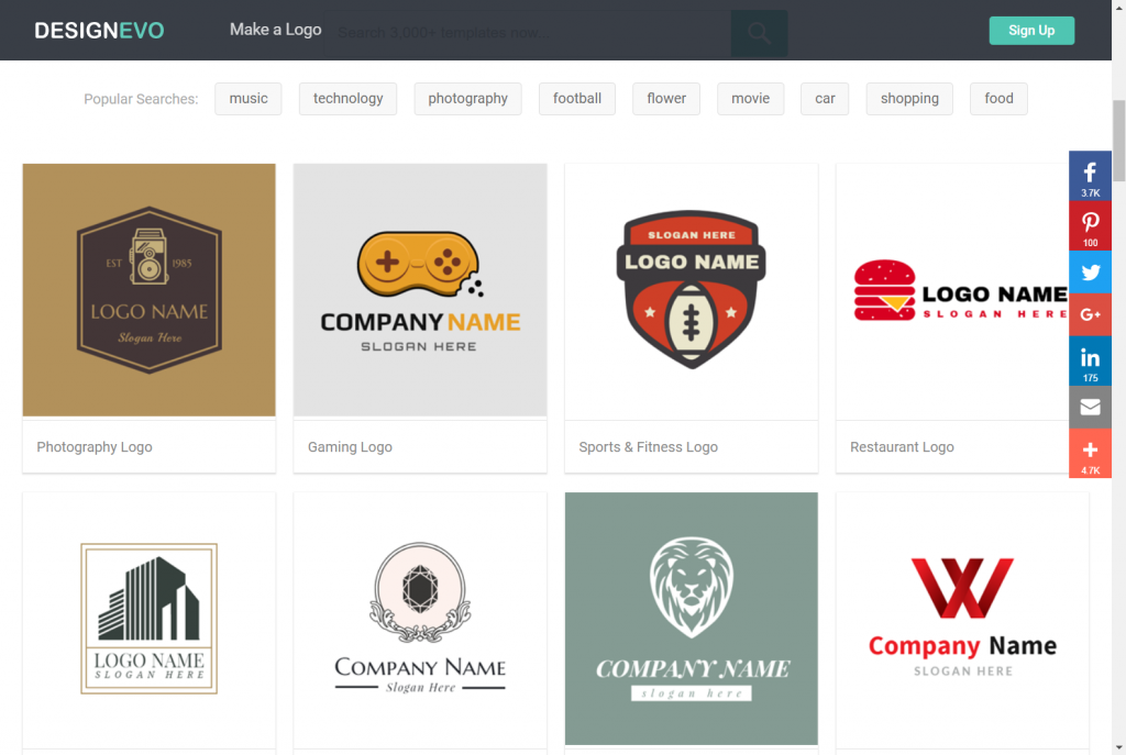 DesignEvo Landing Page. (Screenshot: Noupe)[/caption]
Regular readers of our magazine know already know the Canva-rival FotoJet. Just like FotoJet, DesignEvo was developed by the team of PearlMountain, which was mainly known for graphics desktop applications in the past. With FotoJet and DesignEvo, they are now taking a consistent route into the web, while offering installable applications of the two newcomers at the same time. Thus, you can already download and use DesignEvo as a Mac app. The Windows version is still in the works.
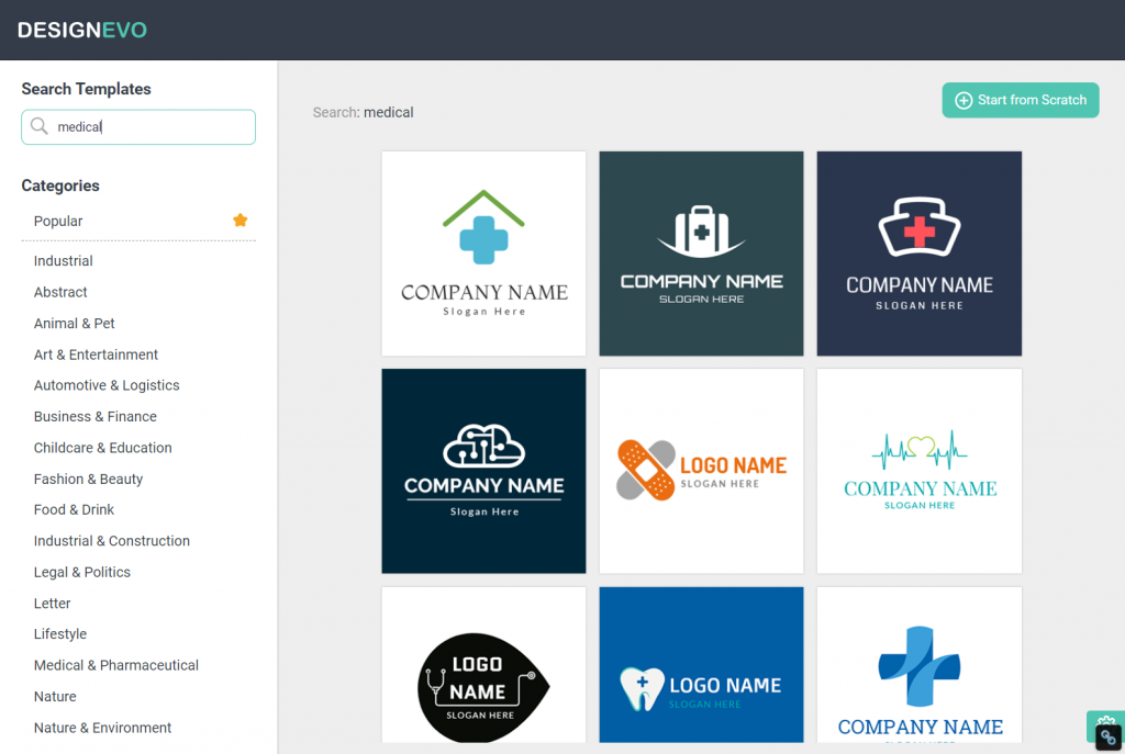 Searching by Free Text Entry. (Screenshot: Noupe)[/caption]
As I want to create a quick draft for Dr. Web Media (home of Noupe Magazine and others), I'm looking for a medically oriented template, and decide to use a two-color draft, as Dr. Web has always been designed using two colors.
After template selection, there is the option to enter a company name and slogan, which are then placed according to the template. This is not necessary. We can also start without text, and add new or further text whenever we want to.
Now, in the editor window, we find ourselves in a work environment with very intuitive controls. On the left, we can switch between icon, text, and shape, accessing the respectively available elements. Under the icon tab, we can search for pictograms via free text, and move them onto the workspace with a click.
[caption id="attachment_103609" align="aligncenter" width="1024"]
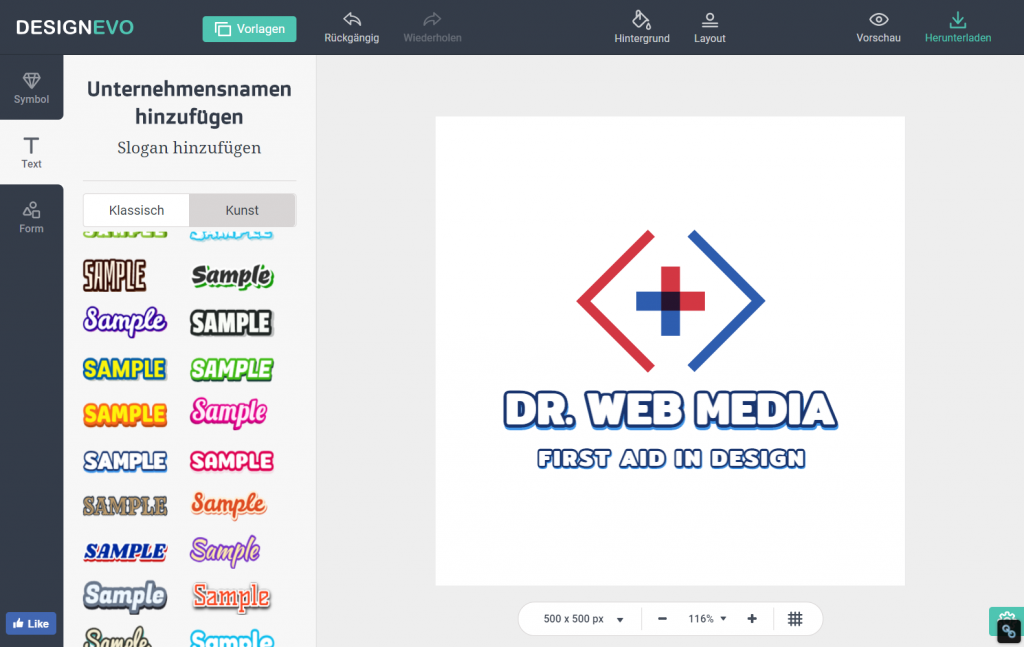 Intuitive Editor With a Right-Sided Workspace. (Screenshot: Noupe)[/caption]
The same applies to text formatting in the sense of font selection. Even complex, colorful fonts are available. DesignEvo considers them art fonts, in contrast to the conventional fonts, which are labeled as classic.
If we need additional shapes, like frames or geometrical shapes like circle or rectangle, we can find them in the shape tab.
Once all desired elements are in our workspace, which we can enhance or shrink via pixel input, we can start editing. A click activates the respective element, opening a toolbar above the workspace, which offers editing options that make sense for the given element.
Changing the size of individual elements is done by simply dragging the corner of an element. The circle symbol on the top right of the element lets you rotate it. We can also sort elements in layers, creating overlapping designs. Changing colors using solid basic colors, or a free color picker is possible, as well as the simple creation of gradients, or manipulation of opacity.
I started working on the selected template with options that are self-explanatory and got to the following result in about two minutes.
[caption id="attachment_103603" align="aligncenter" width="892"]
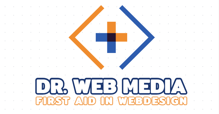 The First Draft After Two Minutes. (Screenshot: Noupe)[/caption]
The icon
 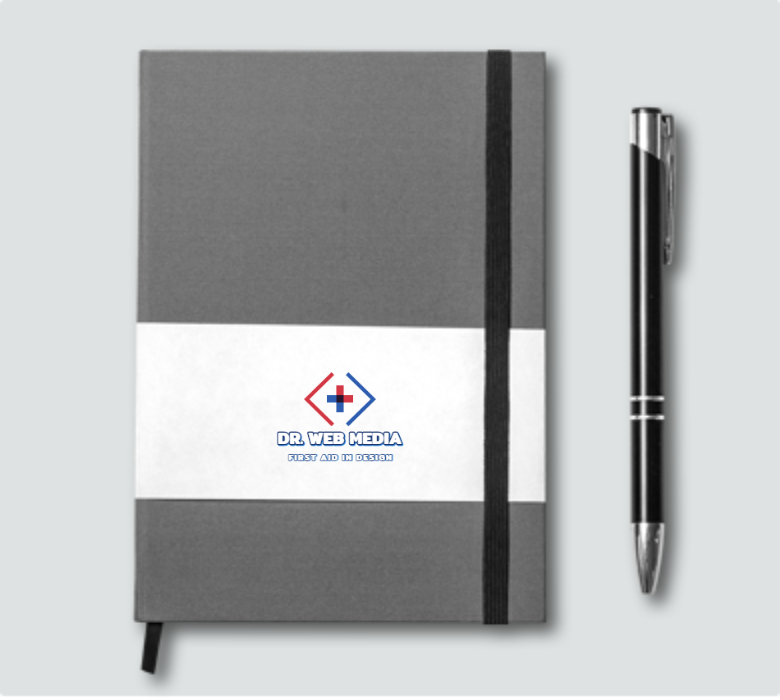 How does the logo look in real life? The preview can show you. (Screenshot: Noupe)[/caption]
In order to be able to download the logo as a JPG, PNG, and transparent PNG, DesignEvo demands a share on social media.
[caption id="attachment_103602" align="aligncenter" width="1024"]
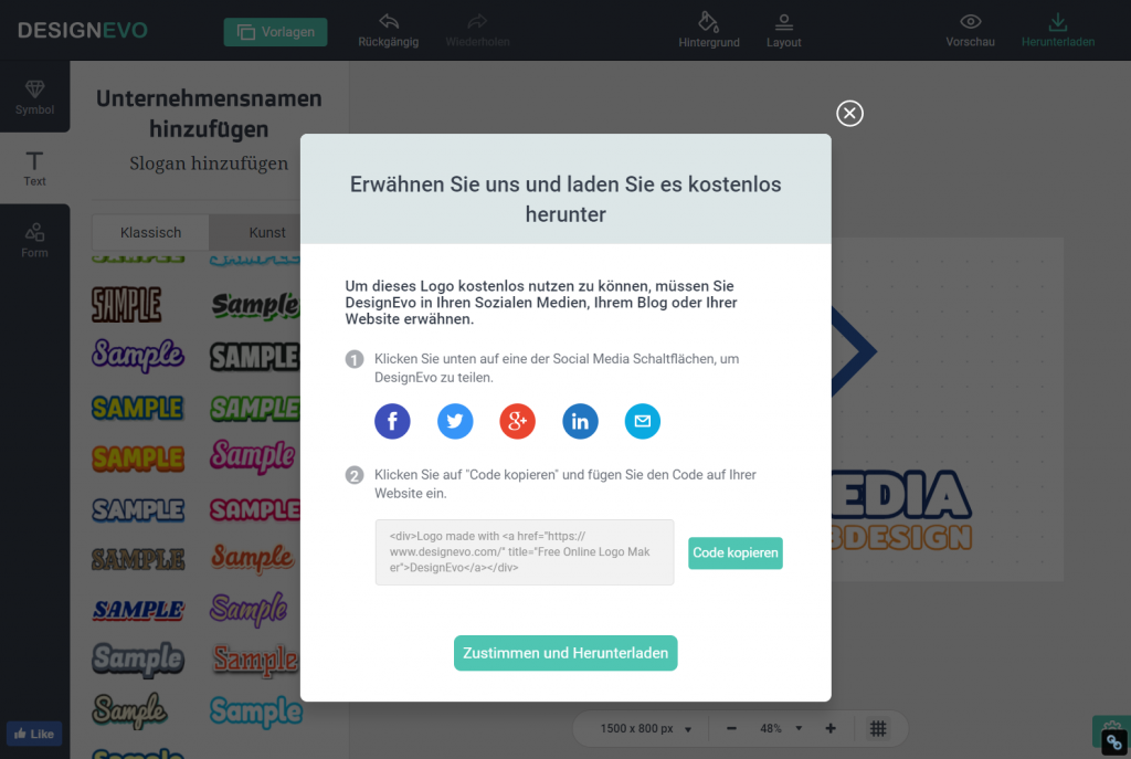 How to pay DesignEvo. (Screenshot: Noupe)[/caption]
The download works without doing so. However, there is a license that only allows you to use it if you publish a tweet, or another post. This post is not related to the actual work, as it is generic. That doesn't hurt.
DesignEvo Complements the Product FotoJet From the Same Company
There are many reasons for a quick, simple, and free logo draft. Being stingy does not always have to be the drive for the attractiveness of free solutions. Of course, a tool such as DesignEvo is a valid option for everyone on a tight budget. But designers and professionals, in general, should take an impartial look at the brand new tool as well. [caption id="attachment_103607" align="aligncenter" width="1024"] DesignEvo Landing Page. (Screenshot: Noupe)[/caption]
Regular readers of our magazine know already know the Canva-rival FotoJet. Just like FotoJet, DesignEvo was developed by the team of PearlMountain, which was mainly known for graphics desktop applications in the past. With FotoJet and DesignEvo, they are now taking a consistent route into the web, while offering installable applications of the two newcomers at the same time. Thus, you can already download and use DesignEvo as a Mac app. The Windows version is still in the works.
The Logo Design Process, Quick and Dirty First
I have to design logos on a relatively regular basis. The procedure is always the same. I ask my client if he has any ideas, and I sound him out regarding the purpose of his business. There has yet to be a situation where this kind of conversion is not enough for the first set of drafts. I sit down in front of my computer and pump out five to six suggestions. They are not radically different from each other. Of course, they are not really elaborate either, because there is no need to put work into the detail if the client could simply send my draft to nirvana by shaking his head. Instead of creating the draft set with Illustrator and other massive tools, I now like to use an array of small web tools, which will be joined by DesignEvo from now on.The First Draft With DesignEvo
DesignEvo is a really good choice for a quick draft. Under the hood, there are more than 3.000 templates from all kinds of sections. The tool is very to use and even available in different languages. Change the language via the turquoise gear icon at the bottom right corner of the editor window. Start your draft by selecting a template, or click on the buttonRestart at the top right of the editor. As a fast draft is our goal, we'll obviously start with a template. To do so, we can either scroll through the categories, or search through the templates via free text.
[caption id="attachment_103606" align="aligncenter" width="1024"] Searching by Free Text Entry. (Screenshot: Noupe)[/caption]
As I want to create a quick draft for Dr. Web Media (home of Noupe Magazine and others), I'm looking for a medically oriented template, and decide to use a two-color draft, as Dr. Web has always been designed using two colors.
After template selection, there is the option to enter a company name and slogan, which are then placed according to the template. This is not necessary. We can also start without text, and add new or further text whenever we want to.
Now, in the editor window, we find ourselves in a work environment with very intuitive controls. On the left, we can switch between icon, text, and shape, accessing the respectively available elements. Under the icon tab, we can search for pictograms via free text, and move them onto the workspace with a click.
[caption id="attachment_103609" align="aligncenter" width="1024"]
 Intuitive Editor With a Right-Sided Workspace. (Screenshot: Noupe)[/caption]
The same applies to text formatting in the sense of font selection. Even complex, colorful fonts are available. DesignEvo considers them art fonts, in contrast to the conventional fonts, which are labeled as classic.
If we need additional shapes, like frames or geometrical shapes like circle or rectangle, we can find them in the shape tab.
Once all desired elements are in our workspace, which we can enhance or shrink via pixel input, we can start editing. A click activates the respective element, opening a toolbar above the workspace, which offers editing options that make sense for the given element.
Changing the size of individual elements is done by simply dragging the corner of an element. The circle symbol on the top right of the element lets you rotate it. We can also sort elements in layers, creating overlapping designs. Changing colors using solid basic colors, or a free color picker is possible, as well as the simple creation of gradients, or manipulation of opacity.
I started working on the selected template with options that are self-explanatory and got to the following result in about two minutes.
[caption id="attachment_103603" align="aligncenter" width="892"]
 The First Draft After Two Minutes. (Screenshot: Noupe)[/caption]
The icon
 Preview at the very top of the browser border gets us to a preview of our logo on different media, like a t-shirt, or as a notebook, or even as a business card or website header.
[caption id="attachment_103605" align="aligncenter" width="780"] How does the logo look in real life? The preview can show you. (Screenshot: Noupe)[/caption]
In order to be able to download the logo as a JPG, PNG, and transparent PNG, DesignEvo demands a share on social media.
[caption id="attachment_103602" align="aligncenter" width="1024"]
 How to pay DesignEvo. (Screenshot: Noupe)[/caption]
The download works without doing so. However, there is a license that only allows you to use it if you publish a tweet, or another post. This post is not related to the actual work, as it is generic. That doesn't hurt.
