Cartoon: If Web Designers Were Florists … [007]
People working in the web design and development industry need to become thick-skinned over the years if they intend to survive long term. I am in this business since web design got invented in the early Nineties, and I sure know what I’m talking about when it comes to the hidden secrets of client communication. My remedy these days is laughing. I refuse to get angry anymore. Instead, I make fun of the situations that only a few years ago made me want to hire a professional killer. There are quite a few people out there who are only still alive for the fact I couldn’t afford to pay one. Nah, just joking. As making fun of it all is the healthiest way to cope with it, we decided to start a new cartoon series titled “If Web Designers Were” here at Noupe. This is part seven. Hope you enjoy it…

 Our reader Christian Longe from Washington goes through experiences like this frequently. That frequently that he decided to propose it as a part of our series. Thanks, Christian! I personally have not exactly witnessed a situation like that, but still the story resonates with me and brings back painful memories such as these:

If Web Designers Were Florists
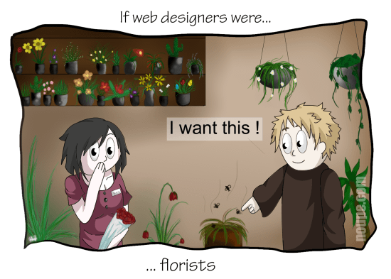
Clients always tend to stretch their orders to ultimately get more out than they put in. Paying little, getting lots is a wide-spread philosophy these days. Designers have to cope with that. The only way to actually secure yourself from delivering too much work for too little money is having everything fixed in a written contract with added written extension orders for every piece of work not initially having been part of the contract. But even then, you will fall prey to your client. They might not even intend to hurt you. Blame it on their unbelievably great ignorance. In today's cartoon, you'll meet a different specimen: the client with absolutely zero taste. You could have told from his 70s jacket and the strange hat he wore. But you had your guard down and thus weren't able to shield yourself. Now cope with it... Our little cartoons will help you eradicate ignorance once and for all. Collect them and show them to your clients as needed. I’m sure they’ll understand immediately.I like this one...
 Our reader Christian Longe from Washington goes through experiences like this frequently. That frequently that he decided to propose it as a part of our series. Thanks, Christian! I personally have not exactly witnessed a situation like that, but still the story resonates with me and brings back painful memories such as these:
Resonates with you? Be aware that our client in this little cartoon is more of the harmless kind. He simply got no taste...
- "Can we have one of these news tickers atop of the page? You know, these where the text moves through from left to right - like in super markets or stadiums."
- "This moving symbol where the postbox opens and closes is great. Can we have that for the link to our email address? Or take that spinning A with the circle around it."
- "That's how my website is supposed to look? Pff, this looks like kind of a computer program, everything in its place. Can we not randomly distribute all the links to information all over the page? That way customers have to search for it and stay on the page longer. And then, this all needs to become much more colorful. It's too boring the way it is..."
More Cartoons from the Series
- If Web Designers Were Tattooers
- If Web Designers Were Car Salesmen
- If Web Designers Were Plumbers
- If Web Designers Were Prostitutes
- If Web Designers Were Pizza Boys
- If Web Designers Were Sculptors
