Plug-in Free #3: Building an Interactive Map
Hello developers! I am back for part 3 in our series on plug-in free web development. While the first article was all about theory, the second showed you how to implement bar graphs with HTML5. Today we'll focus on something even more common. Interactive maps aren't particularly new; they've been around for years. What's different about the map, we will be developing during the course of the following article is, that it will be plug-in free. No Flash, no Silverlight, no Java, nothing.
 Even a plugin-free interactive map isn't totally novel; a few out there rely on HTML and JavaScript. But quite honestly, plugin-free maps usually aren't very exciting, mostly because they rely on older technologies. But with HTML5, we can include features previously found only with plugins, usually Flash.
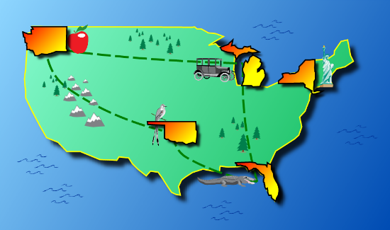 Moving your mouse or finger over the states will make them slightly bigger via an animated effect. (Does that change usability? Not really. But simple visual effects like these, used in moderation, make the experience more engaging.)
Since we want to demonstrate different features, we'll have the map pop up an information window when you click or tap on a state will then grow bigger and appear alongside the information. And as you tap and move between states, the map will show a connecting trail. Remember, the goal here is to show several different techniques you can use in your own interactive map.
 And here's what it looks like rendered as a set of points, which I'll show you how to do shortly:
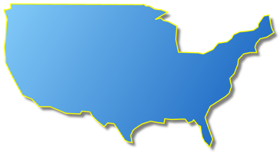 (For those of us from Michigan—that would include me—I apologize for leaving it off, but it will get replaced with an individual state copy of Michigan. So it will be there in the final map, don't worry! I just didn't want to spend time fussing with the detail when it would get obscured by an individual map.)
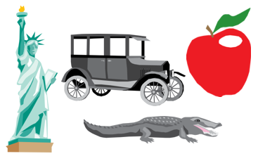
For cute images on the map, Microsoft's Clipart library yielded several usable items, easily stored as WMF files easily opened in my graphics program. I broke apart the images to get just the parts I wanted: a car, an alligator, an apple, a bird, the Statue of Liberty, and some trees, mountains, and ocean waves.
 In the code you'll see a whole bunch of <br /> tags. I added these because when I tried the app on my iPhone, the page wasn't big enough to scroll up for the address bar to disappear. Adding a bunch of line breaks at the end fixed that. (There are other ways to do this, but this was quick.)
To create the U.S. map, I create a polygon that uses these points. Here's what that code looks like:
This is the entire code needed to generate the map! Now we just need to draw it. That's where these lines come in:
This line creates the layer that will hold the map shape. Then we add the maps's polygon to the layer:
And finally, we add the layer to the stage:
And that's all the code we need to create a map of the US. Look carefully at the polygon we created; it has the points, as well as information about the colors, including a color gradient, stroke colors, and shadow colors. The gradient works by specifying the direction the gradient goes from; I started it in the upper left at 0,0 (the start point), and ended it in the lower-right, at 930,550. I then specified two color stops, the first at the starting point, which gets the number 0, with color #8EFFD6, and ends with the number 1 at color #00B34C.
The x,y position will be used to show where to put the state. The header and description will be used in the popup. Inside the code you can see where I'm creating the polygon shapes for each state, just as I did with the US Map. But the states get added to a different layer that's in front of the US map.
Now here's Michigan added (finally!) before you float over it:
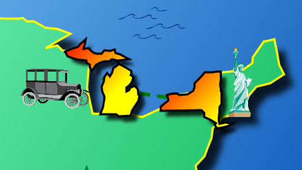 Here's what Michigan looks like when you float over it; it's bigger than it normally is:
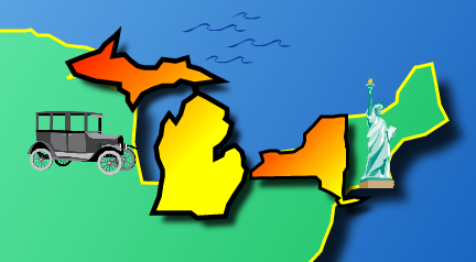 The next important event is the click or touch. Here we use some similar animation: move the popup page in front of the map, and make the state grow and slide over next to the text on the page. Try out the sample to see it in action, then look at the code for how it works. Again, there's not a lot to it; I call transitionTo for the popup window to slide it into view. Then I set the text that appears on the page, and call transitionTo to move the state. Setting the text is easy using the text objects made earlier:
The "self" variable refers to the state that was clicked.
I also include an event so that when you tap on the page, the whole thing runs in reverse and the state goes back to where it started. It's a neat effect.
The third important event drawn dashed lines that appear between the states as you click on them. The idea here is: If this were a map for a theme park, for example, you could grab the GPS location and draw a trail, so the family holding a mobile device can see where they've been. (An important privacy all this takes place on the device itself, so paths aren't actually sent back to the web server.)
Here's what the dashed lines will look like:
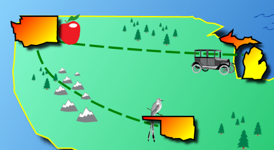 Drawing the lines simply requires capturing the state that was tapped, remembering the previous state tapped, and drawing a line between them. I used a "spline" curve to draw a nice curved line, rather than a straight line. A spline curve requires three points: The two end points, and then a point that pulls the line a bit to give it a curve. I had to calculate that third point based on the first two points; check out the function called "highway" in the source to see the calculations. Then I just create a new object called Spline:
This creates a dashed, green line 5 pixels wide. The tension value shows how much the curved line should stretch toward the third point. It can range from 0 to 1.
One final point on the highway: I also included code to keep track of which highways have been drawn, so each gets added only once. So if you click on Michigan and then Washington, it draws a line between the two. Then if you click back on Michigan, a line already exists, so it doesn't add another line. Otherwise as you click on more and more states, more and more lines would be added, and every time animation takes place, it would have to redraw all those lines. That wastes resources and would slow the app down.

 Even a plugin-free interactive map isn't totally novel; a few out there rely on HTML and JavaScript. But quite honestly, plugin-free maps usually aren't very exciting, mostly because they rely on older technologies. But with HTML5, we can include features previously found only with plugins, usually Flash.
Theme Park Maps: Features on Parade
Seems like the most exciting interactive maps usually represent theme parks. Disney has perhaps the most advanced I've seen. But… it requires Flash. Busch Gardens also has a nice one. Again, it requires Flash, and isn't available for iPhone and iPad users. Find it here. Let's build something similar, using only HTML5 and no plugins. We'll make ours less busy. And since we're using HTML5, it will work on virtually all modern mobile devices. What's not to like? We'll put together an interactive map of the USA, highlighting a few states. Here's what it will look like; you can see the finished product below, live on this web page: Moving your mouse or finger over the states will make them slightly bigger via an animated effect. (Does that change usability? Not really. But simple visual effects like these, used in moderation, make the experience more engaging.)
Since we want to demonstrate different features, we'll have the map pop up an information window when you click or tap on a state will then grow bigger and appear alongside the information. And as you tap and move between states, the map will show a connecting trail. Remember, the goal here is to show several different techniques you can use in your own interactive map.
Smart Start: Leverage Libraries
Let's be honest: Writing a lot of JavaScript code from scratch isn't much fun and can be very time-consuming. Fortunately, there are many free and open-source libraries built over the years that save us from re-inventing the wheel. As a programmer and web developer, I like to focus my efforts on building actual features, not writing thousands of lines of code supporting fundamental aspects of the program. For example, the Canvas element we talked about last time has some great features. But writing animated sprits and shapes requires some coding. So let's get some help from a really cool library called KineticJS, for developing HTML5 Canvas applications.Design Made Easy with Traces and Clip Art
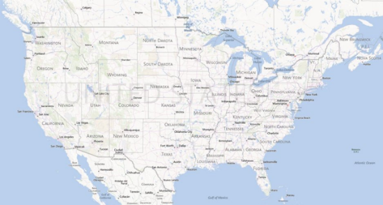
My forte is programming, not design. So to get this project going quickly, I needed to find some images. First, a basic map of the U.S. with realistic shape and non-traditional look. I started with a screenshot of Microsoft's Bing Maps, then used a graphics program to trace around the edges to get a set of points representing the map. I ended up with a set of 107 X-Y points that, when connected, look like the US. Why not just use an image? First, the KineticJS library includes a cool polygon object that will draw out points as described. So if I want to improve the map, I can easily scale to any device without having to stretch a bitmap image. I can also make use of some cool aspects of the KineticJS library, such as shadows. For the individual states, I also traced around them to obtain a set of points. Here's the original (scaled down a bit to fit in this article): And here's what it looks like rendered as a set of points, which I'll show you how to do shortly:
 (For those of us from Michigan—that would include me—I apologize for leaving it off, but it will get replaced with an individual state copy of Michigan. So it will be there in the final map, don't worry! I just didn't want to spend time fussing with the detail when it would get obscured by an individual map.)
For cute images on the map, Microsoft's Clipart library yielded several usable items, easily stored as WMF files easily opened in my graphics program. I broke apart the images to get just the parts I wanted: a car, an alligator, an apple, a bird, the Statue of Liberty, and some trees, mountains, and ocean waves.

Now, The Starting Code, Online
The code for this project is quite long - more than I can reprint here. No worries; you can download the source code using the link at the end of this article. Because we're demoing the project right on this page, right-click and view the source. (Web developers do that all the time, after all.) You can see all the code there; I'll take you through the parts that make it tick. KineticJS creates a Canvas object on the pa ge for us; instead we simply start with an empty DIV tag in our HTML. Here's the single DIV tag that will contain our canvas:- <div id="container"></div>
Layers and Setup Code
KineticJS lets us create layers of graphics to stack on the canvas. I created three layers: The USA map, the clip art, and the main layer holding the states and popup window. (I considered putting the popup window in its own layer. But I'm moving the selected state in front of the popup window, which would have meant having to jump around layers. So I'm keeping the states and the popup in a single layer.) KineticJS requires we create a new object called a stage, representing our drawing canvas. In the code below, you'll see I'm using the JavaScript "new" keyword to create a new object of type Kinetic.Stage. I'm passing as a parameter an object that contains the configuration items: The ID of the container DIV ("container"), the width of my canvas, and the height:- var stage = new Kinetic.Stage({
- container: 'container',
- width:930,
- height:550
- });
The Maps: In Part
I don't have space here to show you all the points in the map; I'll only show you part, and you can see the whole thing in the source. The line for the USA map is just an array of numbers. The numbers are treated as pairs, with the first of each pair being an X coordinate, and the second of each being a Y coordinate. It looks like this:- var USAMap = [57,82,66,110,64,121, . . . ,77,78,64,82];
- var USAShape = new Kinetic.Polygon({
- points: USAMap,
- fillLinearGradientStartPoint: [0, 0],
- fillLinearGradientEndPoint: [930, 550],
- fillLinearGradientColorStops: [0, '#8EFFD6', 1, '#00B34C'],
- stroke: 'yellow', strokeWidth: 3,
- shadowColor: 'black', shadowBlur: 15, shadowOffset: 15, shadowOpacity: 0.8
- });
- var usalayer = new Kinetic.Layer();
- usalayer.add(USAShape);
- stage.add(usalayer);
The States: Right
We're doing something similar for the state maps, but we're creating objects that will hold some additional information as well. Again, use the source to get the full set of data for the five states. Here's part of Michigan:- var MIMap =
- {
- image: 'Michigan.png',
- points: [51,109,55,99, . . . . ,74,109,56,109],
- position: { x: 578, y: 153 },
- Header: 'Michigan',
- Description: 'Michigan has the longest freshwater coastline . . . .'
- };
The Clipart: Tiny Delays
For the clipart, we follow the same approach as the states. But instead of creating images, we just load in the images, which are individual PNG files. For these, I use the Kinetic.Image class. The clipart all gets placed on its own layer as well, which sits between the USA map's layer and the states' layer. Look carefully at how I used the Kinetic.Image class. First creating an Image() object, then adding a function to that object that gets run after the image actually loads. Inside that function is where I create the Kinetic.Image object. All this is important for understanding the correct process for loading images. Although images are loaded from the web site quickly, there's always a delay, even as small as 50 milliseconds. Also, note that the act of setting the image name is what triggers the loading of the image.The Events: Transforming Static to Interactive
The popup page uses the same technique as the states; you can look at the code to see how I created a couple of rectangles and text boxes using the classes Kinetic.Rect and Kinetic.Text. After understanding the polygons and images, these two classes are pretty self-explanatory. The next step is the event system. Events are what transform this final map from a static image into something that's interactive. What's cool about the way KineticJS handles the events is it allows us to specify events for both a desktop browser as well as a mobile browser. For the desktop we use click events; for the mobile we use touch events. Handling touch events is vital for today's apps, because so many people run them on mobile devices. There are three important events you'll want to look over; one when you float the mouse (or move your finger) over one of the states to enlarge them slightly using simple animation. The code is almost too easy; you just specify what you want to change in the animation, how long it should take in seconds, and the type of animation to use:- this.transitionTo({
- scale: { x:1.5, y: 1.5 },
- duration: .6,
- easing: 'elastic-ease-out'
- });
 Here's what Michigan looks like when you float over it; it's bigger than it normally is:
 The next important event is the click or touch. Here we use some similar animation: move the popup page in front of the map, and make the state grow and slide over next to the text on the page. Try out the sample to see it in action, then look at the code for how it works. Again, there's not a lot to it; I call transitionTo for the popup window to slide it into view. Then I set the text that appears on the page, and call transitionTo to move the state. Setting the text is easy using the text objects made earlier:
- Header.setText(self.Header);
- Description.setText(self.Description);
 Drawing the lines simply requires capturing the state that was tapped, remembering the previous state tapped, and drawing a line between them. I used a "spline" curve to draw a nice curved line, rather than a straight line. A spline curve requires three points: The two end points, and then a point that pulls the line a bit to give it a curve. I had to calculate that third point based on the first two points; check out the function called "highway" in the source to see the calculations. Then I just create a new object called Spline:
- new Kinetic.Spline(
- { points:[{x:x1,y:y1}, { x:midx, y:midy} ,{x:x2,y:y2}], dashArray: [ 33, 10],
- stroke:'green', strokeWidth: 5, linecap:'round', tension:.5 }));
The Conclusion: Fun Proof
That’s it! The whole thing works quite well and sports the “cute” look of many theme park maps. It’s interactive and includes a little bit of animation, but not too much. Spend some time looking through the code, and we can share some thoughts in the comments below. And don't forget to handle touch! Mobile is king these days. And most importantly, have fun! I had a blast putting this thing together, grabbing clip art, and trying different colors and animation techniques. Give it, or similar, a shot. You will too. Float your mouse over some states, then try clicking on some states
About the Author(dpe) Image by Epic Images from PixabayJeff Cogswell has nearly 25 years of experience as both a software engineer and a professional writer. He has worked on development teams, doing everything from low-level C programming on Unix up to high-level web development. In the past decade he has focused his work primarily on web development, including mastering such technologies as server-side programming with C#, and client-side programming such as HTML, XML, JavaScript, and Adobe tools, and now HTML5. He has authored numerous books, including C++ All-in-One for Dummies. He writes regular columns for SourceForge and SlashDot, including columns on parallel programming and development.

One comment