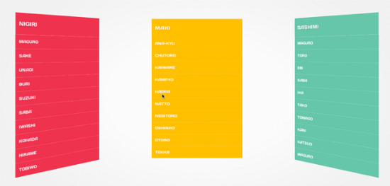
Makisu – Sushi-Inspired CSS 3D Navigation for jQuery
Better browser support has CSS experiments become more popular these days. My personal favorite up until today was Paperfold CSS. Of course we also saw Meny and some other more playful approaches. Makisu is a brand-new concept for dropdown navigation menus realized by the use of CSS 3D transforms. I have seldom seen such an impressing result. Sorry Paperfold CSS, I leave you for Makisu...
Makisu - the virtual bamboo mat
Justin Windle aka soulwire, born in the UK, but now living in the United States, developed Makisu, a concept resembling the older Paperfold CSS, but going much farther than that. It is actually easily implementable in live websites through its iteration as a jQuery plugin. The strange name stems from the Japanese language, where a Makisu is a bamboo mat used to produce a certain kind of sushi or just to squeeze moisture out of fruits and other overly moist nourishments.
[caption id="attachment_73106" align="alignnone" width="550"] Makisu fully rolled out[/caption]
Justin Windle's Makisu can not be used to produce sushi obviously, neither can you squeeze fruit-juices with it. Anyway, take a look at it and you'll immediately understand the name. The Makisu navigation menus unfold like a bamboo mat let loose while held on one side. The navigation items roll out and the virtual bamboo mat even swings back and fourth, making for a realistic effect. The dropdowns are made up of list items, one per line. These items can be toggled to show or stay invisible. Unfolding the dropdown leads to the bamboo effect.
Makisu is a mere CSS concept using CSS 3D transforms. As such it only works in some of the most recent versions of browsers, as they are Chrome, Firefox, Safari, and the standard browsers in Android, iOS and Blackberry. Internet Explorer 10 should also be displaying Makisu correctly. As I am testing some of the most recent Ultrabooks at the moment I took one and fired up IE 10 to double-check if something that beautiful but at the same time demanding would really, I mean really as in real not really as on a spec paper, work in a Microsoft environment. I did not get disappointment, given that I expected it not to. Makisu actually works, but the whole experience is sluggish, slow and all the animation effects are left out. No elegantly swinging at the end of the process. Microsoft proves to be reliable...
[caption id="attachment_73105" align="alignnone" width="550"] Makisu in full motion[/caption]
Makisu as a CSS concept would not be very easy to implement into your own website. That's why Justin wrapped a jQuery plugin around it. This makes implementation a snap. Simply call jQuery and the plugin in the head of your document and call the function like this:
$( '.list' ).makisu({
    selector: 'li',
    overlap: 0.2,
    speed: 0.8
});
The most important parameter is the choice of selectors. In the above shown example it is the regularly used li-element, but you could as well go more exotic and choose elements as to your liking. The other options refer to speed and overlapping. 3D effects are provided by the use of perspective and vertex shading via shading.
Makisu can be downloaded and used free of charge from Github. It is only a few days old and - let me say it again - is a concept. If you are the adventurous kind you could of course put it on one of your live websites. Chances are your customers might complain. But boy, it really looks fancy...
Related Links:
- Makisu - Github
- Justin Windle's Profile - Github
- Demonstration of Makisu - Github
- Definition of Makisu in Japanese cooking - Wikipedia
- Browsersupport for 3D Transforms - Can I use...
Related Content on our German sister site:
- Paperfold CSS: HTML5 kreativ eingesetzt - Dr. Web Magazin
- Ihre Website in 3D mit Meny und CSS 3D Transforms - Dr. Web Magazin
- Spaß mit CSS Transforms: 3D it!, 3D Fishbirds und Wonder Webkit - Dr. Web Magazin

While this is really cool, I fail to see when something like this would be good to use on an actual functioning website. It takes to long to unfold and fold back up, even when you adjust settings. It would become extremely annoying for visitors to use this style of navigation compared to a dropdown menu that just slides down really quick.
Still a nice example of what can be done, though.
This is the nature of a concept ;) Prototype what is possible, even though some polishing needs to be done.
I am still confused though the article is good , i still cannot grasp what Makisu means and its application to the mentioned. Please dont be offended , its my view.
i can imagine to use this as a “your a winner” click to show your price.
The global usage of browsers supporting CSS 3D being 58.45% also deters the possibility of using the Makisu Effect for now. Give it a couple of years and this could change for the better.
A very cool effect but unfortunately it jerky for me.
very nice …
This is cool, and I’m no design / css snob, but this kind of thing may be skeuomorphism gone totally bonkers. I think guys like this should be designing video games and stuff that is really about the experience and not for mass distribution on websites where users just want to click to their solution quickly…