Typography rules: Eye-Catching Headlines with slabText for jQuery
Typography in web design has long been treated as an orphan. With the rise of web fonts the situation changed and thanks to jQuery we have loads of elegant little helpers to make our sites prettier. The more advanced plugins even introduce possibilities formerly only known to print designers. Today we are going to take a look at slabText.js. This tool will split longer headings into two or more rows and set these rows to full justification, where each row is scaled individually, which guarantees for an eye-catcher.
slabText: FitText clone at first, but not at second sight...
You might have already put your hands on FitText, a very popular plugin, that at first sight seems to achieve the same tasks slabText intends to. The difference is small, but profound. FitText only scales one-row headings to the size of its container.
slabText takes the next step and provides almost the same functionality for longer headings. Taking a longer title marked H1, slabText will split it in rows. Then it takes these rows and justifies them to the left and to the right, which obviously requires changes in font-size, as not all words are created equal. In doing so, slabText calculates by itself where to fill in the line breaks. Thinking of event announcements or other layouts with a focus on structured information, automatic line breaking will usually not lead to intended results. We don't need to worry about that as slabText allows for manually set forced line breaking, too. All you need to do, is fill in the text between this markup:
var stS = "",
    stE = "",
    txt = [
        "For one night only",
        "Jackie Mittoo",
        "with special Studio One guests",
        "Dillinger & Lone Ranger"];

$("#myHeader").html(stS + txt.join(stE + stS) + stE).slabText();
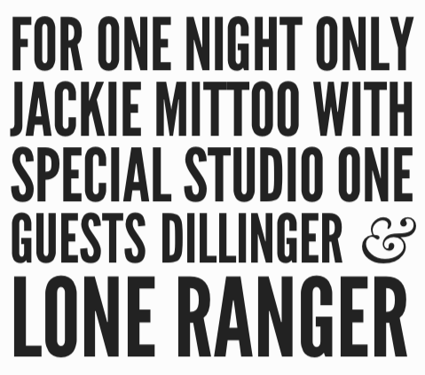
If you're puzzled as to where the problem might lie, let's take a look at an eye-catching heading. The first variant is based on the automatically calculated line breaking of slabText, whereas the second alternative shows forced line breaking depending on manual settings. I think you'll agree that the second variant is much more attractive, readable, world-changing, what else:
[caption id="attachment_71469" align="alignnone" width="479"] slabText's proposal: Not optimal under communication aspects[/caption]
[caption id="attachment_71468" align="alignnone" width="483"]
 Manually set line breaks transport the important information way better[/caption]
Using the function viewpointBreakpoint, we are able to define the minimum resolution for the plugin to be invoked. You'll usually not want to have scaled heading if your browser's viewpoint is below a certain resolution, say 300 to 400 pixels in width. With the definition of a breakpoint, slabText stays completely idle (if invoked in the defined range), whereas it interprets all other resolutions responsively.
Important note for web font users: Make sure all fonts are loaded before you fire up slabText. The product's website doesn't stick to this rule, but intentionally. The developer wants you to see the untouched heading for a short period of time before slabText goes into effect. Live websites shouldn't risk to work that way.
slabText is under active development. The latest changes happened only a few days ago. slabText can be used free of charge under a MIT-/GPL-license.

Lovely…
cool, missing design roundups..
Gute Idee, gut umgesetzt. Danke!
It is really useful for me
Useful article, thanks for sharing.
You may be wondering: http://crazypixels.net/4-hardest-decisions-in-typography/
Nice! I Would find it cool if slabText could adjust word- and letter-spacing too.