CSS Framework Cute Grids: Highly Flexible Grid System for Responsive Layouts
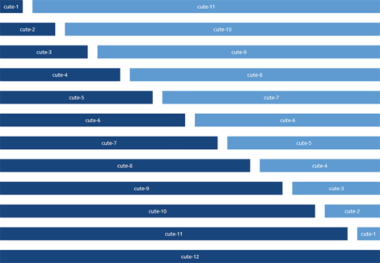
These days it is impossible to ignore the power of mobile. So, if you're in the process of designing a website, chances are that you will do that with mobile in mind. Most likely, you are working on implementing a fully responsive layout. The lean and clean CSS framework we want to introduce you to today, wants to help you achieve that goal easily. "Cute Grids" is highly flexible and allows for the creation of a grid-based layout with up to 12 columns. "Cute Grids" will only take care of the columns, nothing else. But it will do that in relation to the size of the browser window.

Cute Grids: Literally Lightweight Framework
As "Cute Grids" doesn't care for anything else but the presentation of your columns, it is very small. The file cutegrids.css is merely 500 lines of code, the popular normalize.css cares for resetting CSS properties to their standards. The foundation of "Cute Grids" is a grid of 12 columns, which you can combine in different ways. You could create two (2 x 6 columns), three (3 x 4 columns), four (4 x 3 columns) or any combination of values.Cute Grids Not Only Differentiates Resolutions, But Also Devices
What's special about "Cute Grids" is, that it not only differentiates different resolutions, but also brings classes for desktops, laptops, smartphones and tablets to the table. This way it gets astoundingly simple to define from which resolution downwards, columns are supposed to be shown underneath each other instead of side by side. Classes for smartphones („cute-1-phone“ to „cute-12-phone“) will always be presented besides each other, no matter the size. This grants a layout to stay multi-column, independent of the resolution. The classes for tablets („cute-1-tablet“ tos „cute-12-tablet“) make sure, columns are presented in one row as soon as the browser windows reaches a width of at least 48 em. On laptops this size needs at least be 62 em, and on desktops minimum 75 em.<div class="row">
<div class="cute-6-desktop"></div>
<div class="cute-6-desktop"></div>
</div>
<div class="row">
<div class="cute-6-tablet"></div>
<div class="cute-6-tablet"></div>
</div>
In our above example we define two rows with two columns each. As soon as the browser window falls below 75 em, the columns of the first row will no longer be presented side by side, but underneath each other, while the second row stays as is. The second row will then line-break as soon as the window width falls below 48 em.
„Cute Grids“ knows further classes, allowing you to define the distances between columns as well as the order of columns in a row. As „Cute Grids“ is reduced to the basics, it is fairly easy to adjust the CSS to your liking. You should definitely check it out as a starting point for your next responsive project.
(dpe)

This is great, I find any class with the name “cute” in it is useful. “class=”cute-6-desktop”. Also, you aren’t lying about it being easy to edit to my liking! Thanks for the tips, I am going to try this in my next responsive design layout.