Creating an Accessible Breakout Game using Web Audio and SVG
As the co-author of Babylon.js, a WebGL gaming engine, I was always felt a little uneasy listening to folks discuss accessibility best practices at web conferences. The content created with Babylon.js is indeed completely inaccessible to blind people. Making the web accessible to everyone is very important. I’m more convinced than ever about that as I’m personally touched via my own son. And so I wanted to contribute to the accessibility of the web in some way.
 Background photo by Cutewallpaper.org
That’s why I decided to work on creating a game that uses WebGL and is fully accessible, to prove that visual games aren’t inherently inaccessible. I chose to keep it simple, so I created a breakout clone, which you can see in action in the following YouTube video:
https://youtu.be/25quyIGtujk
You can test it in a Web Audio compatible browser (see caniuse.com for a list) or download or peruse the source code on Github.
Now, let me share with you the background story of this game and all the experiments involved…
 The beauty of the SVG viewbox is that it perfectly scales across sizes & resolutions
This became the baseline for my experiments.
For audio, I had several ideas. The main trick I wanted to use was spatial sound to enable people to know where they are on the board without having to see the screen. This can be achieved using Web Audio. As I didn’t have access to a visually impaired tester, I ‘cheated’ by closing my eyes while wearing a good set of headphones. You’ll see later that testing the game with a real blind user helped me fix a lot more things, but as a start, this was an OK way to test the game.
I started tinkering with the Web Audio API using a sample from an excellent tutorial on HTML5Rocks as my guide. The main demo is in the “3D positional sound” section:
 I then replaced the sound emitted by the mouse cursor with the position of the ball in the game. Testing that didn’t work out as well as I’d hoped. It was too complex to understand exactly where the ball was on the screen by sound alone and you couldn’t predict the direction of the ball like you can when you see the screen. Still, I thought it was interesting to emit some 3D sounds when the ball was hitting something—a brick or one of the walls. It was information that could be useful to anybody, so I kept that part.
As I’m also a composer in my spare time, my next idea was to use a specific piano note for every brick’s column, thereby adding a sense of what is left and right. By default, I chose to have 8 columns to cover an octave. I coded it and… it was fun, but didn’t help the gameplay.
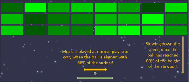
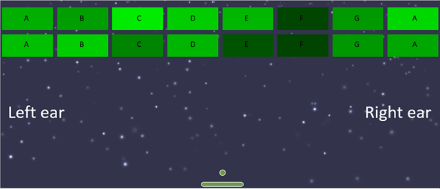 I knew I needed help, so I showed what I did to my oldest son and he came up with the best solution. He told me it would make sense to use the play rate and effect of the sound to provide information about where the ball was. After several tests, I’ve ended up with the following algorithm:
 I was very happy with the game using these gameplay parameters. I’ve been testing the game with several of my colleagues who were able to play the game while closing their eyes. But they all knew what a breakout game should look like and, thus, their brain was able to more or less anticipate the gameplay mechanics already. They were conditioned.
My ultimate test was during Paris Web 2014, an awesome and well-known conference in France. My goal was to finish a first draft of the game for the famous lightning talks. I was a bit nervous about what I’d done and met again Stéphane to share my worries. He told me I should talk to Sylvie Duchateau, who is a blind woman involved in web accessibility, to describe what I’d done and do a quick test with her.
During one of the breaks, I shared my project and the audio gameplay ideas behind it with her. To my surprise, she told me she didn’t know what a breakout game was! Which is obvious once you think about it. If you can’t see, a purely visual game doesn’t have much appeal to you. However, she found the idea of a game with spatial audio interesting, so we gave it a go.
She put on my headset, and I started the game… to my dismay, she wasn’t able to play the game at all. There was too much audio information to precisely decide what to do. Should I move left or right now? After a brief discussion with her, she told me I should remove some audio details. She also suggested that I avoid using web audio spatialization for the music (it was moving from the center to the left or right based on the distance from the paddle) and instead enable only the right or left speaker in order to provide very clear instruction on what to do. I quickly fixed the code while she was there and then she was immediately able to break her 2 first bricks. I was so happy, you can’t even imagine. She even asked me what was the best score to beat, which means that I reached my goal of delivering an accessible game—at least for the visually impaired.
The main code handling all of this is here:
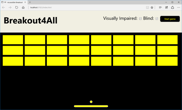 (2) If you can’t see at all, you can uncheck the “Visual Impaired” option to enable great graphics for your surrounding audience. The paddle width remains the same and you still have audio assistance:
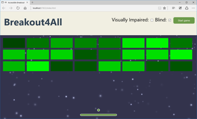 (3) If you don’t have any visual impairments, you can uncheck everything to make the paddle more narrow and the ball speed faster:
 Background photo by Cutewallpaper.org
That’s why I decided to work on creating a game that uses WebGL and is fully accessible, to prove that visual games aren’t inherently inaccessible. I chose to keep it simple, so I created a breakout clone, which you can see in action in the following YouTube video:
https://youtu.be/25quyIGtujk
You can test it in a Web Audio compatible browser (see caniuse.com for a list) or download or peruse the source code on Github.
Now, let me share with you the background story of this game and all the experiments involved…
Once Upon a Time
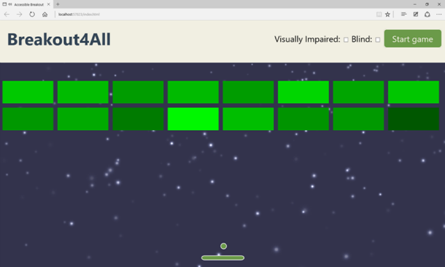
It all started during the Kiwi Party 2014 conference, while listening to Laura Kalbag’s talk about guidelines for top accessible design considerations. I was discussing with Stéphane Deschamps, a lovely, funny and talented guy about my lack of knowledge on how to make WebGL accessible and how I could avoid people creating lots of inaccessible content. To motivate me, he challenged me. Probably without estimating the consequences: “it would be very cool if you’d manage to create an accessible breakout game!”. Boom. The seed of what you see here got put in my brain right there and then. I started thinking about that in earnest and researched on how I could create such an experience. First, I discovered that there were already accessible audio games available at audiogames.net and game-accessibility.com. I also researched best practices for creating games for blind people. While interesting to read, I wasn’t finding what I was looking for. I didn’t want to create a dedicated experience for blind people, I wanted to create a universal game, playable by anybody, regardless of ability. I’m convinced that the web was created for this reason and my dream was to embrace this philosophy in my game. I wanted to create a unique experience that could be played by all kind of users so they could share in the joy together. I wanted great visuals & sounds, not a “look it’s accessible, that’s why it can’t be as good” solution. To this end, I started to do some experiments. I took a small breakout game written by my friend, David Catuhe, that used SVG. I refactored it a bit to use the SVG viewbox for better scaling across screens and re-wrote it in TypeScript. I also replaced the animated 2D Canvas in the background with a WebGL canvas using Babylon.js to add a starfield experience.
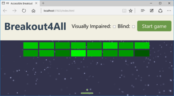
 The beauty of the SVG viewbox is that it perfectly scales across sizes & resolutions
This became the baseline for my experiments.
For audio, I had several ideas. The main trick I wanted to use was spatial sound to enable people to know where they are on the board without having to see the screen. This can be achieved using Web Audio. As I didn’t have access to a visually impaired tester, I ‘cheated’ by closing my eyes while wearing a good set of headphones. You’ll see later that testing the game with a real blind user helped me fix a lot more things, but as a start, this was an OK way to test the game.
I started tinkering with the Web Audio API using a sample from an excellent tutorial on HTML5Rocks as my guide. The main demo is in the “3D positional sound” section:
 I then replaced the sound emitted by the mouse cursor with the position of the ball in the game. Testing that didn’t work out as well as I’d hoped. It was too complex to understand exactly where the ball was on the screen by sound alone and you couldn’t predict the direction of the ball like you can when you see the screen. Still, I thought it was interesting to emit some 3D sounds when the ball was hitting something—a brick or one of the walls. It was information that could be useful to anybody, so I kept that part.
As I’m also a composer in my spare time, my next idea was to use a specific piano note for every brick’s column, thereby adding a sense of what is left and right. By default, I chose to have 8 columns to cover an octave. I coded it and… it was fun, but didn’t help the gameplay.
 I knew I needed help, so I showed what I did to my oldest son and he came up with the best solution. He told me it would make sense to use the play rate and effect of the sound to provide information about where the ball was. After several tests, I’ve ended up with the following algorithm:
- If the ball is perfectly vertically aligned with the paddle, play the sound at the “normal” rate
- If the ball is not aligned with the paddle, slow down the play rate. The farther the ball is from the paddle, the slower the sound will be. It will give an immediate feedback to blind people that the ball is not aligned anymore and they need to move the paddle to avoid missing the ball
- Play the sound of the music in a spatialized way: 0 on the X axis if the ball is at the center of the paddle, and –value and +value on the X axis based on the distance of the ball from the paddle.
 I was very happy with the game using these gameplay parameters. I’ve been testing the game with several of my colleagues who were able to play the game while closing their eyes. But they all knew what a breakout game should look like and, thus, their brain was able to more or less anticipate the gameplay mechanics already. They were conditioned.
My ultimate test was during Paris Web 2014, an awesome and well-known conference in France. My goal was to finish a first draft of the game for the famous lightning talks. I was a bit nervous about what I’d done and met again Stéphane to share my worries. He told me I should talk to Sylvie Duchateau, who is a blind woman involved in web accessibility, to describe what I’d done and do a quick test with her.
During one of the breaks, I shared my project and the audio gameplay ideas behind it with her. To my surprise, she told me she didn’t know what a breakout game was! Which is obvious once you think about it. If you can’t see, a purely visual game doesn’t have much appeal to you. However, she found the idea of a game with spatial audio interesting, so we gave it a go.
She put on my headset, and I started the game… to my dismay, she wasn’t able to play the game at all. There was too much audio information to precisely decide what to do. Should I move left or right now? After a brief discussion with her, she told me I should remove some audio details. She also suggested that I avoid using web audio spatialization for the music (it was moving from the center to the left or right based on the distance from the paddle) and instead enable only the right or left speaker in order to provide very clear instruction on what to do. I quickly fixed the code while she was there and then she was immediately able to break her 2 first bricks. I was so happy, you can’t even imagine. She even asked me what was the best score to beat, which means that I reached my goal of delivering an accessible game—at least for the visually impaired.
The main code handling all of this is here:
// To help visually impaired users, the sound is being played at normal rate
  // on 66% of the global width. It's to help them anticipating the ball
  export const ACCESSIBLE_PAD_TOLERANCE = 0.66;
  export const DEFAULT_MUSIC_PLAYRATE = 1.3;
private _updateAccessibilityMusic() {
      var paddleX = this._padX;
      var paddleW = this._padWidth;
      var ballPosition = { x: this._ballX, y: this._ballY };
    var deltaX = paddleW * ((1 - ACCESSIBLE_PAD_TOLERANCE) / 2);
    if (ballPosition.x > deltaX + 10 && ballPosition.x < this._viewPortWidth - (deltaX + 10)) {
          paddleX += paddleW * ((1 - ACCESSIBLE_PAD_TOLERANCE) / 2);
          paddleW = paddleW * ACCESSIBLE_PAD_TOLERANCE;
      }
    // If paddle & ball aligned, sound is played on both ears (X = 0, for center)
      // If the ball is on the left, musicIndicatorX should be negative otherwise positive
      var musicIndicatorX;
    // Position coordinates are in normalized canvas coordinates
      // with -0.5 < x, y < 0.5
      if (ballPosition) {
          var x = (ballPosition.x - this._viewPortCenter.x) / this._viewPortWidth;
        // Ball and paddle are vertically aligned
          if (ballPosition.x >= paddleX && ballPosition.x <= paddleX + paddleW) {
              this._music.setPlaybackRate(DEFAULT_MUSIC_PLAYRATE)
              musicIndicatorX = 0;
          }
          else {
              var distanceFromPaddle;
              // Ball is on the left of the paddle
              if (ballPosition.x < paddleX) {
                  distanceFromPaddle = paddleX - ballPosition.x;
                  musicIndicatorX = -30;
              }
              else {
                  distanceFromPaddle = ballPosition.x - paddleX - paddleW;
                  musicIndicatorX = 30;
              }
              var distanceFromPaddleNormalized = distanceFromPaddle / this._viewPortWidth;
              // Slowing down the play rate based on the distance from the paddle
              this._music.setPlaybackRate(0.9 * (1 - distanceFromPaddleNormalized));
          }
          // Playing music on left or right speaker based on the ball position from the paddle
          this._music.setPosition(new BABYLON.Vector3(musicIndicatorX, 0.5, 0));
      }
  }
Note: I’m using the BABYLON.JS sound stack implemented on top of Web Audio. You can read our documentation or get the code on Github.
Other Ideas I Added to the Game
I can’t remember every trick I’ve tried in order to optimize the gameplay to be “universal”, so I’ll wrap up with what I’ve implemented.Speech Synthesis
Some users may not be able to see how many bricks are left. Similarly, they have no way of knowing if they have won or lost, based on the visuals. That’s why I thought it was a good idea to use the Web Audio speech library meSpeak.js to add audio clues. However, after discussing with Anthony Ricaud and a bunch of other people at the event, it turns out that was not the best solution. The issue was that I would be forcing a specific voice and speed in my code. Users of assistive technology, however, already have preferred settings —a certain voice at a defined speed. It is therefore better to use an ARIA Live Region to update the user during gameplay. I’m sure there is more I can do too; feel free to enhance my code if you’d like to, I’d appreciate it. The speech synthesis currently tells you the number of bricks left to break, that the game has started or ended (by losing or winning), and your final score. As values in an ARIA live region, screenreaders will automatically read this information to the user. Visual users don’t need a robot voice to tell them what’s going on.SVG Styling
I decided to use SVG for this game for several reasons: it scales perfectly on all screens as it is vector based, it can be coupled with CSS for the design, and, last but not least, it works perfectly well with ARIA. I’ve already mentioned the scaling part earlier in this article and I haven’t done enough research into where ARIA (apart from Live Regions) could be useful with SVG in this case. CSS, on the other hand, was very helpful to me. As a reminder, my goal was to have the same game, with the same code base, being used by anybody. When you’re loading the game, I load the default style sheet with optimisations for the visually impaired. Here’s why:- If you can’t see or you only see partially, it is better to start with the high contrast visuals. I’m loading “indexvi.css” by default to have a high contrast colors using yellow & black. I’m also disabling the background WebGL canvas to reduce the visual clutter. If you can see and don’t like this, you can uncheck the appropriate options and get the starfield and less vivid visuals.
- If you can’t see at all, you can disable the “visual impaired” option to enable high quality graphics. This will load the “index.css” style-sheet and enable the WebGL background. Thanks to the beauty of SVG mixed with CSS, we just need to load this new style-sheet and the rest happens automatically. Of course someone who can’t see doesn’t care about having poor or great graphics. But it’s better for people watching you play as it shows that accessible games don’t have to look basic.
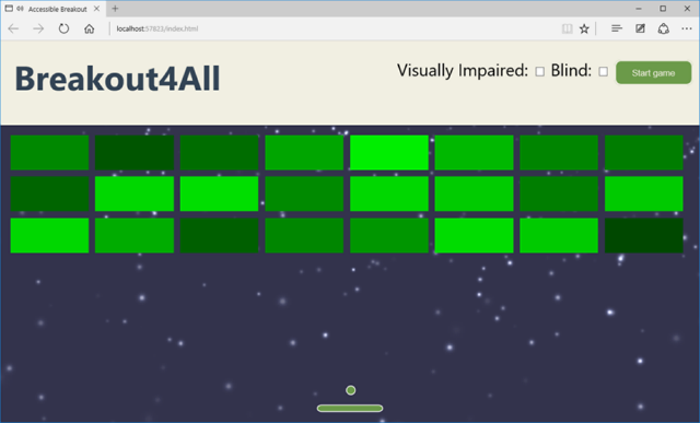
- If you can see clearly, uncheck all options. You’ll have great visuals and the speed and paddle width will be adjusted to be more difficult. You also won’t get the audio clues as to how many bricks are left and whether you won or lost. That would be unnecessary—it should be pretty obvious.
 (2) If you can’t see at all, you can uncheck the “Visual Impaired” option to enable great graphics for your surrounding audience. The paddle width remains the same and you still have audio assistance:
 (3) If you don’t have any visual impairments, you can uncheck everything to make the paddle more narrow and the ball speed faster:

Ideas Not Implemented & Conclusion
The challenge I gave myself was to have a great gaming experience independent of a person’s ability to see. I know that I haven’t completely fulfilled this commitment—for example, if you can’t see at all, you don’t know where the remaining bricks to break are on the screen whereas if you can see or have minor visual impairments, you can likely locate the remaining bricks and adjust the ball direction to break them. My initial idea was to use speech synthesis once there are only 10 bricks left. It could say something like: “4 bricks are on the left, 4 on the center and 2 on the right”. Still, this is not very precise and it remains difficult to change the direction of the ball without visuals. But maybe one of you will find a cool & elegant solution to solve that (hint, hint). Still, I’m quite happy about this challenge and I had a lot of fun trying to solve it. I’ve learned a lot by reading articles dealing with accessibility. I also hope I’ve proven that accessibility can be provided to people, even in unexpected areas, by simply thinking about what’s possible. Last but not least, I learned that by enabling accessibility in your games, you can improve the experience for everybody.More Hands-on with JavaScript
This article is part of the web development series from Microsoft tech evangelists on practical JavaScript learning, open source projects, and interoperability best practices including Microsoft Edge browser and the new EdgeHTML rendering engine. We encourage you to test across browsers and devices including Microsoft Edge – the default browser for Windows 10 – with free tools on dev.modern.IE:- Scan your site for out-of-date libraries, layout issues, and accessibility
- Use virtual machines for Mac, Linux, and Windows
- Remotely test for Microsoft Edge on your own device
- Coding Lab on GitHub: Cross-browser testing and best practices
- Microsoft Edge Web Summit 2015 (what to expect with the new browser, new supported web platform standards, and guest speakers from the JavaScript community)
- Woah, I can test Edge & IE on a Mac & Linux! (from Rey Bango)
- Advancing JavaScript without Breaking the Web (from Christian Heilmann)
- The Edge Rendering Engine that makes the Web just work (from Jacob Rossi)
- Unleash 3D rendering with WebGL (from David Catuhe including the vorlon.JS and babylonJS projects)
- Hosted web apps and web platform innovations (from Kevin Hill and Kiril Seksenov including the manifold.JS project)
