Clippy: Visual Generator for Complex Clipping Paths With CSS3
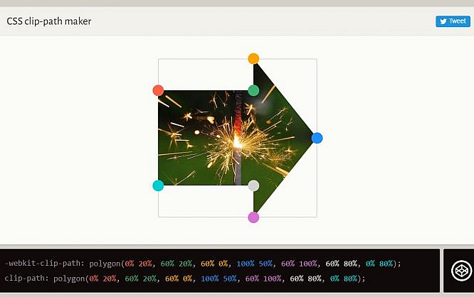
The CSS attribute 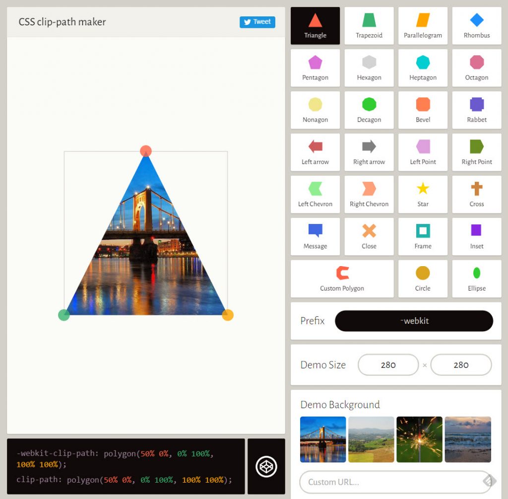 Clippy Provides an Intuitive Editor Interface. (Screenshot: Noupe)[/caption]
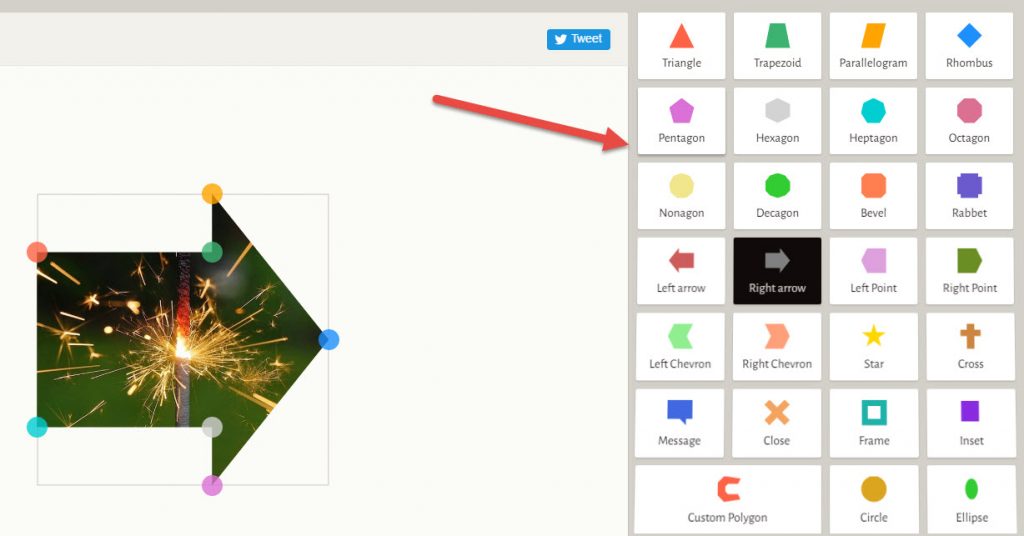 Clippy Provides 26 Basic Shapes and an Editor For Your Own Complex Shapes. (Screenshot: Noupe)[/caption]
On the left, you'll always find a preview, which can be resized by entering pixels on the right, below the shape selection. The background can be changed as well. Here, Bennett has provided four examples to choose from. However, entering a URL of your desired image enables you to load it into the background as well.
Below the preview window, there's a permanent display of the current CSS code, which you copy into your project using the clipboard. On the basis of the displayed code, it's also possible to switch over to Codepen and keep on experimenting there.
[caption id="attachment_79912" align="alignnone" width="1024"]
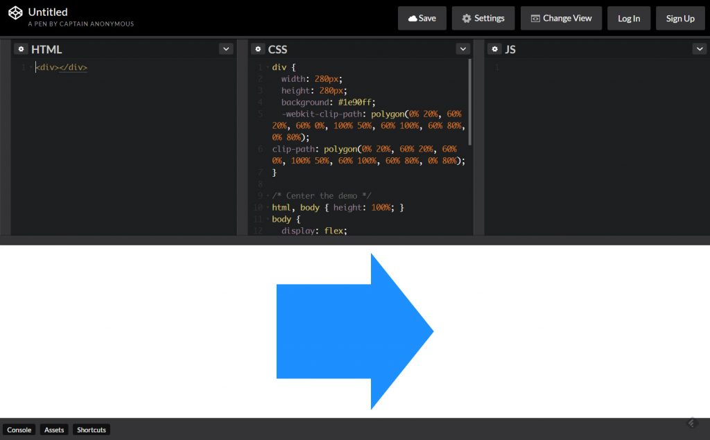 Directly Continue to Edit Each Code Snippet Via Links to Codepen. (Screenshot: Noupe)[/caption]
Bear in mind that
clip-path allows you to make sure that not the entire content of a box is displayed in the browser by using complex clipping paths. This way, powerful effects are possible. The web app Clippy takes care of the coding for you. You compile your clipping paths visually and immediately see the result.
The CSS Attribute clip-path
Clip-path is the successor of the attribute clip, expanding it significantly. Previously, clip only allowed for rectangular shapes. The newer attribute clip-path lets you create clipping paths of almost any desired shape.
Apart from basic shapes, such as circle, ellipse, or polygon, you can also use SVG graphics as shapes for the clipping paths. This reaches a new, previously impossible, flexibility in terms of presentation. As long as your shapes have the same amount of path points, you can also apply CSS animations and transitions to them, causing very subtle motion effects.
Bennett Feely and His CSS Experiments
Regular readers already know Bennett Feely from Pittsburgh, Pennsylvania. Two months ago, we presented his projectImage Effects here. Image Effects is an example of the smart use of combinations, and repetitions of different modern CSS attributes, allowing you to create image effects that you would not have created with pure CSS up to this point. Image Effects is a visually working app as well, and it automatically generates the required code snippets for you.
[caption id="attachment_79915" align="alignnone" width="1024"] Clippy Provides an Intuitive Editor Interface. (Screenshot: Noupe)[/caption]
Clippy works in a very similar way, but looks much more elegant, offering an appearance more oriented towards common interface editors. This makes getting started quite simple.
26 basic shapes are the perfect equipment for the first 1,000 steps. The button Custom Polygon takes you a couple of steps further, as it lets you build shapes that are as complex as you want them to be, by just placing path points within the image, that are automatically connected by Clippy.
[caption id="attachment_79913" align="alignnone" width="1024"] Clippy Provides 26 Basic Shapes and an Editor For Your Own Complex Shapes. (Screenshot: Noupe)[/caption]
On the left, you'll always find a preview, which can be resized by entering pixels on the right, below the shape selection. The background can be changed as well. Here, Bennett has provided four examples to choose from. However, entering a URL of your desired image enables you to load it into the background as well.
Below the preview window, there's a permanent display of the current CSS code, which you copy into your project using the clipboard. On the basis of the displayed code, it's also possible to switch over to Codepen and keep on experimenting there.
[caption id="attachment_79912" align="alignnone" width="1024"]
 Directly Continue to Edit Each Code Snippet Via Links to Codepen. (Screenshot: Noupe)[/caption]
Bear in mind that
 Clippy only generates the code for the clipping path. You have to add the respective image yourself, and the text flow surrounding the shape has to be built manually as well. To do that, use the attributes from the shape- array, like shape-outside.
In Clippy, you decide if you want to use the browser prefix webkit, which makes sure that the code works in Apple's Safari. As of right now, there is no browser that fully supports clip-path in its entirety. clip-path is not supported at all in Microsoft's Internet Explorer, and Edge, as well as in Opera Mini. In Firefox you will want to enable clip-path by setting the appropriate settings flag as mentioned on Caniuse.
Of course, Clippy is free to use, and does not require you to setup an account. 
This means that I can now clip mask my images or shapes for my website? Thats one hell of a thing it is. That is so worthy piece of gold for me