The content management system you choose can really make a huge difference in how much time you (or your clients) spend keeping a site updated and maintained. There's a huge variety out there—some estimates put the number at around 1700 different options. Some are great...some, not so much.
Below are
ten useful guidelines to consider when choosing a
CMS, followed by rundowns on ten great CMS options available and how they stack up based on the guidelines.
Ten Simple Guidelines for Choosing the Perfect CMS
1. The CMS you choose should be really good at whatever the main function of your website is.
What do you want your website to do? Is it going to be primarily a static website, like an online brochure? Or is it going to be a fully-functioning ecommerce site? Or maybe it's going to be really media-heavy with tons of videos, photos, and audio files. Or is a blog going to be the primary focus?
Whatever your site's primary function is going to be, you need to define it and then find a CMS that does that particular thing really, really well. If blogging is the main focus of the site, then use a blog platform. If images and video are the main focus, then you need to find a CMS that either has great support for media built-in or has great plugins for enabling those functions. If your site is going to focus on an online store, then the platform you choose needs to be able to seamlessly integrate that online store without a ton of extra work.
While there is no size-fit-for-all option, it is worth investing your time and effort to find the best CMS for your eCommerce websites
2. A CMS needs to work intuitively.
When you average user opens up the backend of the site, they should be able to figure out how to do basic functions without too much instruction. Different elements of the site should be clearly labeled. The basics of posting a new page, editing a page, and even changing themes or sidebar elements should all be relatively simple to figure out for the average computer user.
3. The backend needs to be standardized.
Things should all work basically the same way in the backend of the site. A good CMS should have a standardized format for each section of the backend. If one section uses a drop-down menu for selecting something, then all of the other sections should use the same type of menu for similar options—not radio buttons or some other selector.
The same goes for the way things are named or otherwise referred to. If something is called a "page" in one place and a "post" in another, that's going to get confusing (plus, most people consider those two different things). If it's a "sidebar" in one place and a "second column" somewhere else, that's going to confuse your average user.
4. The backend needs to be logical and well-organized.
Things should be laid out logically in the backend. This means that all of the functions related to editing, or sidebars, or themes, or creating new content, should be grouped somehow or otherwise function the same. Alternatively, some CMSs put all of the things related to pages in one place, sidebars in another, plugins in another, etc. Either way, they're laid out logically and once you know the basic architecture, it's easy enough to figure out where things are supposed to be.
5. The right CMS shouldn't have a ton of extra functionality you'll never use.
This is a completely personal choice. Some sites will make use of tons of advanced functionality. Other sites won't. If you're never going to have an online store, why do you need a CMS that focuses on ecommerce? If you never plan to do anything beyond posting photos to your site, why have a CMS that does that plus a hundred other things? Instead, find a CMS that does the one thing you want to do really well and forget about the other features.
6. The right CMS should be easy for non-geeks to use.
Web designers and developers are very good at using web-based applications and pretty much anything else computer-related. A lot of their clients, on the other hand, probably aren't. While most of the end-users of any CMS are going to have at least basic computer knowledge, they're probably not super tech savvy. While you might love a particular CMS and think it's the best thing since solid-state hard drives, your clients might find it confusing, hard to use, and overly complicated.
The question I always ask myself when considering this is, "Could my mother use this?" My mother is your typical business computer user. She can do spreadsheets, word processing, and email, but she's definitely not a techy. If I'm confident that I could easily explain a CMS to her and she'd then be able to use it with a minimum of later support, then I know it's going to be appropriate for 90% of other likely users.
7. It needs to include a WYSIWYG editor.
WYSIWYG editors make life easier for your clients. Most clients don't know HTML and don't care to learn. But they want to be able to use bold or italic text or use header tags to create sections within their pages. A WYSIWYG editor makes that all possible for non-tech-savvy users.
8. The pages it creates should be fast-loading and have simple code.
One of the major advantages of a CMS is that it simplifies the updating and management of a website. So the pages it produces should also be simple. There shouldn't be a lot of extra code or provisions for unused functionality in the final page code. All that serves to do is slow the load times for the page and increase the likelihood that something will render wrong or throw an error.
9. The template engine should allow you complete creative control.
Some CMSs have very set ideas about what a website should look like. There needs to be a sidebar for navigation. You shouldn't use navigation dropdowns. The content has to be arranged in nice, neat columns. Who's the designer here? Whatever CMS you choose should let you design pages the way you want and should work around your needs.
10. The right CMS should have adequate support and documentation.
In all likelihood, you're going to run into some sort of problems with any CMS you choose. Whether this is caused by add-ons or in the course of customizing some bit of code, or whether the CMs is doing something unexpected, having somewhere you can turn to to get advice on how to fix the problem is invaluable.
This doesn't necessarily have to be some expensive tech support phone number or other paid support. Sometimes you can get quicker and better responses from a user community. Does the CMS you're considering have support forums frequented both by other users and by those involved in the project? Are there other, off-site forums dedicated to that particular CMS? The people who visit these forums can be a wealth of information for doing just about anything with your CMS of choice.
Thorough documentation for the CMS is also valuable. It should provide information on everything from basic use of the CMS to customizations and advanced functionality. In addition to being complete, it should also be easy to understand and accurate (which can be hard to determine until you actually delve into doing some of what it suggests).
Ten Excellent CMS Options
WordPress has morphed from a basic blogging platform into a fully-functioning CMS. WordPress' primary functionality is still blogging, though with plugins it's capable of doing everything from brochure sites to portfolio and gallery sites to fully-featured ecommerce sites. For the most part, WordPress' backend is intuitive to use, with different functions laid out based on different sections of the site (appearance, posts, pages, etc.) The way things work in the backed, though, is very standardized and once you're used to doing things in one section, it's easy enough to figure them out in every other section. Likewise, it's also well organized and finding where to perform different functions is very straight-forward in most cases. The WYSIWYG editor provides all the basic functions you could need, including inserting images, video, and other media, and makes it easy to toggle back and forth between HTML and Visual mode.
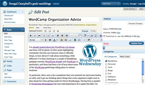
Because a lot of WP's functionality comes from plugins, the basic platform is pretty simple, with support for pages, posts, and other standard content that will be used on the vast majority of sites. You only need to add plugins as you need their functionality, meaning there isn't a whole lot of unused "stuff" in the core installation. WP is also simple enough to use for non-geeks (my mother has no problem with it and she's running a complete ecommerce site with WP) and the different user permissions means it's harder for users to break things (just limit their access to things like themes and plugins).
WP is also completely standards-compliant. The pages it creates are simple and quick-loading. Of course, some plugins create not-so-small pages, especially those that put JavaScript and CSS right into the page instead of in separate files. Just be aware of this when checking out plugins.
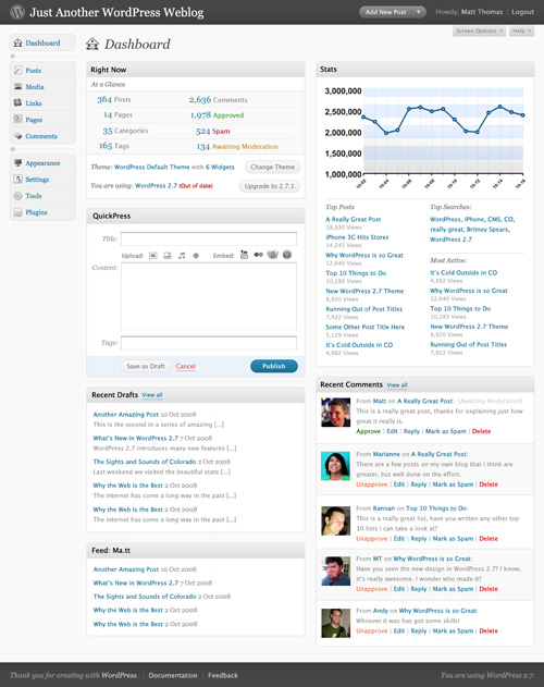
WP really makes it possible to design pages however you see fit. From galleries to text-heavy sites and pretty much anything in between, WP can do it through the use of custom themes and page templates.
Where WP really shines, though, is in it's documentation. The WordPress Codex is massive, covering everything from basic instructions for use to creating your own plugins and working with advanced features. WP also has active forums where you can generally find fixes for any problems you might encounter from other users.
Radiant is built on Ruby on Rails. It's really good at building basic sites with an unlimited number of pages. Blogging and gallery functionality can be added through extensions. The backend is simple and logically laid out, with pages, snippets, and layouts as the primary sections. Functions work pretty much the same no matter which section you're in.
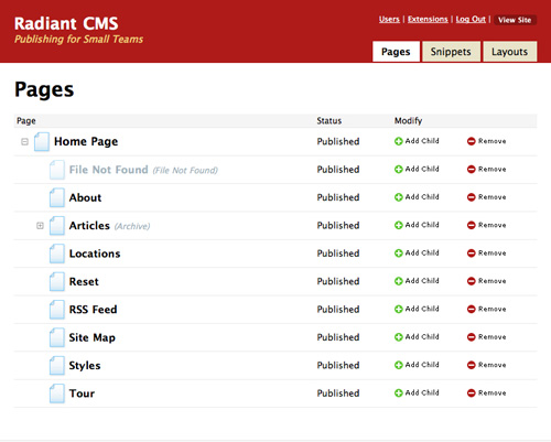
Currently, Radiant is rather limited in its functionality, so it's unlikely you'll end up with any unneeded functions. Extensions can be built in Ruby On Rails, though, opening up huge possibilities for future functionality. The WYSIWYG editor is basic but allows users to perform all of the basic functions.
Radiant has an extremely easy-to-use backend. Basic functions like updating and add pages are really no more complicated than sending an email. This makes it a great solution for clients who aren't at all tech-savvy. The code Radiant produces is simple and clean.
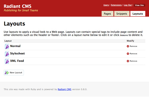
Pages can be built to look pretty much however you want based on a combination of snippets you create. There also appears to be an active developer community with extensive documentation for developers. End-user documentation is a bit light, but it's such simple to use CMS that it's not really a big issue.
SilverStripe is a full-featured CMS that's capable of just about anything you want it to do. It's built in PHP on the Sapphire framework, making it more customizable. One of SilverStripe's most interesting features is that designers can customize the backend for each of their clients, only showing content fields the clients actually need to access. This makes it potentially one of the easiest-to-use CMSs for geeks and non-geeks alike. And of course it includes a WYSIWYG editor.
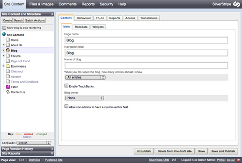
SilverStripe is probably overkill for most very basic websites, but because of its ability to be customized, it's appropriate for most other sites. SilverStripe also provides tons of great, free support, including documentation for both developers and end-users, forums and an IRC channel. SilverStripe makes a point to stay out of the HTML/CSS portion of your site, making it possible to design pages to look however you want.
Joomla is widely considered to be the most popular open-source CMS currently available. It runs on PHP and MySQL. The backend is relatively simple and straightforward, with sections for managing articles, the front page, menus, media, and other content. There's also a link to create a new article to save time. Drop-down menus also give more options for those and other sections (including extensions). Joomla's WYSIWYG editor includes tons of formatting options—even emoticons.
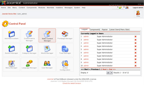
Joomla is pretty powerful, so it's another CMS probably not well-suited to very simple sites, where it would have a lot of excess functionality. It includes a number of provisions to make pages load faster, including caching and GZIP page compression. Joomla also has a huge list of plugins available to extend its functionality, making it appropriate for just about any kind of site requiring advanced functionality. One of the biggest drawbacks of Joomla, though, is it's use of tables for layout. While there are workarounds to replace the tables with CSS, it might not be worth the effort considering how many other CMSs don't use tables to begin with.
TYPOlight uses PHP5 and Ajax and includes functionality for static pages, blogs, newsletters, and calendars, among other sections. The backend is intuitive while still offering a ton of functionality. There are shortcuts for doing everything from creating forms to including Flash content. Content is displayed within modules, which can be styled with CSS. The output is accessible XHTML Strict. It also offers mootools and GZip support.
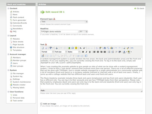
TYPOlight may be a bit overwhelming for those who aren't at least a little bit tech-savvy. It's not that it's complicated; just that there's a lot of options and a lot of different ways to customize it. It does include a complete WYSIWYG editor and other tools to make publishing content simple. The interface is intuitive if you take a minute to look over what's there and everything is laid out logically. Again, it's just that there's a lot of information in there!
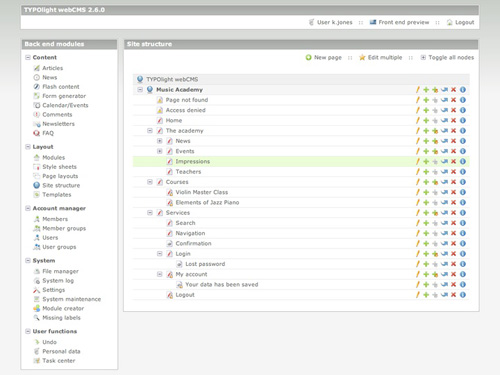
TYPOlight does include some nice developer tools, including a built-in CSS generator and a form generator. There's plenty of documentation on the site for both developers and end-users. There are screencasts, forums, and a wiki for support. There are also options for paid support through TYPOlight partners in case you (or your clients) really need advanced help.
Frog is basically a PHP-based version of Radiant CMS (mentioned above). Frog has a simplified UI that's very intuitive. It allows for an unlimited hierarchy of pages and allows you to customize templates on a per-page basis. It includes the requisite WYSIWYG editor, simplified and more like WP's than some of the more complex editors. It also features reusable snippets for regularly-used bits of content.
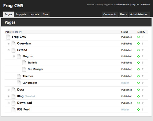
The backend provides a very coherent and well-organized structure that's user-friendly while also being quite powerful. The basic functionality is aimed at a site with an unlimited number of pages, but there are plenty of plugins to extend that functionality. There are currently plugins for both admin functions and front-end improvements (including a number for image galleries). The code Frog creates is clean and semantic.
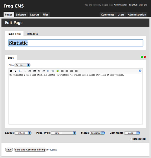
Frog has decent documentation, with plenty of how-to articles for both basic functions and development. There's also an IRC channel to get answers to any questions you might have.
Textpattern uses a tabbed UI on the backend, which is surprisingly intuitive. It automatically brings you to the content editor to add a new page when you login, a great feature for sites that add new content regularly. The biggest drawback to Textpattern is its lack of a WYSIWYG editor. It does use Textile, though, for content editing, which is easy enough for a new user to learn.
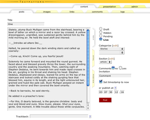
The pages output by Textpattern are very lightweight and quick-loading, so no issues there. The thing I like most about Textpattern is that it feels like a real alternative type of CMS. The rest of the options out there are all, to some extent at least, kind of the same. The basic functionality of the CMS is very simple, without a ton of added features you're unlikely to ever use. There's support for images, categories, and articles, and not a whole lot else. But there are a ton of different plugins available to extend its functionality, including plugins for everything from media and gallery support to advanced navigation options and stats. There are even a couple of different ecommerce plugins available.
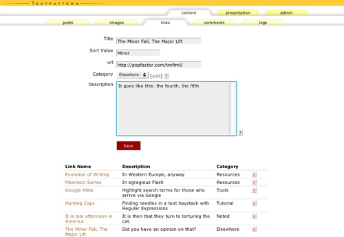
There's a large community built around Textpattern, so documentation and support are surprisingly good. There's at least one book available, plus a support forum, developers' weblog, and TextBook (a community-powered user manual).
Expression Engine is one of the more powerful CMSs out there. EE has support for just about every function you could ever need or want, either in the core package or through plugins. The backend is very simple and intuitive (the first time I used it I was able to figure out the backend within a couple of minutes). It's probably overkill for very basic websites, but appropriate for pretty much anything else. Modules are available for everything from statistics to user forums. The built-in WYSIWYG editor is pretty standard and works well.
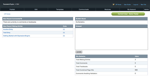
The pages created by EE are a bit bulkier than many of the other CMSs featured here, but still appear to be reasonably clean, with the exception of some JavaScript plugins. Some of the plugins available (or at least some of those used on sites powered by EE) either stick the JavaScript in the header of the page or, worse, right in the middle of the page's code. But there have to be some tradeoffs when working with a CMS with this much built-in functionality.
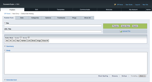
EE's biggest drawback is that, except in certain circumstances, it's quite expensive. A personal license is $99.95 and a commercial license is $249.95. You can use the free Core Version, but only on personal, non-commercial or non-profit sites.
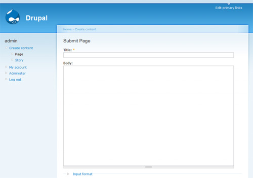
Drupal is another very powerful CMS that can be used for everything from corporate sites to ecommerce sites to social networking sites. The backend of Drupal is incredibly simple, with logically organized links to create new content, manage accounts, and edit existing content. One of Drupal's nicest features is their "Book Page" content type. These pages can be grouped into collections, referred to as books, which are automatically linked together. This is a huge advantage if working with this kind of content. Drupal doesn't have a WYSIWYG editor in the core installation, but there is a module to add the functionality.
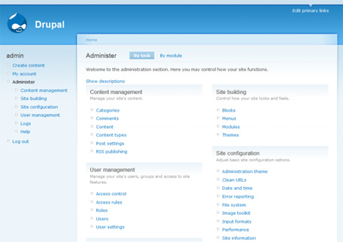
The amount of functionality available in the backend is astounding, especially considering how easy it is to access it all. Drupal has tons of modules available, too, to add functionality beyond basic content management. There really are plugins to be able to do just about anything you could think of. The code output by Drupal is a bit more complex than some simpler CMSs, but still relatively semantic and easy to decipher.
Drupal has a huge user community with forums both on the main development site and elsewhere. There's also extensive documentation for end-users and developers.
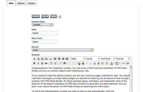
When they say "Made Simple," they really mean it. CMS Made Simple was the first CMS I ever used. I literally set up my first CMS-powered website in the course of a single evening (with a customized but out-of-the-box template). It includes complete template support, an incredibly easy-to-use backend, and an unlimited content hierarchy. There's support for "global content blocks" (called snippets in a lot of other CMSs) and plenty of options for site layout. There's also access to help files right from the backend, including the wiki, IRC and forums. This is another CMS with no built-in WYSIWYG editor, but there is a plugin to add that functionality.
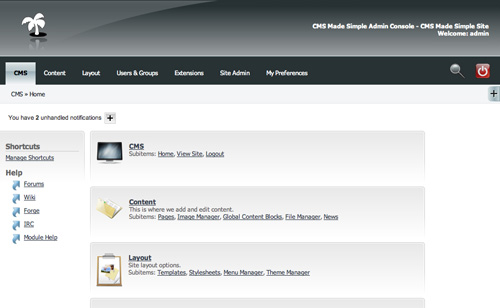
The pages output by CMS Made Simple are all XHTML and CSS compliant in addition to being clean and quick-loading. The core installation has all the basic content functionality you'd need, with plugins available to add most other functionality, with one exception: there doesn't currently appear to be an ecommerce plugin for the platform.
There's good documentation available for
CMSMS. There's also extensive support options, including IRC and forums.

Cameron Chapman is a writer, blogger, copyeditor, and social media addict. She's been designing for more than six years and writing her whole life. If you’d like to connect with her, you can follow her on
Twitter or at her
Personal Website.
Write for Us! We are looking for exciting and creative articles, if you want to contribute, just send us an
email.


I recently stumbled across cms.txt and it looks like it would be fun to play with. Anybody have any experience with it?
Something about MODx keeps bringing me back to it. I would love to hear how @Cameron would compare it with the others in the list. It took me a couple of times to get used to it (I was thinking too hard). To me, other CMSes are like modular houses partially built, when MODx is like getting the raw materials to build any house you want.
What is everyone’s thoughts about building custom CMS’s on a job by job basis?
Basically I build only what I need for most of the jobs I do. Some of them have been for some pretty high profile clients too! I feel its easier to build what you need and keep it basic (with LOTS of error handling) then to take a platform like drupal or joomla and remove what you don’t need so that the client dosn’t screw it all up.
any thoughts? should I invest some time into taking an already built CMS and just strip it down and start using it?
From a client’s perspective, custom CMS development has two problems. One, is that it locks me to you as a vendor. A standard CMS that you configure, however, will allow me to switch vendors in the future without having to rebuild the site from scratch. (What if you decide to change careers or you go out of business?)
The second is that it is less flexible because you are coding to a set of requirements that is guaranteed to change in the future (because Web sites are projects that never conclude). With a custom coded solution, reconfigurations will require re-programming, which takes time and presents many opportunities for new bugs. Whereas for popular CMS’s you can often reconfigure with settings and/or plugins that have already been tested–or they provide a standardized API to program against.
I think your first poitn is somethign of a myth, okay if someone writes everythnig from scratch in say PHP, then yes you probably would have to rebuild from scratch, but that is a bit out-of-date. Most develoeprs use a framework these days, so if someone uses say Ruby On Rails, it will be written using a framework other develoeprs are perfectly familar with, using MVC and no doubt using plugins others are perfectly familar with. So the client is really only locked into RoR, which is any differnet than being locked into Joomla or Drupal.
And as for being less flexible, that is simply hilarious, a CMS is inherently less flexible than a framework.
Clients may also wish to consider performance, pre-built CMS simply don’t compare.
I’m not sure if i can clear drupal as the best cms in my mind :)
Excellent article. Well researched and written. Now there are enough systems out there that, in the future, lists like these can be more specific. Instead of a general list of “top CMS,” lists should now focus on a category, like the best for personal sites, the best for small businesses, medium-sized businesses, corporate sites, etc.
and what about SPIP ?
SPIP
Good post. Frog CMS and WordPress is my fav. Thx
MojoPortal is excellent! (www.mojoportal.com)
Sadly, no CMS will meet all of those requirements. Most of the ones listed don’t even come close.
I would suggest looking at Symphony CMS (http://symphony-cms.com/). It meets every one of the 10 items listed except for part of #10. The user community is fantastic but the documentation is not yet finished. Since it uses XSLT as the templating language, which is a Web standard, there is already a lot of resources for that available.
Requiring wysiswg and design control from a cms may not be in your best interest. What matters is to keep consistency and to focus on content (content is king).
If the website is well designed and developed, style sheets take care of the styling, and users just have to focus on content.
Once you start giving layout control to the user, consistency and design quality goes down the drain. To make a parallel, compare the eye-cancer inducing flashing blinking myspace pages that can crash yout computer to the clean, uniform design of facebook profiles.
wysiwyg seems cool and makes clients happy, but more often than not it gives them control on stuff they shouldn’t even have to worry about.
to sum up: use a cms for content management and leave design to designers.