Camera+ by Taptaptap: A Great Photography App And Now Native On iPad
Welcome to part two of our series with iOS Apps for Creative Professionals. I didn’t tell you, but I will now. I like the iOS app Camera+ by taptaptap so much, that I installed it on my new iPad. Even though I knew it was only optimized for iPhones. As the retina display double-sizes the iPhone apps nicely without showing visible pixelation I was happy enough with that solution. But taptaptap was obviously not content with me being just happy, they wanted to excite me. And they did with their release of Camera+ for iPad today.
Camera+: The Basics
Camera+ is a best-selling camera app in the App Store. With its easy to use image manipulation possibilities it has gained a huge community of fans from around the world. Up to today the app has only been available as an iPhone app with a simple workflow.
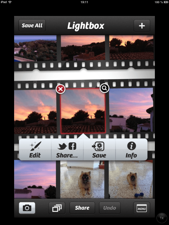
Take a picture or series of pictures. Head over to the app section named Lightbox (this is not your iPhone’s camera roll). Here you choose to edit, share or save a picture. Saving stores it to the camera roll. Sharing sends it to Twitter, Facebook or Flickr or lets you email, message or share a web link with the picture as a content. If you’re like me, you’ll most often choose Edit, which takes you to a variety of options to change the look of your photo.
[caption id="attachment_72360" align="alignnone" width="550"] iPhone: The Lightbox[/caption]
From the menu to save, edit or share you can reach a feature named Info. Choosing this provides you with information on where the image was taken and what the metrics of the camera where it has been taken with. After you’ve edited a picture the information on which filters and effects you used will be visible from here too. Now let’s head over to the manipulation techniques…
At first you have the possibility to change the mood of your photo using a wide portfolio of so called Scenes. We can auto-adjust the colors, add flash or backlight the picture. Or we select one of the standard scenes, such as beach, portrait, concert, food and some others, depending on what best suits your image.
Next up you can adjust your photo by flipping it 90 degrees to the right or to the left or mirror it vertically or horizontally. This will mostly only apply if you have taken the photo using a different orientation than it shall be looked at in. Now you can use the flexible crop tool to cut the final picture out of the bigger shot. I haven’t used this much though, as I always take the pictures carefully enough to not have to crop some parts away afterwards. Anyway, if you like Camera+ lets you apply crops in fixed sizes, e.g. the golden cut is there, as well as in freeform.
Now for the app functions I use most. The effects section comes with 36 fantastic filters to have your photos look totally different. Instagram users will instantly fall in love with Camera+. All the vintage editing is here, there are color-based filters, special effects like HDR, miniaturization aka tilt-shift, depth of field, cross process and many more. You can pile effect on effect if you like but should be aware that the filters are destructive. You always change your original.
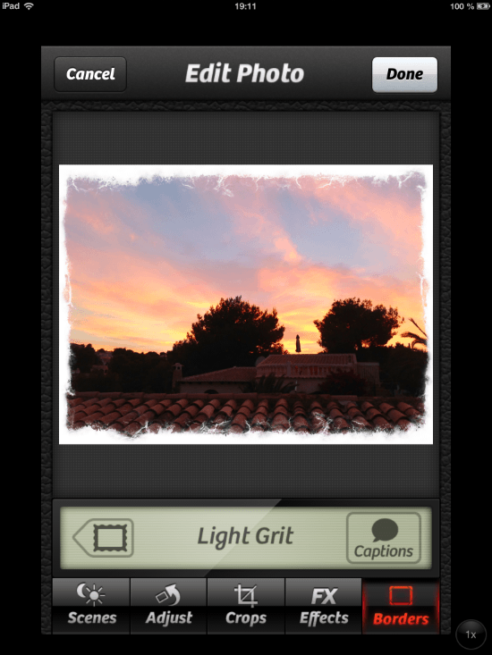
Finally I select a border. Camera+ comes with nine simple and nine stylized borders. Simple means thick white, thick black plain borders, stylized adds a viewfinder look or makes your picture look like a proof from a print shop.
[caption id="attachment_72361" align="alignnone" width="550"] iPhone: Select a border[/caption]
Camera+ is not the replacement for the camera app. At least not for me. There are no obvious advantages in terms of just taking pictures and saving them to the roll. The camera part of the app comes with a stabilizer, timer and burst mode, functions the native app doesn’t have, but haven’t been missed up to now, at least not by me.
Camera+ can be bought for a mere 0,99 USD during an undefined promotional period while introducing the iPad app. The app doesn’t go universal though. You’ll have to flip out 99c twice, if you want to own both iterations.
Camera+ Now With iCloud-Lightboxes
Before we head on over to the iPad-specific functionality it should be mentioned, that today’s update to Camera+ also adds new features to the iPhone app. With Apple’s Photo Stream being introduced Camera+ fell short, because of the principle of not saving to the camera roll from where the benefits of Photo Stream would have been automatically obtained.
Instead Camera+ saves to its own Lightbox. From there you have to manually store photos to the camera roll. I do so each time I went through the various steps of manipulation. But I don’t save every photo to the camera roll, only the best make it there. That doesn’t mean the others are as bad as to having to be thrown away. I simply keep them in the Lightbox. Fair enough to say, that you can change the storage path any time you like from Lightbox to camera roll or both.
Now this Lightbox gets iCloud synchronization. Your unedited and unsaved pictures are automatically pushed to your iCloud account and synched to other installations of Camera+ on your other iOS devices. This mimics the behavior of Photo Stream and is particularly useful if you’re deep into the Apple eco-system. Now you can snap photos with your brand-new iPhone, they get synchronized to your iPad and there, on the big screen, you can comfortably edit them.
Camera+: Effects, Borders, Adjustments Now More Comfortable
You won’t be surprised to hear that Camera+ on the iPad means much more comfort in handling and editing the pictures. While the camera part of the app provides functionality identical to its iPhone counterpart, the editing possibilities are enhanced to the max. There’s simply much more space.
The Lightbox shows more pictures and provides information on the highlighted one directly at the bottom of the app without the need to tap here or there. From here you can add photos from your iPad’s Photo Library, Facebook or Flickr. The iPhone version is only able to import from the camera roll and the Photo Stream.
[caption id="attachment_72363" align="alignnone" width="550"] iPad: A better Lightbox[/caption]
The real functionality boost lies in the editing section of the iPad app. Although at first sight you’ll find the same functionality and filters, everything feels much more usable. The available space let’s you judge your photos much better and manipulation can be finer tuned than on the small iPhone screen.
If you look deeper into it you’ll see the bigger difference. The functionality only seems the same, but in fact there are much more options to it. The above-mentioned Adjust-command not only lets you flip photos around different angles, but provides manual adjustment techniques as well as the correction of red eyes effects. You can blur or sharpen the image or control the white balance. This additional functionality is placed to the right side of the image in landscape view or under the toolbar in portrait view, on spaces you simply don’t have on an iPhone.
[caption id="attachment_72362" align="alignnone" width="550"] iPad: Adjustments en masse[/caption]
The FX filters can now be piled on top of each other and then manipulated separately while seeing the potential effects directly on the photo. It is possible to fine tune the effects in relation to each other which has not been possible before. Up to today you had to choose one effect and apply it, than you were able to choose another and apply that too. The rest was hoping they’d fit together.
[caption id="attachment_72364" align="alignnone" width="550"] iPad: Comfortably editing a pile of effects[/caption]
In addition to piling effects on top of each other and manipulating them in relation, you’ll find brush tools to each effect. These brushes allow you to paint on the image, thus excluding parts from the effect, show a mask to add a visibility layer to your brushing efforts and lots more.
This part of Camera+ is a whole new experience, I wouldn’t even call it update. It resembles the former look but goes much farther in functionality. Still they give it away for a mere 99 Cents, a no-brainer. Not everybody is happy with the policy of double-take double-pay. I’d agree: taptaptap simply double the price and give it away as a universal app ;-)
Related Links:
- Camera+ at home - taptaptap
- Camera+ for iPhone at the App Store - iTunes Link
- Camera+ for iPad at the App Store - iTunes Link
