Why dark mode web designs are gaining popularity

Dark mode is more popular than ever. More and more web designs, apps, and products have started offering a dark mode option to their users - catering for a unique stylistic demand in the market that has been, until now, a desire exclusive to coders.
Where typical UI’s have focused on using dark colors on a white background (similar to a printed book), dark mode offers the reverse, flipping a traditional design fundamental on its head.
But what has driven dark mode's popularity in web design? As technology has changed the way users interact with websites -both in the device they use, and the amount of time they spend interacting- various changes in preference have emerged. Parallax designs are one example, as they helped to cater to mobile users to scroll through content with ease. Similarly, dark mode has catered to new user desires, some of which are unique to the current era of technology.
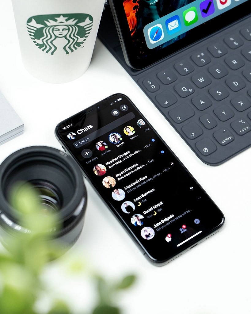
This has led to countless websites and even major products offering dark mode. Both Twitter and Facebook IM have begun to offer it, and it has even been adopted by Mac OS and Windows. It’s no wonder that if these giants have adopted it, that web designers haven’t taken long to follow suit. After all, as this article will explain, dark mode may be the ideal choice for any website that requires lengthy engagement.
What is dark mode?

Dark mode (sometimes known as dark theme), is a dark background with light text. In essence, it is a partial inversion of your typical black text on a white background color scheme. However, it isn’t a complete inversion, as dark mode backgrounds are almost never black. MacOS’s, for example, uses grey text on a darker grey background.
Dark mode was typically the choice for coders, who spent long hours of the day staring at code. They found the dark mode more enjoyable so it became more readily adopted. Now, as user preferences are shifting, more and more websites are either experimenting with the design for aesthetic reasons or catering to their reader's demands. Everything from typography to logo design, to layout, are being considered with dark mode in mind.
Either way, dark mode is well on its way to becoming a widely used, mainstream choice with its prevalence growing alongside its adoption by popular new technologies, such as VPN’s, SaaS platforms, and cloud services. But as we’ll see, there are both advantages and disadvantages to this.
Advantages and disadvantages of dark mode
There are two benefits of dark mode that are touted above all others. The first is that dark mode is less bright, so it demands less of your battery and consumes less electricity. This, in turn, makes your phone last longer and is better for the environment. But the second, and even more important benefit is that dark mode’s lowered brightness is much easier on the eyes, reducing both eye strain and helping the bodies natural release of melatonin, which leads to better sleep. All in all, longer phone use and better health isn’t exactly an unappealing prospect.
However, many of the health benefits are unproven due to a shortage of rigorous scientific studies. One researcher from the University Cambridge noted that a dark background does reduce glare and eye strain, but it is unclear whether reading text on such a background is better than the traditional alternative. Many studies have had similar concerns. Some have found that reading dark characters on light backgrounds is far better for legibility for readers of all age groups. Others have found that light backgrounds lead to increased perception of detail.
But despite these various points for and against Dark Mode, perhaps the most important consideration is whether it is approved of by Google. Luckily, we have a clear response. When asked whether Dark Mode would affect a websites SEO, Google’s John Mueller said:
I think this is totally cool. I really like the trend to dark mode websites or dark mode apps in general. It’s something that I wouldn’t have expected a few years back, that people would want to have kind of this dark mode/light mode setup.
With regards to SEO that’s absolutely not a problem. Usually, people implement this using CSS, and the way you implement things in CSS doesn’t affect how we would pick things up for indexing. So go for it, I think that’s really awesome.
I don’t think dark mode would be a ranking factor. So ... if dark mode is really, really popular then maybe we would need to highlight dark mode sites in search when people have their phone set up to dark mode. But I don’t know if that would actually happen, or if it will really go that far.
How marketers and website builders can use dark mode to their advantage 2020
Whether you believe dark mode is better for your eyes or not, it’s important to understand that there is a real demand for dark mode in your readership. A sizeable portion of visitors to your website will wish to have a dark mode option, so the most simple way to use this to your advantage its to provide them with the option.
Naturally, this is useful if Google does start catering results based on preferences, but for now, it’s just catering to demand. If big companies like Apple, Windows, and Facebook are doing it, why should you be any different? In fact, just by offering the option, you distinguish yourself from your competitors who have failed to see the change in user preferences. A boost to your marketing efforts without any extra cost to your budget.
If you’re coding your website from scratch, this shouldn’t be overly complicated, and there are plenty of guides online. However, if you’re using a platform like Wordpress, you want to make sure any changes you make fit with their other functions, such as a content editor.
You could also experiment with letting your dark mode “switch” on, depending on the time of day that the user was accessing the site. For example, if a user was accessing at night time, then it’s far more enjoyable for them to view it in dark mode, as it helps to aid their melatonin release and send them to sleep. Likewise, providing them with a bright mode during the day or early morning will help them wake up.
Conclusion
Dark mode’s popularity isn’t likely to stop any time soon. Both aesthetically and practically, it comes with a lot of benefits that people enjoy. Incorporating it into your web design choices as we move into 2020 will put you ahead of the curve and make your website stand out.

My issue with “light mode” is not eye strain, but is an inability to distinguish gray text on a light background. Plus, after long periods staring at a light (white) screen, my vision goes into what I describe as overload where everything becomes “blobby” and blurry. Maybe that’s a result of eye strain, but it doesn’t occur for me as a fatigue or tiredness of my vision.
I’ve adopted the practice of abandoning apps or websites that don’t support a dark theme. Adobe XD is a good example of an app that users have requested a dark mode theme and have been ignored for the past several years.
BTW, it’s interesting that this article doesn’t use dark mode ;-)
Dark themes only benefit battery life if it’s an absolute black background on an LED or OLED panel. Otherwise, if YFT or LCD, doesn’t benefit the battery.