What is Emotional Design and Why Should You Care?

In a way, emotional design is the upper class of modern design. And although the term is nothing new, there are not many competitors you can learn from.
Even though the term "User Experience" seems to not only establish itself as what it is, but also as a focus in design realization, this doesn't mean we've reached the top end of the flag pole. But, let's start at the beginning. Then, you'll understand where I'm trying to go with this.
101: Functionality, Reliability, Usability
Looking at the minimum requirements of a design, we'll all agree that the keyword is "functionality". Now, when you deliver a design, at least, it will need to contain the requested functions. What the design looks like is insignificant at that point. All that matters is that it does what it's supposed to do.
One step further, it is important for the functionality to be reliable and that not only under certain circumstances (such as a specific browser, for example). If the developers of native iOs and Android apps did put well more emphasis on this, I would have a reduced heart attack risk while using many smartphone apps. Unreliability is a dealbreaker.
If your design is functional and reliable, on the next level, it also has to be usable. Usability is a priority, and is represented by the keyword UX (User Experience), when speaking of high-quality design. A design that is not usable will still fail, even if it is functional and reliable, as shown by our following cartoon:
[caption id="attachment_94313" align="aligncenter" width="640"] Not everything that's possible makes sense... (Cartoon: Noupe)[/caption]
Although there are many designers who don't only go for sheer usability, when it comes to UX, but also consider elements that improve the usability emotionally, emotional design is still rather under-represented.
Emotional Design: When the Fun Factor Comes Into Play...
Emotional design is a term coined in the eighties by Don Norman, co-founder of the famous Nielsen Norman Group. His books "The Design of Everyday Things" and "Emotional Design" are, not least because of regular maintenance, still up to date.
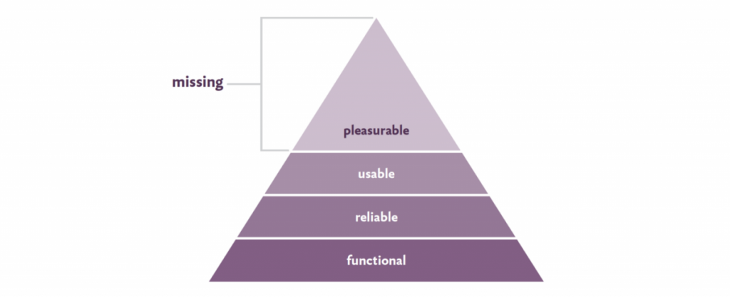
"Designing for Emotion" by design veteran Aarron Walter is a bit more recent, but states the same theses. Walter, however, had the original idea to apply Maslow's hierarchy of needs to design. This turns the previously mentioned elements functionality, reliability, and usability into layers of a pyramid.
According to Walter, this is what it looks like:
[caption id="attachment_103356" align="aligncenter" width="1024"] from Aarron Walter, Designing for Emotion, A Book Apart[/caption]
According to this, most of today's designs are missing the top of the pyramid. Just like Maslow's pyramid, we need all bottom layers to be fulfilledin order to get to the top. In contrast to Maslow, however, striving for the top is not a natural inevitability, as emotional design requires the designer's will to go the extra mile.
So, if your design is functional, reliable, and usable, that doesn't mean it's emotional. Of course, emotional is always used in a positive way here. A design is only an emotional design in the positive sense if it is fun to use. Of course, this does not only include the proverbial beauty of the design, but mainly the design of perfect interactions, breathing life into the design.
The catch is, that your design will always invoke emotions, whether you want it or not. It's like the old wisdom that it is impossible not to communicate. Thus, it is better to be very aware of the instrument of emotionalization, rather than accidentally triggering the wrong feelings.
The special charm of the emotional design becomes obvious when looking at it in relation to my article on the topic of "Brain-Friendly Design". There, you learn why experiences are important, and what the fastest way of creating them is. The fastest way of triggering experiences that remain in the long-term memory is creating emotions. Step by step, this results in the "gut feeling" that is responsible for most of our decisions.
Methods of Emotional Design
Now, if you're wondering how to create emotional design, all you need to do is to think outside the box. Obviously, this is assuming you already have the aesthetic aspect covered. Regarding that, people are relatively quick to agree on something, the current craze being Flat Design. If you follow the increasingly slowly changing trends, you're always on the safe side when it comes to the aspect of beauty, at least in the eyes of the masses.
Thus, let's focus on other aspects of emotional design:
Minimalism
Obviously, an article like this can not miss a reference to Dieter Rams. Every designer knows Rams. His Design Basics are still considered up to date, even today, although his design masterpieces originate from the second half of the last century, when he was working for the German business Braun. Memories of Rams can be found even today, in some of Apple's products, for example. Today, Rams is 85 years old.
Good design is as little design as possible, is one of Rams' tenets. In conjunction with the tenet that good design is supposed to make a product easier to understand, I think it becomes obvious where I'm going with this. If you can make your design explain itself and, as Steve Krug would want to, not force people to think, you'll create positive emotions in the users of the design. Everyone hates complex products, that make you do your Ph.D. in order to use them.
Minimalism itself is a tool of emotional design, but it is often not interpreted and used in this direction. There's room for improvement.
Gamification
Game design is primarily interaction design. This is all about getting the player as deep into the game as possible. To do so, a full-scale attack on the human neurons is needed.
The reward system is always the goal of the game design. Once a human is expecting a reward, he releases dopamine, also known as happiness hormones, in advance. Dopamine increases the drive and motivation, and makes the gamer stick around.
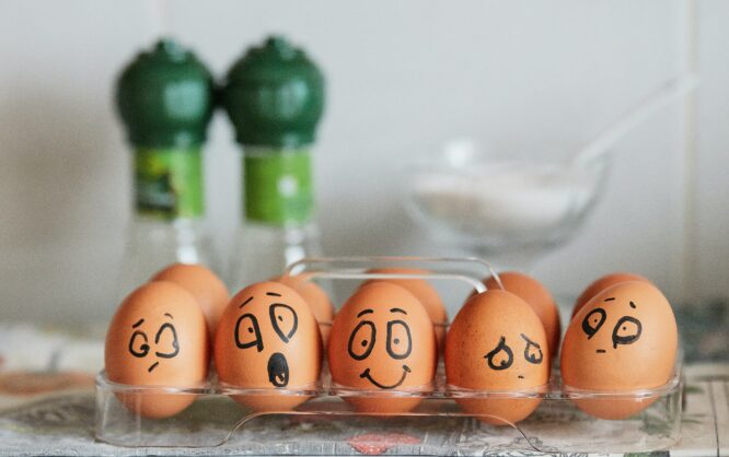
Photo by Paige Cody on Unsplash
We as designers also want our visitors or users to stick around. So why shouldn't we make use of some game design approaches? Slack, the team communication revolution, for example, goes for a completely playful interaction with its features. This does not only apply to the design, but for the functionality in general.
All networks, that work with likes also make use of the dopamine mechanism. The small kick that is caused by a human receiving a like on his Tweet, post, or image makes him tweet, post, or upload even more. The like is the reward.
Just like small rewards, small surprises can trigger positive emotions as well. Windows, for example, gets you a neat background to explore everytime you go to the login screen. More than once, I actually wanted to find out where the respective image was taken. The login screen of my Windows installation is an element that I am actually excited to revisit, as I want to see which landscape I'll see this time. Similar effects can be achieved using quotes, or short tips.
Immersive Design
Immersive design tries to address all of the user's senses. Due to the rapid progress of the smartphone technology, and the invention of gesture controls as a new way to design digital experiences, even today, we are able to make design palpable, although it will take a while until we really get to address all senses.
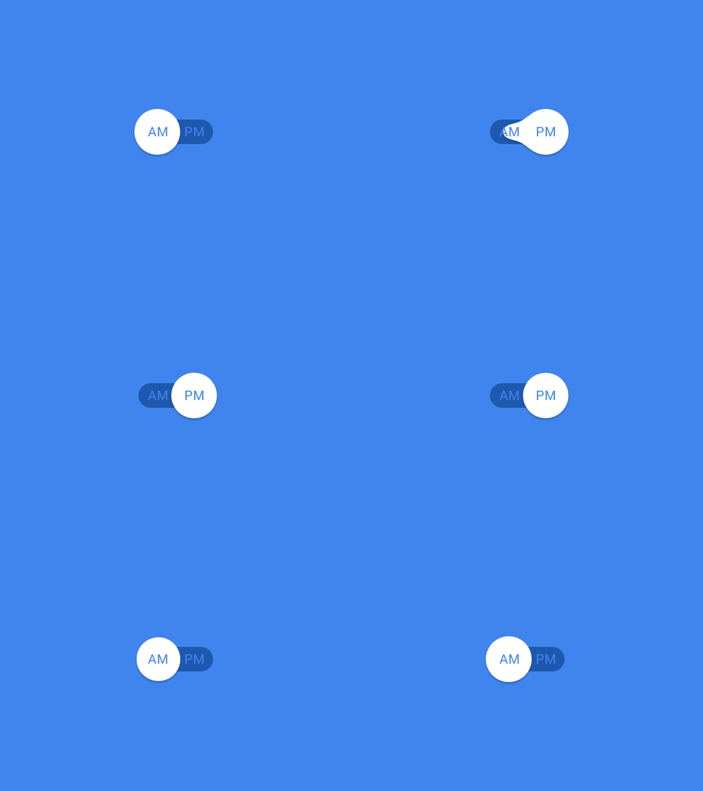
Subtle animations convey the impression that your design was alive. You should put special focus on microinteractions. Microinteractions define the actual human-machine interface. When you turn off your alarm, or lock and unlock your car via remote controls, flush the toilet, or turn on/off the light - all of that are microinteractions.

Fluid Switch | Leo Zakour
From these examples, you can tell that all of them are short actions that take little time to do, however, they are significant for the respective user experience. Thus, it is no exaggeration to say that microinteractions are the most important elements in product design.
Microinteractions are what allows you to set your product apart from the competition. Basically, the only way the user interacts with your product is via microinteractions. The more convincing they are, the smoother it feels to use them, and the happier the user will be to use your product.
The interaction itself is what triggers the emotion. Due to this interaction option, the pure design becomes something we can bond with. The design reacts, moves, becomes a bit more human, and develops a personality.
The Extra Mile
Emotional design goes further than the pure design. If you're running an online shop, you could continue the principle after a concluded purchase. You can send a friendly email explaining why you are so happy about your new customer, what your philosophy is, and so forth. Instead of the standard packaging, you could go for something people would like to unbox. Customers might even upload unboxing videos because they are impressed by the extra effort. You could add a gift. There are so many things you could do to separate yourself from the competition. The customer will remember it because he didn't expect it.
Conclusion: Emotional Design Sets You Apart From the Competition
Looking around us, it is not hard to see that emotional design is not the norm. Thus, starting to use it now is advantageous, as the edge over the competition can be enormous.
In fact, today and tomorrow, emotional design can not fully unleash its theoretically possible potential. To do that, our interface would have to be able to recognize emotions. Are you stressed, hurried, or happy and relaxed? Once modern interfaces allow designs to accept emotions as input, things will get interesting. Let's call that emotional design 2.0.
In the meantime, we can listen to Aaron Walter, who says:
If we stop thinking of interfaces as dumb control panels, and think of them as people our target audience wants to interact with, we can craft emotionally engaging experiences that make a lasting impression.
In that sense: Where do you see room for improvement in your design?
Do you want to read more on the topic of "Emotional Design"?
- Humans are Emotional — why is our Design Thinking not? | Signe Roswall (Prototypr)
- The necessary rise of emotional design | Jordan Harper (freeCodeCamp)
- What I think about Emotional Design from a UX Perspective | Sophie Riwaters (Prototypr)
- The most overlooked growth hack: designing for emotions | Lisa Zeitlhuber (uxdesign.cc)
- 6 Ways to Design for Anger | Ezequiel Bruni (Webdesigner Depot)
- Design for Emotion | Daniel Ruston (Google Design)
- Design for Emotion to Increase User Engagement | Miklos Philips (Toptal)
- Exploring the Impact of Emotion in Web Design | Anna Dzhulii (Speckyboy)


Nice article! I think that one more thing can be added as a part of emotional design. I’ve found out one web design blog not long ago about which I remembered when I was reading your text. It leads to idea that if you’re a good web designer you have to get acquainted with the topic of your work. You can’t just do the design if you don’t understand what you’re working with. I think it’s a good example of what you’re telling us about. And when you understand the thing I think it’s at the moment very pleasant to work.
Thanks Dieter Petereit for great article! Also I want to repeat Aaron Walter’s quote
“Respect between design and development is the most critical ingredient in making great products, but it rarely happens organically. It has to be a core value of a company, demonstrated daily by leaders.”
? Aaron Walter