Websites of the Deep: A Showcase of Underwater Web Design
Developing a website can sometimes be a dry process, but that doesn't mean the finished site can't make a splash. As the lead designer at a studio called "The Deep End", it's always interesting to see what others have done with the underwater web design theme, and it turns out there are quite a few sites out there. Pay close attention to the different styles that are utilized, as there are many different ways to bring the allure of the sea to the web.
Below is a showcase of beautiful websites that have used the underwater landscape and the creatures who reside there as either a backdrop, or to tell a compelling story. From cartoonish and quirky to stunningly photographic, these aquatic websites have a lot of range. So dive in to this showcase of underwater web design and find the inspiration you are looking for to turn your next web project into something truly deep.
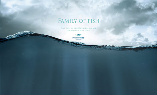
 Family of Fish uses beautiful fullscreen photography in multiple layers to create an amazing parallax effect as you scroll down to the ocean floor.
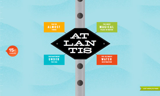
 The site for the fictitious Atlantis World's Fair has the look and feel of a children's book from the 1960s. Mostly baby blue with several pops of color, it follows the journey from the water's surface down to the lost city.
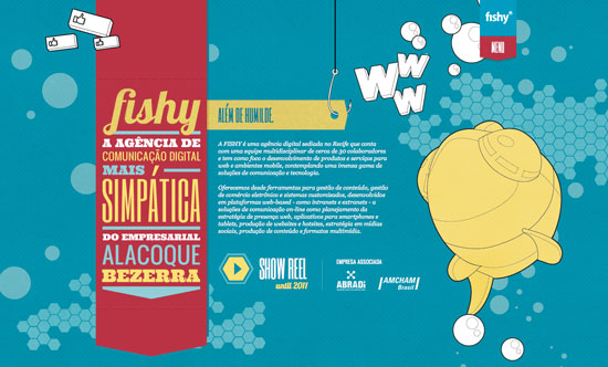
 Fishy has a quirky and colorful interface that makes great use of pop art illustrations and HTML5 animations to showcase their work.
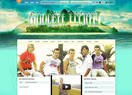
 Goodbye Elliott is a Hawaiian boy band that uses the natural underwater beauty of their home state to gorgeous effect.
 Liquid Torch gives the illusion of being underwater through simulated beams of light, as well as splashes of water on and behind the hero image.
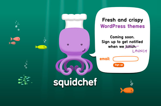
 Squid Chef's coming soon page plays with lighting effects and a colorful, simplistic illustration of their mascot.
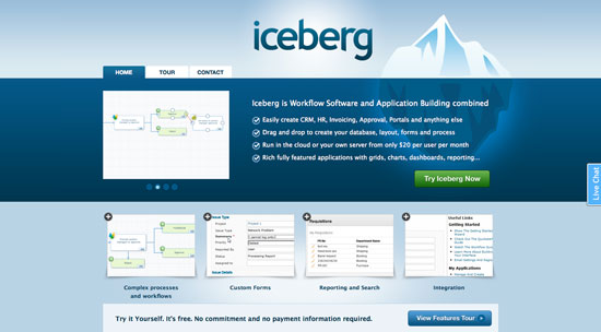
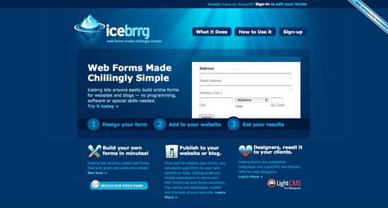
 Iceberg brings us a somewhat chilled version of the oceanscape. Using gradients and subtle glow effects, Iceberg shows us that there really is more under the surface.
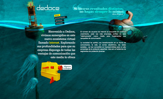
 Dedoce utilizes a beautifully textured watercolor-esque illustration as a backdrop, and the result is quite dramatic.
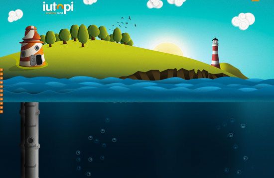
 Iutopi is a fantastic example of using parallax to tell a story. As you scroll down from the surface, you encounter many of the creatures which call the ocean home, and they only get stranger the deeper you go.
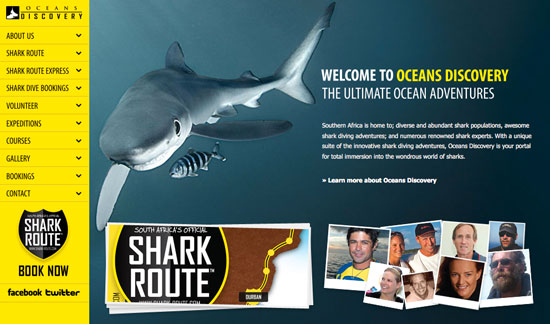
 Ocean's Discovery uses the requisite ocean blue in the hero photo, but sets it off with a pop of vivid yellow on the navigation bar and to highlight some of the copy.
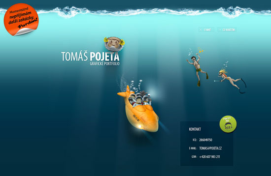
 Tomas Projeta's portfolio site has a very atypical and interesting navigation. Rather than starting at the top, it starts in the center of the vertical space, allowing visitors to scroll up to the sky, or down into the sea. The wonderfully detailed illustrations make both directions worth the trip.
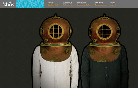
 We Think suggests a deep sea dive through the clever use of their heroes' image: Two guys in their pajamas and old-school diver helmets. Their header also includes a repeating wave pattern to add to the effect.
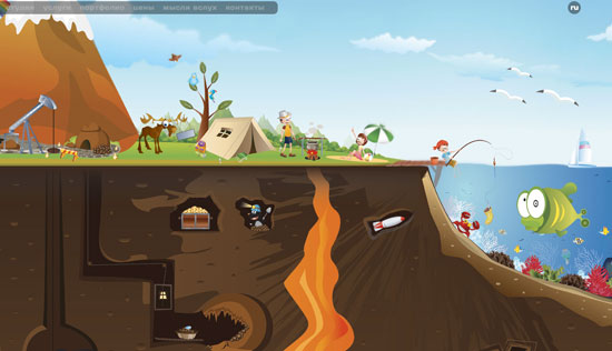
 Ukranian Design Studio includes many environments in addition to the beautiful coral reef. You can easily navigate toward space, dry land, as well as the center of the earth.
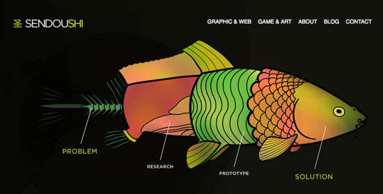
 Sendoushi uses a fish as a metaphor for the different stages that stand between a client's problem and their solution. Now that's deep.
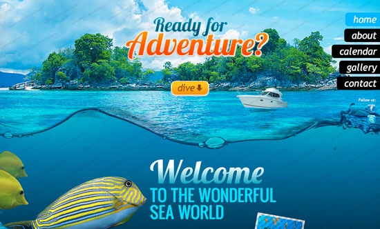
 Deeper is a WordPress theme that combines gorgeous fullscreen photography and some slick jQuery scrolling. It is meant to be used by scuba diving businesses.
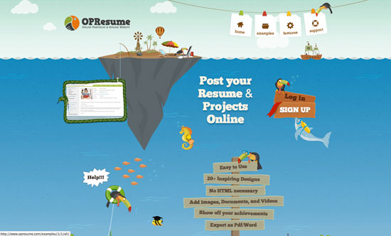
 OPResume integrates the scenery into almost every aspect of the design, including navigation items and calls to action. So what if they put toucans underwater? This site has a lot of fun with the illustrations and animations, and it all works.
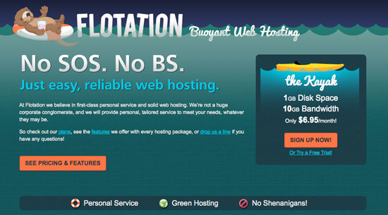
 Flotation Web Hosting uses semi-transparent wave graphics and a lifesaver to bring their otter mascot to the top of the page. Subtle texture and cool hues let the bright calls to action really stand out.
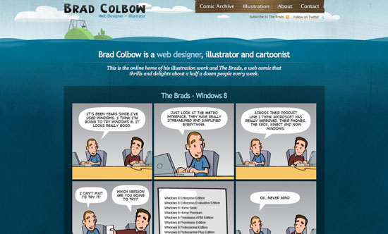
 Brad Colbow's portfolio site has a cool, somewhat grungy illustration of a swing set being swallowed up by the sea as its background.
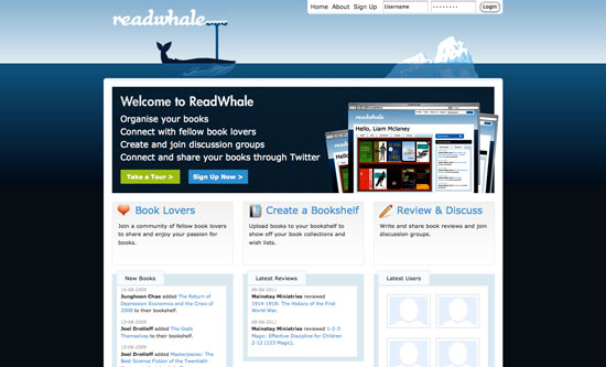
 Thanks to a shot of water out of his blowhole, ReadWhale's whale mascot blends in seamlessly with their logo. Ultra simple, in various shades and gradients of blue, this site really conveys an arctic mood.
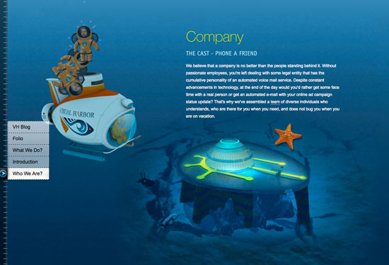
 Visual Harbor puts its employees into the scene as deep sea divers loaded into a mini submersible, before popping out for a quick swim. There is also a really great illustration of their "underwater headquarters." I doubt they get much work done there, but its cool nonetheless.
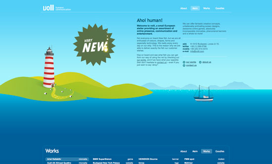
 Voll's site is the second on our list to start in the center of the horizontal space, allowing visitors to either scroll up or down. If you choose the downward path, you will be greeted by brightly colored octopi and a landscape that looks more lunar than aquatic. Snaps for artistic license!
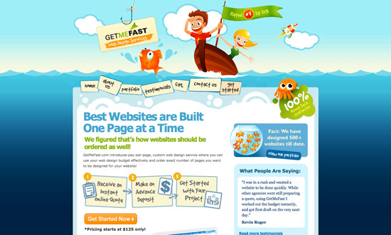
 Get Me Fast has a very colorful, cartoony vibe that goes well with their mission of making web development simple.
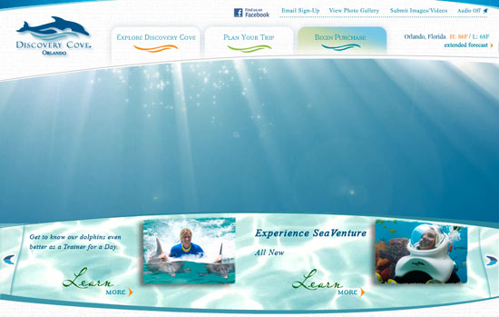
 Discovery Cove's main content area serves as a slideshow for images of the underwater activities the park offers, intercut with animated images of brilliant, sparkling underwater light.
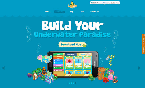
 The site for Lonely Sock Games' Coral City App uses fun, colorful underwater illustrations of the game's central characters, as well as underwater structures. Some retro design elements give the site even more visual interest.
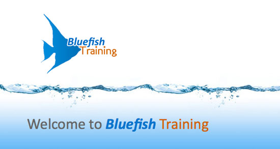
 Bluefish Training uses an angelfish silhouette and a ultra clean waterline to give the content a sense of space.
 Icebrrg's tagline reads: "web forms made chillingly simple." The same can be said for the website itself. Using only simulated light in cool hues, you get the sense that the water is pretty cold down here.
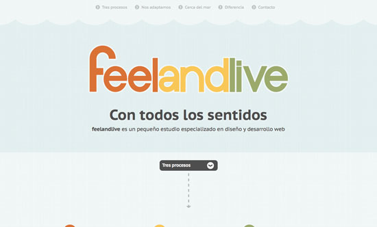
 Feel and Live gets the subtlety award for this list. Their site has a very pale blue background with a faint wave pattern running across the header. The overall effect is very light and refreshing, and it lets the three main accent colors make a more powerful statement.
Websites of the Deep
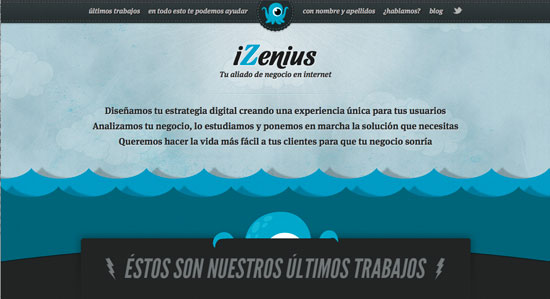
iZenius uses subtle animation, texture and a fun retro aesthetic to bring a stylized ocean to life. Family of Fish uses beautiful fullscreen photography in multiple layers to create an amazing parallax effect as you scroll down to the ocean floor.
 The site for the fictitious Atlantis World's Fair has the look and feel of a children's book from the 1960s. Mostly baby blue with several pops of color, it follows the journey from the water's surface down to the lost city.
 Fishy has a quirky and colorful interface that makes great use of pop art illustrations and HTML5 animations to showcase their work.
 Goodbye Elliott is a Hawaiian boy band that uses the natural underwater beauty of their home state to gorgeous effect.
 Liquid Torch gives the illusion of being underwater through simulated beams of light, as well as splashes of water on and behind the hero image.
 Squid Chef's coming soon page plays with lighting effects and a colorful, simplistic illustration of their mascot.
 Iceberg brings us a somewhat chilled version of the oceanscape. Using gradients and subtle glow effects, Iceberg shows us that there really is more under the surface.
 Dedoce utilizes a beautifully textured watercolor-esque illustration as a backdrop, and the result is quite dramatic.
 Iutopi is a fantastic example of using parallax to tell a story. As you scroll down from the surface, you encounter many of the creatures which call the ocean home, and they only get stranger the deeper you go.
 Ocean's Discovery uses the requisite ocean blue in the hero photo, but sets it off with a pop of vivid yellow on the navigation bar and to highlight some of the copy.
 Tomas Projeta's portfolio site has a very atypical and interesting navigation. Rather than starting at the top, it starts in the center of the vertical space, allowing visitors to scroll up to the sky, or down into the sea. The wonderfully detailed illustrations make both directions worth the trip.
 We Think suggests a deep sea dive through the clever use of their heroes' image: Two guys in their pajamas and old-school diver helmets. Their header also includes a repeating wave pattern to add to the effect.
 Ukranian Design Studio includes many environments in addition to the beautiful coral reef. You can easily navigate toward space, dry land, as well as the center of the earth.
 Sendoushi uses a fish as a metaphor for the different stages that stand between a client's problem and their solution. Now that's deep.
 Deeper is a WordPress theme that combines gorgeous fullscreen photography and some slick jQuery scrolling. It is meant to be used by scuba diving businesses.
 OPResume integrates the scenery into almost every aspect of the design, including navigation items and calls to action. So what if they put toucans underwater? This site has a lot of fun with the illustrations and animations, and it all works.
 Flotation Web Hosting uses semi-transparent wave graphics and a lifesaver to bring their otter mascot to the top of the page. Subtle texture and cool hues let the bright calls to action really stand out.
 Brad Colbow's portfolio site has a cool, somewhat grungy illustration of a swing set being swallowed up by the sea as its background.
 Thanks to a shot of water out of his blowhole, ReadWhale's whale mascot blends in seamlessly with their logo. Ultra simple, in various shades and gradients of blue, this site really conveys an arctic mood.
 Visual Harbor puts its employees into the scene as deep sea divers loaded into a mini submersible, before popping out for a quick swim. There is also a really great illustration of their "underwater headquarters." I doubt they get much work done there, but its cool nonetheless.
 Voll's site is the second on our list to start in the center of the horizontal space, allowing visitors to either scroll up or down. If you choose the downward path, you will be greeted by brightly colored octopi and a landscape that looks more lunar than aquatic. Snaps for artistic license!
 Get Me Fast has a very colorful, cartoony vibe that goes well with their mission of making web development simple.
 Discovery Cove's main content area serves as a slideshow for images of the underwater activities the park offers, intercut with animated images of brilliant, sparkling underwater light.
 The site for Lonely Sock Games' Coral City App uses fun, colorful underwater illustrations of the game's central characters, as well as underwater structures. Some retro design elements give the site even more visual interest.
 Bluefish Training uses an angelfish silhouette and a ultra clean waterline to give the content a sense of space.
 Icebrrg's tagline reads: "web forms made chillingly simple." The same can be said for the website itself. Using only simulated light in cool hues, you get the sense that the water is pretty cold down here.
 Feel and Live gets the subtlety award for this list. Their site has a very pale blue background with a faint wave pattern running across the header. The overall effect is very light and refreshing, and it lets the three main accent colors make a more powerful statement.


yessssss some are really very inspire to me ….
Nice inspiration collection!
I wonder how much time you spend in order to get a list like.
Hey George, it took quite a while actually! But it was worth it, I think its a pretty good list, and hopefully it will inspire some designers out there.
Great sites, this one definitely deserves to be on the list.
http://titanic.q-music.be/
That Titanic site is awesome Todd, great addition!
Great collection, I like especially the cartoon website designs !
Despite the fact most of the cartoony websites originate from a foreign country, they’re my favorite. It’s a bit disappointing that there’s not very many illustrative websites made in America. What does that say about American web design?
Thanks for the inspiration. There are some interesting designs in there, also some less interesting… I’ll share it on my Twitter!
Nice collection, I love the iZenius website. Thanks!
I think that one is my favorite too Franco. Good taste!
Great listing. Some of these look very good. Would love to add this one to the list: http://www.frogmaninteractive.com/
Great collections… they really inspire me soo much… like iZenius the most!!!
Nice! I would like to add this one: http://www.astralkids.net/