Website Footer Best Practices & Examples to Learn From
As with anything that has been around for a long while, websites also have some common aspects that can be found in almost any example. One of them is the website footer. More often than not, web developers and designers overlook the importance of a proper website footer as it’s probably one of the least viewed sections of the website. But that does not mean that they are unimportant.
Quite the contrary, website footers fulfill multiple roles that no other section of the website can do without making the website look too crowded. After all, there’s a reason why there’s a whole menu at the very bottom of a website. So, let’s have a look at which links you can include in your footer, and then let’s have a look at some great website footer examples.
The Must-Haves of a Website Footer
There are three links that almost any should have in their footer. Having these links is the bare minimum of a proper website footer.
1. Terms of Service/Use
The general terms of how to use your website/products should be listed in your Terms of Service. This is extremely important for any website, any terms you want to layout should be included in your terms of service page. As these pages are not visited often, they find their place in the website footer.
2. Privacy Policy
In a world where our personal data is owned and accessed by dozens of companies, people are, rightfully concerned about their privacy. Some countries even have strict laws surrounding how websites and companies access their users’ personal data. As a result, you should be extremely careful while preparing your privacy policy and it should be listed on a spot that people can easily find it. You can use this privacy policy template as a starting point for creating your own.
As almost every website places their privacy policy on their website footer, visitors will most likely search for it there.
3. Copyright
As much as it’s the right of your visitors to be concerned about their own safety, you should also be protective of your own website. Adding a copyright symbol with the year and logo will help you prevent plagiarism.
Good to Haves on a Website Footer
Now let’s have a look at some other links that you should consider adding to your website footer. Most of them are quite important but won’t break your website if you don’t add them. Still, it’s a good idea to use the relevant ones.
1. Contact Us
Most websites include a contact page or form on their website. Depending on your niche, it might make sense to add the contact page in your website footer. However, websites that provide a service or sell goods should consider adding it at a more visible place as such websites often require to provide some sort of customer support. Some companies separate their support page and contact page. In such cases, the contact page is used for business inquiries, partnerships, or marketing and it can be placed on the website footer.
2. Sitemap
While it’s not enforced by Google having a sitemap is quite important for the success of a website. A sitemap is a list of every page on your website and contains information on how they relate to each other. This helps Google bots to index your website on their search engines. Having the sitemap on your website footer is a good idea as it’s not visited too frequently by regular visitors.
3. About Us
Whether you’re a personal blogger, a small team, or even a big company, having a page about your vision and more information about you or your brand is a good idea.
4. Social Media Link
Nearly every website includes links to their social media pages on their websites and the website footer is one of the most popular spots. Having links to your social media pages is a good way to increase engagement with your visitors which leads to a more successful website.
Website Footer Examples

This footer example is the most common type of website footer. It lists all the necessary information while also providing additional navigation options.

Another great example. This website footer has everything and some more. The JotForm footer includes links to its mobile apps which is a good place to list them except on a mobile-related page.
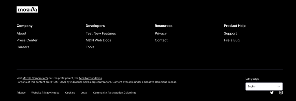
Mozilla's website footer includes everything necessary. It has some additional links such as reporting a bug button, community guidelines. The social links are cleverly placed under the language slider.
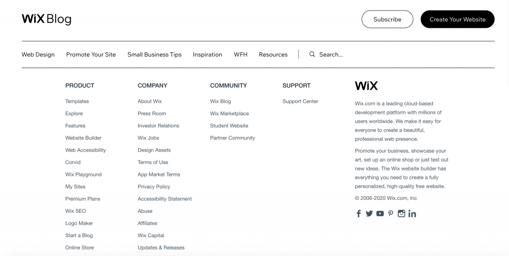
This is a bad example of a website footer. As you can see, the number of links doesn't even fit a whole page. You should always remember that a website footer is just that, it's a footer. Overdoing it to an extent that it takes up more than an entire screen defeats the purpose.

Not many website footers use a centered view but this one works perfectly. It has all the necessary information and links while also providing links to their other network websites.

This website footer is more colorful than many. It covers all the necessary requirements but it also includes the link to an upcoming event that fits well into the website footer.

An extremely unique website footer. Considering the entire website is designed like an old newspaper, the footer is cleverly fit without giving too much away from the overall theme.
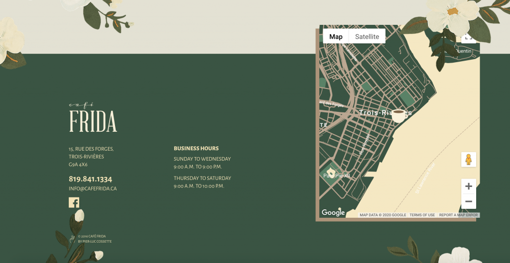
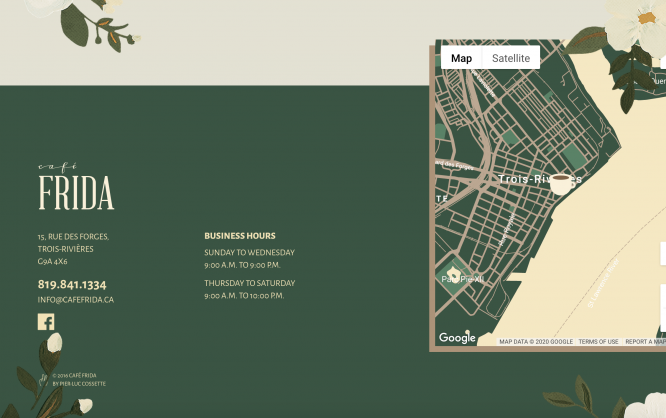
Another really unique website footer example. The footer of a cafe website has all the necessary links but it also has something that brick & mortar websites should utilize more, a map. And not just a regular map but a custom-designed map that matches the design tone of the website.
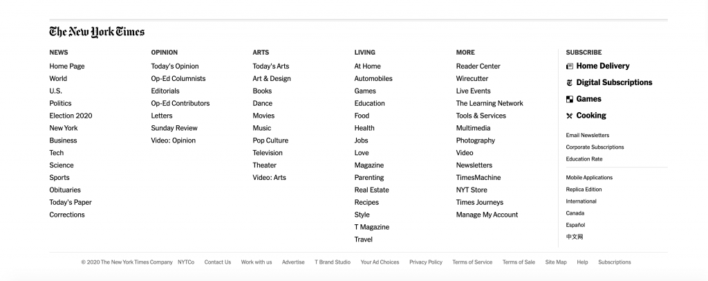
This is another bad example of a website footer design. Even though it's the website footer of a very successful website, it still has too many issues. It resembles more of a dropdown menu with article categories, and the categories are spread between different sections too. It makes it extremely difficult to navigate.

An interesting take on a website footer. It's way less populated than other website footers but it has a fun twist with local times from all around the world.
Conclusion
Overall, website footers are an overlooked but vital part of any website. Building a website footer that works isn't too hard, but as it can be seen in many examples there's always room for making them more interesting and engaging.
But as it can be seen with some of the other examples in the article, even big websites can screw a functioning website footer. So, what do you think? Have we missed any important aspects of a proper website footer? Do you have any interesting website footer examples or any bad ideas?
