Web Throwback: Showcase of Vintage and Retro Web Design
Given the popularity of vintage and retro styles among the web design community, we thought we would take an opportunity and shine a spotlight on some of those styles applied to websites. With so many flawless examples of vintage and retro web design floating around the internet it was a bit difficult to narrow down the search, but we think we found some inspired designs that have not already hit everyone's radar, and maybe one or two that have.
So take a look below at the showcase we have prepared for you and see how some talented designers have brought the past to life on the web today.
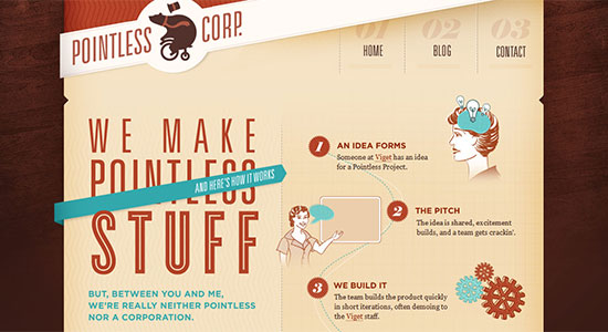
 Pointless Corp uses a blend of retro elements, most notably the typography and vintage ad style characters to create a feeling of yesteryear throughout the design.
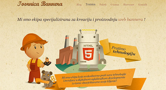
 Tvornica Bannera pulls off something of an interesting feat. It is not often that a design featuring a robot can have a retro appeal, but this site manages the feat well.
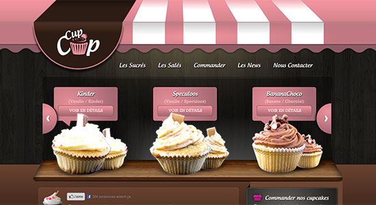
 Cup Cup Cupcakes uses soft coloring with a header that mimics the awnings of delis and malt shoppes of the old days to pull together a delicious design.
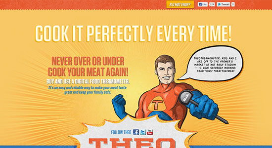
 R U Hot Enuf? calls on the comic books hero styles of old to create a powerful vintage style that really packs a punch.
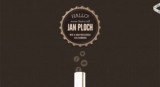
 Jan Ploch has a very simple, minimal design with a monochromatic color palette which all gets it's retro feel from the site header.
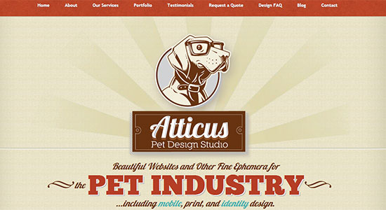
 Atticus Pet Design Studio uses various vintage design elements, together with a whimsical mascot image that lands in the old school camp.
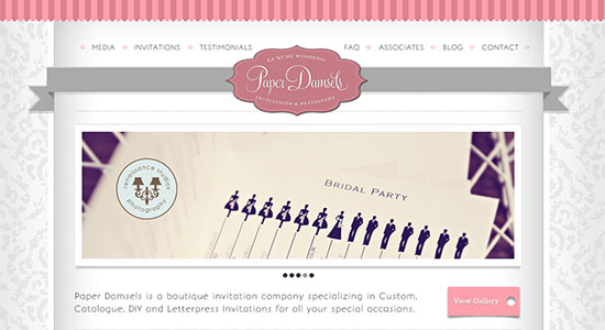
 Paper Damsels wonderfully combines pinks and greys to craft a very elegant, almost Victorian era feeling design for their site.
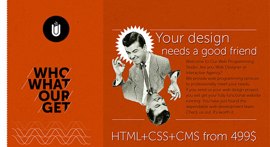
 Smultron has a deep orange background with a black and white, 20's style character giving the entire site the feel of an old advertisement.
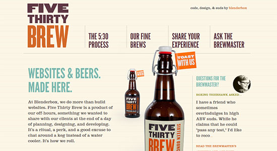
 Five Thirty Brew combines an advanced, fluid design with retro styled colors and elements for a playfully, informative website.
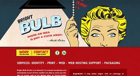
 Bright Bulb Design Studio is a site that you have probably seen before, but it's awesome vintage design was one that we just couldn't ignore.
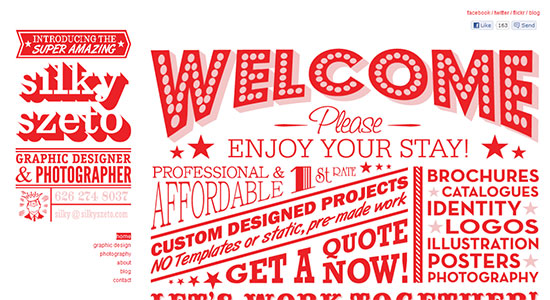
 Silky Szeto has an interesting, very old school design, full of various bold fonts tightly packed together like some of the vintage advertisements of yesteryear.
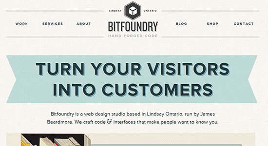
 Bitfoundry has a simple, retro design which gets its throwback feel from the bold, clean typography and softly colored elements.
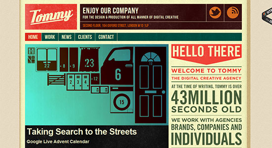
 Tommy has such a harmonious blending of vintage elements that it was another that the showcase would not feel complete without.
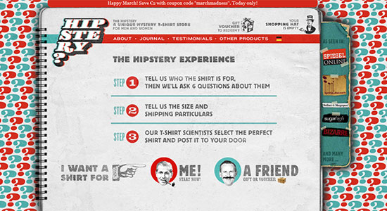
 Hipstery does a good job of employing a range of various elements with an old school 70's and earlier era feel, however the overly busy background can be a bit hard on the eyes at times.
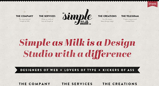
 Simple as Milk is another minimal, yet retro styled design, which relies heavily on the typography to impart this feel. The thick scripted site header shines in this respect.
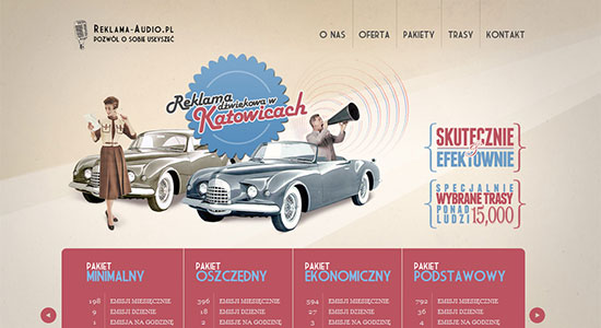
 Reklama-Audio draws on 1940's era Americana styling for their website design, and it pulls all the elements together with class.
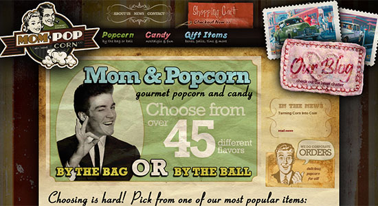
 Mom & Popcorn is another flawless blending of so many vintage styled design elements, layered to perfection in such a way that it embodies the very essence of this showcase.
 (rb)
(rb)
Web Throwback
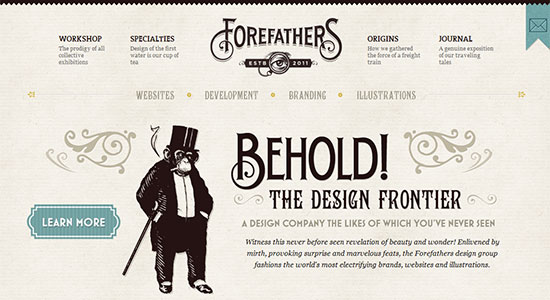
Forefathers Group has an open, classically vintage style that could be pulled straight from a 20's broadsheet. Beautiful execution. Pointless Corp uses a blend of retro elements, most notably the typography and vintage ad style characters to create a feeling of yesteryear throughout the design.
 Tvornica Bannera pulls off something of an interesting feat. It is not often that a design featuring a robot can have a retro appeal, but this site manages the feat well.
 Cup Cup Cupcakes uses soft coloring with a header that mimics the awnings of delis and malt shoppes of the old days to pull together a delicious design.
 R U Hot Enuf? calls on the comic books hero styles of old to create a powerful vintage style that really packs a punch.
 Jan Ploch has a very simple, minimal design with a monochromatic color palette which all gets it's retro feel from the site header.
 Atticus Pet Design Studio uses various vintage design elements, together with a whimsical mascot image that lands in the old school camp.
 Paper Damsels wonderfully combines pinks and greys to craft a very elegant, almost Victorian era feeling design for their site.
 Smultron has a deep orange background with a black and white, 20's style character giving the entire site the feel of an old advertisement.
 Five Thirty Brew combines an advanced, fluid design with retro styled colors and elements for a playfully, informative website.
 Bright Bulb Design Studio is a site that you have probably seen before, but it's awesome vintage design was one that we just couldn't ignore.
 Silky Szeto has an interesting, very old school design, full of various bold fonts tightly packed together like some of the vintage advertisements of yesteryear.
 Bitfoundry has a simple, retro design which gets its throwback feel from the bold, clean typography and softly colored elements.
 Tommy has such a harmonious blending of vintage elements that it was another that the showcase would not feel complete without.
 Hipstery does a good job of employing a range of various elements with an old school 70's and earlier era feel, however the overly busy background can be a bit hard on the eyes at times.
 Simple as Milk is another minimal, yet retro styled design, which relies heavily on the typography to impart this feel. The thick scripted site header shines in this respect.
 Reklama-Audio draws on 1940's era Americana styling for their website design, and it pulls all the elements together with class.
 Mom & Popcorn is another flawless blending of so many vintage styled design elements, layered to perfection in such a way that it embodies the very essence of this showcase.
 (rb)
(rb) 
Love them. Great collection.
As for the comment exclaiming “White only customers, please!”??? Wow. That’s pretty ignorant. Study art history much?
nice collections.
some are very much inspiring vintage designs
I really like the vintage design for website but not entirely sure why.
I really like the Reklama-Audio design. Just gorgeous. I agree, too, that there’s something very evocative and happy about 50s styles. A better time. I think I will try a retro design for the next makeover of my company website.
Vintage web design?!? Love it! It captures my imagination.
Mom and Popcorn…wow, that is really clever. Ever have that wish-I-thought-of-that moment? I’m having it now!
Really fun ride. Love this stuff. I’ll be storing this stuff and using it as inspiration tonight! Thanks!
Nice design … thanks for sharing.
Great roundup of websites. Four Father and Pointless Corp are 2 of my favorites! Thanks for the share.
I just love it. It’s so good for inspiration, I can’t wait to use some ideas for my own website. Thanks!