Web Design: Transparency as a Design Element (plus Best Practices)
Transparency has become a big hit in web design since most browsers can display it. Transparent elements are used to either set accents or draw attention to a certain area like images or text passages. But there are a few things that can go wrong while developing websites with transparent effects. Today we'll show you what you should pay attention to. Let's create a harmonious website with transparent elements, shall we?

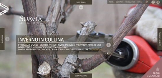 Only a closer look reveals that the transparent area is slightly too transparent. The mentioned "suboptimal" effect becomes apparent on a subpage with a multi-color background where the transparency has not been adjusted.
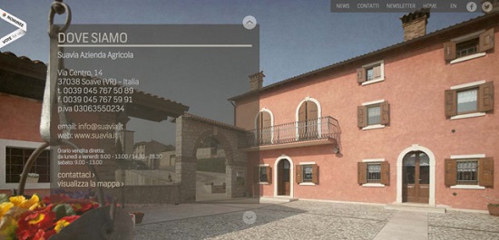 The readability suffers a bit due to the high transparency values. Less would have been more here.
 The few transparent effects this template uses look pretty good, emphasize and clarify the impression of the image and message. Well done!
 Blurb is a web design agency from Yorkshire, England. Their website is a good example of how to use transparency only as a supporting effect and putting the focus on the readability of the content.
 They did everything right. Many transparent areas alternate with animations - a funny concept that's well implemented.
 The subdued transparency of the main content area enhances the readability of the content. It does not only look good but is also user-friendly.
 GO4 Events only has one transparent area on their website - in the header around the logo. This area, however, dovetails with the "normal" website elements and supports them with this little goody.
 The illustrator Brad Colbow also relies on subdued transparent elements. He uses these areas to highlight titles, which works very well because the title elements accentuate this area without being too intrusive.
 The Body Shop ATL uses transparency in three areas: the logo, the bar below the hero area (the large images), and the small area in the right half of the image containing the company's telephone number. Here transparency is used to accentuate and not as an end in itself.

Transparency in Web Design
There are two different ways to get transparency: by using transparent PNG files or pure CSS. The latter becomes more and more popular since all modern browsers can display transparency via CSS. Such effects help display certain areas clearer and add contrast, which draws your visitors' attention to specific content. Using alpha transparent PNGs might be the easier way; however, most of the time CSS delivers better results. But it's up to you which way you want to go. Especially in the developing stage, CSS3 is the faster and better option as you only need to adjust one line of code to get a quick result. This makes it easier to quickly change the transparency.Apply Transparency Using CSS3
Transparency becomes more and more popular thanks to the support of CSS3 with its RGBa color definition. The "a" in RGBa represents the transparent channel. A value of, for example, 0.5 adds 50% transparency to the background color. But don't forget older browsers if you need to support them. The CSS3 opacity can be applied to images, texts, backgrounds, div elements, etc. Pure CSS solutions perform faster and should be considered, for this reason. However, the most common way to apply transparencies still is the good old alpha transparent PNG.Be Careful with Multi-Color Backgrounds
Working with multi-color backgrounds can be quite tricky, not only for web design beginners because you'll sometimes get results which are rather lesser than perfect. Always be careful with images as this can quickly become a complete bomb. Here's a list of example websites using transparencies. Some make good use of it, others not so much.Transparent Elements
Suavia
This website does many things right, however, still appears imperfect. The designers did an (almost) perfect job on the homepage. What is a bit annoying when scrolling down is the amount of white space and the not optimized working JavaScript, which actually should prevent the scrolling because there's no content below the viewport. But let's have a look at the beautifully designed homepage: Only a closer look reveals that the transparent area is slightly too transparent. The mentioned "suboptimal" effect becomes apparent on a subpage with a multi-color background where the transparency has not been adjusted.
 The readability suffers a bit due to the high transparency values. Less would have been more here.
Interior CMS Template
 The few transparent effects this template uses look pretty good, emphasize and clarify the impression of the image and message. Well done!
Blurb Creative
 Blurb is a web design agency from Yorkshire, England. Their website is a good example of how to use transparency only as a supporting effect and putting the focus on the readability of the content.
Rich Transparencies
There's no such thing like perfect transparency. All new designs have something special to them and, therefore, require individual settings and transparencies. Experiment with the options CSS3 provides. It's easy as a breeze because you can change and try out other transparency settings within seconds. You'll surely find the transparency that works best for your website. If you want to apply transparency effects to several areas of your website, try out different levels of transparency because some projects require different settings even on the same page. Generally speaking, you should focus on readability and user-friendliness. Otherwise, you may upset your visitors who will then turn their back on your website. When putting a content area on the main content, you should use low transparency to make sure that the content is readable. Here are some examples:Pizza-za
 They did everything right. Many transparent areas alternate with animations - a funny concept that's well implemented.
West City Hotel
 The subdued transparency of the main content area enhances the readability of the content. It does not only look good but is also user-friendly.
Subdued Transparency
The following examples use carefully selected, subdued transparent areas. Sometimes to highlight certain things, sometimes to obtain a certain effect, like GO4 Events.GO4 Events
 GO4 Events only has one transparent area on their website - in the header around the logo. This area, however, dovetails with the "normal" website elements and supports them with this little goody.
Brad Colbow
 The illustrator Brad Colbow also relies on subdued transparent elements. He uses these areas to highlight titles, which works very well because the title elements accentuate this area without being too intrusive.
Body Shop ATL
 The Body Shop ATL uses transparency in three areas: the logo, the bar below the hero area (the large images), and the small area in the right half of the image containing the company's telephone number. Here transparency is used to accentuate and not as an end in itself.
Conclusion
With all the possibilities it offers today, transparency is almost a must-have in web design. It should not be used as an end in itself but only for supportive reasons. This brings off the effects, and you'll get what you're after: an interesting website. I hope this article provides you some inspiration and helps you implement transparency correctly. I explained on one example what could have been made better. I'm sure you'll strike a balance.Related Links
- A brief introduction to Opacity and RGBA - CSS3.info
- RGBA colors - CSS3.info

Excellent write up and great set of examples which include both good and bad uses of the transparency. I think this element of design helps you enhance the experience and look, and will be much more useful for eCommerce websites.
These are great, but most of these would not pass AA accessibility requirements so I would highly advise using these techniques only portfolio sites or smaller sites with a specific audience. Transparency can be done right, and it can be done very very wrong. A lot of these sites place light grey text on lighter grey transparent backgrounds… Looks cool but if you ever applied this to a education, state, or other government website – be prepared to handle a lawsuit and pay out millions.
Thanks for the share! This was a really great read, I’m always trying to stay up to date on whats trending and the best practices. Especially with everything changing so much lately.