Visme.co: Swiss Knife for the Creation of Presentations, Infographics, Banner Ads and More (Comment to Win)
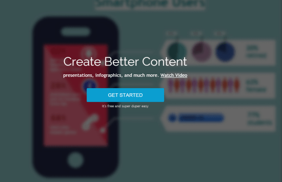
Visme.co is a recently relaunched and re-branded service loyal Noupe readers already know. We've covered the service under its former name EWC Presenter in August of 2013 already. At that time, our conclusion was entirely positive. We recommended to put PowerPoint and Keynote aside, and use EWC Presenter instead. A lot has happened behind the curtain since then, so we thought it would be time to revisit a service we had enjoyed at first encounter. Are we still fans? Well, the name Visme.co is way better than the wooden EWC Presenter. And else? Read on...
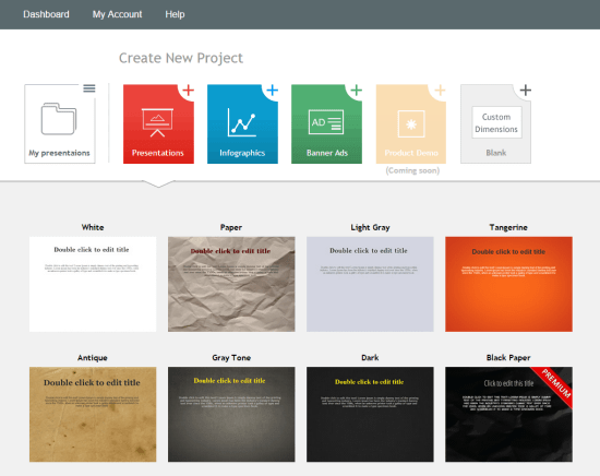 If nothing had changed, this wouldn't have been a bad thing as EWC Presenter was already impressive last time we reviewed it. But, indeed is Visme.co an evolution compared to EWC Presenter. Log into the tool and see that the website builder is now a tab in Visme.co and was a separate URL then. Take that as a side note, there are bigger changes ahead.
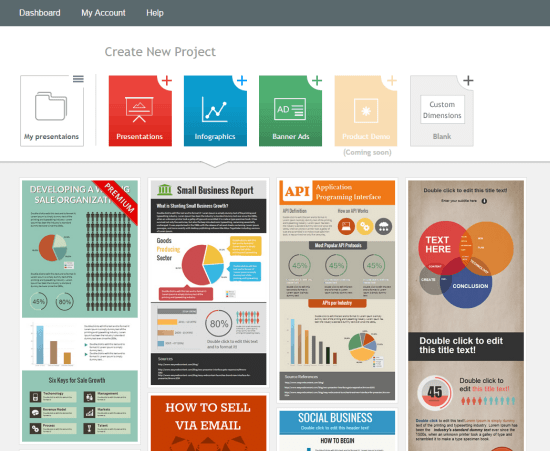
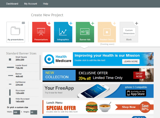
First, EWC Presenter had a strong focus on presentations. Visme.co still has. Additionally, Visme.Co has now elaborate functionality when it comes to infographics and banner ads while Presenter was a little rudimentary in that regard. You'll agree that infographics and banner ads are a much more lucrative business to move into.
 I said it before: an image is worth a thousand words. And while the infographics hype is already slowing down, visual content in itself is becoming more and more important. Banner ads are here to stay, too. No matter how bad the performance allegedly is. This always reminds me of the car business. Try to buy a car from a retailer. It will always be expensive with not a lot of possibilities for a decent rebate. Then try to sell your car back to the retailer. It will be practically worthless, accept it. Cognitive dissonance - anyway, takeaway is: keep doing banner ads. They will still be there tomorrow.
 What else has changed? Animations were a separate feature then. In Visme.co you can animate each creation. No need to decide beforehand which gives you much more freedom to bring your ideas to life.
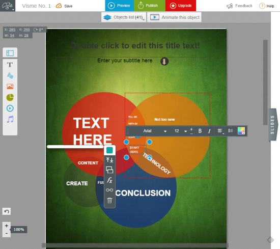
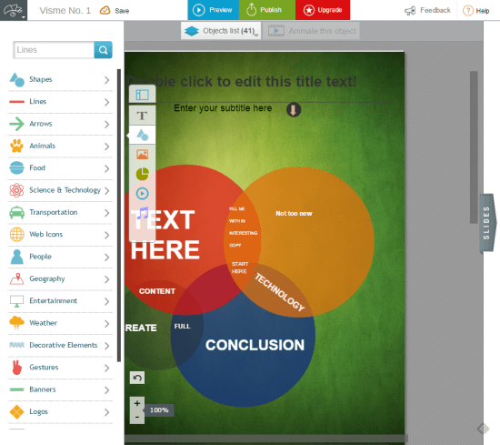
Then let's talk about the user interface. It was good then, but it is better now. Sporting that flat look inspired by iOS7, it is way more intuitive and simply gets things done. If you are used to any drag and drop visual builder out there, Visme.co will not impose any problems on you. Choices have become fewer than before, but that's only as far as the interface is concerned. Visme.co gives you easier access to the same functionality, just with lesser clicks. In the early days, Presenter promised to be able to export the work to HTML5 soon. Visme.co today can do just that.
 Watch the following short video for a thorough first impression:
http://vimeo.com/104754559

Visme.com: The Trend is - Visualize Me
The predecessor of Visme.co had the word presentation in its name; and for a reason. Visme.co entirely omits that term. Its motto is "Visualize Me" and as a visualizer in general it focuses not only on presentations but all kinds of visual content. While Presenter had major strengths in creating presentations, Visme.co is also capable of building infographics and banner ads. What made the people behind Presenter change its name? I assume the focus on presentations resulted in a more or less boring image of the service that was from scratch able to do more than just replace PowerPoint. Visual content is much more than a few slides. In fact, visual content is a vital part of any content strategy - or at least should be. But why guess? Let Payman Taei, the founder of Visme.co explain it:The change from EWC Presenter to Visme was two-fold. Visme is transitioned beyond Presentations; it's in essence becoming the Swiss Knife of Visual content where users can also create infographics, animations, product demos and banner ads. Last but not least, we wanted a brand name that symbolized simplicity.
Why Visual Content Will Save the World
An image is worth a thousand words. Who doesn't know that phrase? And while this has always been true, it is becoming even truer (I know there is no such word) with the rise of content marketing efforts worldwide and the growth of the web in general. Already today we have more content than we could ever possibly consume in our lifetime and content production doesn't stop now. Thus, we need strategies to survive the information overflow and still raise our intake as the world around us is the one we need to cope with. The same is true for content creators. They are facing fierce competition. Who wins the attention of the reader, for example with personalized micro marketing strategies, who gets lost in the mist? Chances are the less time your content takes to be consumed, the more likely it is to find its audience. See, I'm a rather big fan of Medium, who openly communicate the estimated time it takes to read any given article. Does this number rise above 3 minutes, I'm off. If the title sounds interesting I might save it to Pocket for later reading, but don't take me at my word that I'll actually do. Visual content, if well done, is much less time-critical, way easier to consume - a pure time-saver. And as such it is much more likely to be consumed in between two tedious tasks with tight deadlines. So, whether you are a consumer or a broadcaster of information, visual content should become a vital part of your survival strategy. And this is where Visme.co enters the stage.Visme.co: Still a Great Visual Builder Tool
Should you not have read our piece on EWC Presenter do that now. It will give you a much better insight into what was then and what is now. At first sight, not much has changed besides the name. Visme.co is all about presentations, infographics, banner ads or custom creations. Product demos have been (Coming Soon) then and still are today. Has nothing changed, then? If nothing had changed, this wouldn't have been a bad thing as EWC Presenter was already impressive last time we reviewed it. But, indeed is Visme.co an evolution compared to EWC Presenter. Log into the tool and see that the website builder is now a tab in Visme.co and was a separate URL then. Take that as a side note, there are bigger changes ahead.
First, EWC Presenter had a strong focus on presentations. Visme.co still has. Additionally, Visme.Co has now elaborate functionality when it comes to infographics and banner ads while Presenter was a little rudimentary in that regard. You'll agree that infographics and banner ads are a much more lucrative business to move into.
 I said it before: an image is worth a thousand words. And while the infographics hype is already slowing down, visual content in itself is becoming more and more important. Banner ads are here to stay, too. No matter how bad the performance allegedly is. This always reminds me of the car business. Try to buy a car from a retailer. It will always be expensive with not a lot of possibilities for a decent rebate. Then try to sell your car back to the retailer. It will be practically worthless, accept it. Cognitive dissonance - anyway, takeaway is: keep doing banner ads. They will still be there tomorrow.
 What else has changed? Animations were a separate feature then. In Visme.co you can animate each creation. No need to decide beforehand which gives you much more freedom to bring your ideas to life.
Then let's talk about the user interface. It was good then, but it is better now. Sporting that flat look inspired by iOS7, it is way more intuitive and simply gets things done. If you are used to any drag and drop visual builder out there, Visme.co will not impose any problems on you. Choices have become fewer than before, but that's only as far as the interface is concerned. Visme.co gives you easier access to the same functionality, just with lesser clicks. In the early days, Presenter promised to be able to export the work to HTML5 soon. Visme.co today can do just that.

 Watch the following short video for a thorough first impression:
http://vimeo.com/104754559

This is one software i would definitely wanna try :)
I work for a very large multi-national company. Do you know what this means? I have to sit through terrible presentations day after day after day. The same boring templates. The same ‘corporate’ look. It kills me. The funny things is, nobody seems to question it. It’s been this way for that long, that it’s just ‘the done thing’. Help me change this, either by showing everyone there is a way to make presentations EXCITING, or help them show me the exit. Either way, please shorten the time i need to spend adding to the library of antique presentations with a subscription to Visme.co!
I would really like to try it
My wife is profoundly, seriously ill. Her neurological disease, Myalgic Encephalomyelitis (ME), is mostly ignored throughout the world, leaving hundreds of thousands of people in horrendous suffering, with no hope of investigation, treatment or a cure. Many have died. My wife has suffered relentlessly for two decades now. The disease has wrecked our life on every level, but not our love. When you are fighting for your life, you become a passionate communicator. Visme would give me access to much needed, powerful presentational tools, that I, as a full time carer – and self-taught web designer, could not possibly afford.
When you are fighting for your life, you become a passionate communicator. My wife is seriously, Indescribably ill. Her neurological disease, Myalgic Encephalomyelitis (ME), for outrageous reasons, goes mostly ignored throughout the world, condemning hundreds of thousands of people to decades of suffering, their bodies malfunctioning on every physical level. For my wife it has been over twenty years of excruciating agony, yet for her and everyone else, there is little hope of investigation, treatment, a cure – or even being taken seriously. I can either sit back and do nothing or fight and campaign to the best of my ability. For that reason I have taught myself web design. I badly need access to a top quality, professional level presentational package, Visme would give communication opportunities that I could not, as a full time carer possibility afford.
Useful and easy to use tool, really!
This would a great to add to my toolbox at work. I am a web designer for the second largest community college in the U.S. and are just beginning to incorporate info-graphics into our website. We are launching a redesign in March 2015 which will contain a section dedicated to info-graphics. If I can turn heads with this application an educational license would not be far behind. Plus, it seems cool.
I’m using it already … free pro would be great :)
My design skills are frankly quite embarrassing, so this tool would be of great use to me in producing infographics.
Oh, I would love this!