Typography for Everyone Makes Texts Much Easier to Read

If you, as a page owner, think you didn't have to care about typography, you're wrong. The legibility of your texts also depends on the typography. Thus, in the following article, I want to cover this typography for everyone.
Naturally, typography has always been one of the most important elements in classic design. When studying graphic design or related subjects, typography becomes part of your daily routine from the very first semester. I don't want to write theoretical essays on academic levels, though.
This is more about conveying the value of the realization of typographic basics to non-designers. The following tips let you create much more legible text, also resulting in a better findability in the packed world web.
Let's start with tips for comfortable designs, written by InVision's designer Luke Jones at Medium. These are three small changes that can be applied to any text with little effort. After the second or third time, these tips will feel natural, as if you had always used them.
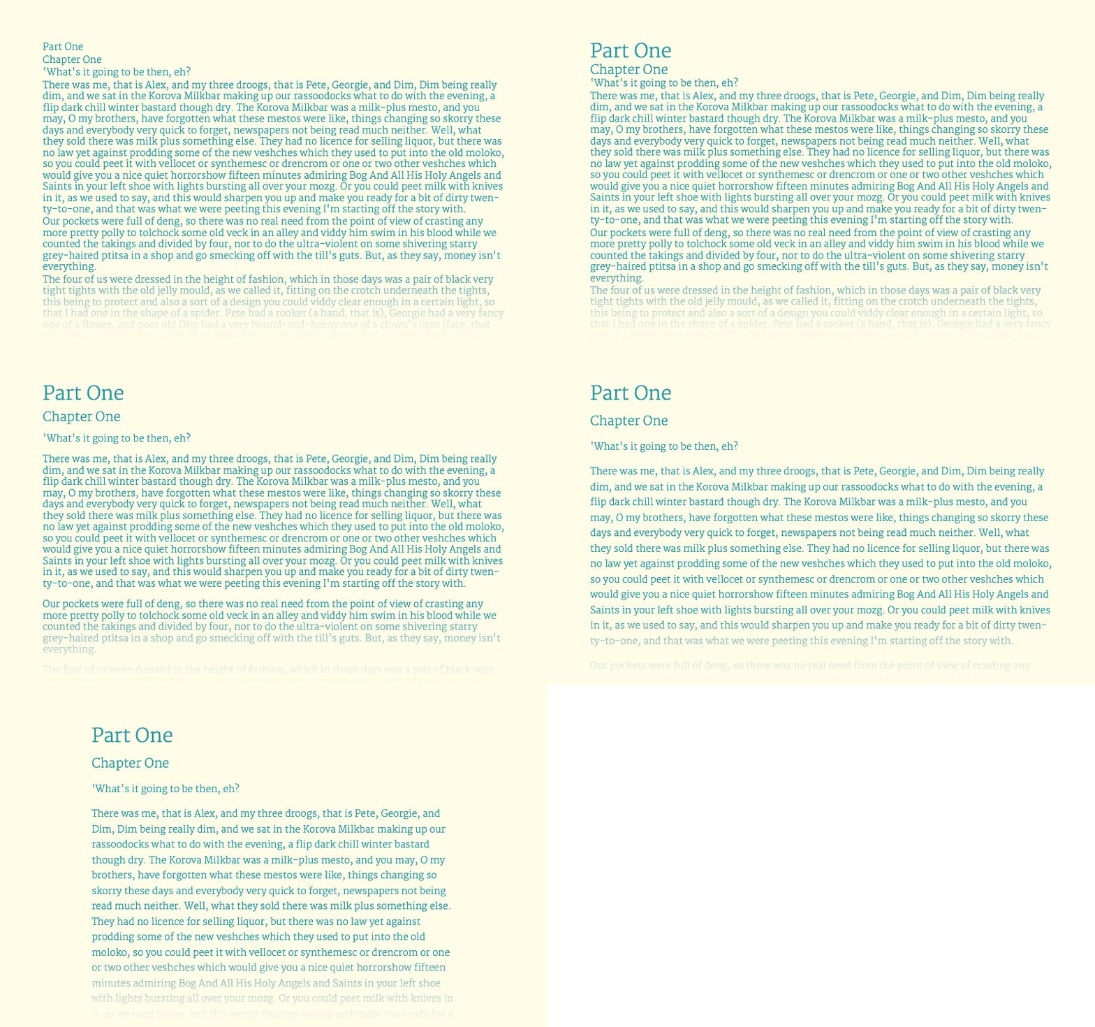 This GIF does a good job at showing how quickly an illegible text can be turned into an easily legible one. It doesn't even take much effort. (Gif: Luke Jones, Medium)[/caption]
The starting point for the observation is always the continuous text, which is what we write into the p-tags on the web. This text is the index, meaning it keeps the font size of 100 percent. All other elements are derived from that.
According to this, the first step is getting the text to a comfortably legible size. A lot of this is just a matter of taste. For me, this value is at 18 pixels, I don't want it to be any lower. Common publications are mostly around 14 pixels. No matter which size you define, it is important that it is the foundation for all other elements.
Headlines (hl) should have 180 to 200 percent of the original size, secondary headings (h2) 130 to 150 percent, and tertiary headings (h3) should only be slightly bigger than the running text. In many cases, you'll see h3 as a simple bold text. You should be able to go up to 125 percent without problems. Footnotes shouldn't exceed 75 percent of the size of the continuous text.
This way, the sizes of the different text components alone let us create a visual hierarchy that provides orientation, making the reading experience more comfortable.
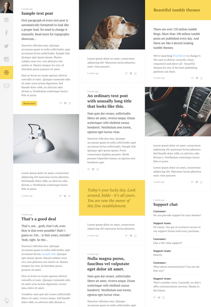 Good example for a legible column set, but the lack of hyphenation has a negative effect - see tip 7. (Creator: Pawel Kadysz)[/caption]
Line lengths of a maximum of 75 characters are considered to be enjoyable to read. After that, there should be a wrap. This results in the multi-column set of the venerable print media. Of course, there are different opinions on this topic as well. You're somewhere in the wide consensus if you're ending your lines between 40 and 80 characters.
Single column layouts should end their lines after 65, according to the typography pope Robert Bringhurst. He also said that the required width for the text can be calculated by taking your planned font size and multiplying it by 30. So, if you take my preferred font size of 18 pixels, you'll get to a value of 540 pixels for the text column.
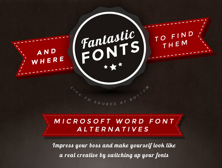 Alternatives to Microsoft's boring supply are always nice to have. (Snippet: Plato Web Design)[/caption]
There's an overview of the whole thing in this infographic.
 In the HTML tag, in order for the hyphenation to work properly, English has to be deposited as the document language, like this:
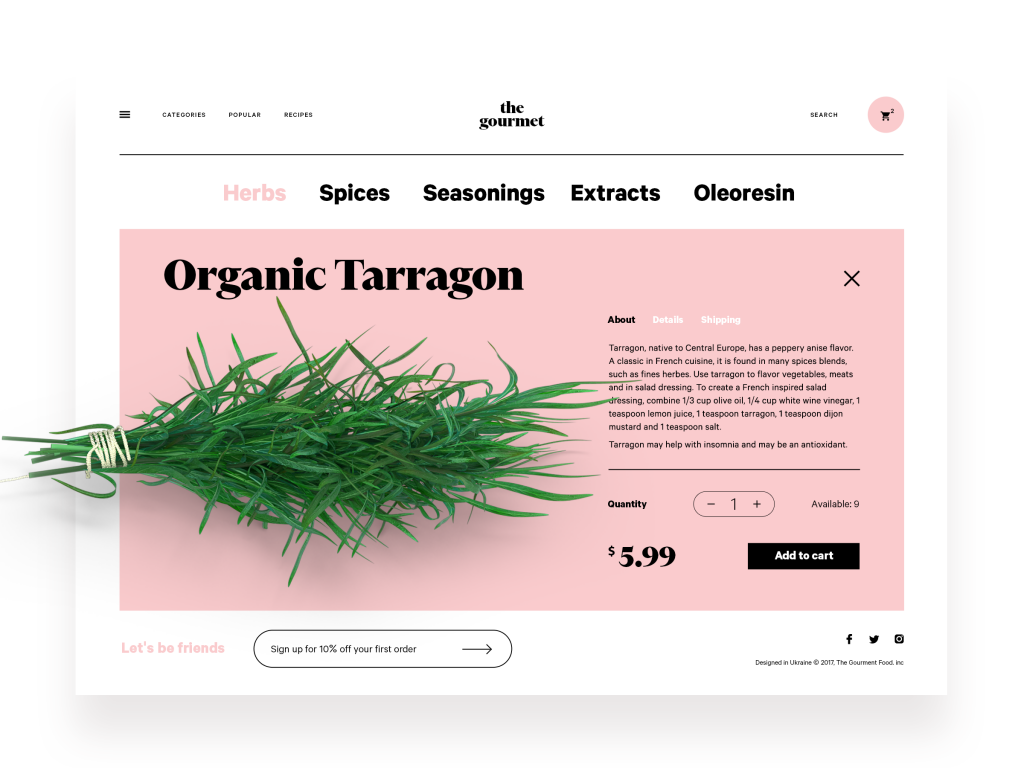 Lots of white space, even if it's pink in some cases, few elements, very legible overall. (Design: Tubik)[/caption]
Also, make sure to always add a clear contrast between the text and background. There's a reason why books are printed with black text on white paper. This contrast is considered optimal. Very bold experiments in that regard will most likely result in you losing parts of your readership.
Typography is More Than Line Distance and Font Types
This should be enough for today. Of course, these tips are merely the tip of the iceberg. So, if you pay attention to all tips in this article, you're still no expert. However, you're already providing a lot more for your readers than many other writers or page operators. This is not just important in e-commerce, where it helps purchase decisions, making it turnover-relevant. A legible freelancer blog will also be a lot more popular. In any case, you're setting yourself apart from the competition.
As you can see, there are only advantages. So, what are you waiting for?
Related Sources:
Tip 1: Typographic Hierarchy Structures the Text
When writing on the web more or less regularly, you'll know that keeping a correct text hierarchy is the main factor for the findability of your content in search engines. For that reason alone, you're probably already paying attention to correct labeling. However, not only search engines have an easier time working with cleanly structured articles. You readers also profit from a logical division of the content. Oftentimes, it is enough to focus on the headings of the stages one to three (h1 - h3), the correspondingly smaller running text, and the even smaller footnotes. For that, there are a couple of very simple assumptions, that allow for a clean structure applicable to every text. [caption id="attachment_104206" align="aligncenter" width="800"] This GIF does a good job at showing how quickly an illegible text can be turned into an easily legible one. It doesn't even take much effort. (Gif: Luke Jones, Medium)[/caption]
The starting point for the observation is always the continuous text, which is what we write into the p-tags on the web. This text is the index, meaning it keeps the font size of 100 percent. All other elements are derived from that.
According to this, the first step is getting the text to a comfortably legible size. A lot of this is just a matter of taste. For me, this value is at 18 pixels, I don't want it to be any lower. Common publications are mostly around 14 pixels. No matter which size you define, it is important that it is the foundation for all other elements.
Headlines (hl) should have 180 to 200 percent of the original size, secondary headings (h2) 130 to 150 percent, and tertiary headings (h3) should only be slightly bigger than the running text. In many cases, you'll see h3 as a simple bold text. You should be able to go up to 125 percent without problems. Footnotes shouldn't exceed 75 percent of the size of the continuous text.
This way, the sizes of the different text components alone let us create a visual hierarchy that provides orientation, making the reading experience more comfortable.
Tip 2: Generous Line Heights Make Reading Easier
We've all been parched in a dry text desert more than once. The simple view at a wild pile of letters lets our mouth go dry immediately. The salvation is so simple, though: just visibly divide the individual lines to bring the reading flow back to life. Even for that, there are simple rules of thumb. The distance between a line and the previous one should be between 120 and 160 percent of the size of the original text. Jones' rule of thumb is that a lying lower case h in the original size should fit into the gap without touching the upper and lower tips of the letters in the two lines. Clearly divided lines make words easier to conceive, resulting in a faster and more enjoyable reading process. The same goes for the correct placement of gaps between the paragraphs. In the past, the hyphenation was simply clicked twice, which usually results in too big gaps between the paragraphs. Thus, it seems better to use the size of the basic text for the gap.Tip 3: Don't Let the Lines Get Too Long
Users of large screens surely know the blogs that were set in a way that the width of the text is adjusted to the width of the visitor's display. This is called fluid design, and it is a valid means of design, but not like this. [caption id="attachment_104202" align="aligncenter" width="704"] Good example for a legible column set, but the lack of hyphenation has a negative effect - see tip 7. (Creator: Pawel Kadysz)[/caption]
Line lengths of a maximum of 75 characters are considered to be enjoyable to read. After that, there should be a wrap. This results in the multi-column set of the venerable print media. Of course, there are different opinions on this topic as well. You're somewhere in the wide consensus if you're ending your lines between 40 and 80 characters.
Single column layouts should end their lines after 65, according to the typography pope Robert Bringhurst. He also said that the required width for the text can be calculated by taking your planned font size and multiplying it by 30. So, if you take my preferred font size of 18 pixels, you'll get to a value of 540 pixels for the text column.
Tip 4: Use Different Weights of the Same Font
Once you've created the basic structures, you can still realize some of the other tips. In order to organize a text in a way that's more differentiated than simply setting text to bold and other formatting options, it is recommended to use different versions of the same font. Oftentimes, fonts are designed with a separate weight and are able to be used like that. These fonts are way more attractive than the computer-created version of the used original font. There are more variations of them, too. If one font doesn't provide any alternatives, you could also consider using a font from the same family. However, you should always change entire text parts, instead of mixing within the running text or the headings. I don't think I have to explain that this tip doubles as a plea for using web fonts. Don't rely on the conventional system fonts you'll find on every computer any longer. Instead, take the design wheel and use more interesting fonts, which are even easier to control in terms of their looks. You should start at the low threshold of Google Fonts, which are very easy to implement in WordPress sites. Recently, my colleague Denis Potschien showed you his must-haves for the year 2018 in this article.Tip 5: Never Use More Than Two Fonts
I remember that all elements of a presentation used to fly over the screen, animated via Powerpoint, and even included sound annoying sound effects at times. Every font installed on the computer was used in the wildest ways. Sometimes, awful fonts were installed deliberately. Oculists were booming. Well, now I may be exaggerating a bit... Although there are still ugly fonts that make our eyes bleed today, things have gotten better. We don't even have to use Powerpoint anymore. Take a look at Ludus, for example. I recently presented it here. Nonetheless, it is a tip worth considering: never combine more than two fonts in one piece of content. And, even when combining these two fonts, make sure not to use opposite font concepts. For that, FastPrint has built an infographic that deals with the combinability of the most popular fonts of Google's free collection. Check it out.Tip 6: Find Alternatives to Microsoft's Boring Fonts
If you know Calibri and Cooper inside out, it is time to do something about it. The designers of Plato Web Design rush to help you, and provide you with neat alternatives to the plain Microsoft material. [caption id="attachment_104203" align="aligncenter" width="750"] Alternatives to Microsoft's boring supply are always nice to have. (Snippet: Plato Web Design)[/caption]
There's an overview of the whole thing in this infographic.
Tip 7: Use the Automatic Hyphenation
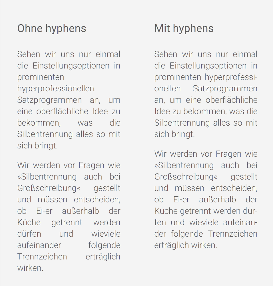
With CSS3, the attribute hyphens has been released. Text passages with this label, like the paragraph tags, are supposed to lead to the display of cleanly divided texts in the user browser. The markup itself is very simple:p { hyphens: auto; }
 In the HTML tag, in order for the hyphenation to work properly, English has to be deposited as the document language, like this:
<html lang="en">
Tip 8: Use White Space, Images and Contrast
Strictly speaking, this is no piece of advice on typography. Since it affects the legibility of texts, however, I think I should still mention it here. I frequently encounter texts on the web, where I can tell that it is a quality article after the first few lines, but I am still unable to read until the end. If it can't be traced back to one of the previously mentioned mistakes made by the page operators, it is always the result of a lack of images, or due to the fact that the text area can barely be told apart from the surrounding elements. Thus, I ask you to integrate images into your text. They loosen the reading flow, and, if chosen smartly, they even contribute to a better understanding of the text. Also, please provide an appropriate amount of white space, which is space not covered by text or other elements. This makes it easier for the reader's eyes to follow the text flow, rather than having to fight off distractions. [caption id="attachment_104204" align="aligncenter" width="1024"] Lots of white space, even if it's pink in some cases, few elements, very legible overall. (Design: Tubik)[/caption]
Also, make sure to always add a clear contrast between the text and background. There's a reason why books are printed with black text on white paper. This contrast is considered optimal. Very bold experiments in that regard will most likely result in you losing parts of your readership.
Typography is More Than Line Distance and Font Types
This should be enough for today. Of course, these tips are merely the tip of the iceberg. So, if you pay attention to all tips in this article, you're still no expert. However, you're already providing a lot more for your readers than many other writers or page operators. This is not just important in e-commerce, where it helps purchase decisions, making it turnover-relevant. A legible freelancer blog will also be a lot more popular. In any case, you're setting yourself apart from the competition.
As you can see, there are only advantages. So, what are you waiting for?
Related Sources:
- 10 Typography Tricks to Make Your Text Much More Readable | Creative Market
- 3 Typography Tips For A More Comfortable Read | Luke Jones, Medium
- 8 Simple Typography Tips For Your Designs | Smashing Magazine
- 20 Typography Mistakes Every Beginner Makes – And How You Can Avoid Them | Canva
