The Psychology of Business Card Design
We know you! We know that you are keen to know everything about business cards. At least that's what Google Analytics tells us. You like design templates, sample designs for inspiration purposes and engage in games where you can win sets of cards of your own. This is why we'd like to point you to a brand-new infographic by our friends over at UPrinting. They know their ways around everything printable and have now put together some essential tips on the psychology of a business card. You will definitely want to take a look...
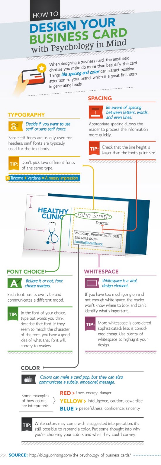
Design Your Business Card with Psychology in Mind
Obviously you do not want your business card to look ugly. So you will naturally be going for decent looks and probably shapes and materials that stand out from the crowd. These are nice intentions. The more important choices to make are less obvious.
As you can learn from the following infographic, which by the way is only a summary of the longer blog post by Arthur Piccio over at the UPrinting blog, business card design is much more about typography and spacing than about shapes, sizes and colorful illustrations.
In fact, speaking from my own experiences, unusual shapes and sizes can be a deal breaker when it comes to business cards. You will want your potential customers to be able to keep your business card as close to their hearts as possible. Just so they have it at hand only seconds after their newest order reaches their minds and urges for being placed. If you provide them with usual sized cards, such as credit cards are, you can be sure, that they could carry them around easily if they wanted to. If you hand them little disc-shaped business cards, it is likely, they throw them away as soon as they have the chance to.
The worst example of an innovative business card I have ever seen was by a fellow designer, who thought it would be smart not only to have the cards shaped as small discs, but in fact really being small compact discs. On the discs he only had his name printed. If you wanted to know his address, e-mail and all the other details, you would have to put the disc into your computer and start a flash-based presentation. Can you imagine how successful this approach was?
Back to UPrinting's advice: Typography, font-sizing, font-choice, letter-spacing, line-height and whitespace are viable details you need to pay close attention if you want your business card to make the best impression. As long as you have not covered these basics you could print them with silver on a gold coating and then wonder why they don't turn you in any orders...

(Source: UPrinting, Infographic published at MarketingProfs)

This is great! I recently got tasked with making business card for someone and I’m forwarding this infographic to them now. Thank you so much.
Great Article! I was wondering what to look out for when designing a business card and this is it. Thanks!
Scintillating info, a must known feature for any designer vide experience. Thank you
This post has been very helpful :) It has given me ideas to get some business cards of my own made :P