The Perfect User Interface: GoodUI Equips Web Designers with Solid Marketing Knowledge
Jakub Linowski, UI designer from Toronto, Canada, is used to be working for the bigger brands. He obviously possesses knowledge not only in the field of webdesign craftsmanship but also in the field of marketing. The latter is what he conveys through his side project GoodUI.org. If you are a web designer interested in maximum conversion aka massive sales, you should definitely care for obeying what Linowski teaches you. Not each and every tip will be a fit to every project, though. Just as it is in real life, if the shoe fits, wear it. If not, don't...

GoodUI, Continuously growing Source of Marketing Wisdom
GoodUI.org is a minimalistic website on purpose. It was created to transfer information in a very straightforward way. And this is what it does. At the time of this writing, you will be able to breathe in nine essential tips on UI design. Linowski promises to add to the wisdom twice a month. If you don't want to miss a lesson, subscribe to the newsletter. Linowski promises to not spam you and solely use the addresses for tips-oriented mails.
At first sight, nine short lessons don't make a dent, surely not in the universe. At second sight, these tips are absolutely essential, the roots of success, derived from general lessons in business economics, students learn in the first few semesters of their studies. As most web designers are not likely to have attended lessons in business economics, Linowski's tips will not sound familiar to all of them.
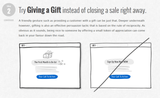
Linowski manages to keep his messages straight and comprehensible. Amazingly simple sketches add to their expressiveness.

The focus of GoodUI.org lies on conversion-oriented designs for shops, freelancers, artists, anyone who needs sales success. No wonder, that strategies for calls to action are given broad coverage. All in all Linowski seeks to concentrate on tips for unambiguous user guidance aiming at selling successfully.
I myself attended a few semesters in marketing during my MBA studies and can only emphasize and countersign GoodUI's statements. GoodUI.org should be found in the bookmark collection of any designer out there!
Related Links:
- Tips for Good UI Design - GoodUI.org
- Linowski Interaction Design - Homepage of the Toronto-Based Designer Duo

Hello Dieter,
A good user interface has a psychological background. And the truth behind it is that simpler is better. Once the internet venture has taken place people are going to loose their patience with complex interfaces, with multiple choices and with hard to find action buttons (sadly still there are many commercial websites where we meet these bad issues).