The Human Touch: Building User Relationships and Trust In Web Design
When creating websites you have to consider a great deal of aspects such as usability, visual-appeal, the technical side, and last but not least, brand building. Many successful and profitable businesses have been tackled this brand building with user-centric website design. They do this for different reasons, but the one that tends to draw most brands in this direction, is the way it often helps build a relationship with their users.
There are several ways that one can go about building user relationships and trust through web design, and putting a face with the design is one that, when done well, can score a lot of points for you and your brand. To add that personal element to your brand, your website can be one of your brand's most effective weapons. But it has to be done with care to ensure that it is handled properly.
Below is a list that is filled with great examples of people making their website designs not only visually appealing, but also trustworthy by adding the human touch.
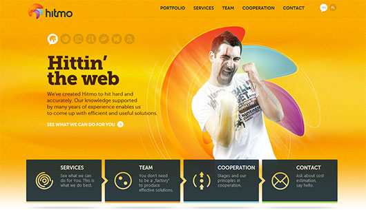
 2. Hitmo studio shows eagerness to fighting on your side and working as a team against the problems. The image also plays the role of visual interpretation of the main slogan.
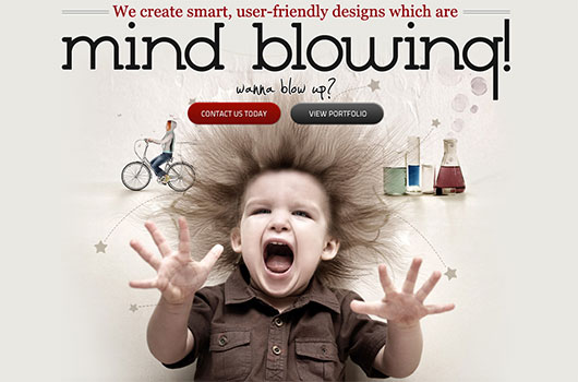
 3. Netbluez provokes good feelings that are usually associated with the image of child-like keenness, honesty and purity of mind. The well treated photo highlights the main message and completes the whole design.
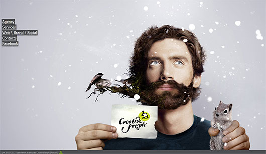
 4. Creative People is a great example, where the image not only makes the whole design look fresh and mysterious, but also gets users to believe that this agency works with really talented people, who definitely use unconventional approaches.
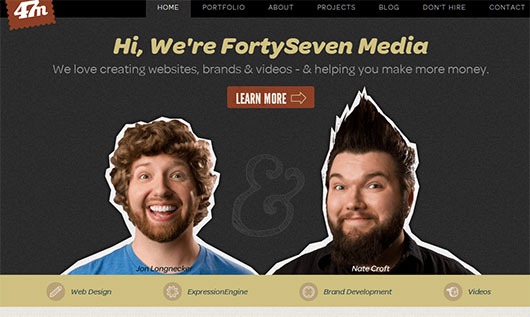
 5. Forty Seven Media presents people behind the scene with a touch of quaintness. The appearance of the potential performers shine with eagerness and creativity, convincing us of their good intentions.
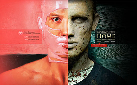
 6. Gavin Castleton's site uses a masterful photomanipulation to both divide the website into two functional parts and to inspire confidence by means of showing off the designer's skills.
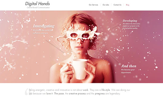
 7. Digital Hands like with the previous example, the agency bets on creativeness and skillfulness of their workers, using an exceptional image that should convince users that such talented people wont let us down.
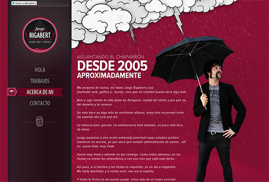
 8. Jorge Rigabert's whole website design is made with such a scrupulousness and attention to the smallest details that the self-portrait of the executor only adds seriousness to his intentions to do the job perfectly.
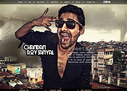
 9. Chandan Roy Sanyal is not afraid to show his dark side. This unwonted and peculiar image can be regarded as an attempt to be honest with the users.
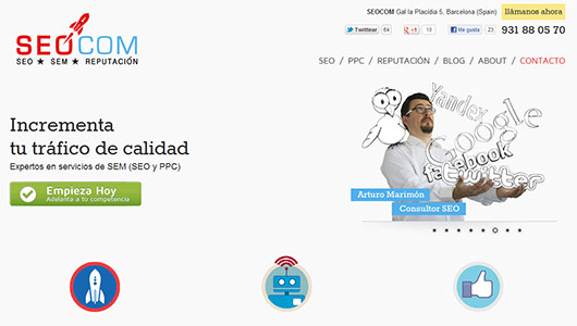
 10. SEOCOM plays with the illustrated names of search engines and social media websites to bring users the idea that they are on familiar terms with web giants, thus making users feel that they are real pros.
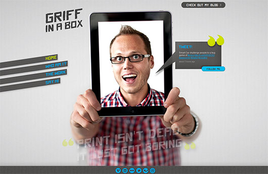
 11. Griffinabox uses a trick with transparent display to say “Hey, this is the guy who will do all the work for you”, and he is always within reach.
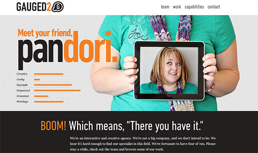
 12. Gauged2 shows all their staff by creating offbeat photos and small descriptions. Focusing on making visitors familiar with all the members of the team and making an impression of an honest and open company.
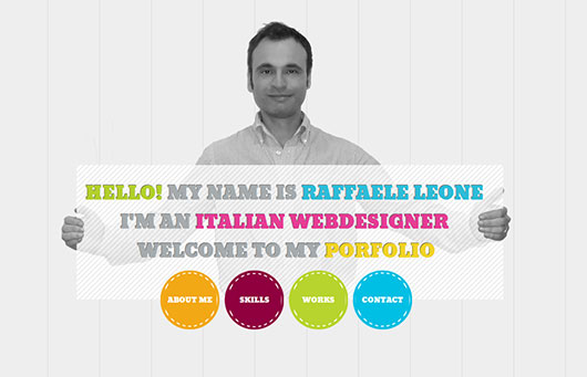
 13. Raffaele Leone greets you with open arms and with serenity on his face. Raffaele wants to make his website a welcoming place where you will feel safe and sound.
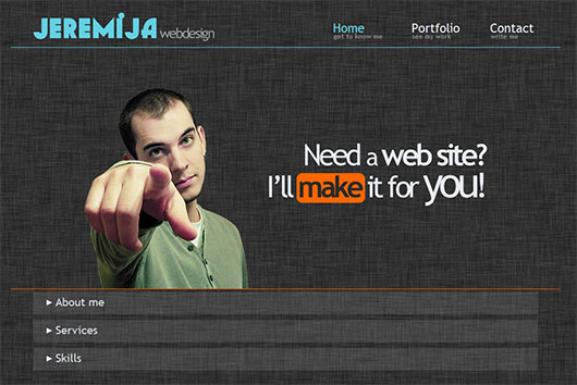
 14. Jeremija Webdesign uses the power of gestures, putting in users minds that he is talking directly to them. Simply establishing the bond between him and the person behind the screen.
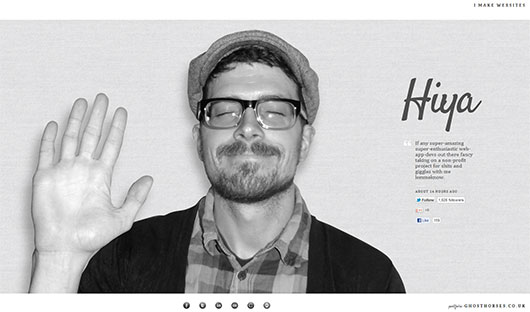
 15. Thathurtabit uses another powerful psychological tool - facial expression. A great deal of people associate smile and “hi-five” gesture with goodwill, fairness and eagerness. And he really does know about it.
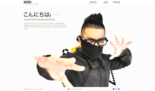
 16. Michael Wong presents himself as a daring and responsible warrior of website design and development, who will lead you through the web jungles and won't leave you in any case. Making users believe that with him they will be safe.
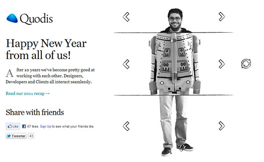
 17. Quodis calls on your imagination, creating a whimsical slider that instills the idea of full understanding and perfect cooperation among all the members, making their company the place to visit.
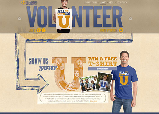
 18. Volunteer Louisiana incorporates images of its members and of the people who regularly volunteer. Showing appreciation - cause for others to “remove their shields” and be more friendly and thoughtful.
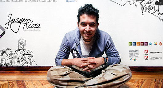
 19. Jorge Riera realizes the importance of eye contact between himself and the user behind the screen, adding amiability and geniality with his smile.
 20. Soul Media does a good job of using geekiness, instilling the sense of hopeless dedication to you and your project.
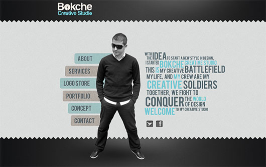
 21. Bokche builds a brand around himself, integrating the impression of stability, gravity and safety. Making the customers believe that they really can rely on him.
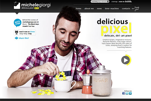
 22. Michele Giorgi concentrates on several images, each of which depicts different emotions. The first shows tranquility, the second the artistic side of Michele, and the last one displays a willingness and eagerness to start working.
 23. Smultron's imagery conveys the sense that "everything is going to be alright".
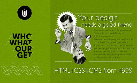
The Human Touch
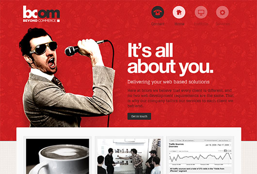
1. Beyond Commerce recreates a sense of the individual approach to every customer using a properly selected slogan and the image of the singing song in your honor. 2. Hitmo studio shows eagerness to fighting on your side and working as a team against the problems. The image also plays the role of visual interpretation of the main slogan.
 3. Netbluez provokes good feelings that are usually associated with the image of child-like keenness, honesty and purity of mind. The well treated photo highlights the main message and completes the whole design.
 4. Creative People is a great example, where the image not only makes the whole design look fresh and mysterious, but also gets users to believe that this agency works with really talented people, who definitely use unconventional approaches.
 5. Forty Seven Media presents people behind the scene with a touch of quaintness. The appearance of the potential performers shine with eagerness and creativity, convincing us of their good intentions.
 6. Gavin Castleton's site uses a masterful photomanipulation to both divide the website into two functional parts and to inspire confidence by means of showing off the designer's skills.
 7. Digital Hands like with the previous example, the agency bets on creativeness and skillfulness of their workers, using an exceptional image that should convince users that such talented people wont let us down.
 8. Jorge Rigabert's whole website design is made with such a scrupulousness and attention to the smallest details that the self-portrait of the executor only adds seriousness to his intentions to do the job perfectly.
 9. Chandan Roy Sanyal is not afraid to show his dark side. This unwonted and peculiar image can be regarded as an attempt to be honest with the users.
 10. SEOCOM plays with the illustrated names of search engines and social media websites to bring users the idea that they are on familiar terms with web giants, thus making users feel that they are real pros.
 11. Griffinabox uses a trick with transparent display to say “Hey, this is the guy who will do all the work for you”, and he is always within reach.
 12. Gauged2 shows all their staff by creating offbeat photos and small descriptions. Focusing on making visitors familiar with all the members of the team and making an impression of an honest and open company.
 13. Raffaele Leone greets you with open arms and with serenity on his face. Raffaele wants to make his website a welcoming place where you will feel safe and sound.
 14. Jeremija Webdesign uses the power of gestures, putting in users minds that he is talking directly to them. Simply establishing the bond between him and the person behind the screen.
 15. Thathurtabit uses another powerful psychological tool - facial expression. A great deal of people associate smile and “hi-five” gesture with goodwill, fairness and eagerness. And he really does know about it.
 16. Michael Wong presents himself as a daring and responsible warrior of website design and development, who will lead you through the web jungles and won't leave you in any case. Making users believe that with him they will be safe.
 17. Quodis calls on your imagination, creating a whimsical slider that instills the idea of full understanding and perfect cooperation among all the members, making their company the place to visit.
 18. Volunteer Louisiana incorporates images of its members and of the people who regularly volunteer. Showing appreciation - cause for others to “remove their shields” and be more friendly and thoughtful.
 19. Jorge Riera realizes the importance of eye contact between himself and the user behind the screen, adding amiability and geniality with his smile.
 20. Soul Media does a good job of using geekiness, instilling the sense of hopeless dedication to you and your project.
 21. Bokche builds a brand around himself, integrating the impression of stability, gravity and safety. Making the customers believe that they really can rely on him.
 22. Michele Giorgi concentrates on several images, each of which depicts different emotions. The first shows tranquility, the second the artistic side of Michele, and the last one displays a willingness and eagerness to start working.
 23. Smultron's imagery conveys the sense that "everything is going to be alright".


Nice post! I agree that when using a face on a website it makes it much more approachable and maybe even trustworthy. Especially if the images are so well worked on like the examples above, then it also shows off your skills along with a personal touch.
Look at this one http://warkate.free.fr
This concept is so relevant. It reminds me of Melissa Rach’s recent article in Contents Magazine, where she mentions the “flawsome” strategy for brand building. “Flawsome” brands are honest, they show their cracks, and admit when they’ve messed up. It definitely textures the brand with human imperfection, and works for an audience that has been bringing more and more of their own “real” identity to the Internet table, too.
Cheers,
Sarah Bauer
Navigator Multimedia
Thank you for the collection! Good ideas for new sites!
Thank you for the collection…
Loved the sites. But most of them have long load-times. I guess one has to sacrifice load time if they come up with an innovative UI…
What a wonderful compilation of websites that we can look at and get ideas from! I am the creator of The Easy API – http://theeasyapi.com – and I am currently in the middle of a redesign. I took a step back from my design of 2 years ago and thought that there was something missing. Human interaction. It’s not scalable, doesn’t have any responsive design characteristics, and just overall needs to be easier for designers. The goal of the company I set out was lost, and I am in the process of regaining that with a new design. It’s getting a full UI make-over and full documentation makeover as well. I’m going to be having two parts one geared for designers who need the jQueryized version and one for PHP, Ruby, etc programmers.
I know that I will be looking at these sites that were listed and drawing inspiration on how to make a really great looking design that says the right message! Thank you so much for bringing them all together!
Cool, looking good guys =)
Thanks for the mention guys! Awesome article.
#NINJAON :)
Great collection of sites and thanks for the inspiration.