Design: What You Didn’t Know About the Color Red

There you are, in the first diaper you were put into, and look at the world. First, you only see black and white, and the world looks rather bleak. But, all of a sudden, there's a colorful spot. You take a closer look, and you don't know what to call it, but this first color you see is red.
There you are, in what might be the last diaper you were put into after your brain injury, which has lead to a wide loss of control, and look at the world. First, you only see black and white, and it seems like your thought that all the world had to offer was desolation was confirmed. But, all of a sudden, there's a colorful spot. You take a closer look, and, you're right, the color you see is red. You start getting better.

For Humans, Red is the Most Important Color in the Color Spectrum
Red is a color with essential significance for us humans. For both newborns and people recovering from a brain trauma, it is the first color they see after black and white. All other colors follow much later, in the order green, yellow, and blue. There's no color that gets a remotely as strong reaction from humans as red.
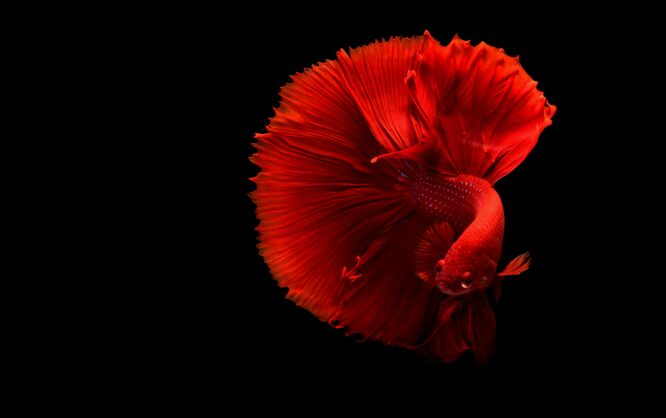
Photo by Anastasiia Petrova
Red has the longest wavelength of all colors. Visually, red objects appear to be closer than they really are. Thus, it is no surprise that red draws our attention towards itself first. That's why red is used as a very effective traffic light signal for "stop" all around the world. Psychologists found out that red is able to trigger our fight or flight reflex. This is one of our earliest evolutionary reactions, which allowed us to survive in highly dangerous situations. It is controlled fully independently from our mind, by our autonomous nervous system.
Isn’t red hard for people who are color blind to see on Web?
Citation needed.
Quite a negative start for a great article that follows.
“This is not a mere question of psychology, but a solid psychological fact that is deeply rooted somewhere inside of us.” Damn that’s right! I also like to use some red on important buttons for a nice ctr ;)