Textured Web: Showcase of Textured & Patterned Website Designs
When it comes to design resources, textures and patterns are among some of the most popular tools on offer. And while we may never be able to get a single, definitive answer from the community as to why this is, one can surmise that their popularity is probably due to their extreme usefulness. Their ability to add such richness and depth to otherwise flat website designs with ease, may also factor into that equation.
In fact, one need only look around the web to find some stunning examples of these elements being deployed with fantastic results. Or one can look at the showcase we have assembled for you below. We have already done some of the leg work for you. The sites we gathered have all used textures or patterns in their website designs, and in such stylish fashion that we felt our spotlight should shine their way.
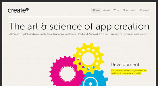
 Create Digital Media has a beautiful open, expansive website, and the minimal design is complemented by the light textured background.
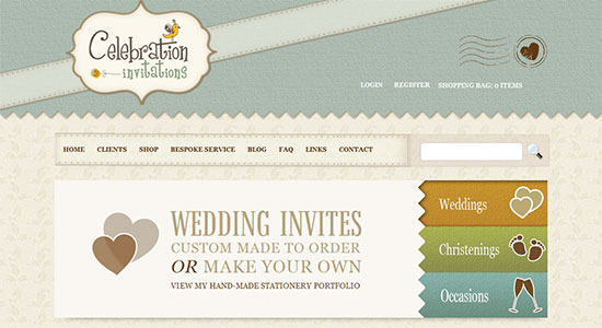
 Celebration Invitations has a large header that uses a light texture to really make the space pop and not feel at all underused. The patterned background adds an extra touch of style to the site.
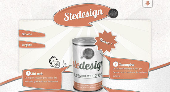
 Stedesign is a vintage styled site in which the design uses a number of textures to really pull the look off with flawless execution.
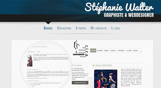
 Stephanie Walter has a lovely design with a texture running all the way down and through the site. Subtle and stylish.
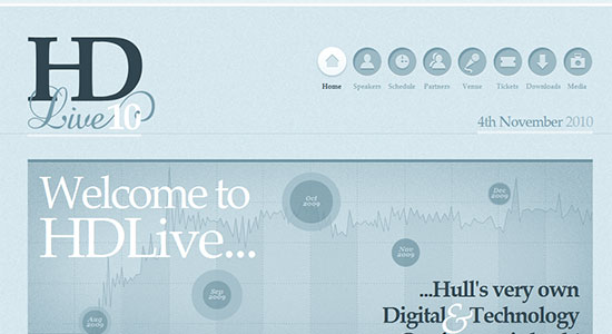
 HD Live is another site with an extra subtle background texture that adds a richness to the open design.
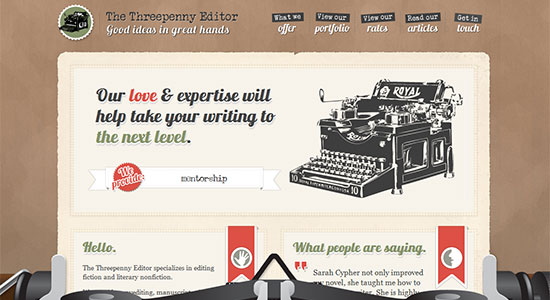
 The Threepenny Editor has a unique and stylistically retro look and feel, with the patterned background tying the design together in a light, graceful manner.
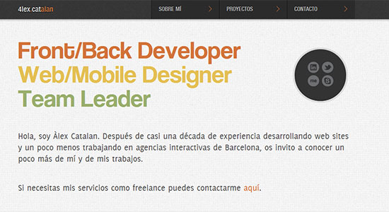
 Alex Catalan has a site design that uses a slight patterned background to give the minimal, oversized style a depth that works wonderfully. The soft texture in the footer and the header also complement the website's design.
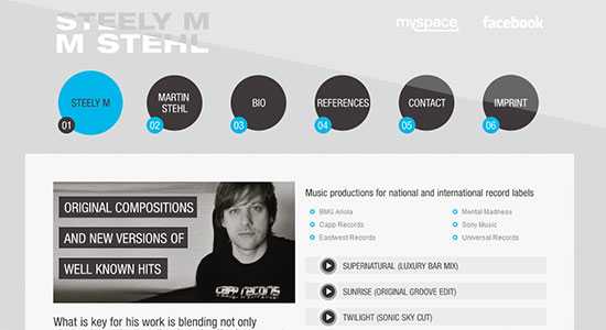
 Steely M Music Production uses a lined pattern to pull the somewhat unconventional layout together.
 PunchTab has used a delicately textured background to set off the over-sized buttons and content areas. Very nicely paired with the rest of the design.
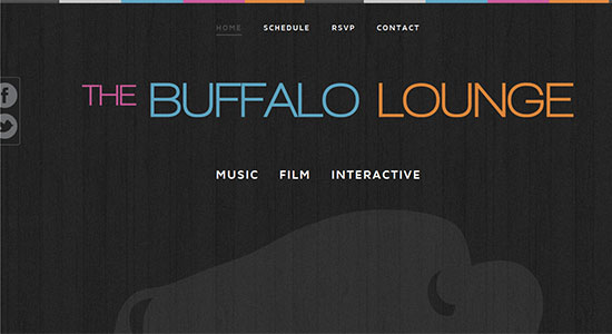
 the Buffalo Lounge has a dark themed site with a wood grain patterned background that gives the entire design the perfect edge.
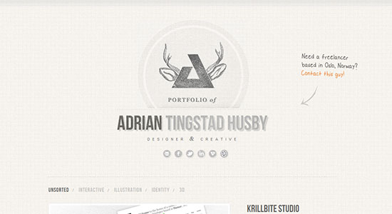
 Adrian Tingstad Husby - Portfolio design is another expansive site layout that adds a touch of attitude and grunge to the otherwise clean style with a patterned background.
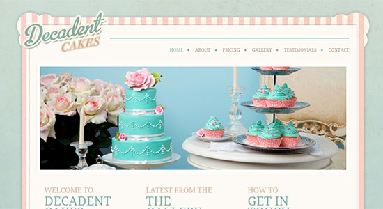
 Decadent Cakes uses both a colorful pattern and an extremely subtle textured background to give the site a combination of class and vintage style.
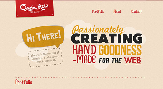
 Qasim Aziz Portfolio is a simple design with a lightly grained texture in the background for that added punch to the site's look.
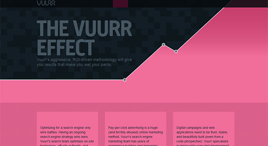
 VUURR uses a pair of simple patterns in their website to pull off a design that is big and bold and anything but simple.
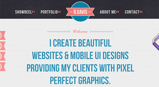
 Rob Davis uses a delicate texture in both the header and footer, along with a slight patterned background to make this minimal design stand out from the pack.
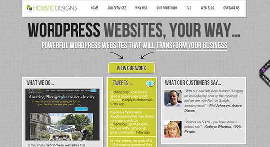
 Holistic Designs has a touch of grunge in their site via a textured background that really catches the eye, but does not steal away focus as the content scrolls across it. Perfectly balanced.
 Launch Factory uses a combination of textures, in the background, throughout the content headers and titles, and more for a pitch perfect design full of grunge.
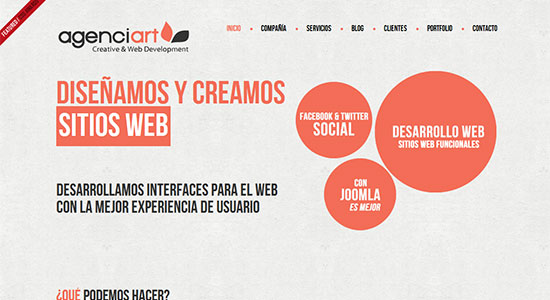
 Agenciart has another big and bold design that is brilliantly complemented by the subtle texture in the background.
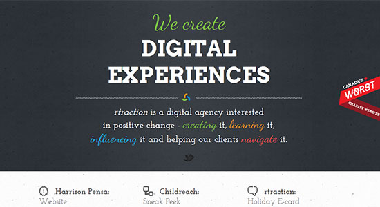
 rtraction is the website for a creative design agency and their use of a light texture in the background works to set off the over-sized content and images. Though the areas where the texture is omitted ends up feeling somewhat less visually comfortable, though the colors could have something to do with that. However, it does seem the texture would soften their slightly harsh feel.
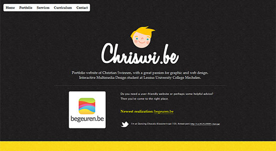
 Chriswi is an example that stands out from the last, as it uses the texture down throughout the site (except for the footer) and the colors that might otherwise feel somewhat harsh on the eyes have a softness it seems the texture adds to them.
 Valpo Creative uses a delicate texture in the background which does work nicely, though the site would seem better suited to have the content displayed against this lightly textured background rather than the box it sits in.
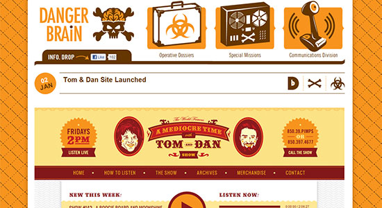
 Danger Brain uses both a pattern for the background and a light texture in the header. The pattern seems like it could be visually overwhelming, but with the content box relegating it to a smaller perimeter it makes it very complementary to the tone of the site.
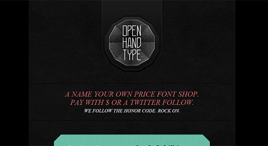
 Open Hand Type has a couple of less than subtle textures employed in the somewhat compact design making their bold look stand out perfectly. Giving the site a certain character.
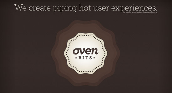
 Oven Bits has a huge header whose open space is lightly textured giving it a softness and retro style. The footer has a matching texture that balances the site wonderfully.
 That finishes off this showcase, but feel free to leave us your thoughts in the comment section below. Also drop us a link on a site that you feel we overlooked, and should have included in this collection if you are so inclined.
(rb)
Textured Web
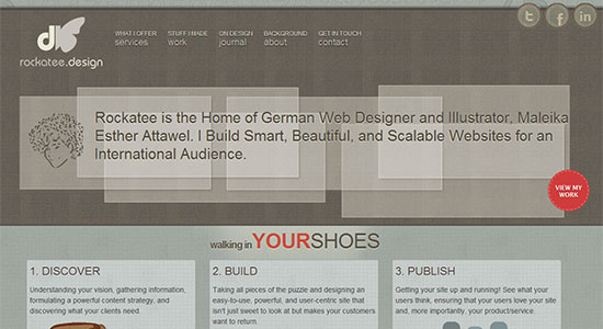
Rockatee is a dark design with a geometric patterned header and footer and two different textures. Both brilliantly installed in the background, one of the main content area, and a subtler one above the header. Create Digital Media has a beautiful open, expansive website, and the minimal design is complemented by the light textured background.
 Celebration Invitations has a large header that uses a light texture to really make the space pop and not feel at all underused. The patterned background adds an extra touch of style to the site.
 Stedesign is a vintage styled site in which the design uses a number of textures to really pull the look off with flawless execution.
 Stephanie Walter has a lovely design with a texture running all the way down and through the site. Subtle and stylish.
 The Threepenny Editor has a unique and stylistically retro look and feel, with the patterned background tying the design together in a light, graceful manner.
 Alex Catalan has a site design that uses a slight patterned background to give the minimal, oversized style a depth that works wonderfully. The soft texture in the footer and the header also complement the website's design.
 Steely M Music Production uses a lined pattern to pull the somewhat unconventional layout together.
 PunchTab has used a delicately textured background to set off the over-sized buttons and content areas. Very nicely paired with the rest of the design.
 the Buffalo Lounge has a dark themed site with a wood grain patterned background that gives the entire design the perfect edge.
 Adrian Tingstad Husby - Portfolio design is another expansive site layout that adds a touch of attitude and grunge to the otherwise clean style with a patterned background.
 Decadent Cakes uses both a colorful pattern and an extremely subtle textured background to give the site a combination of class and vintage style.
 Qasim Aziz Portfolio is a simple design with a lightly grained texture in the background for that added punch to the site's look.
 VUURR uses a pair of simple patterns in their website to pull off a design that is big and bold and anything but simple.
 Rob Davis uses a delicate texture in both the header and footer, along with a slight patterned background to make this minimal design stand out from the pack.
 Holistic Designs has a touch of grunge in their site via a textured background that really catches the eye, but does not steal away focus as the content scrolls across it. Perfectly balanced.
 Launch Factory uses a combination of textures, in the background, throughout the content headers and titles, and more for a pitch perfect design full of grunge.
 Agenciart has another big and bold design that is brilliantly complemented by the subtle texture in the background.
 rtraction is the website for a creative design agency and their use of a light texture in the background works to set off the over-sized content and images. Though the areas where the texture is omitted ends up feeling somewhat less visually comfortable, though the colors could have something to do with that. However, it does seem the texture would soften their slightly harsh feel.
 Chriswi is an example that stands out from the last, as it uses the texture down throughout the site (except for the footer) and the colors that might otherwise feel somewhat harsh on the eyes have a softness it seems the texture adds to them.
 Valpo Creative uses a delicate texture in the background which does work nicely, though the site would seem better suited to have the content displayed against this lightly textured background rather than the box it sits in.
 Danger Brain uses both a pattern for the background and a light texture in the header. The pattern seems like it could be visually overwhelming, but with the content box relegating it to a smaller perimeter it makes it very complementary to the tone of the site.
 Open Hand Type has a couple of less than subtle textures employed in the somewhat compact design making their bold look stand out perfectly. Giving the site a certain character.
 Oven Bits has a huge header whose open space is lightly textured giving it a softness and retro style. The footer has a matching texture that balances the site wonderfully.
 That finishes off this showcase, but feel free to leave us your thoughts in the comment section below. Also drop us a link on a site that you feel we overlooked, and should have included in this collection if you are so inclined.
(rb)
Wow really like some of the designs on here. Textured minimal website designs look so good.
very nice showcase
great collection here. but someone has to say it: speaking of textured websites.. the texture behind the copy on this very website makes it very difficult to read. especially the top section..
Very creative collection!
Great showcase, but I’m wondering when the textured design trend will run its course – for the first time, I found myself thinking “not another textured pattern website!”
Great list of sites! I really like the Danger Brain site!
Great websites! I really like Rob Davis’.
Robert, thanks for including my site in your list, much appreciated!!!
Some nice examples
Thanks for these inspirational sites.