Equinox: 25 Stylish Nightclub Website Designs

All people have different goals in life and are interested in different things. Some take delight in working hard and building excellent careers, others are happy to watch their children grow. Some like to travel and see the world. It is our daily life, things we do in the daytime. But when the night comes, don’t we like to relax, have fun, dance, drink a cocktail or two, party with friends? There are many nightclubs all around the USA, and not just here. Every big city has its own nightlife and where do you think we will find the best clubs in the world? - It is easy to guess that websites will tell us a lot about this kind of enjoyment and fun people like to have.
In this showcase I won’t get you bored with hundreds of badly designed websites that I have experienced to see. Instead I'll show you what I find to be the crème de la crème of nightclub websites. Enjoy!
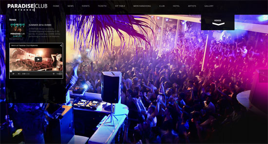
Paradise, Mykonos, Greece
A full-screen image slider - what can be more powerful in making a website visually catchy? This website has also a video gallery and a few photo collections with asymmetric arrangement of images.
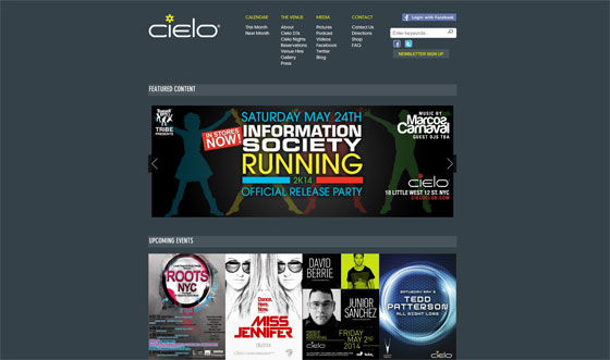
Cielo, NY, US
Cielo is one of the best music nightclubs in New York. Still, I wouldn’t call this website the best in this collection - it is good and designed professionally. The background is monochrome colored and the layout is very accurate. These features differ the site from many more others that are mostly content-rich with photographic backgrounds.
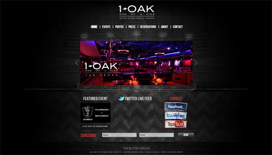
1-OAK, NY, US
This is another nightclub in NY. It is thought to be a great place to listen to hip-hop, pop and mash-ups, but what does the website look like? It is a site designed in a grunge style with a dark textured background and an image slider on the home page. The other pages are designed with Header images, plus there is an extensive photo gallery with vivid pictures.
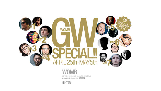
Womb, Tokyo, Japan
Womb is a club with a vast dance floor for crazy clubbers, though the website design is quite restrained. There is a splash page colored white and neatly done content pages.
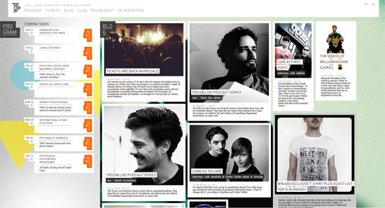
TrouwAmsterdam, Amsterdam, Holland
This legendary nightclub in Amsterdam has a really trendy website. It is based on a wide use of photographs that make this site a perfect viewing experience. The design features a number of geometric shapes of various sizes and colored in different hues. These are yellow triangles, blue circles, pink rectangles. The website does a fantastic job - it makes me curious and I wish to visit this place.
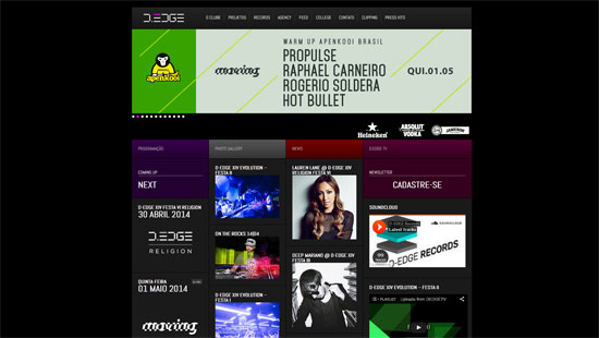
D-Edge, São Paulo, Brazil
This electronic club with lounge has classy interior design, but its website isn’t very bright or extraordinary. The primary color of this design is black, while there are many pictures and what is more there is a large music page. A great collection of tracks is presented to visitors, why not to listen to cool music?
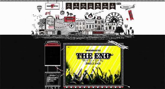
Warehouse Tokyo, Japan
This music club website design reminds me a circus or an amusement park. The design is a bit messy, but is original enough. There are lots of unusual details on this black background. A Header animation picture is quite nice, plus I like the menu tabs - they are cute.
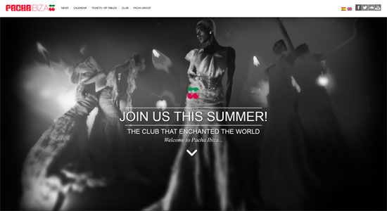
Pacha, Ibiza, Spain
A nice cherry website design on white background is right here for you. The home page is scrollable, and the media pages are awesome.
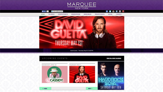
Marquee, NY, US
Here is the most talked about New York nightclub, where the world’s best DJs play and the biggest dance parties take place. The website is not worse: a modish purple color is in the Header, the background pattern is elegant and stylish, the pictures are all over the canvas, the Footer section is huge and the Contact Form is more than just clear.
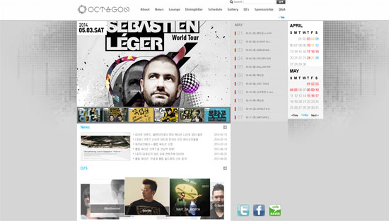
Octagon, Seoul, South Korea
This nightclub website design is simple but visually rich. The background texture is cool, the media galleries are appealing and the overall atmosphere of the site is pleasant.
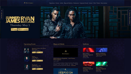
Hakkasan, Las Vegas, USA
This website design charms me with a fabulous color blend of dark blue and golden hues. The content slider has gorgeous transition effects, different for pictures and texts. I very love the bright images of the place - they make me feel this hot ambience coming from the dance floor.
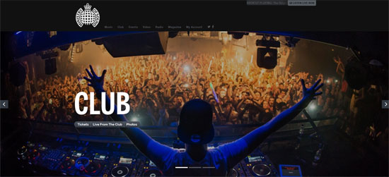
Ministry of Sound, London, UK
The color palette of this website design is versatile and attractive. There are blue, green, purple hues. Tons of large vivid images bring this theme to a new visual level.
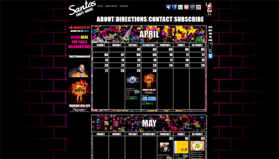
Santos Party House, NY, USA
This is a concert hall, a club, a lounge, and a bar - and it has a top-rate website. The brick textured background colored black and pink looks unique. The home page with a schedule is just perfect for users - it is plain and functional.
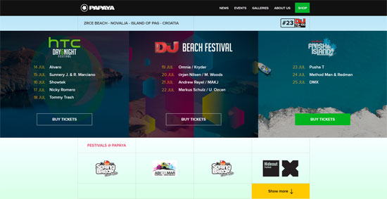
Papaya, Pag, Croatia
This varicolored website is a real fun. Three pictures in the Header have a zoom in effect, it is great. The layout is filled with both photos and videos.
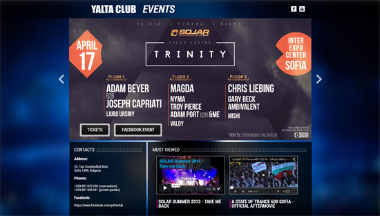
Yalta, Sofia, Bulgaria
This is a one page website with everything being compact and clear. The upcoming events are announced via a large content slider, the contacts are placed in a separate text section and there is a video gallery.
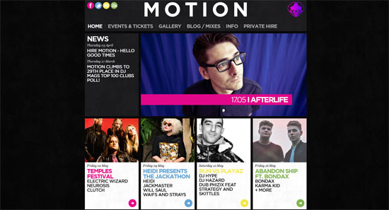
Motion, Briston, England
This website design with multicolored text blocks and numerous photographs is done professionally and with a sense of style.
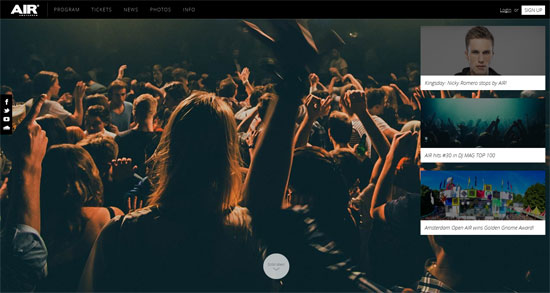
Air, Amsterdam, Holland
This is a creative website design with a sliced layout structure. The content blocks are placed horizontally on the pages, while the home page has also a big image sliding gallery.
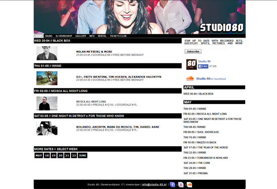
Studio 80, Amsterdam, Holland
Now you see a classic black-and-white website design. It is elegant and I would say pretty cool.
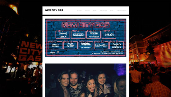
New City Gas, Montreal, Canada
This theme with an edge-to-edge background image is an original solution from New City Gas Club in Canada. It includes a video starting automatically right on the front page.
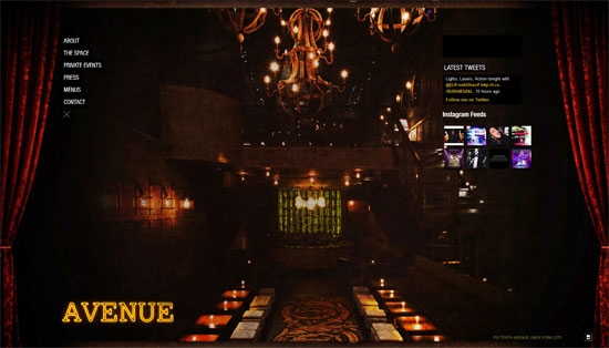
Avenue, NY, US
This luxurious web template is done in a bit old-fashioned manner, but it is a specific feature about this club - it is pompous.
The Castle Club, Ayia Napa, Cyprus
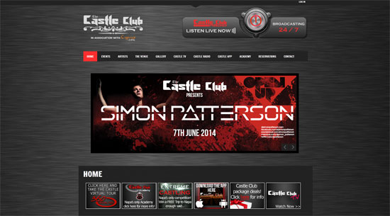
Here is another dark website, but this one has many details colored red. The logotype is done greatly and the overall design is well thought-out.
XS, Las Vegas, USA
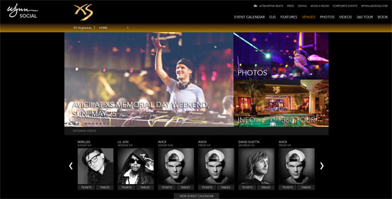
This website with an image slider, sliding thumbnails gallery and a superb event calendar is worth being in this list for sure.
Roxy, Prague, Czech Republic
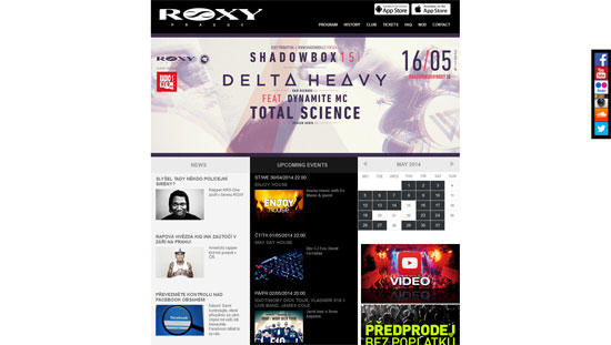
Simple light colored webpage but with a content-rich layout. The navigation menu of this site is definitely a big plus.
Digital, Brighton, UK
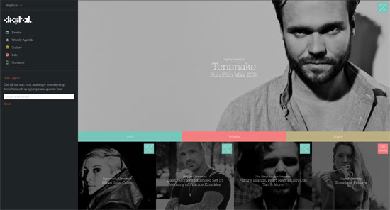
A large sliding gallery with photos is a wonderful decoration of this website. Besides, it has a perfect home page with multicolored text sections and a few black-and-white images.
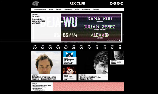
Rex Club, Paris, France
This website grabbed my attention thanks to a functional calendar on the home page. There is a date ribbon with links directing to event pages. This makes it easy and pleasant for clubbers to follow the upcoming parties and miss nothing.
That's it for our little showcase. Which nightclub's website appealed to you most? Do you know of better examples we missed out upon? Let us know in the comments below.
(dpe)
Featured Image by Frankie Cordoba on Unsplash

