Tool Tip: Sizzy Accelerates Responsive Designing

Sizzy is a web app and a Chrome extension that provides a fast way of testing your responsive designs. And by that, I mean really fast.
There are a bunch of tools that show you previews of your websites on all kinds of devices. However, I have yet to find one that's faster than Sizzy.
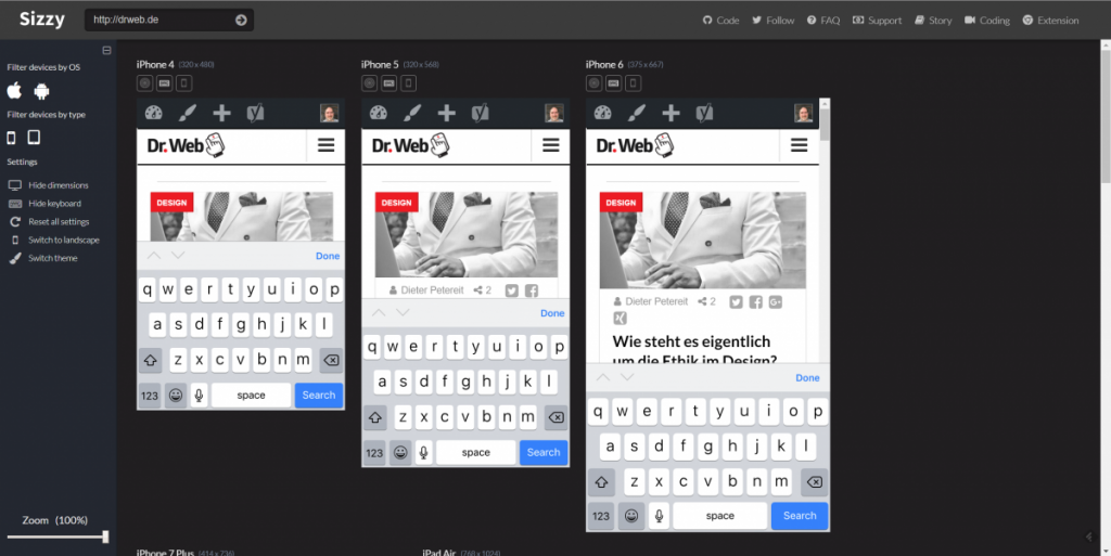
[caption id="attachment_102760" align="alignnone" width="1024"] Different Live Previews at a Glance. (Screenshot: Noupe)[/caption]
Sizzy was made by the Dutch developer Kitze and is based on React.js. It is being distributed under the GNU license, meaning it open source. You can find the source code at Github.
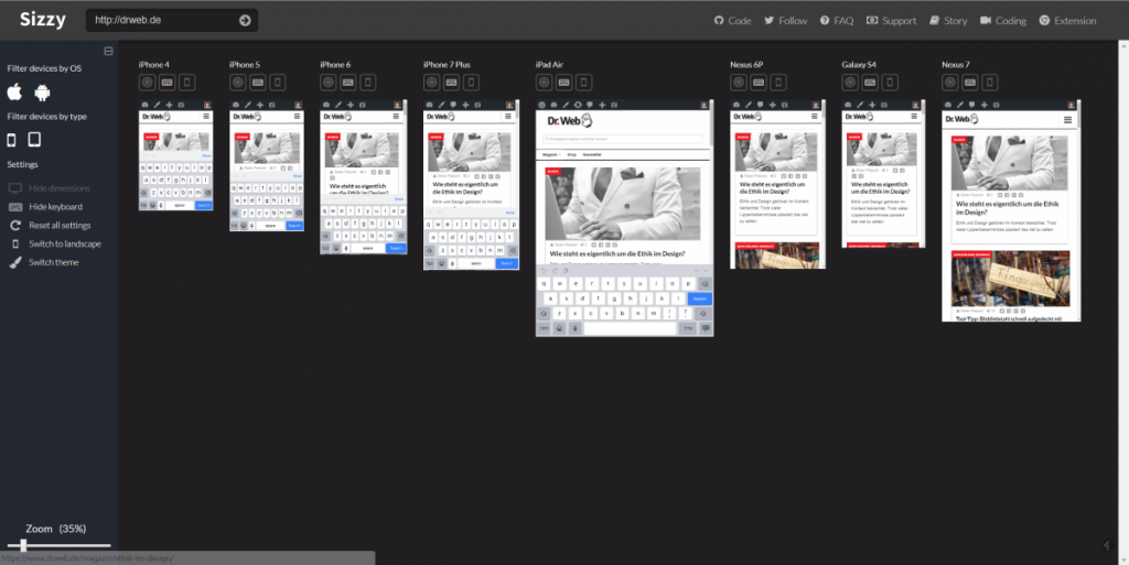
Sizzy was created from its developer's wish to be able to check his responsive designs on all supported devices at once, instead of accessing every single one via Chrome separately. The most interesting of Sizzy's features is the option to zoom the overview page, proportionally shrinking the individual previews.
[caption id="attachment_102759" align="alignnone" width="1024"]
 Sizzy With the Total Overview. (Screenshot: Noupe)[/caption]
If you want to use Sizzy, you can either do so using the website, where you enter the URL of the page you want to test, or you install the Chrome extension. From that point onwards, you just click the Sizzy icon to check any desired page's responsiveness by a single click.
[appbox chromewebstore nfhlbmjiiogoelaflfclodlkncbdiefo]
Once you're in the Sizzy interface, you have several options. To me, personally, there are two striking features, even in comparison to other services. Firstly, I find the option to display the keyboard of the respective mobile device to be beneficial. The second one is the above-mentioned zoom function, allowing you to take a final look at all devices at once.
Banner Image by Peter Olexa from Pixabay
 Different Live Previews at a Glance. (Screenshot: Noupe)[/caption]
Sizzy was made by the Dutch developer Kitze and is based on React.js. It is being distributed under the GNU license, meaning it open source. You can find the source code at Github.
Sizzy was created from its developer's wish to be able to check his responsive designs on all supported devices at once, instead of accessing every single one via Chrome separately. The most interesting of Sizzy's features is the option to zoom the overview page, proportionally shrinking the individual previews.
[caption id="attachment_102759" align="alignnone" width="1024"]
 Sizzy With the Total Overview. (Screenshot: Noupe)[/caption]
If you want to use Sizzy, you can either do so using the website, where you enter the URL of the page you want to test, or you install the Chrome extension. From that point onwards, you just click the Sizzy icon to check any desired page's responsiveness by a single click.
[appbox chromewebstore nfhlbmjiiogoelaflfclodlkncbdiefo]
Once you're in the Sizzy interface, you have several options. To me, personally, there are two striking features, even in comparison to other services. Firstly, I find the option to display the keyboard of the respective mobile device to be beneficial. The second one is the above-mentioned zoom function, allowing you to take a final look at all devices at once.
Banner Image by Peter Olexa from Pixabay